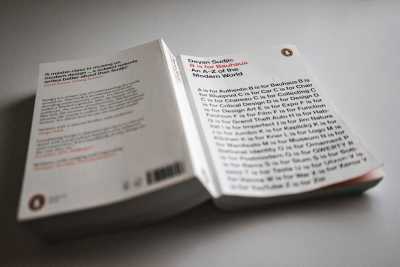
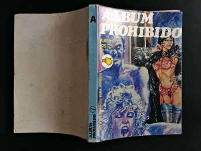
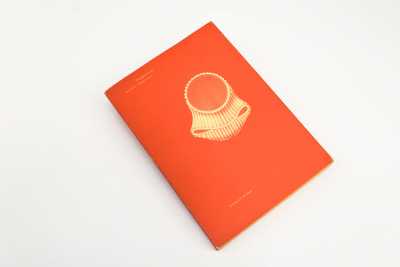
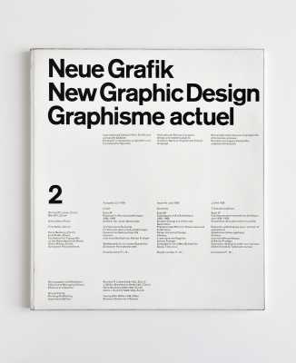
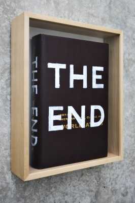
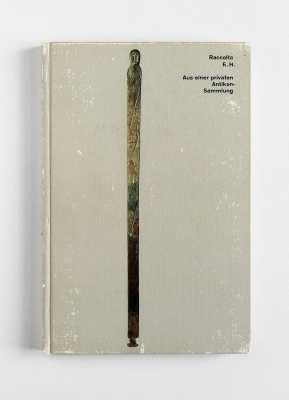
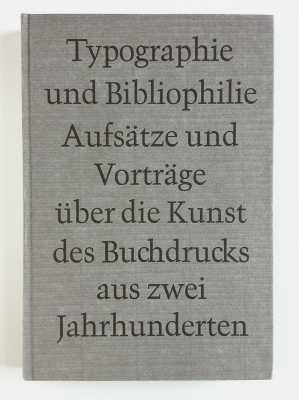
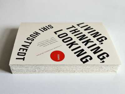
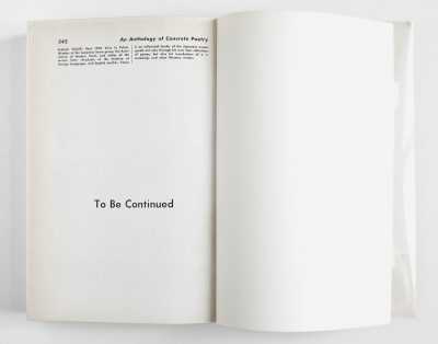
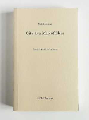
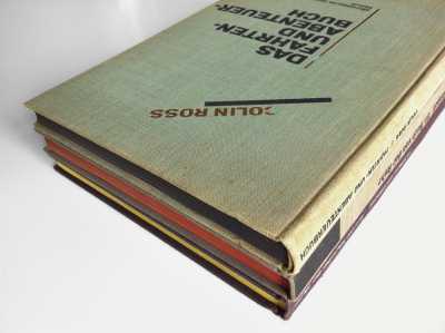
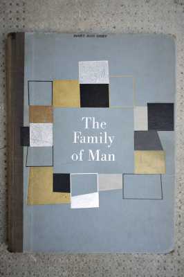
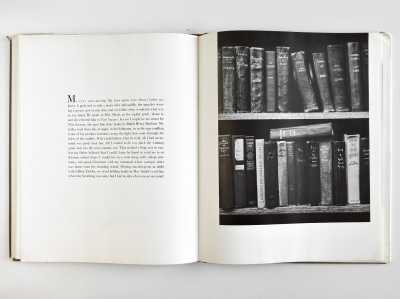
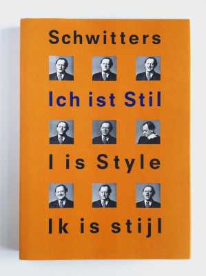
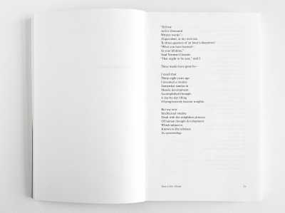
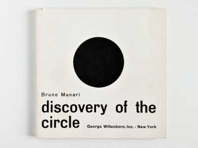
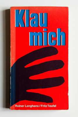
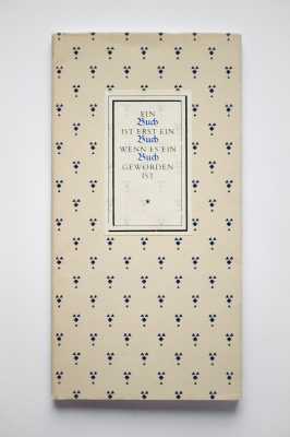
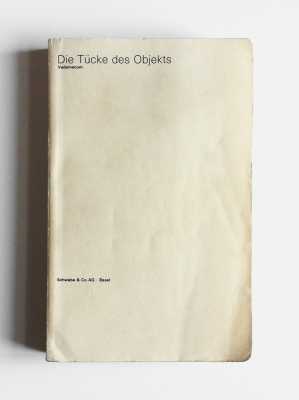
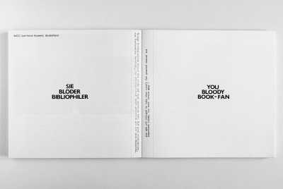
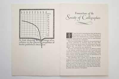
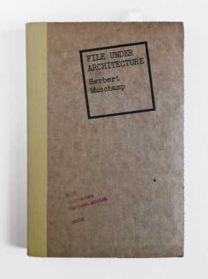
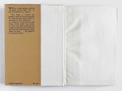
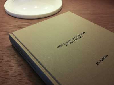
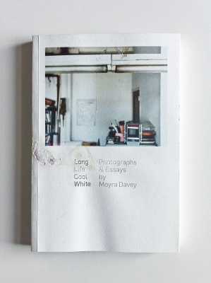
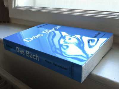
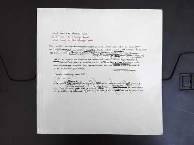
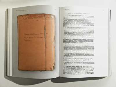
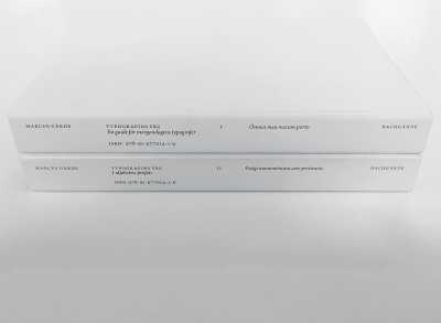
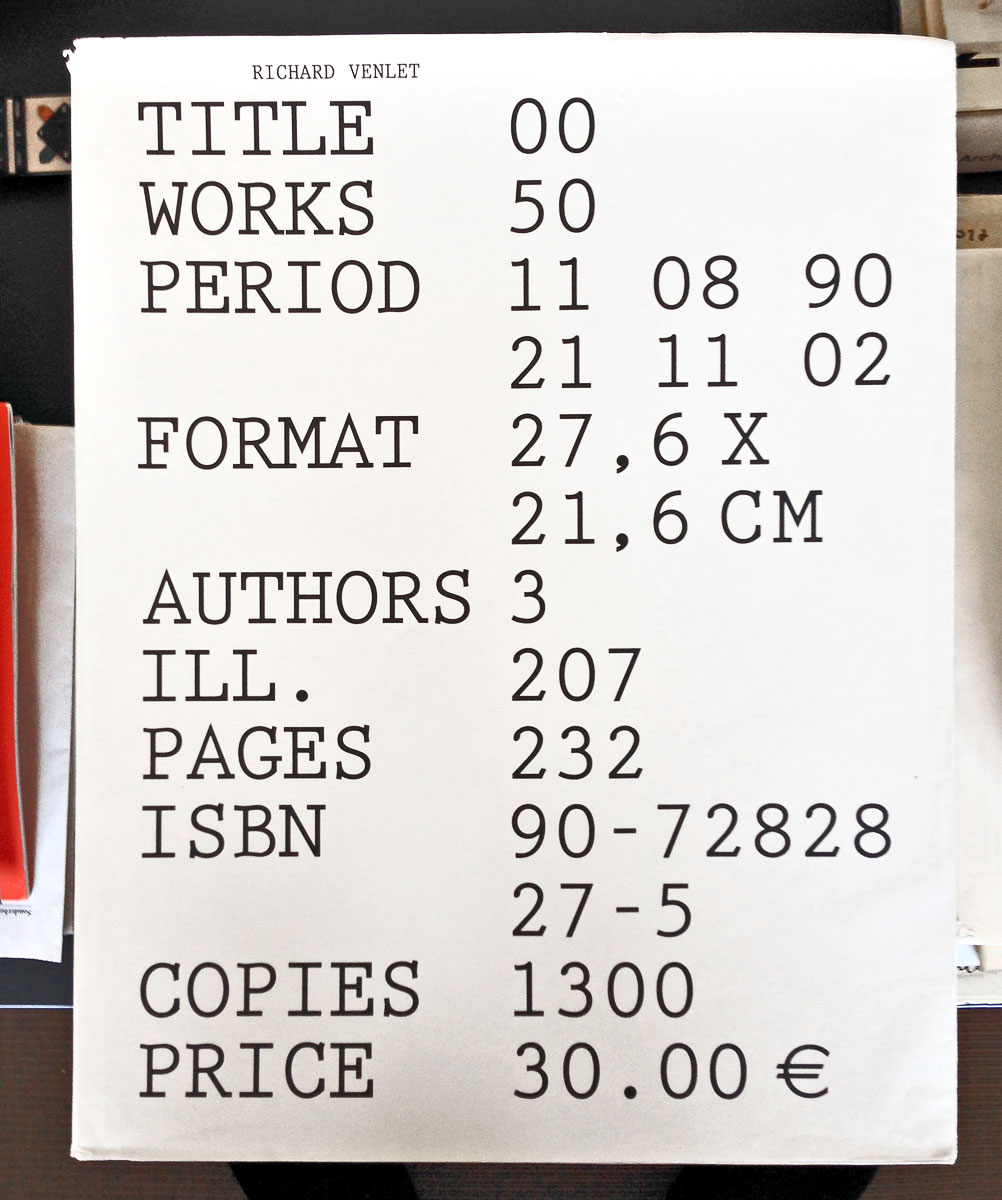
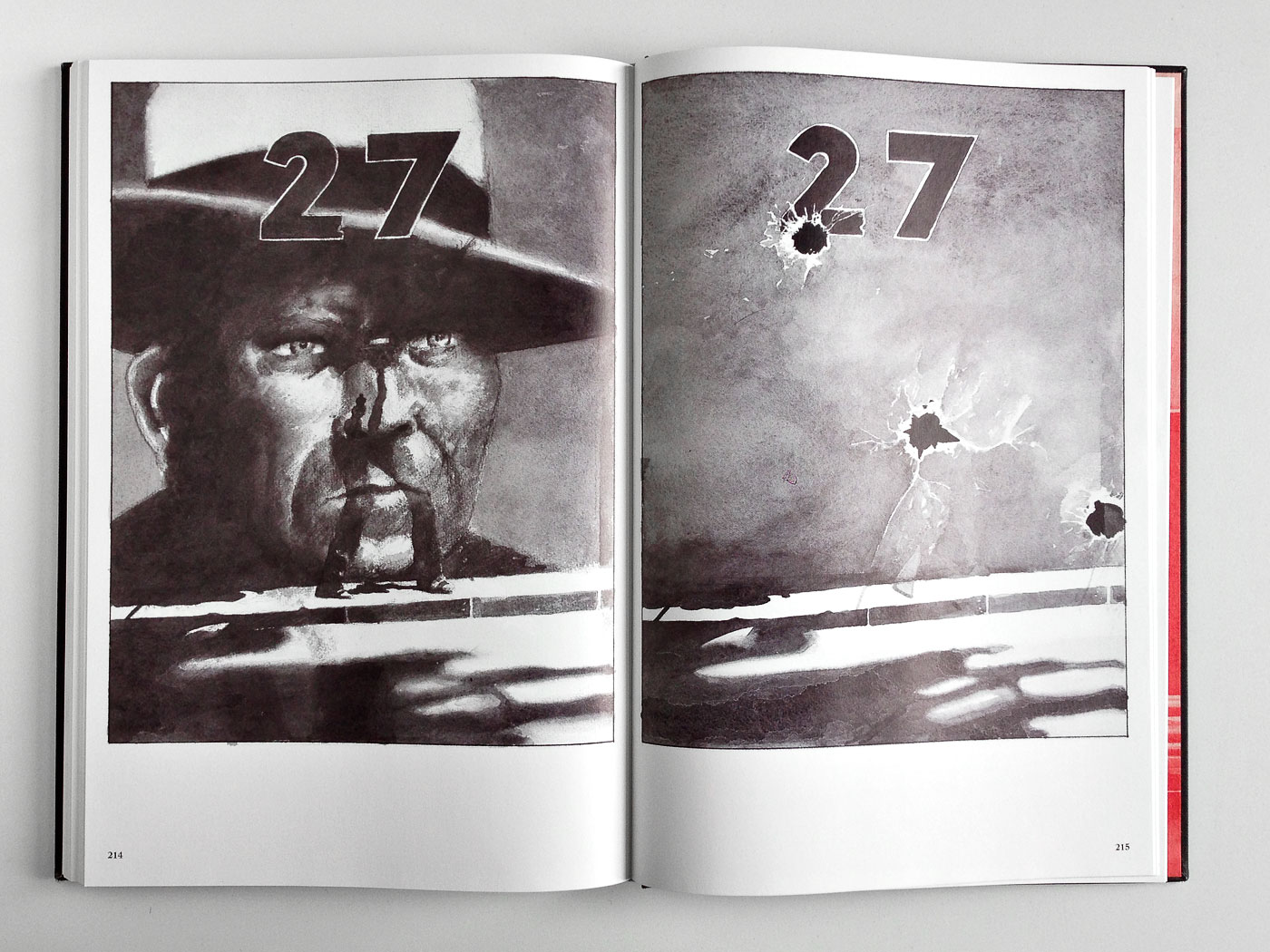
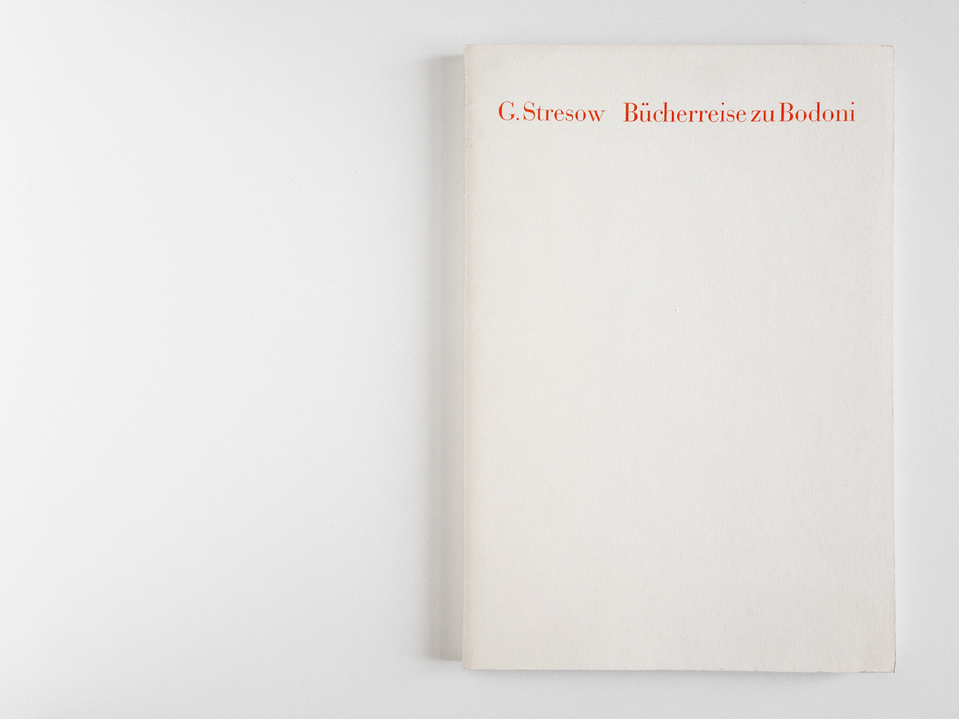
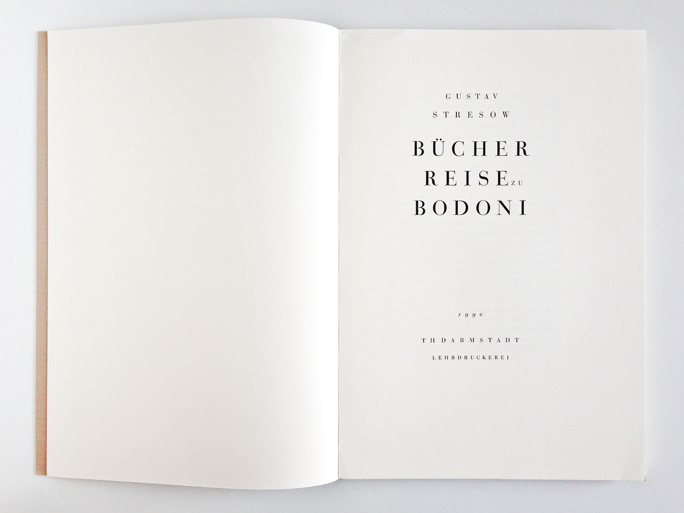
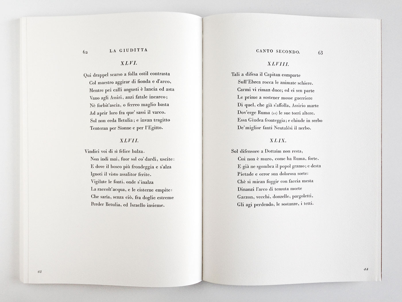
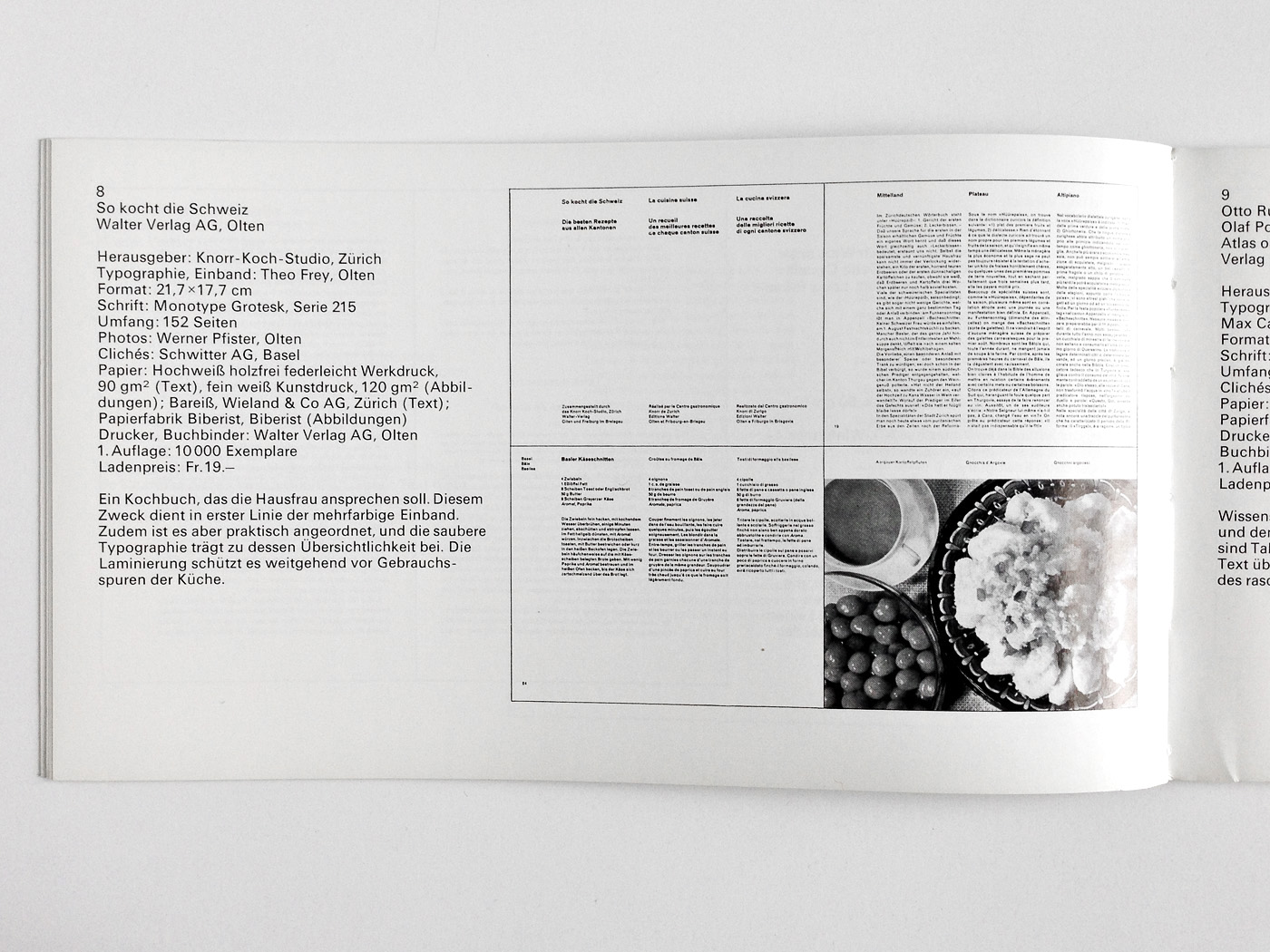
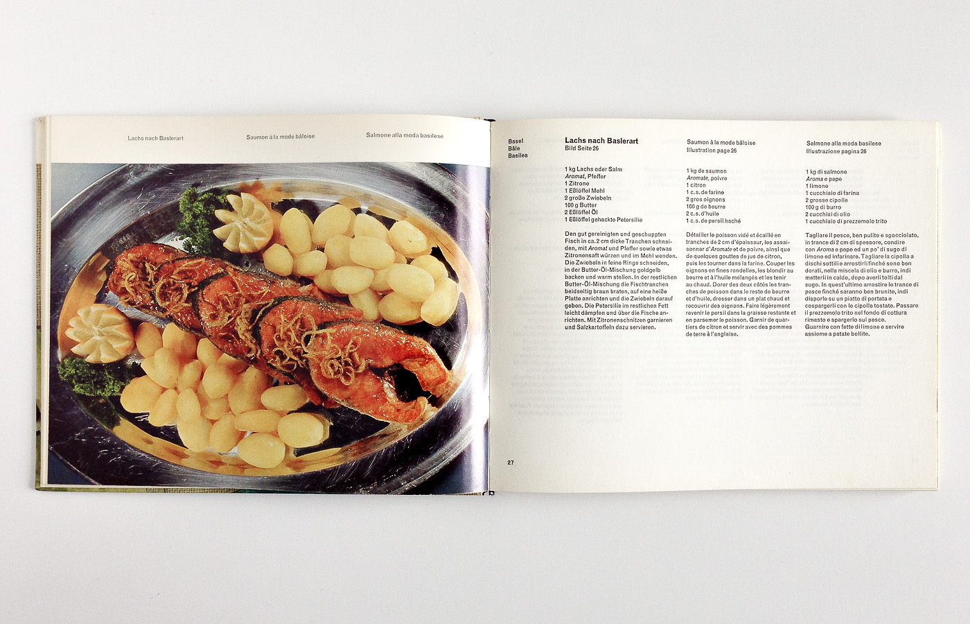
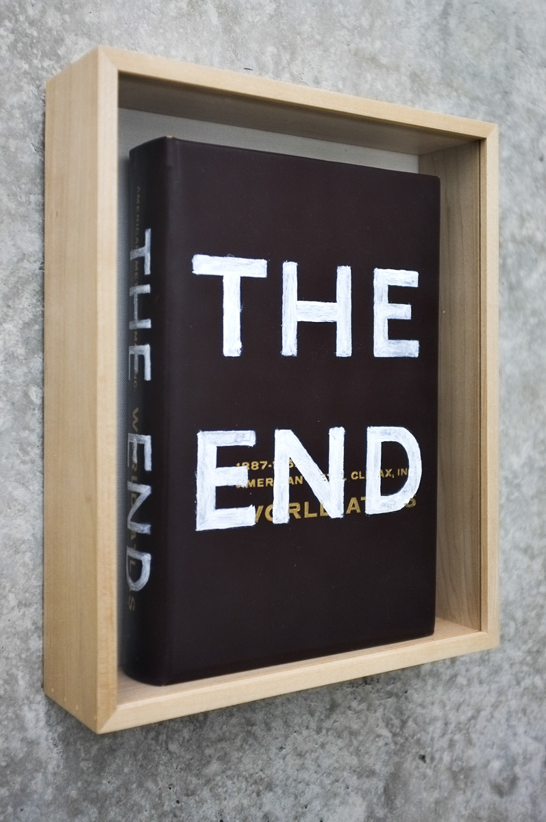
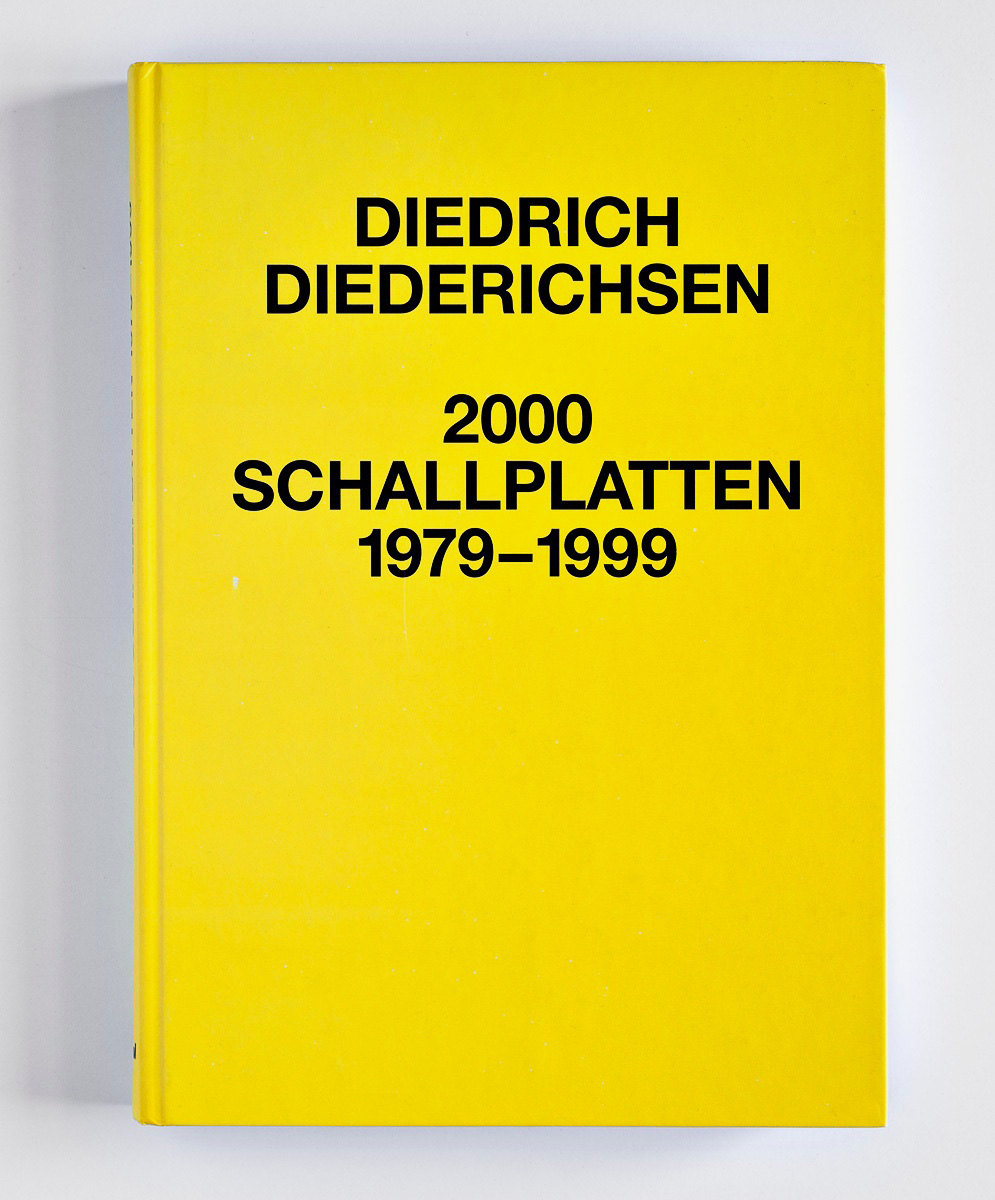
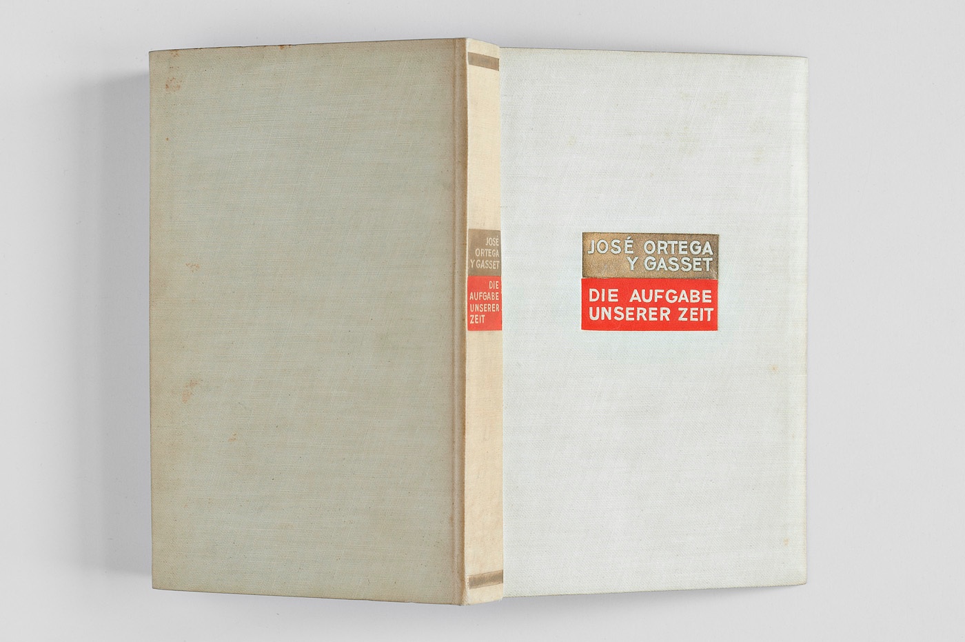
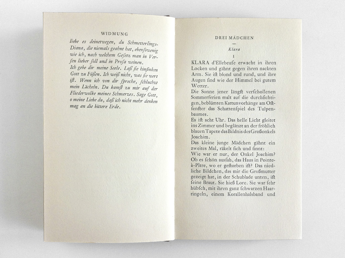
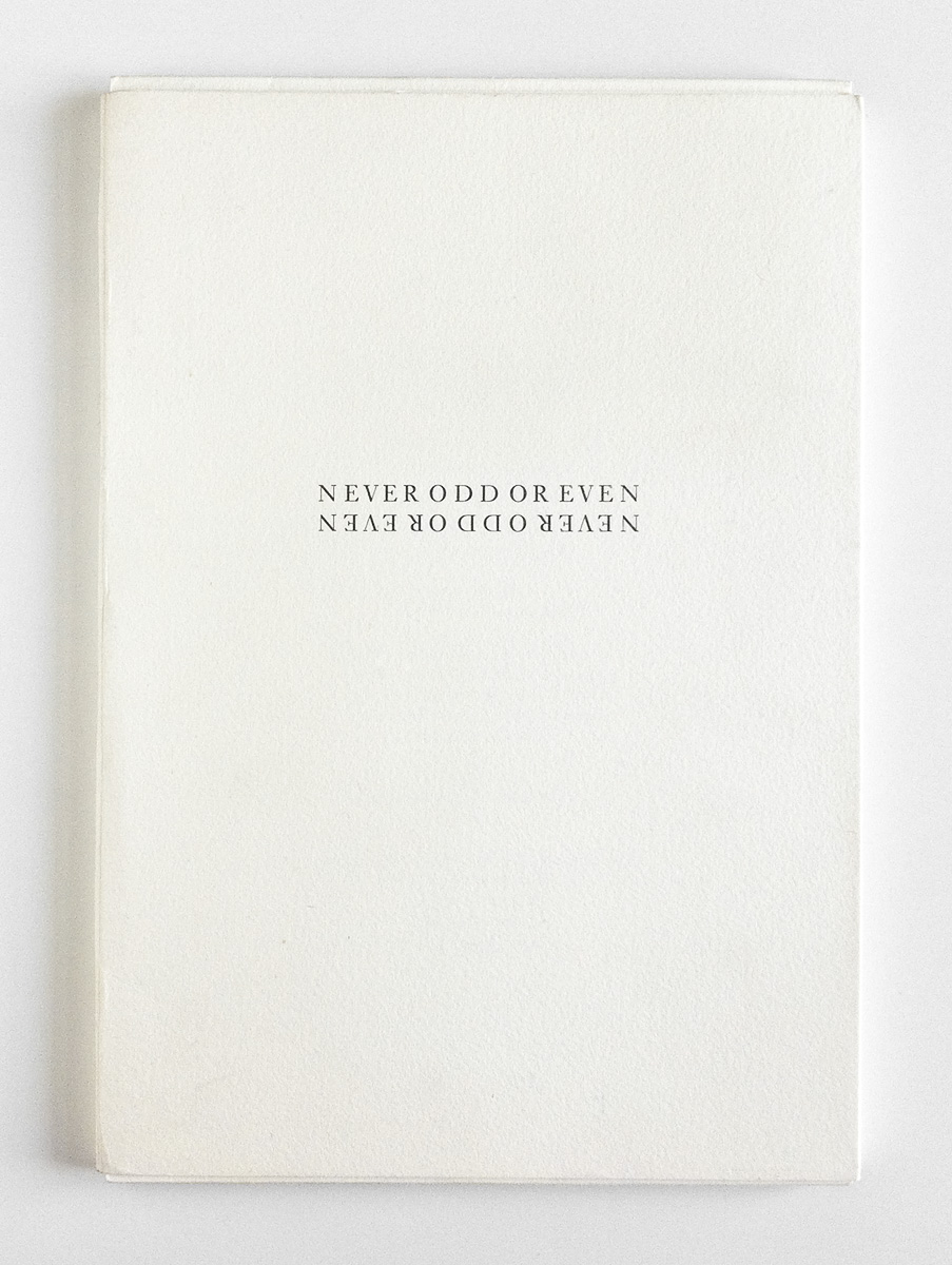
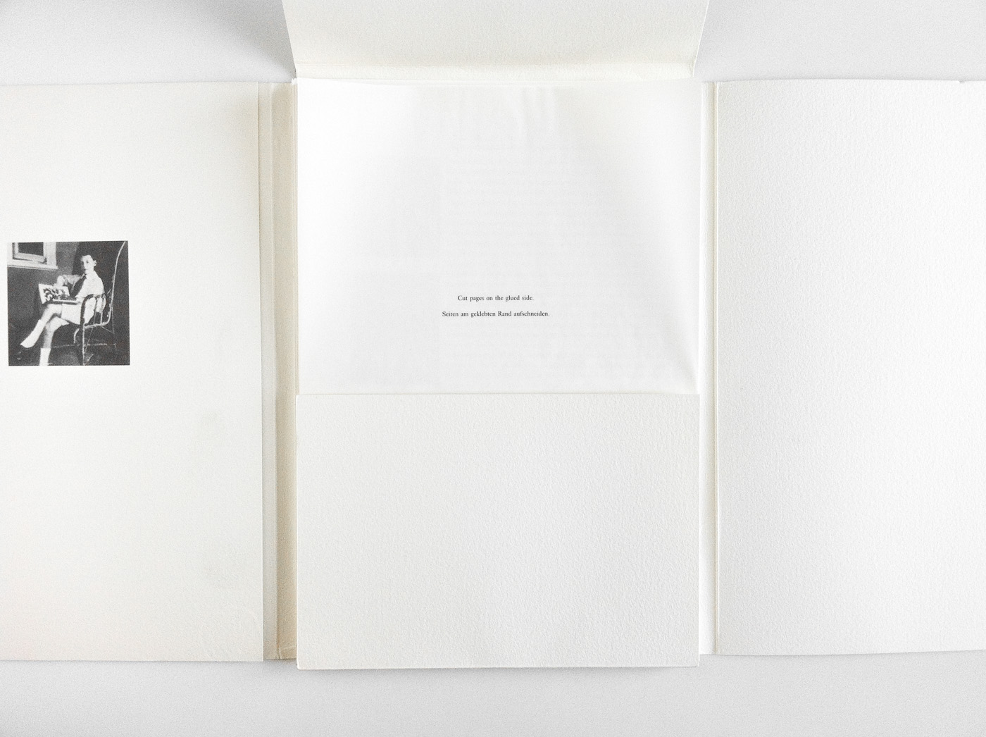
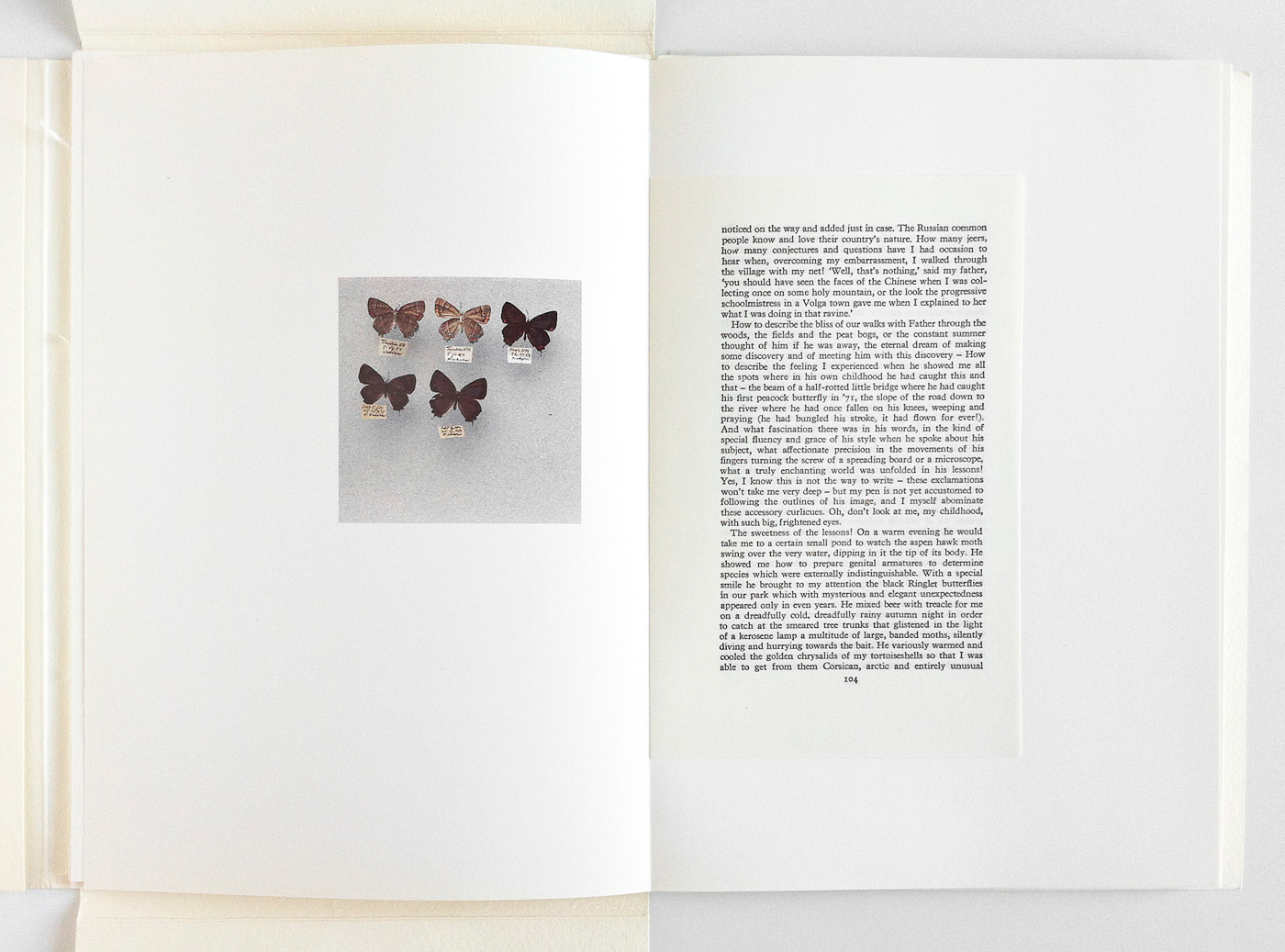
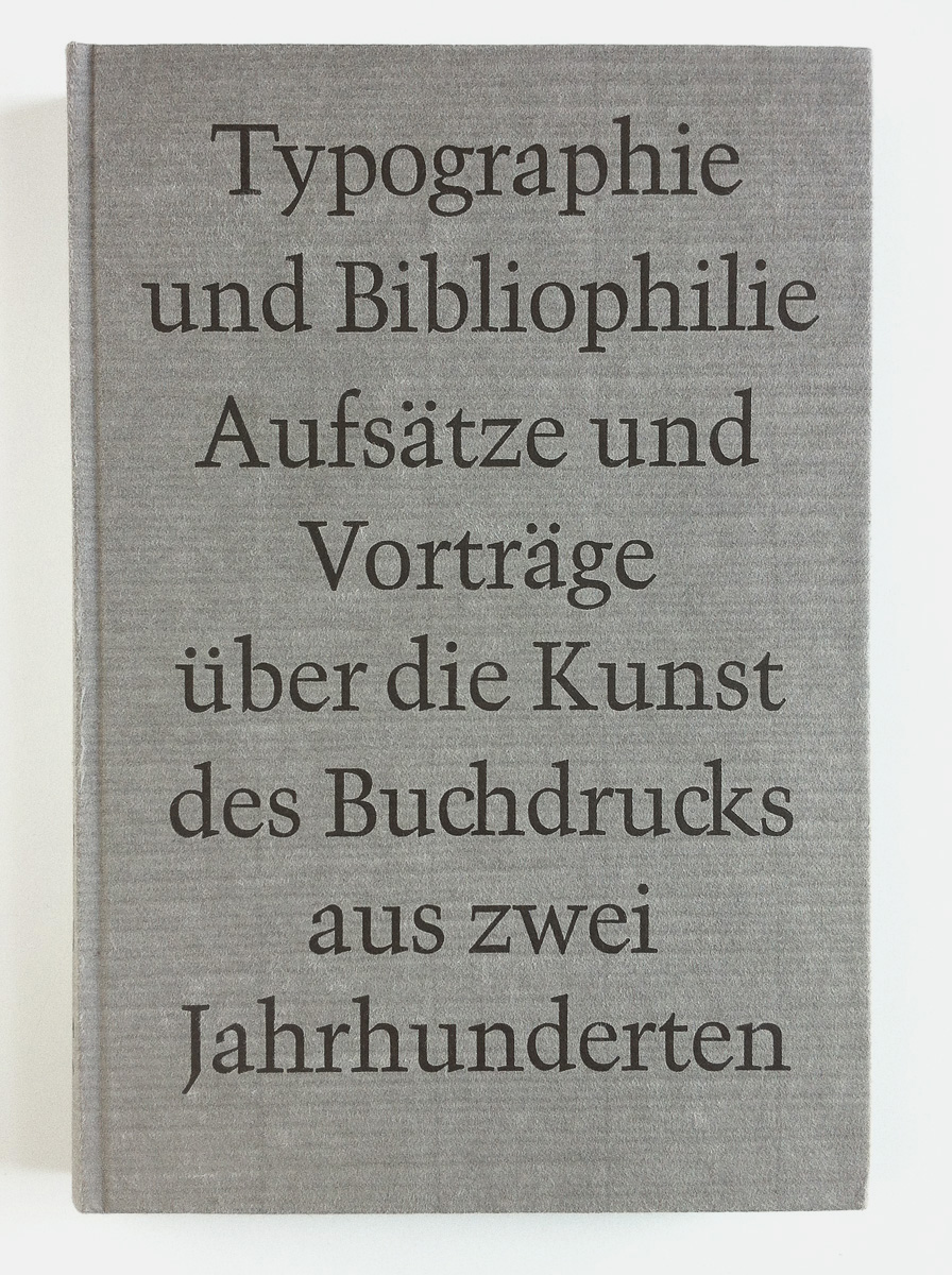
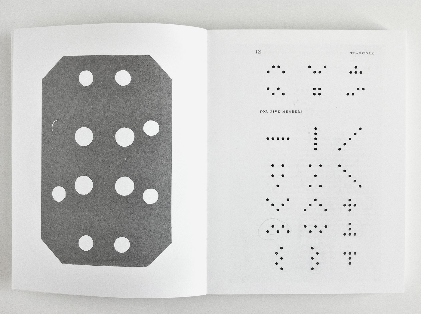
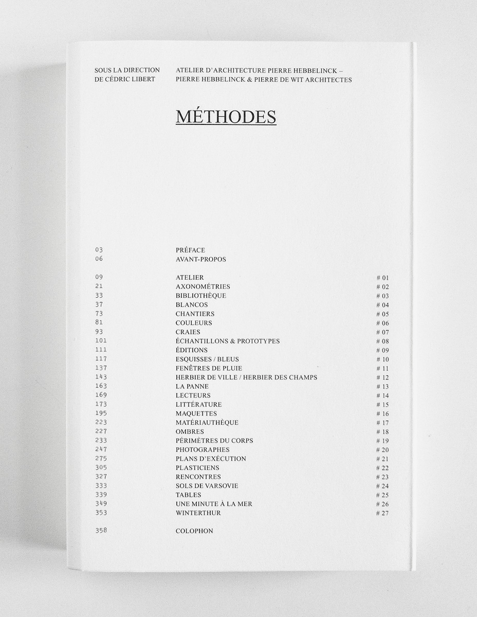
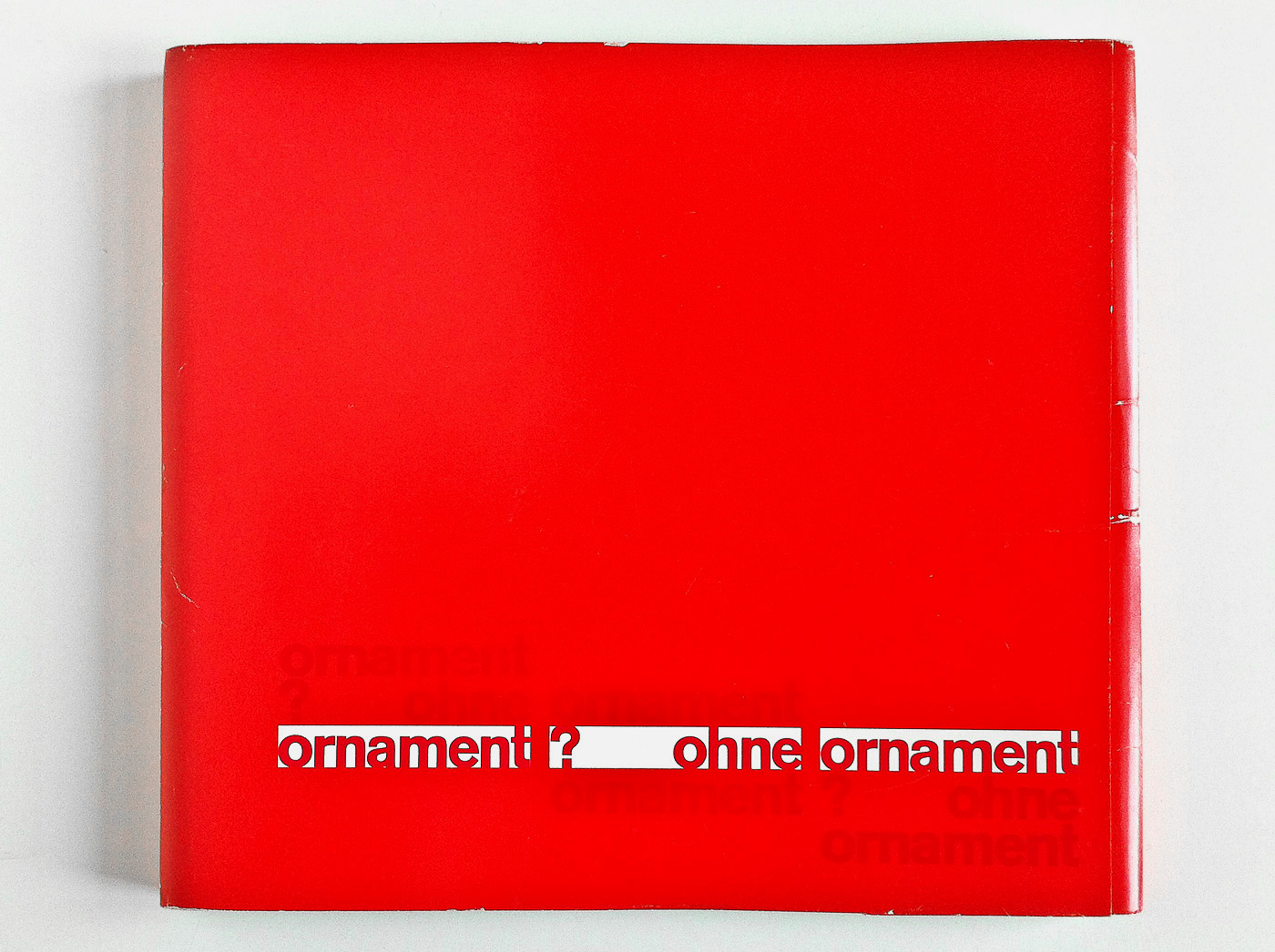
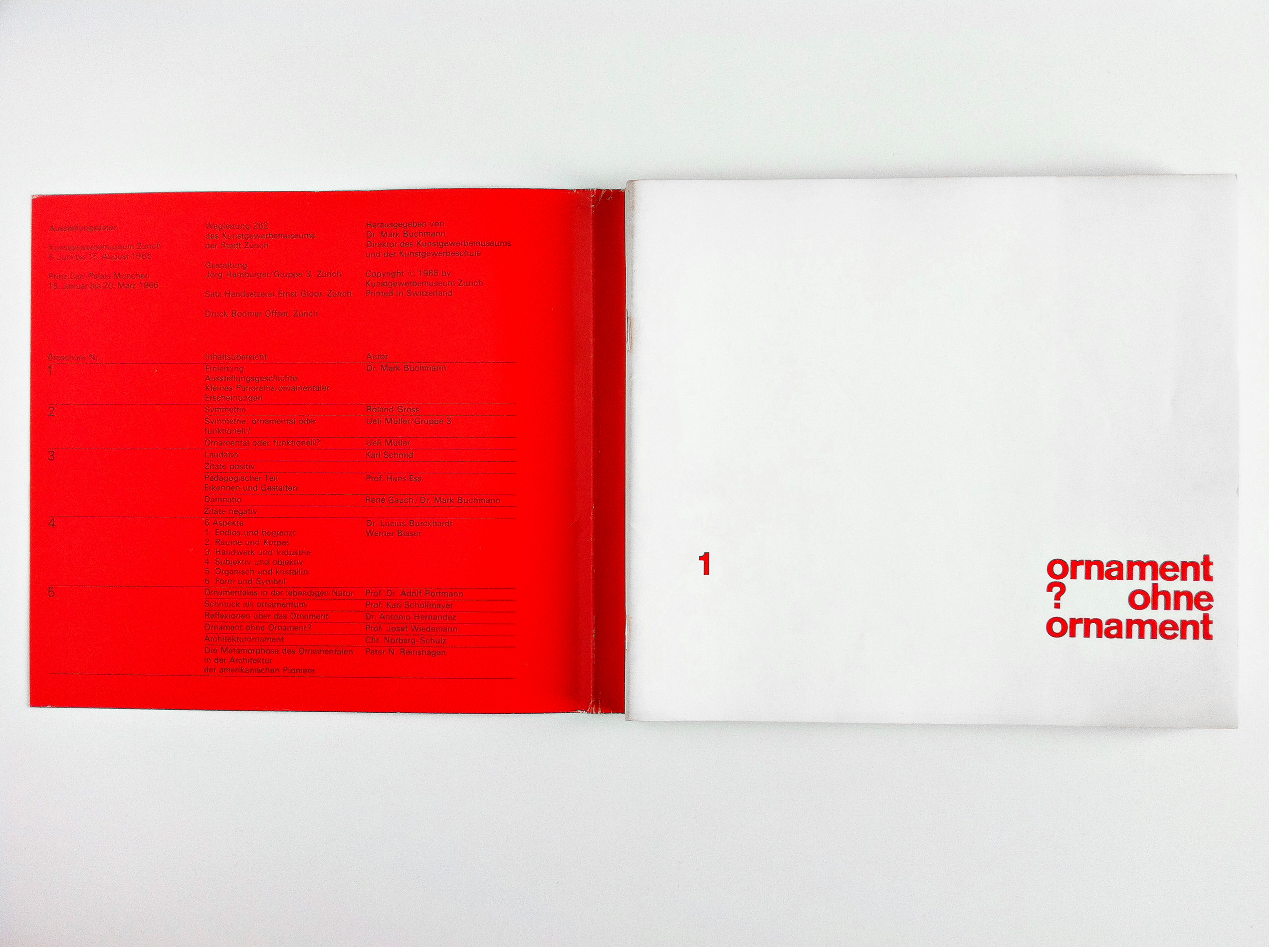
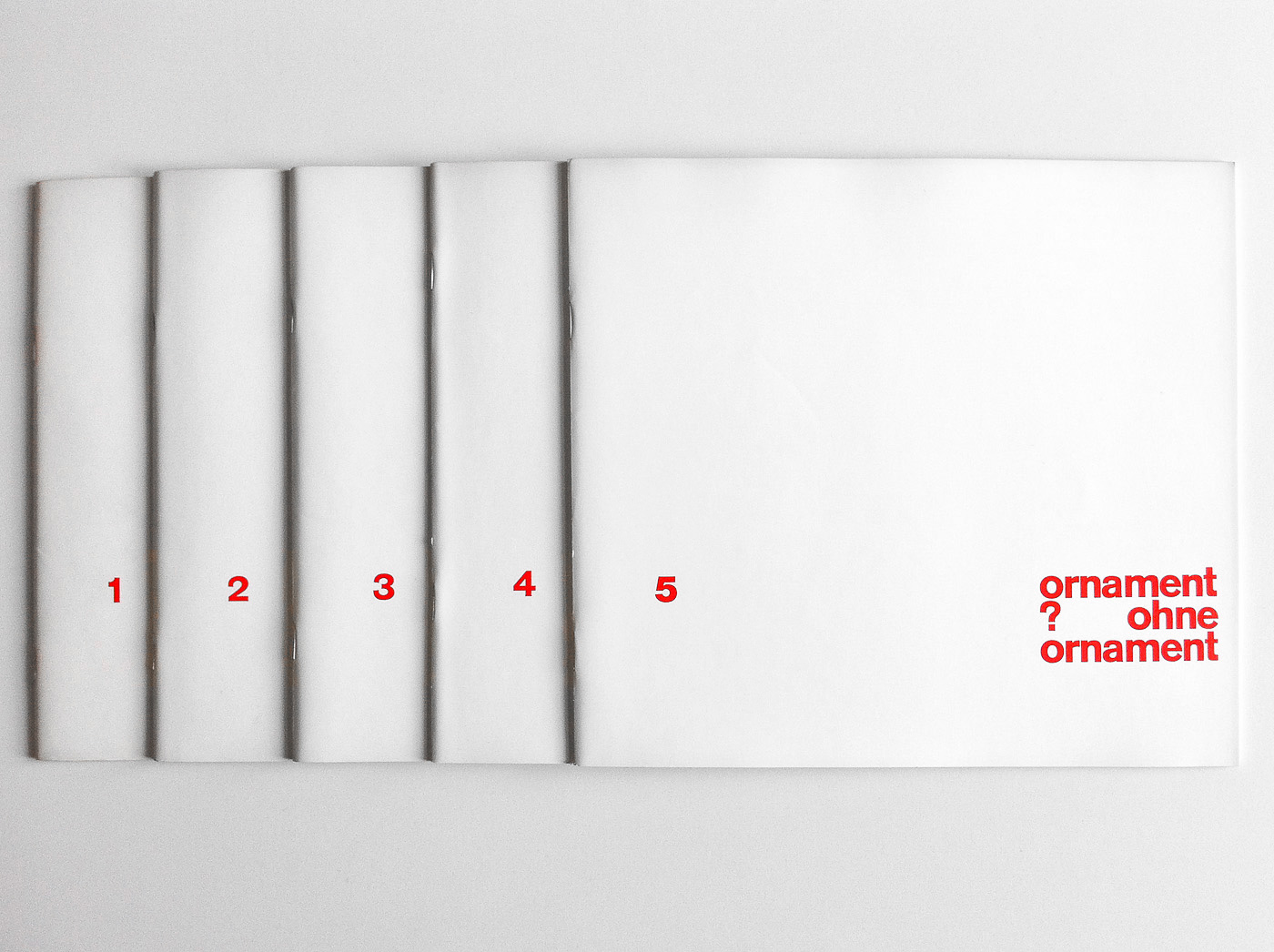
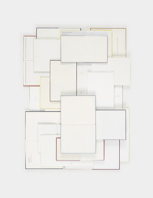
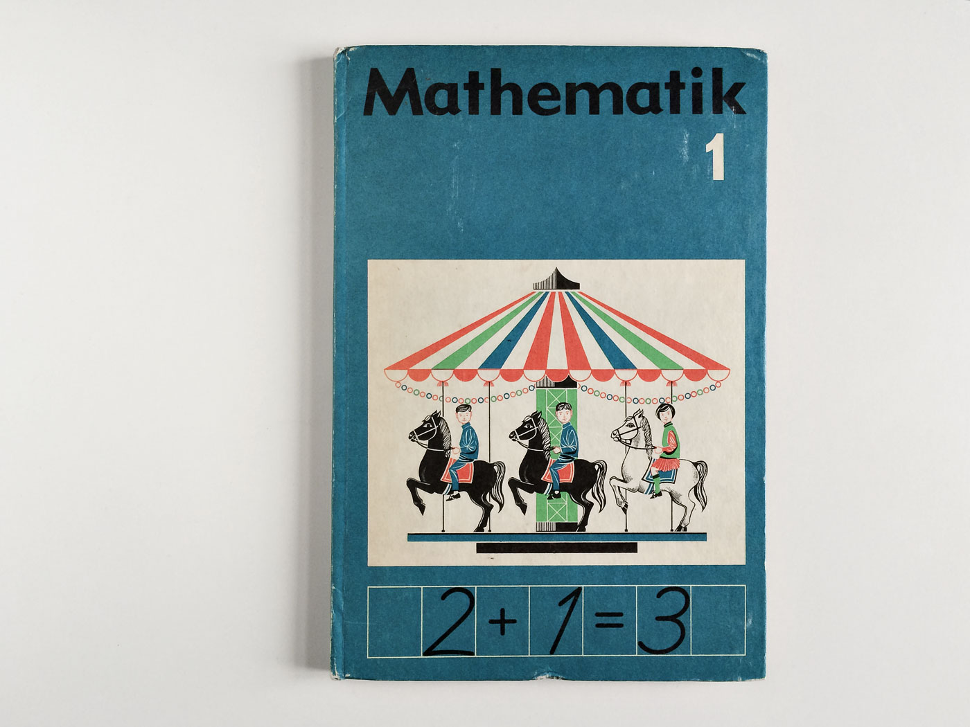
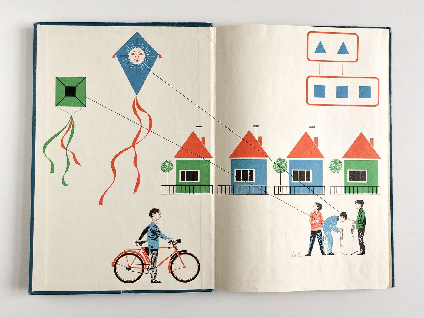
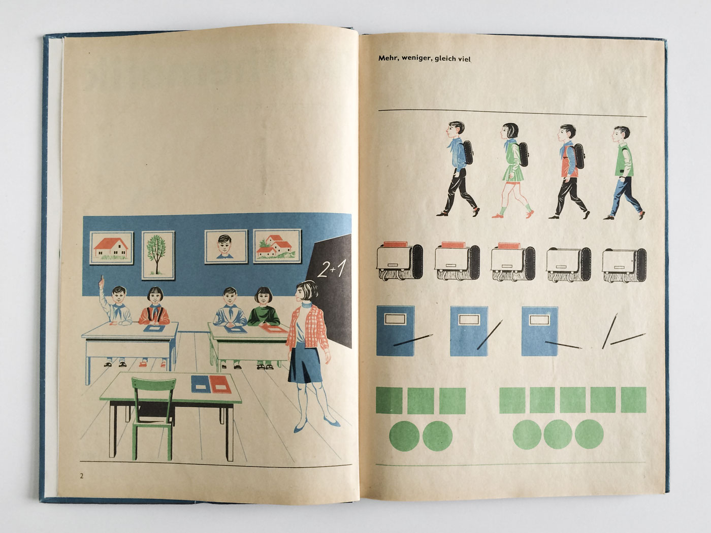
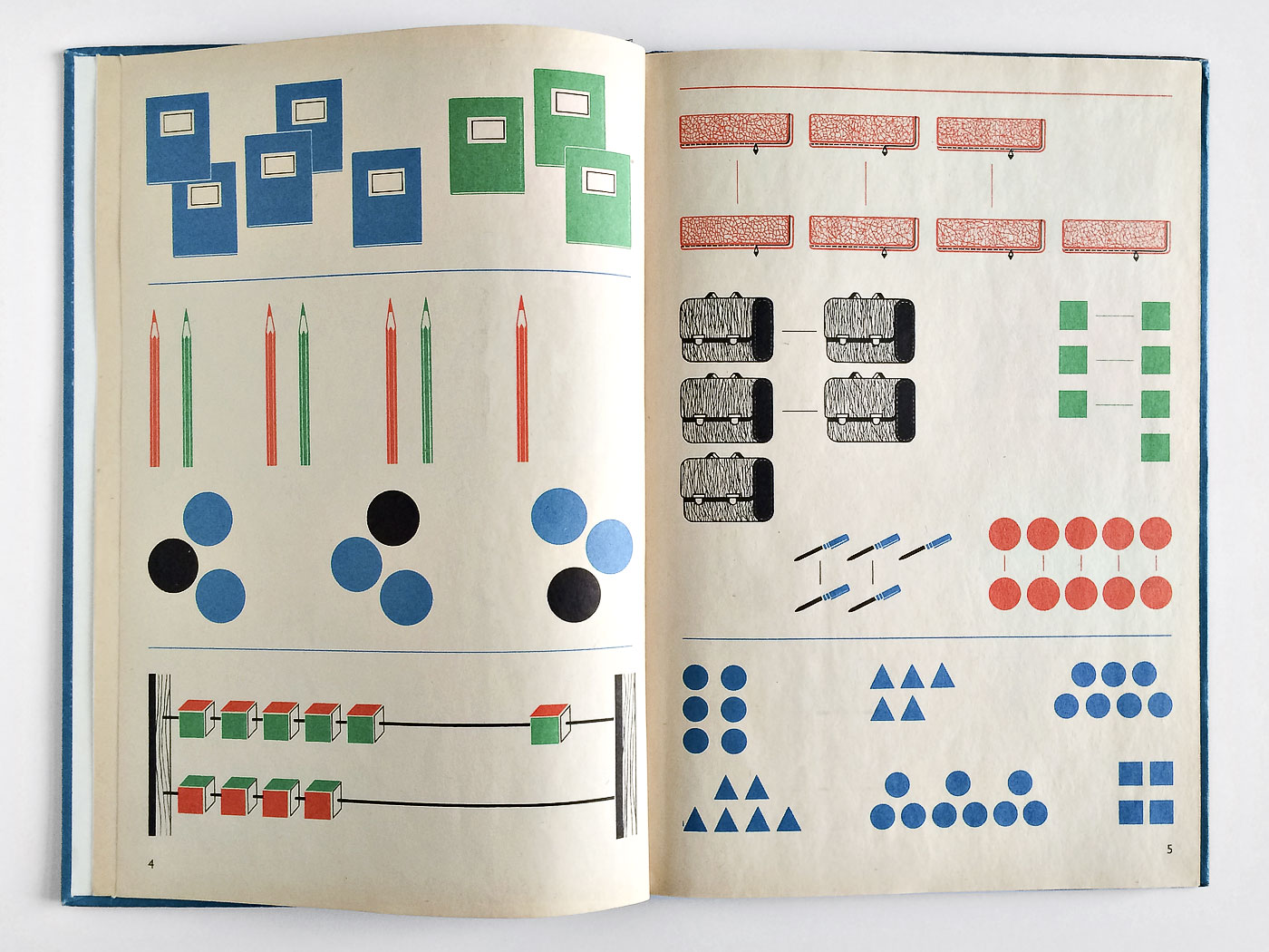
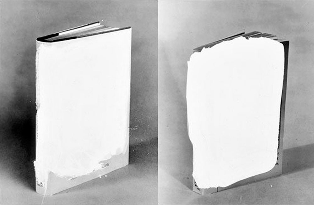
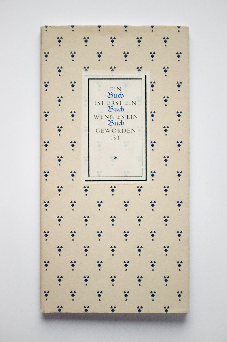
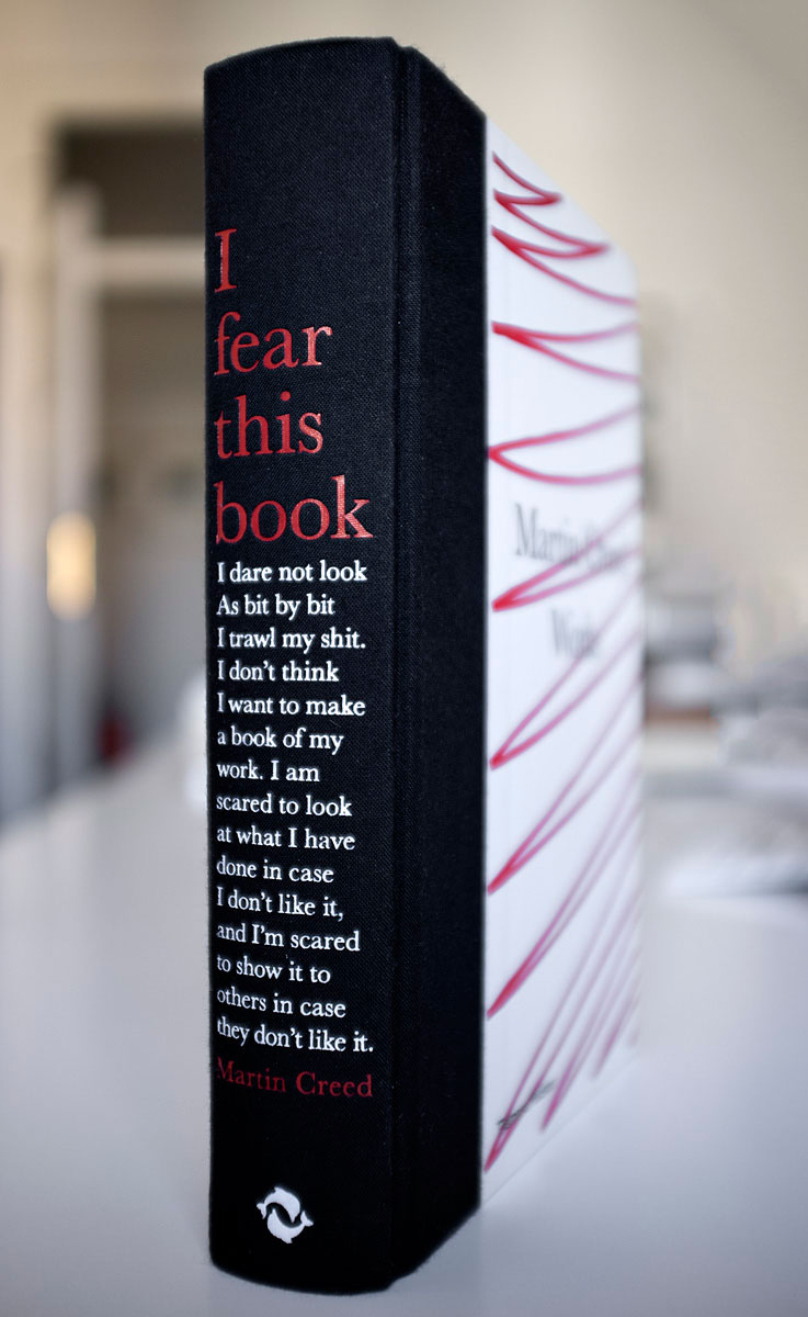
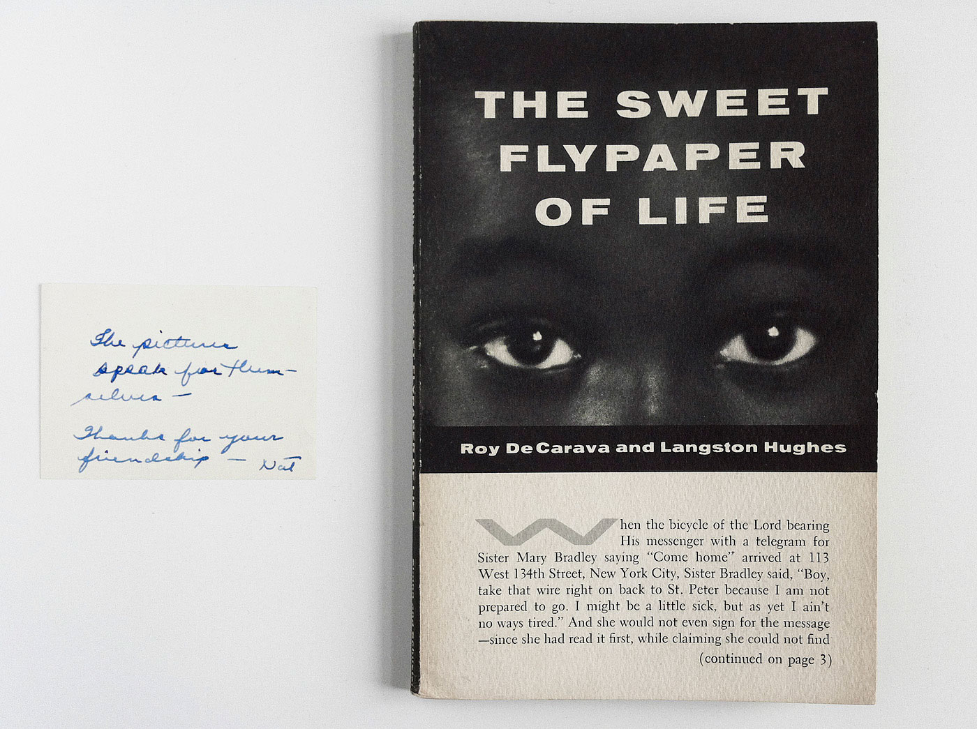
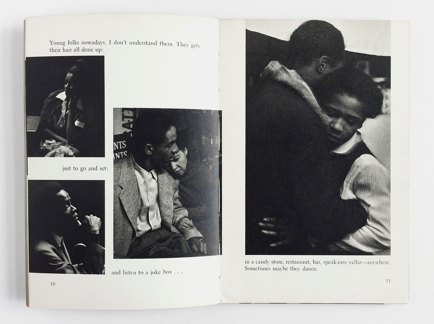
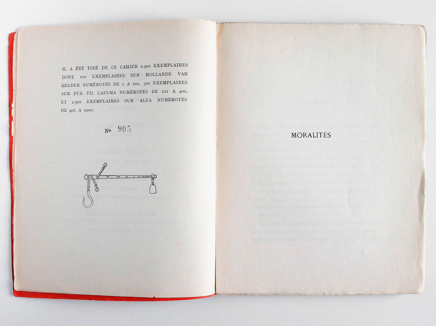
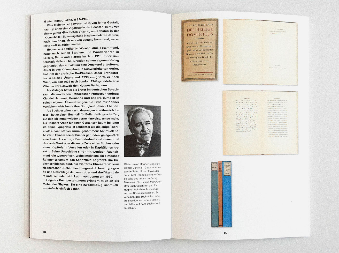
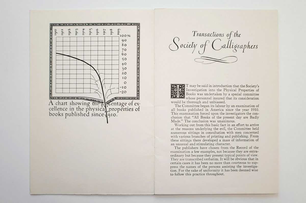
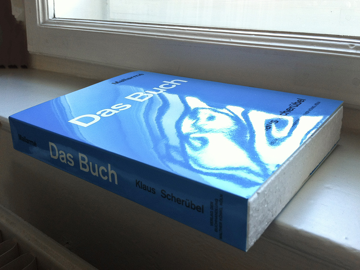
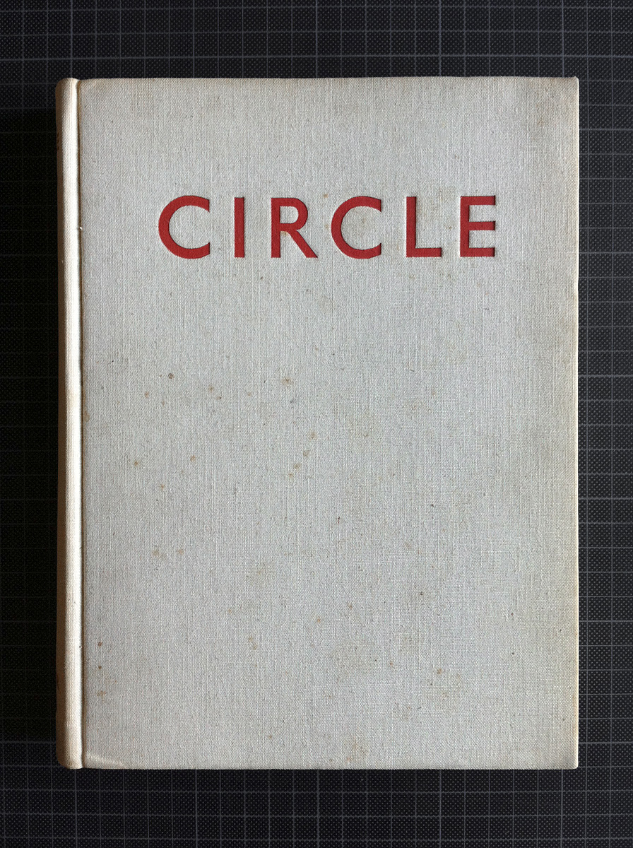
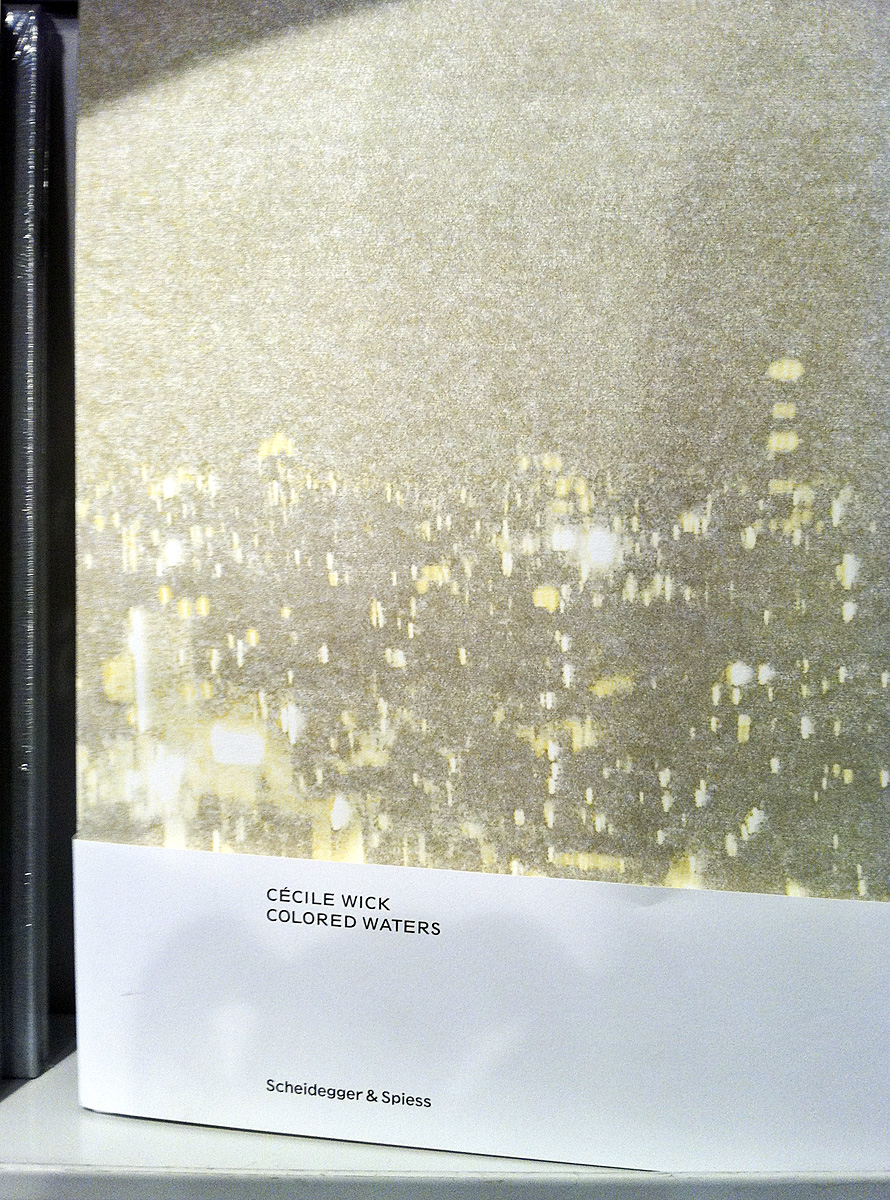
A Good Book

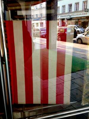
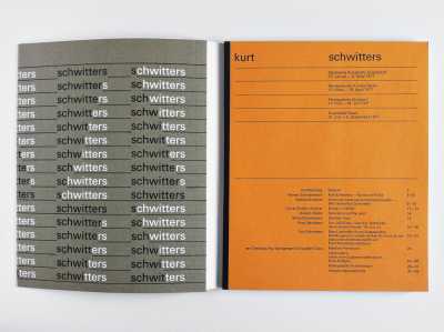
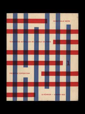
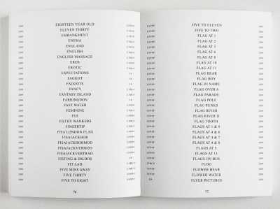
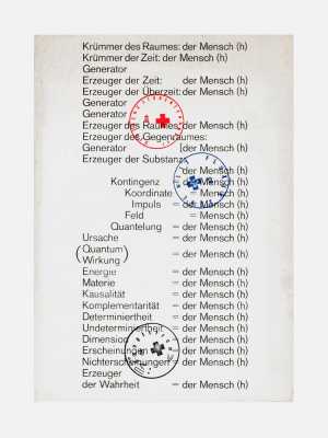
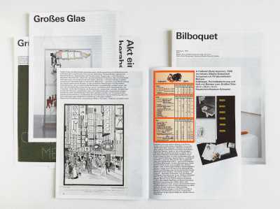
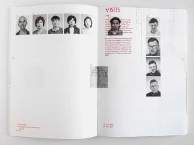
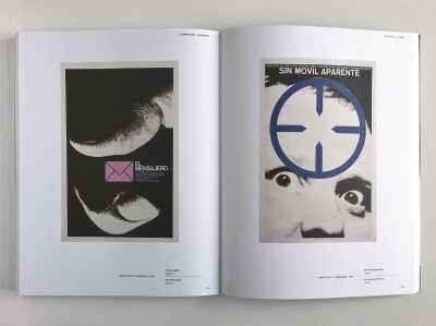
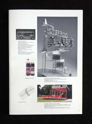
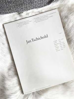
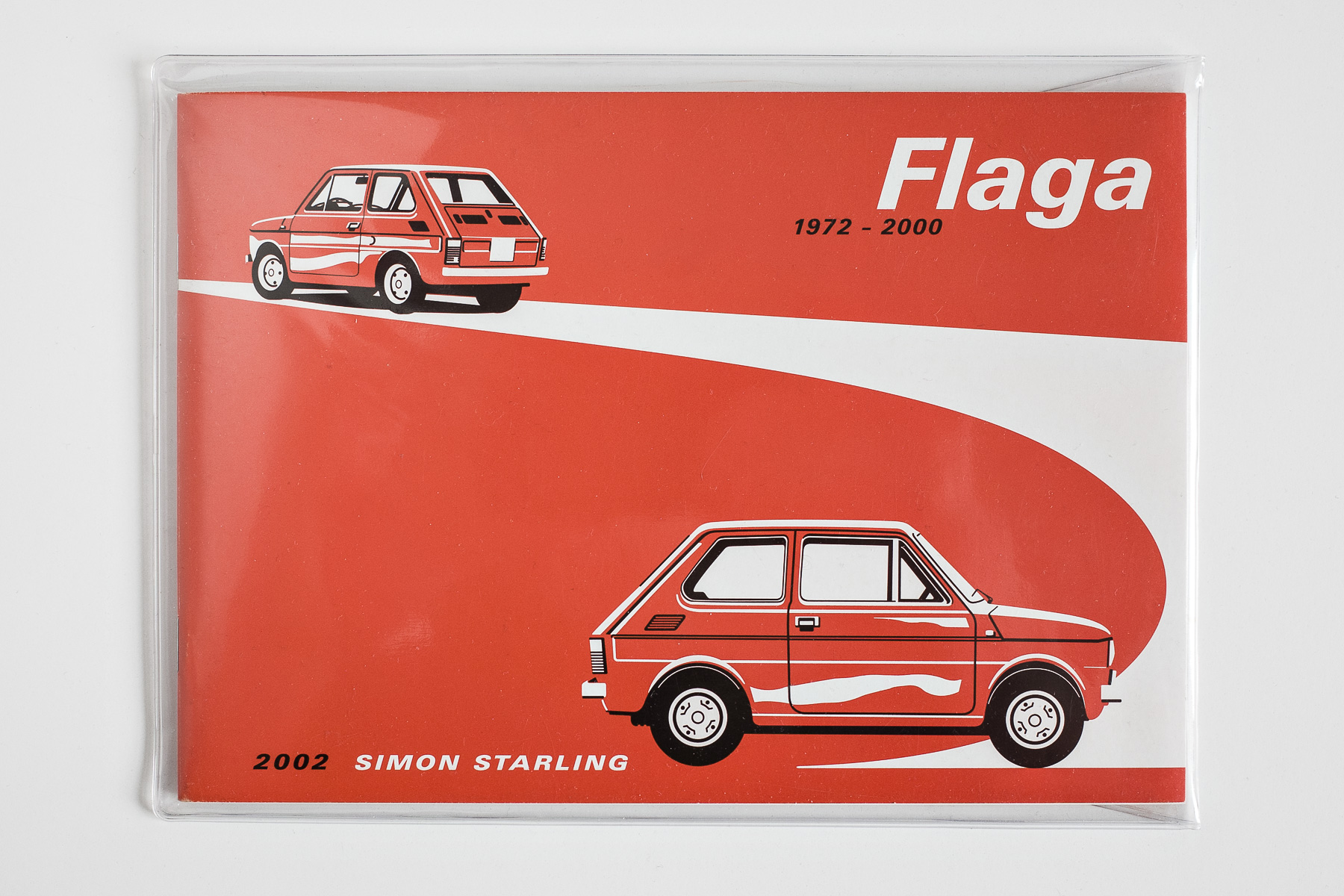
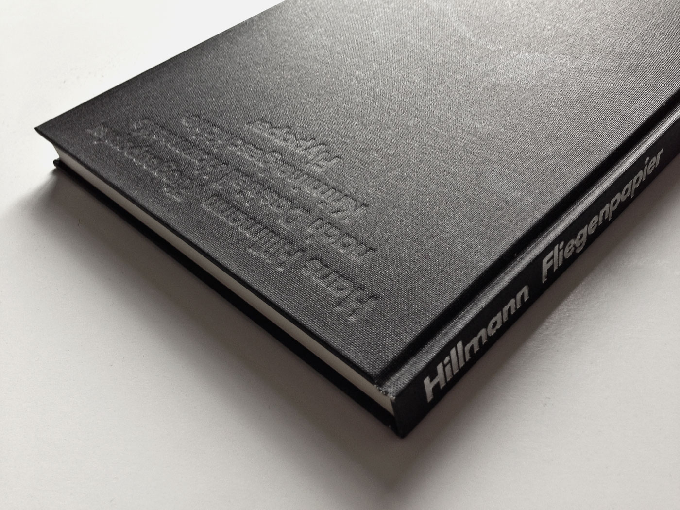
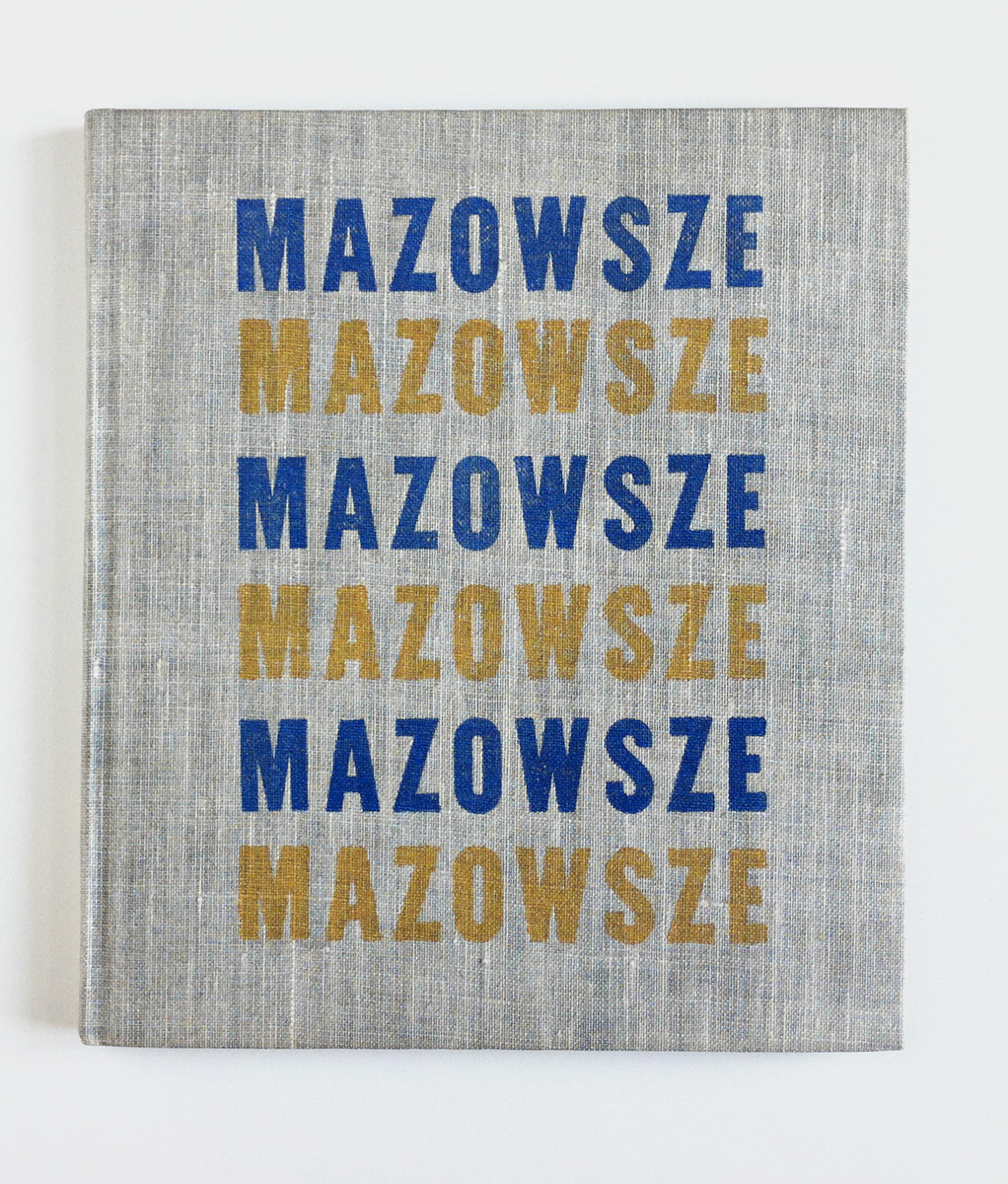
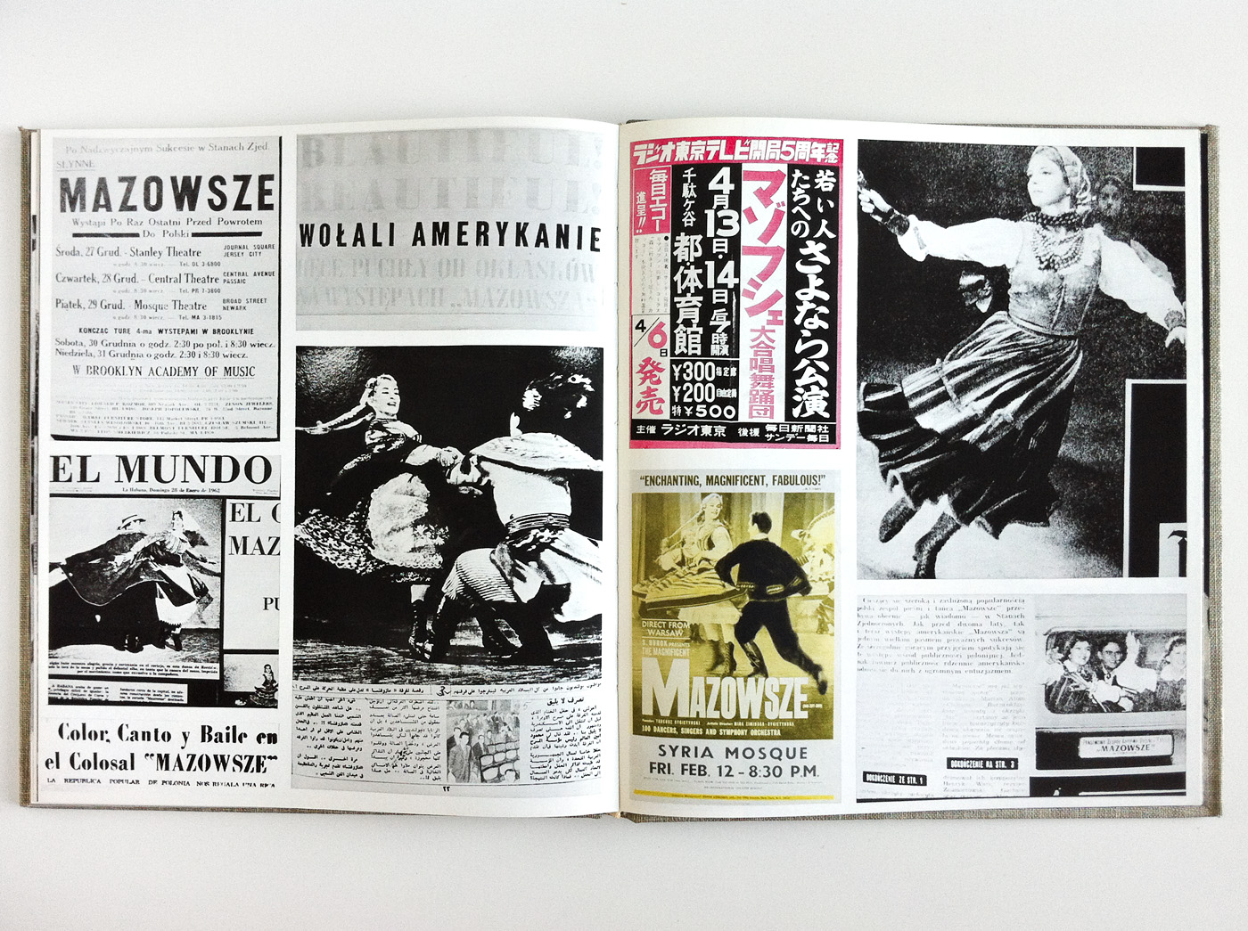
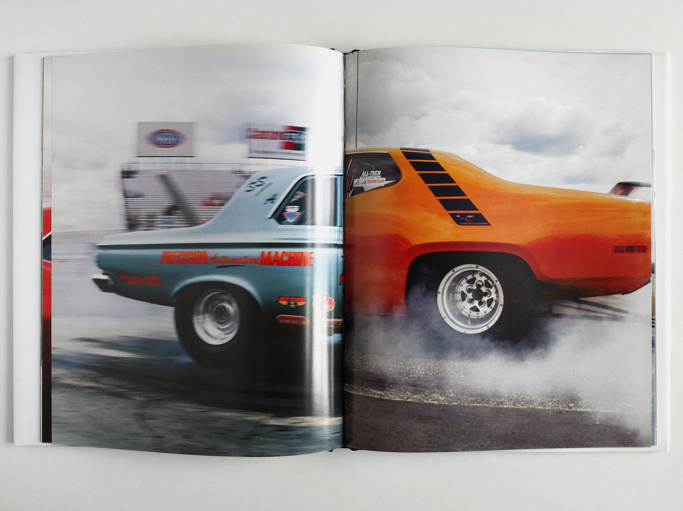
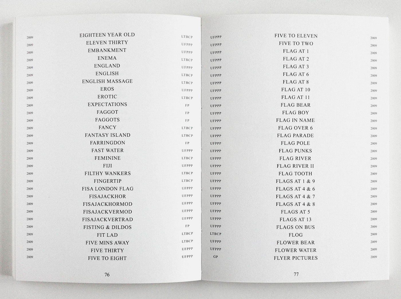
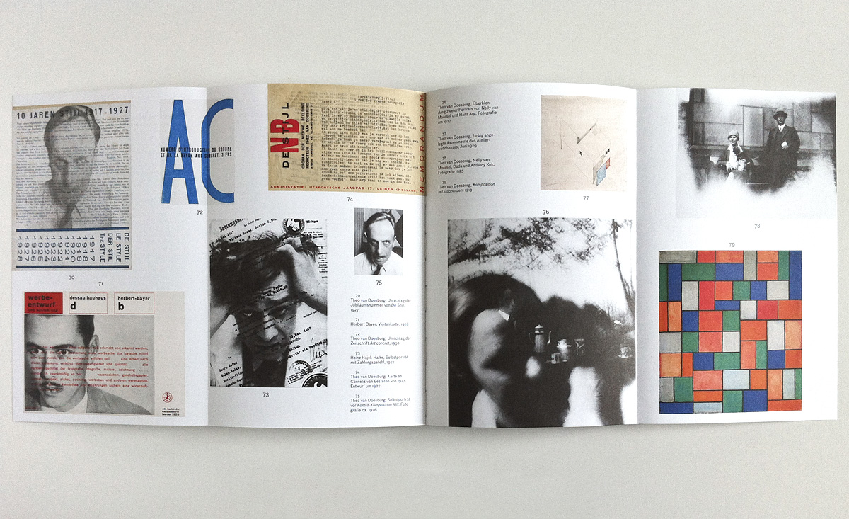
Flaga 1972-2000
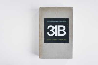
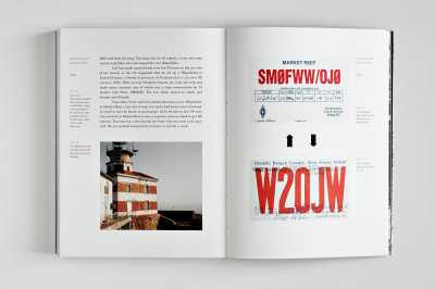
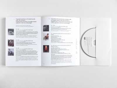
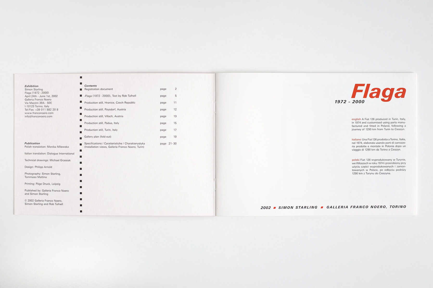
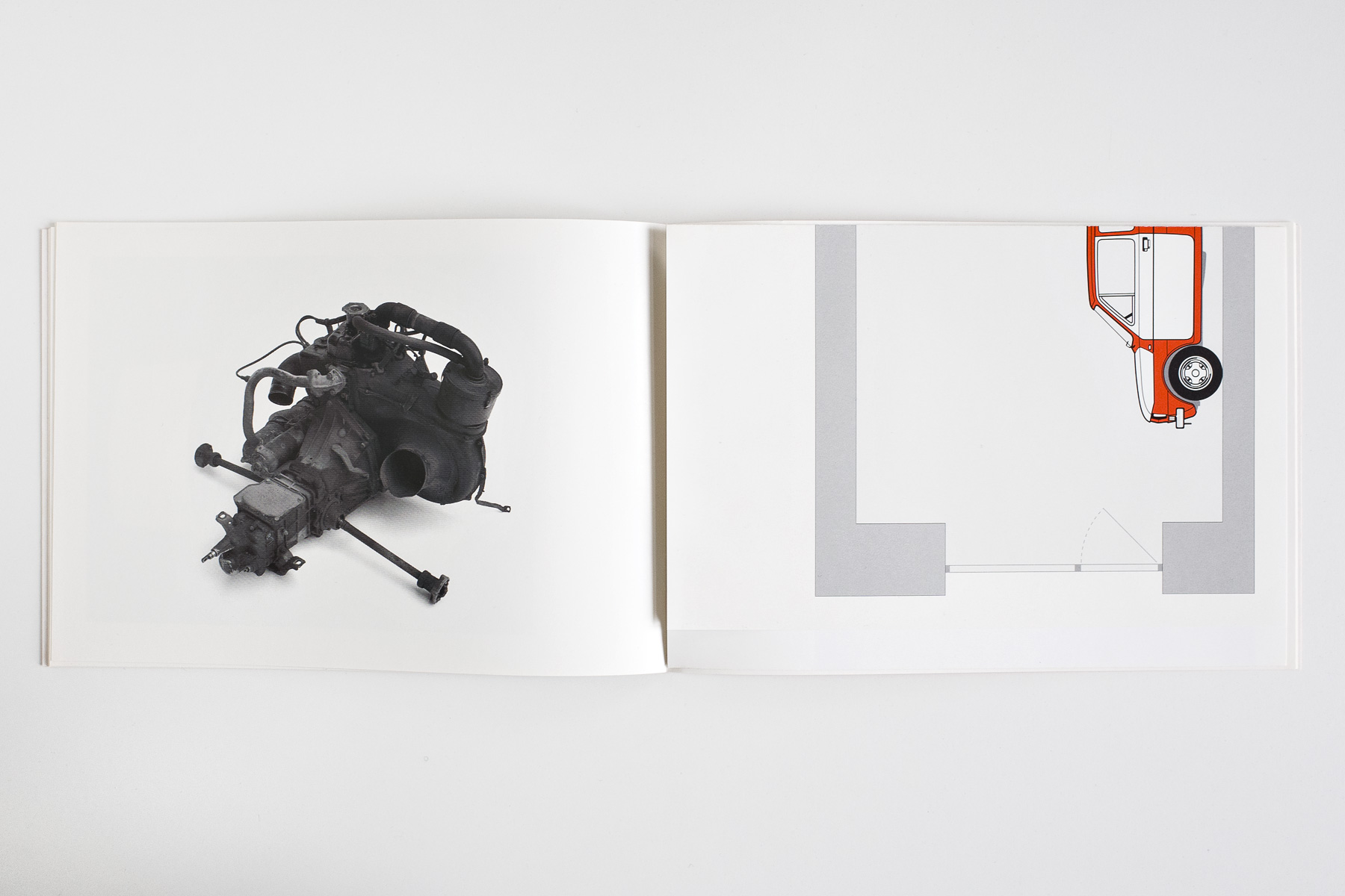
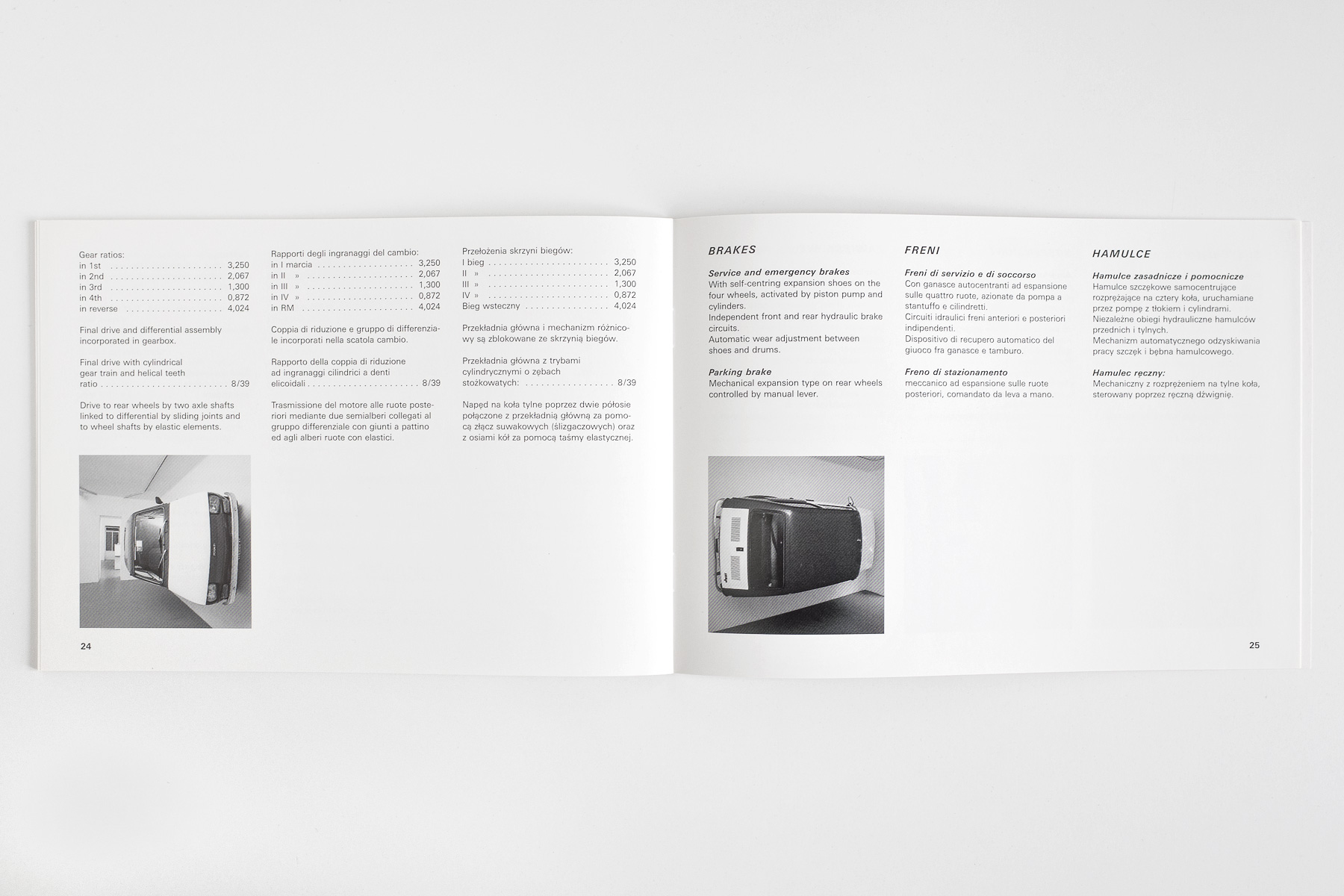
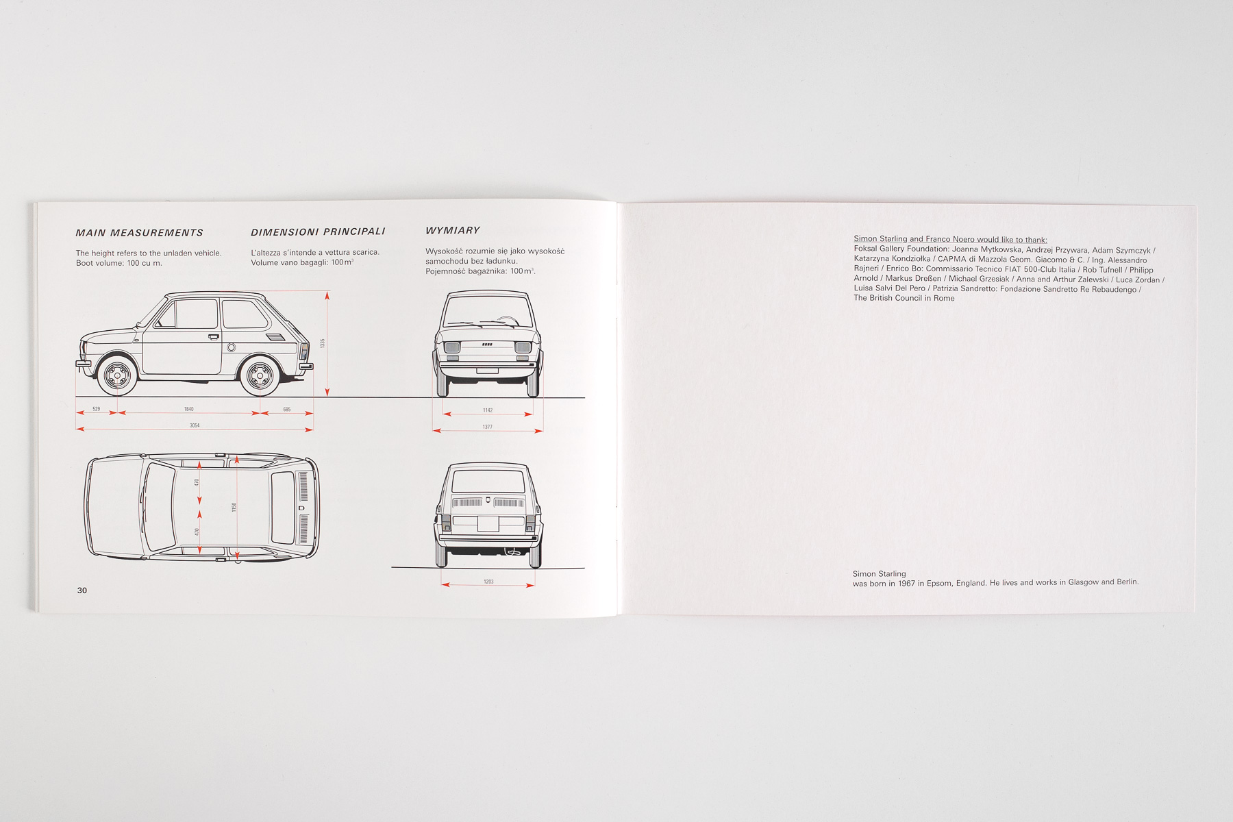
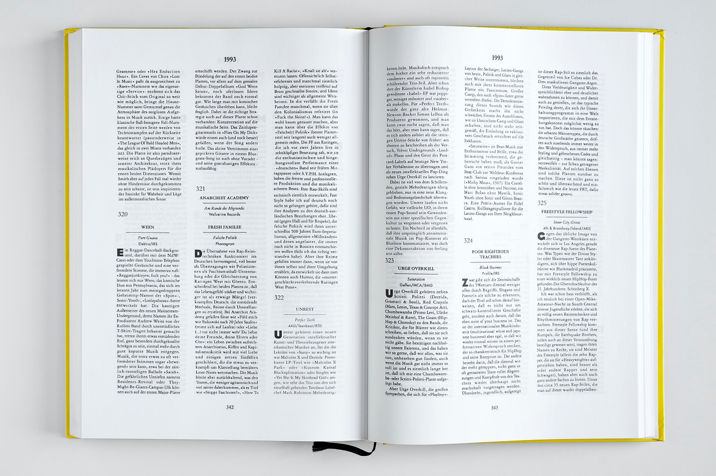
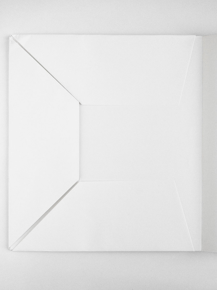
384 6In 2002 Simon Starling drove from Turin, Italy to Cieszyn, Poland in a red Fiat 126 manufactured in Turin in 1974. In Poland Starling substituted the boot, bonnet and doors for white parts produced at the Fiat Auto Poland factory in the neighbouring town of Bielsko-Biała. This lovely little red booklet is the accompanying catalogue.
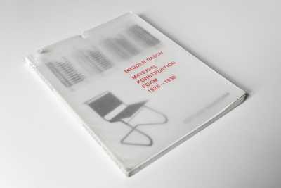
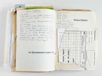
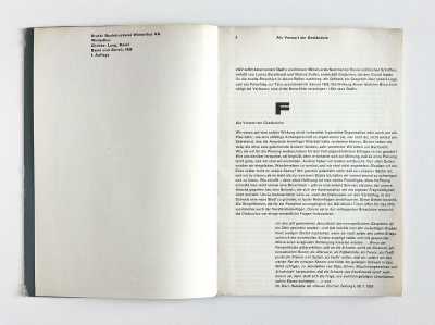
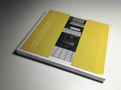
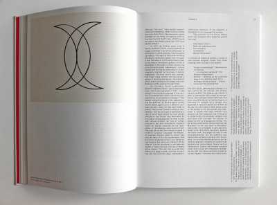
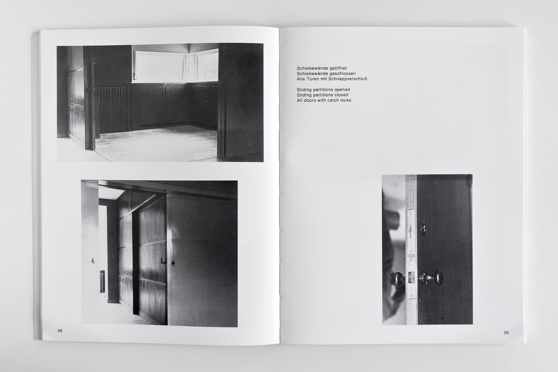
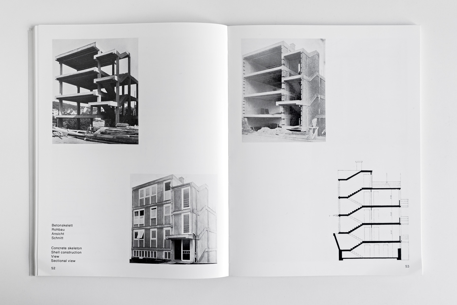
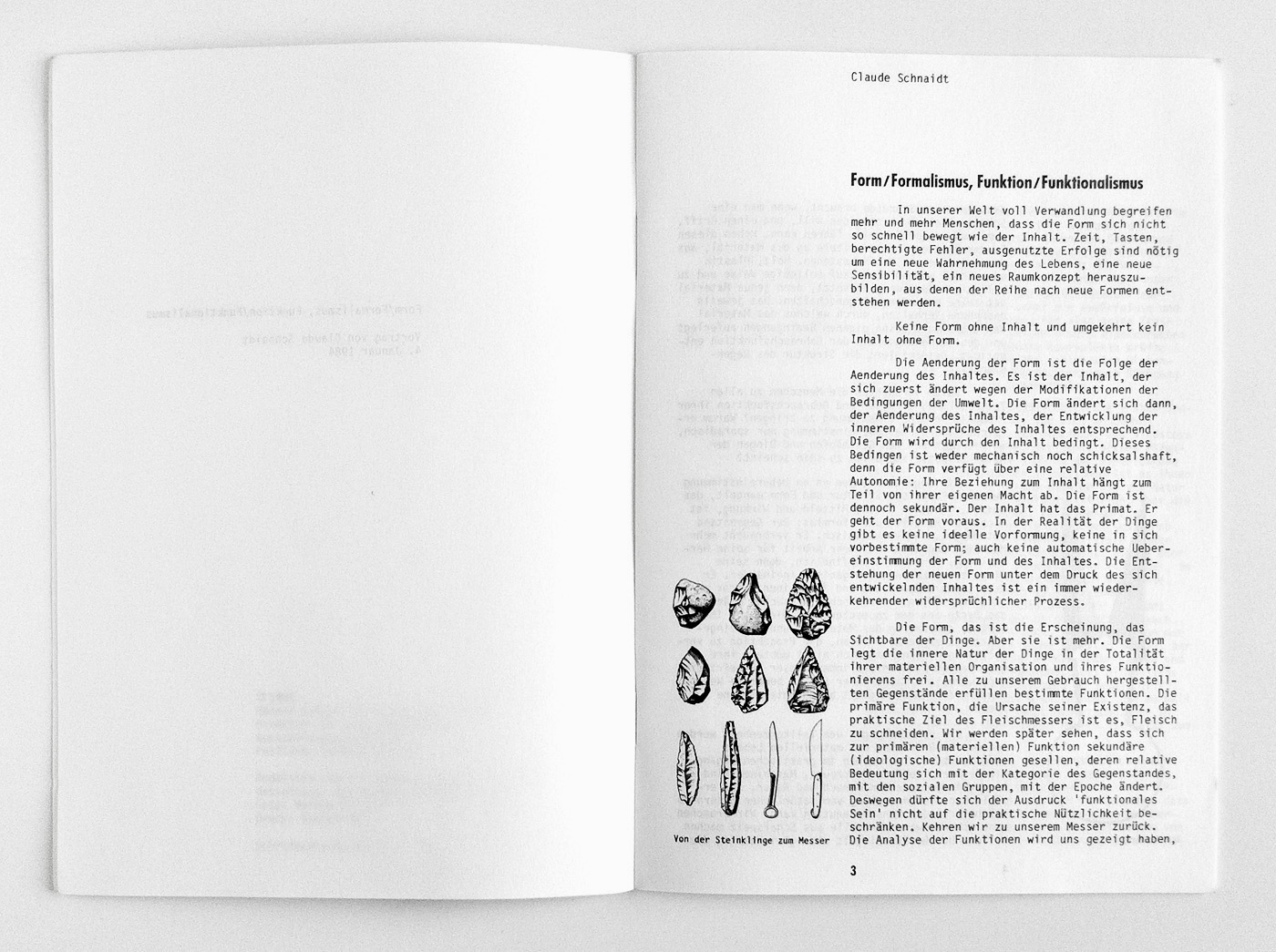
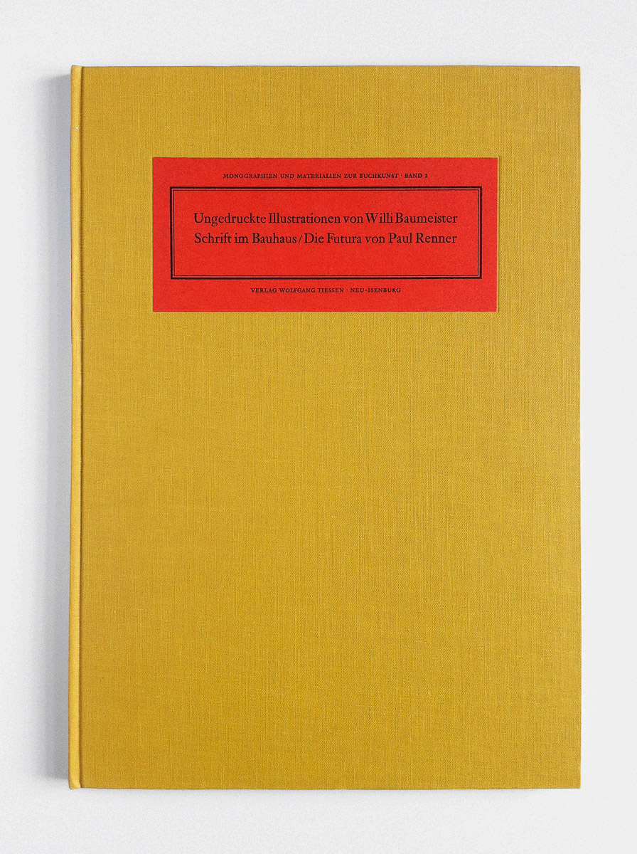
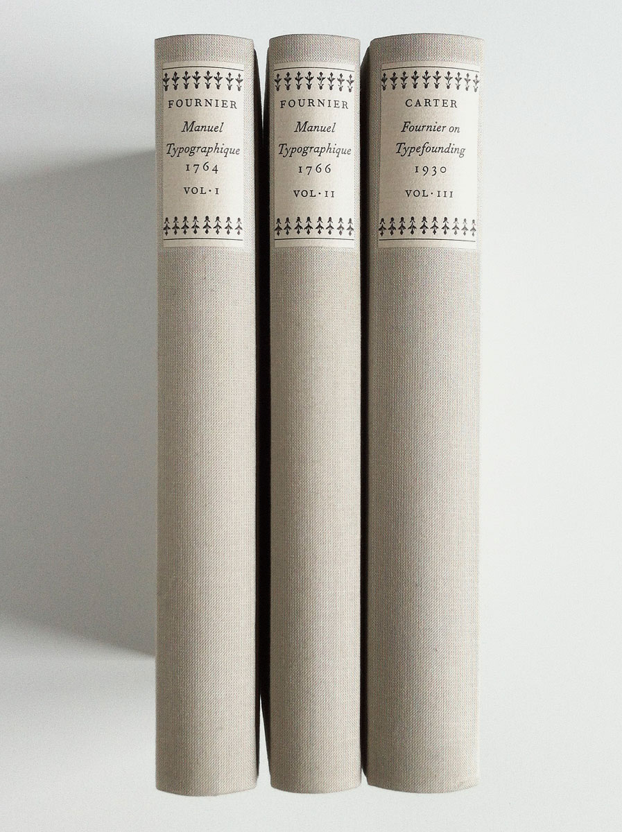
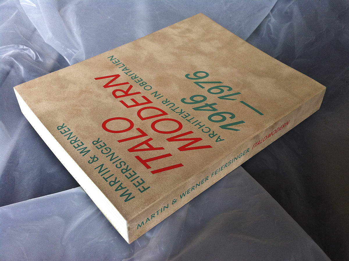
Brüder Rasch – Material Konstruktion Form 1926-1930
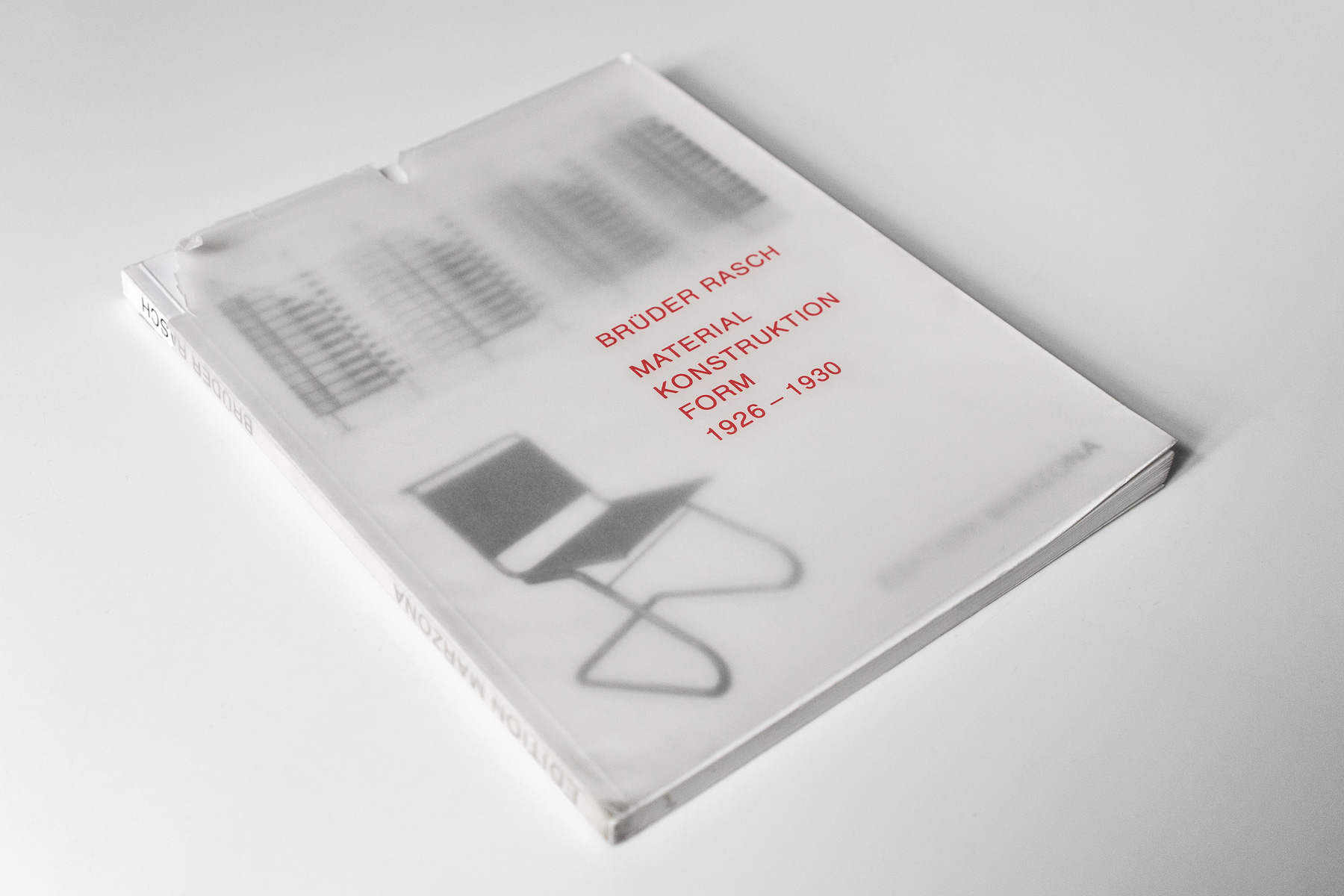
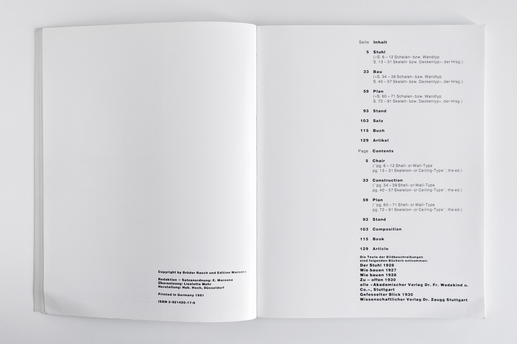
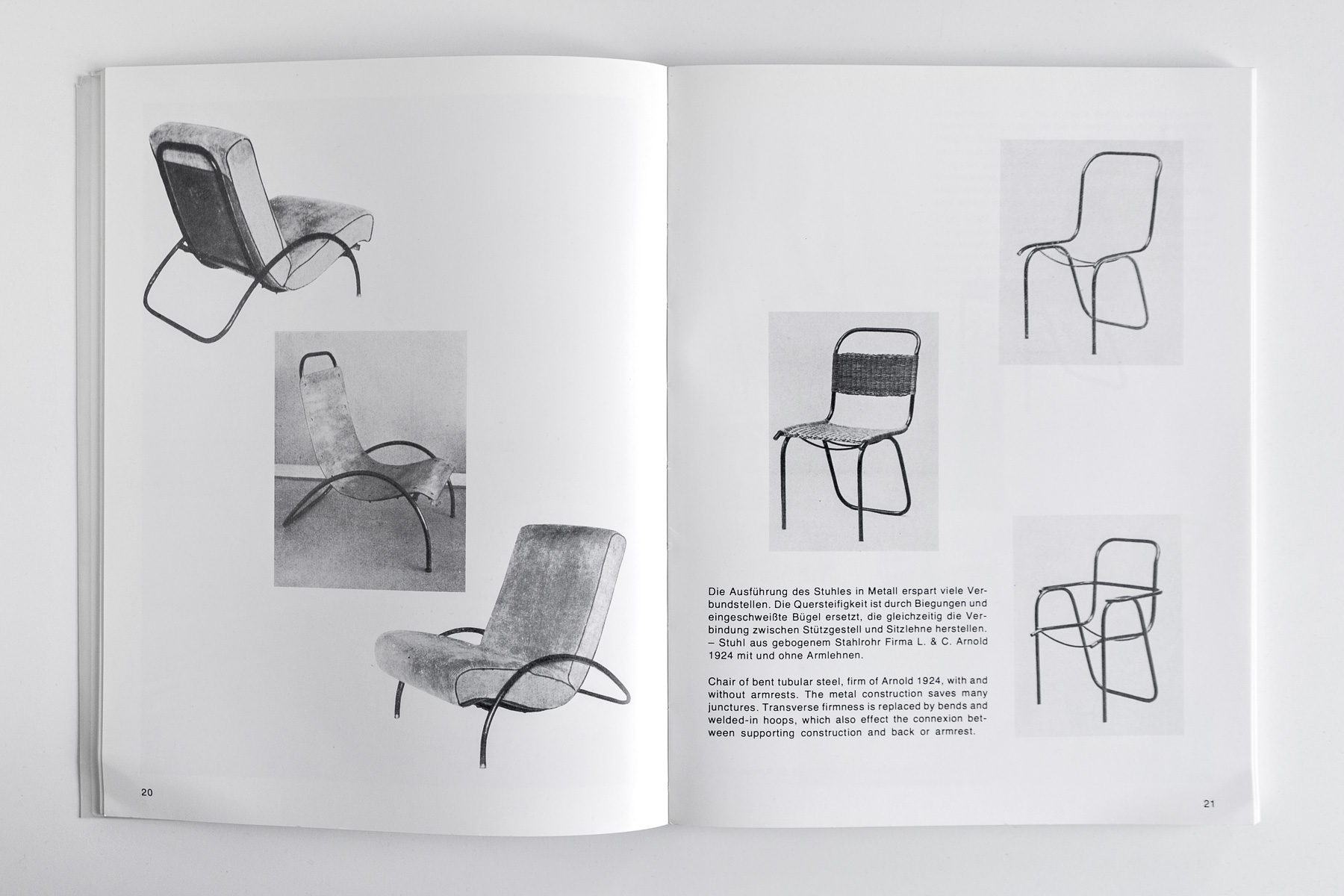
383 5Art collector Egidio Marzona founded an own publishing house in order to document his research in various fields – art, architecture, photography and design. This self-designed volume on the architects and designers Heinz and Bodo Rasch is far from perfect, but its refreshing sensuality and the free and spacious layout has a somewhat hidden beauty.

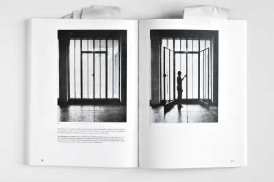
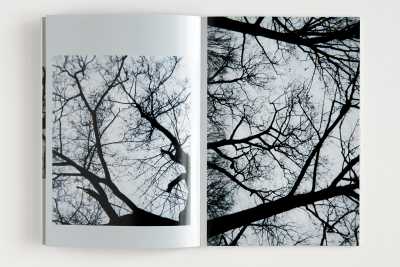
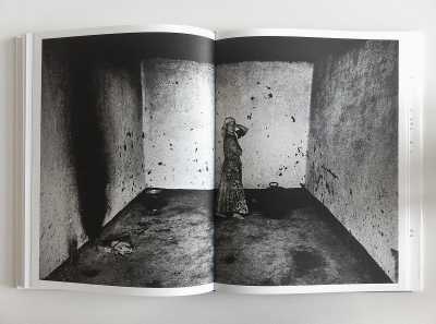
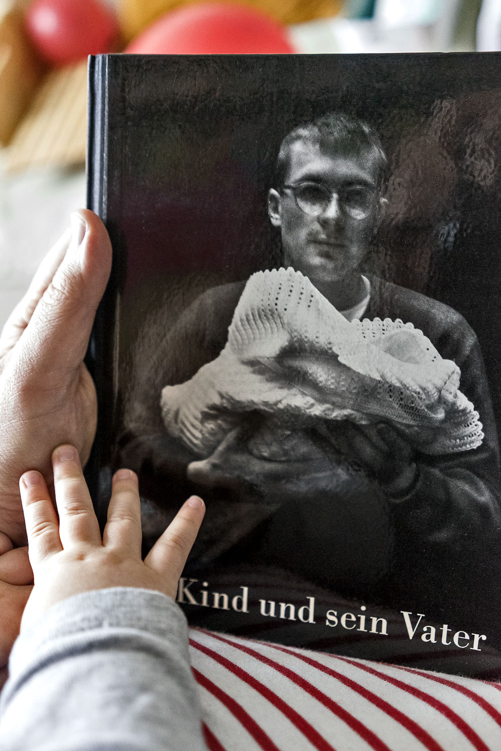
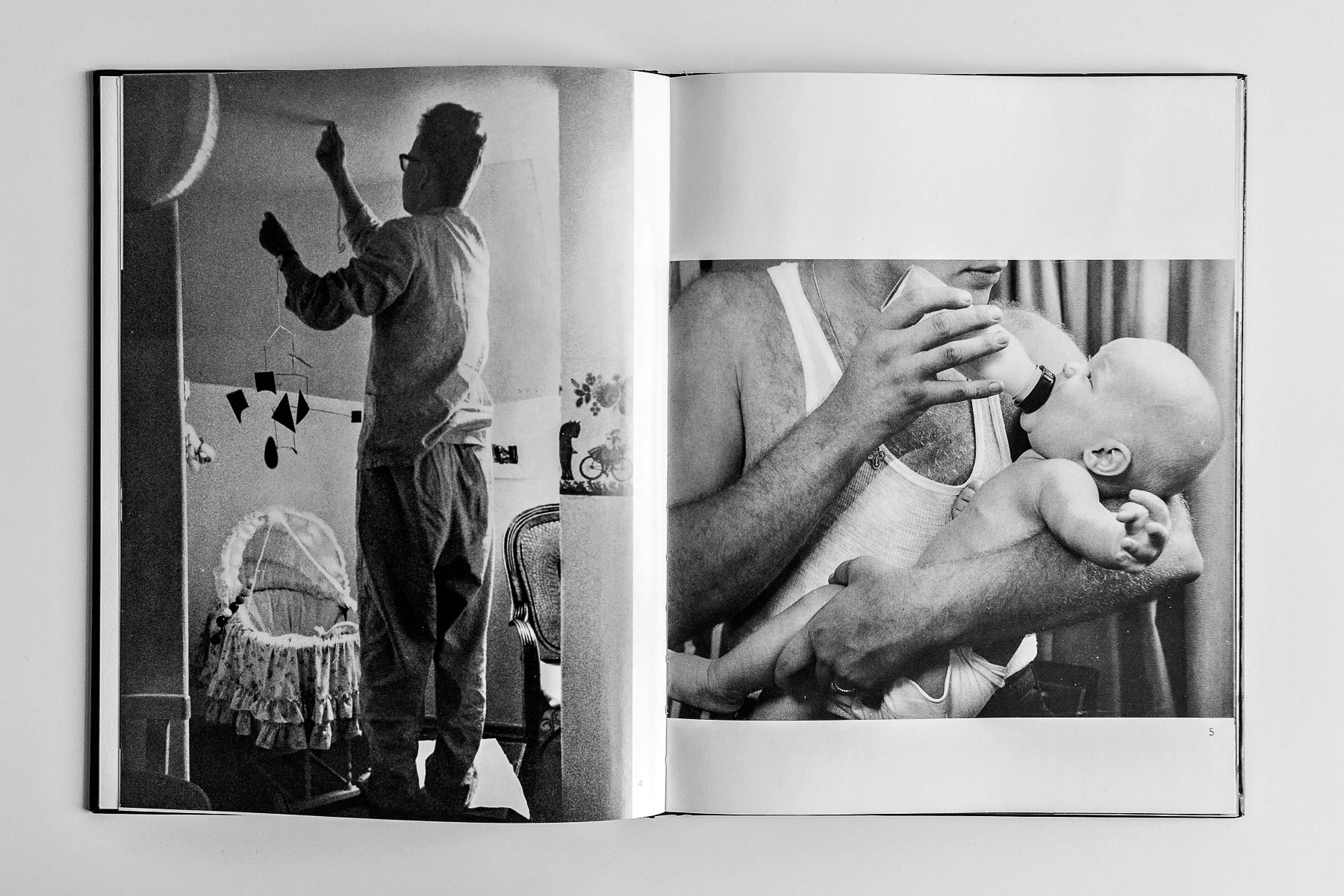
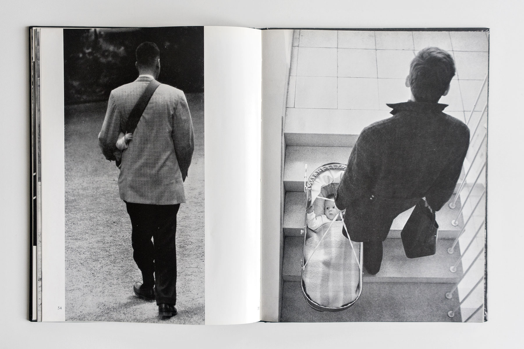
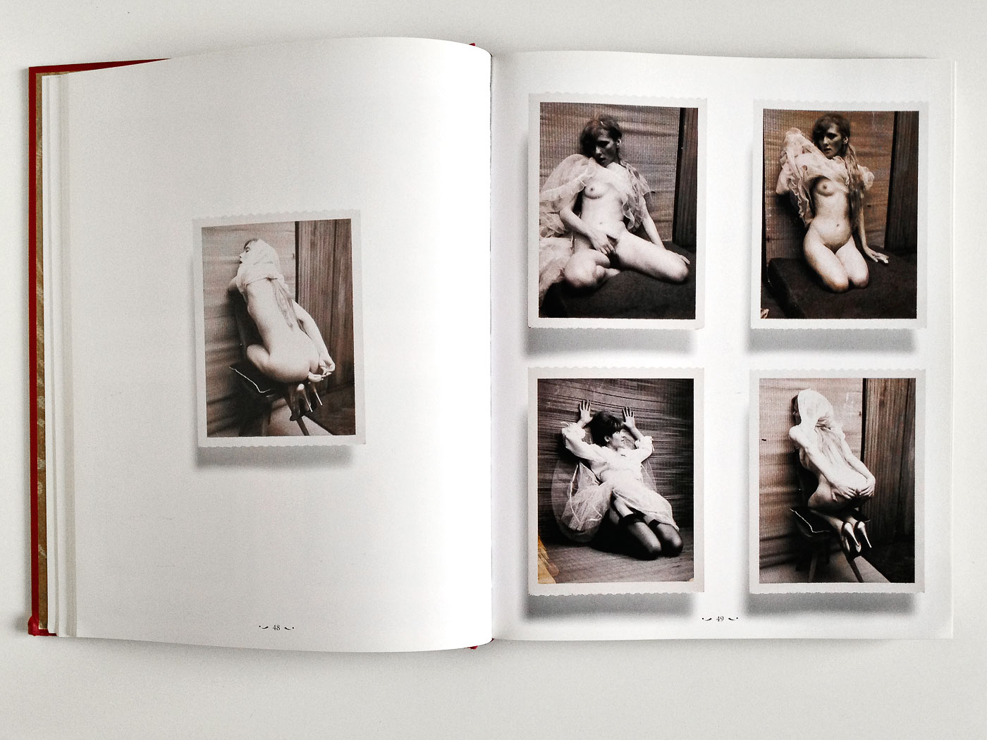
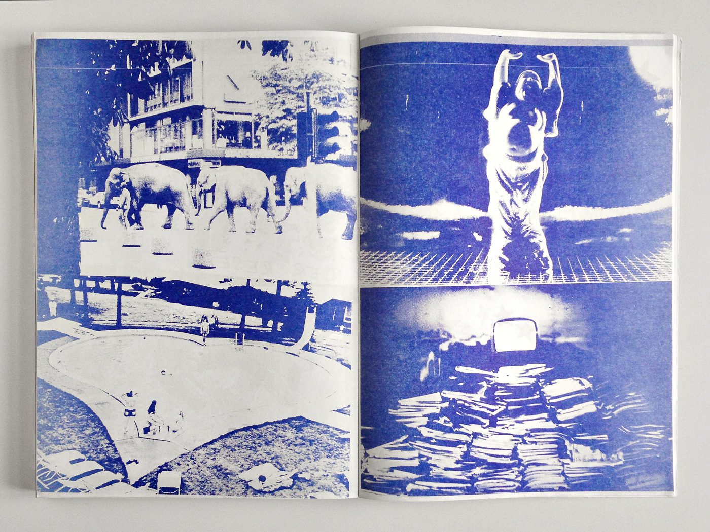
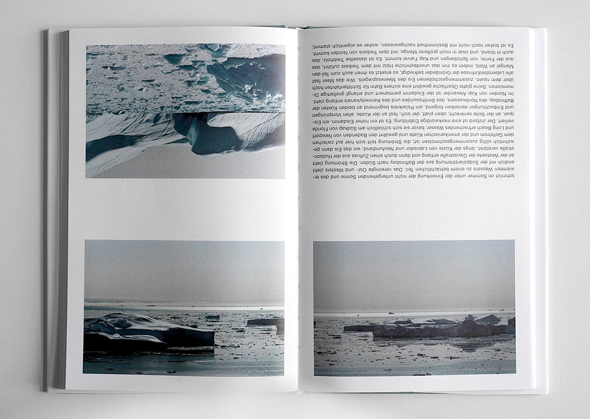
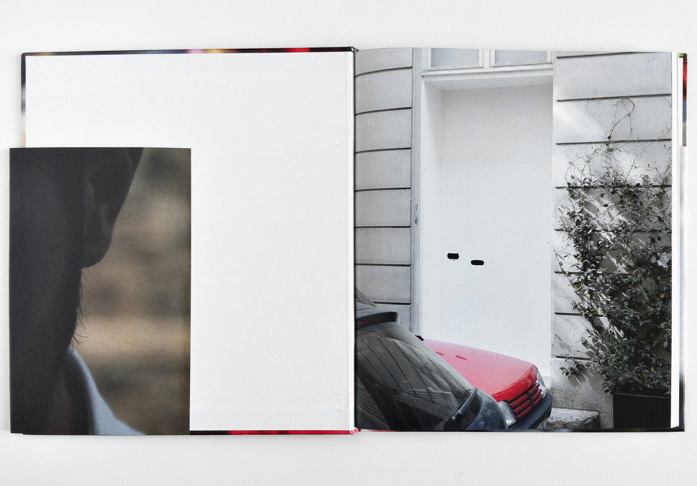
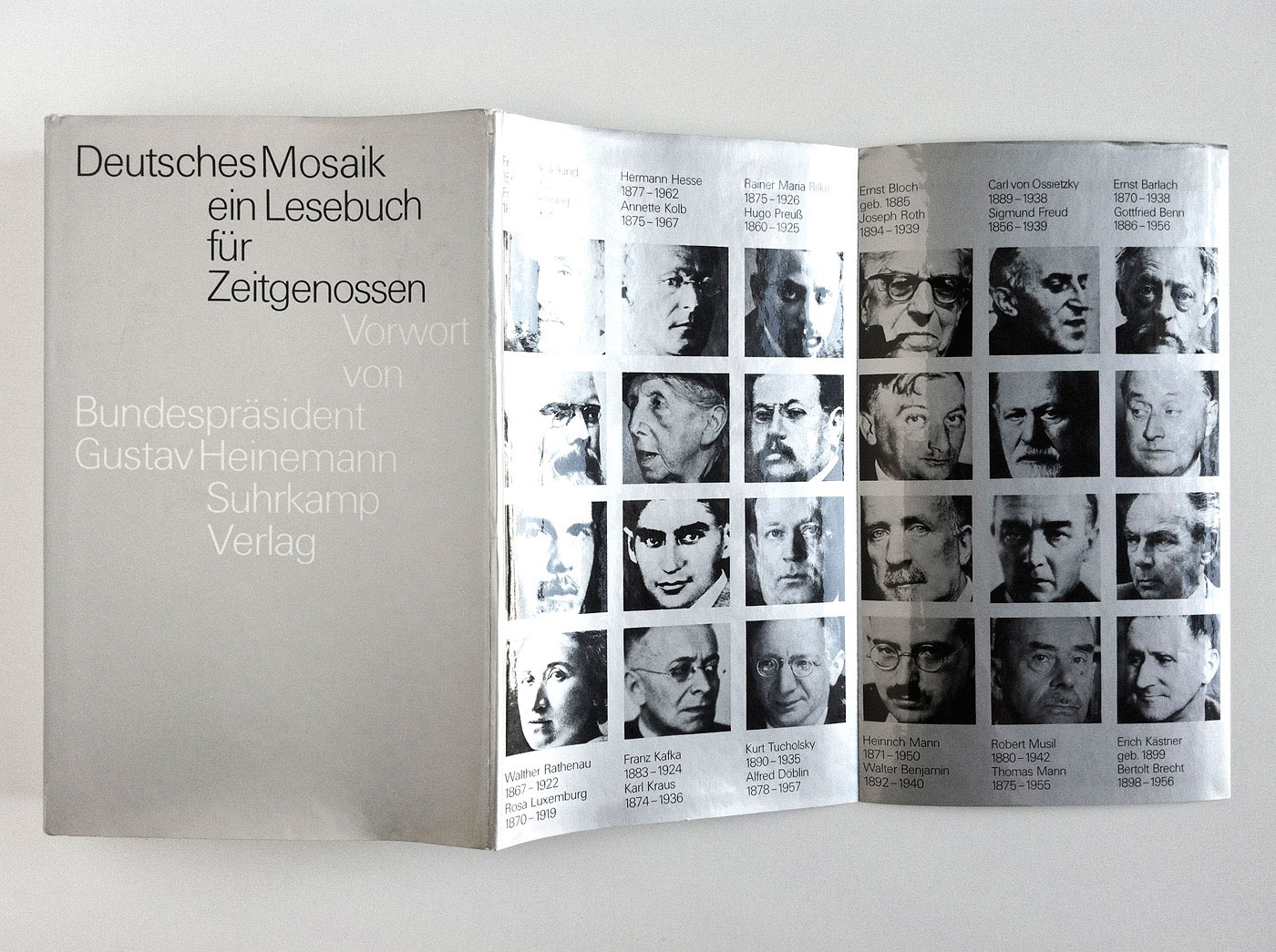
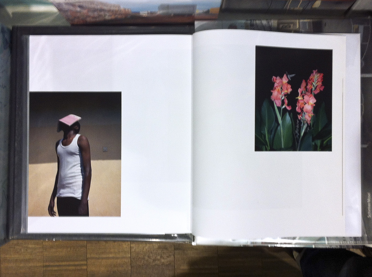
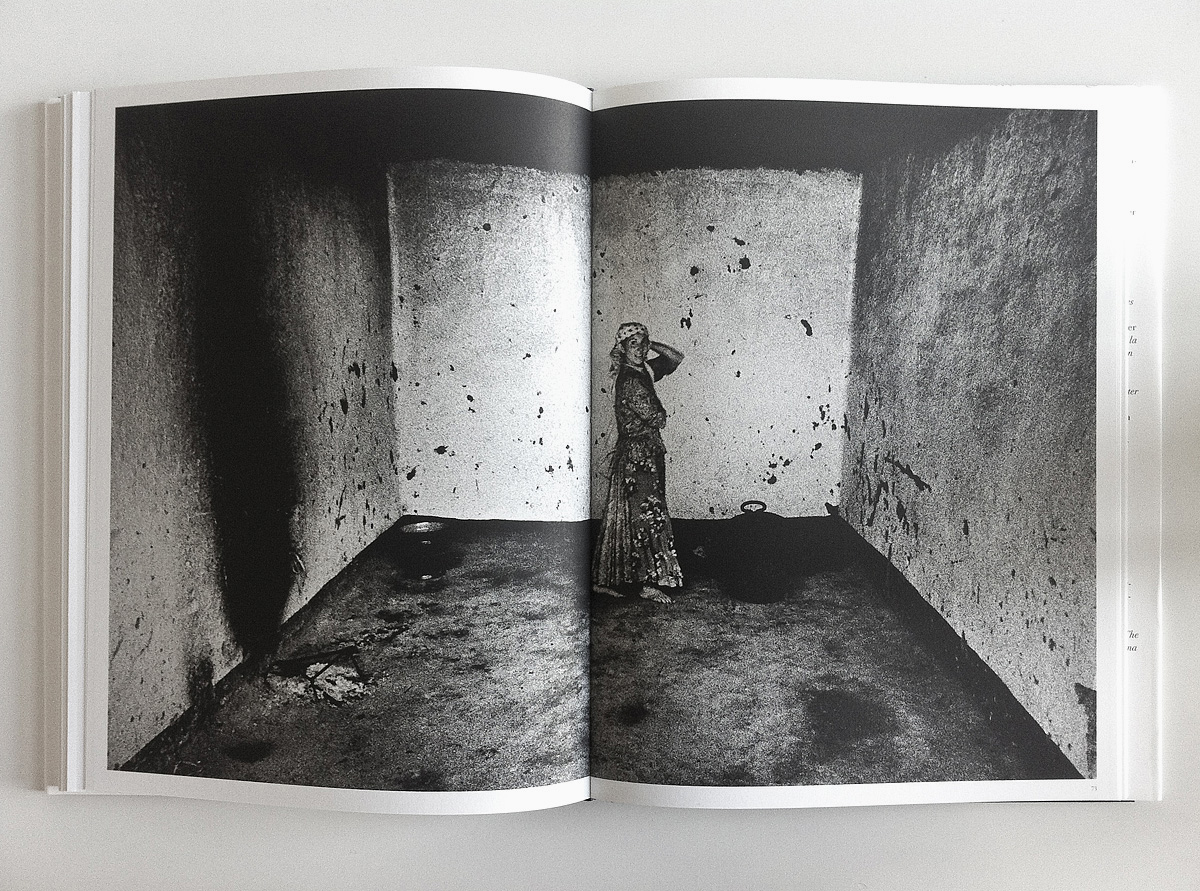
Das Kind und sein Vater
382 5I remember coming across this photo anthology in the window of a closed antiquarian bookstore and fell instantly in love with its title. A few weeks later I was given exactly this book as birthday present. Several weeks thereafter I received the greatest gift in my life. Ever since my admiration and affection for the exceptional beauty of the photographs and the sequencing of this book has been growing.

Fjodor Gejko
has kindly submitted
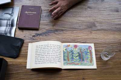
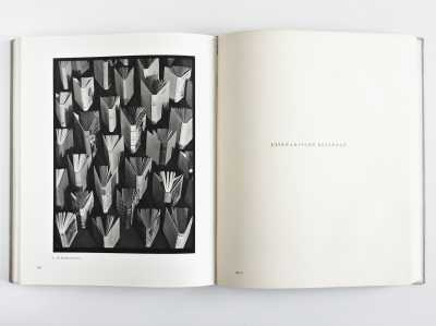
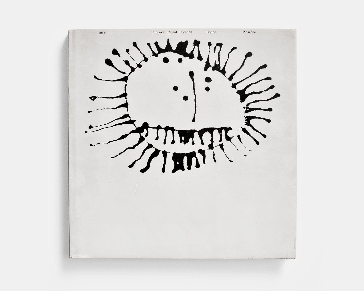
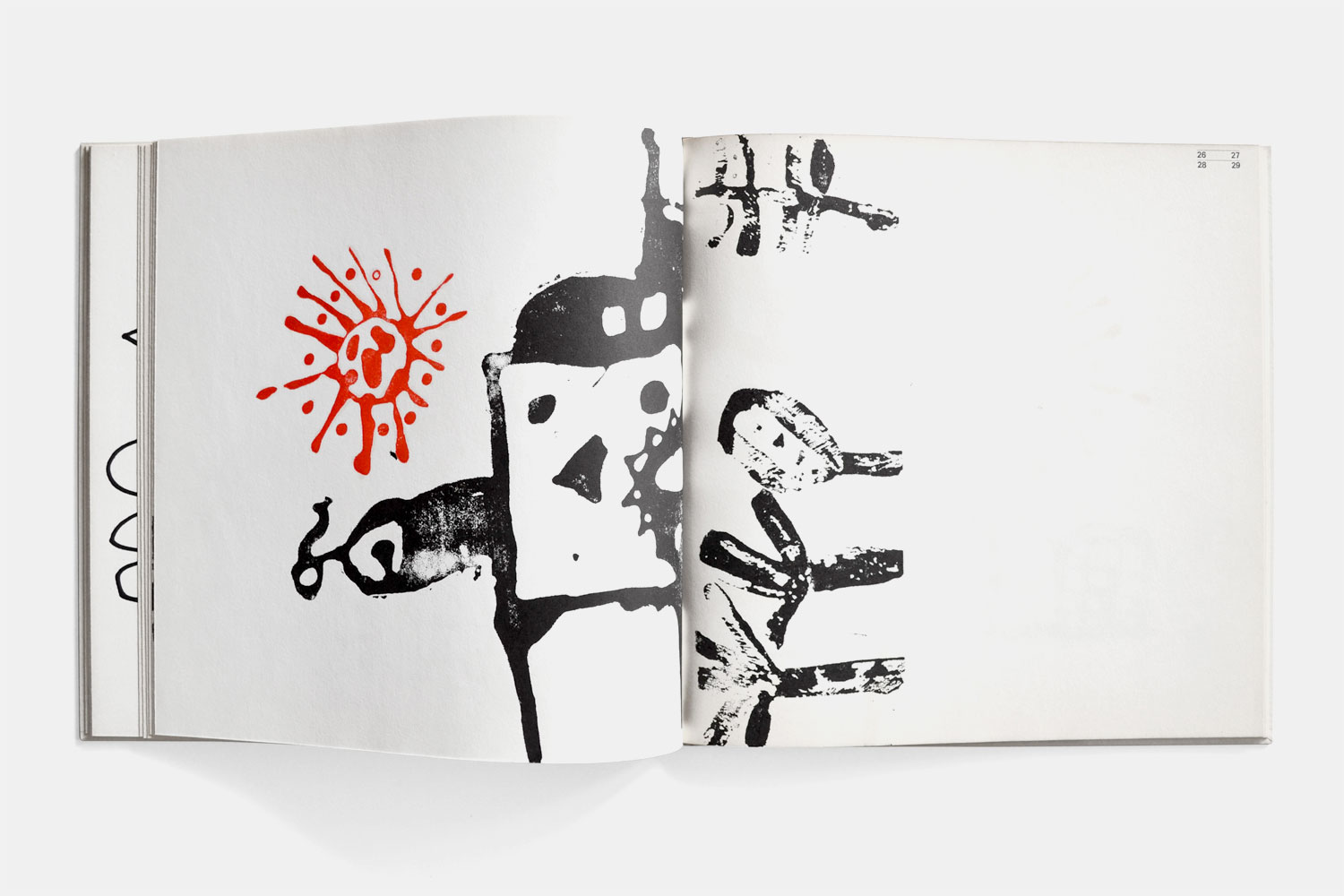
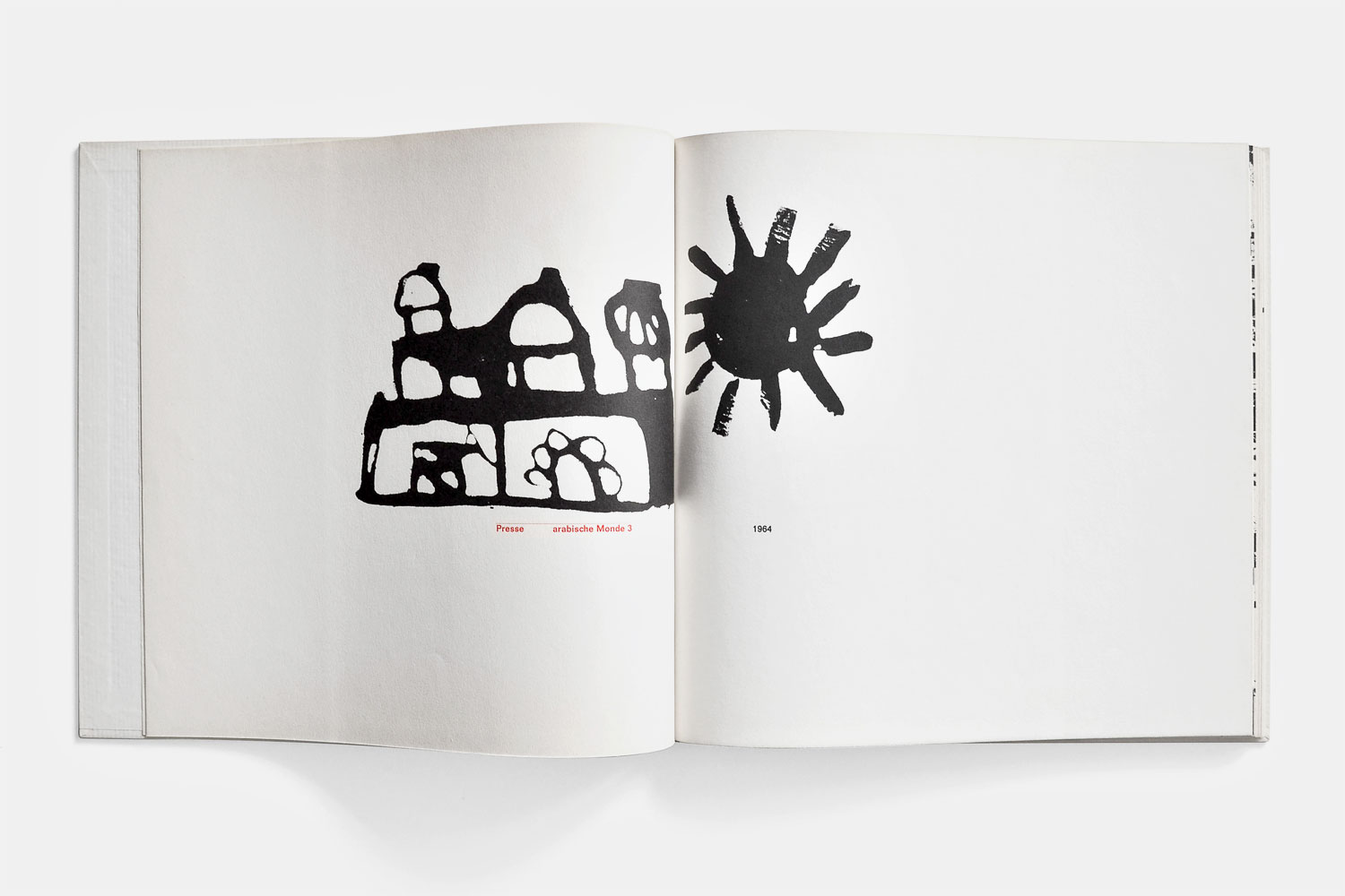
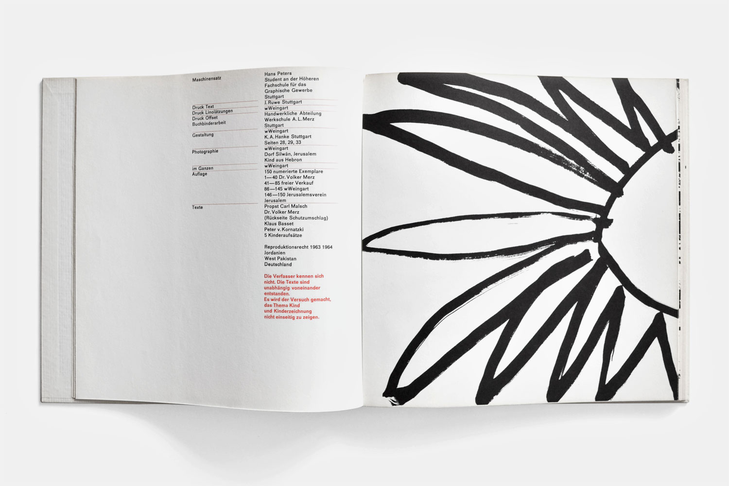
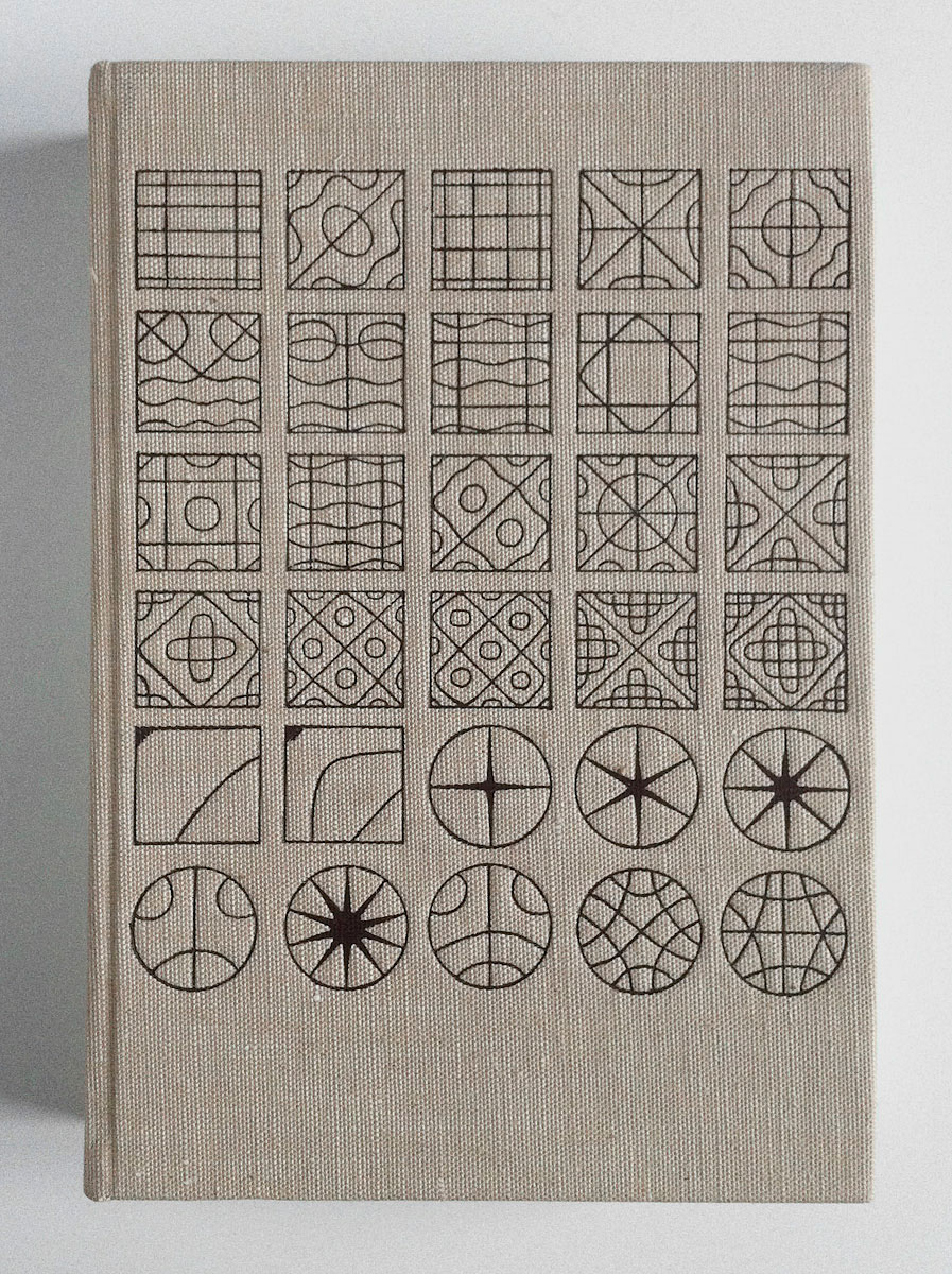
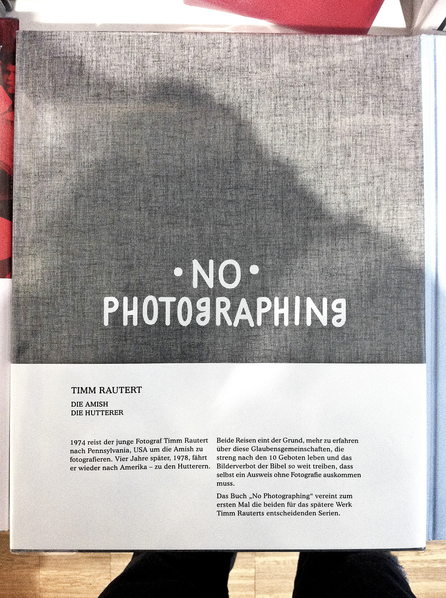
Kinder 1 Orient Zeichnen
A fascinating picture book, designed and realised by Wolfgang Weingart in 1964 with a small print run. It contains drawings by children from the Middle East, spaciously presented in numerous fold-out pages, that allow the reader to rearrange the volume and create new double page combinations. The typography is modest as well as unobtrusive and lets the images speak for themselves.
Submitted by Fjodor Gejko
Michaël Snitker
has kindly submitted
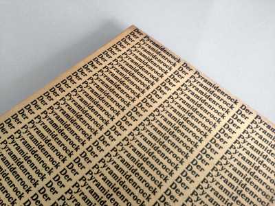
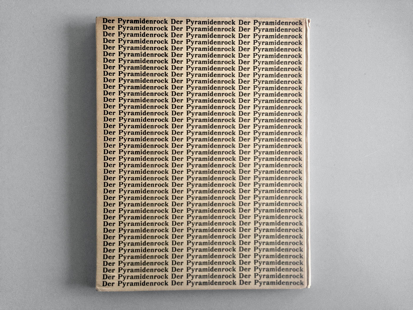
Der Pyramidenrock
This cover looks still fresh after 92 years! The poetry book by Hans Arp was high on my wish list for years. Recently I acquired this rare copy from the private library of Carl Laszlo who died at the age of 90 in 2013. Der Pyramidenrock is Arp’s fourth book with a collection of 41 Dada poems. The portrait frontispiece appears to have been done by Modigliani in 1914 in Paris when Arp became acquainted with Picasso, Apollinaire and other leaders of Modernism.
Submitted by Michaël Snitker
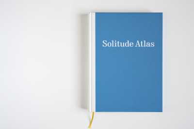
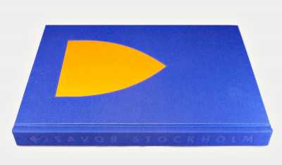
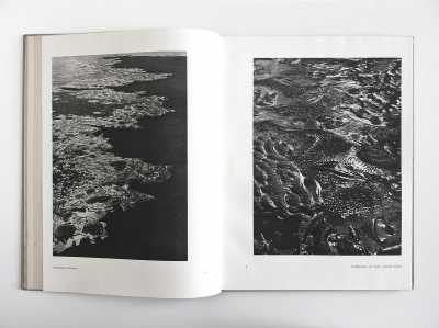
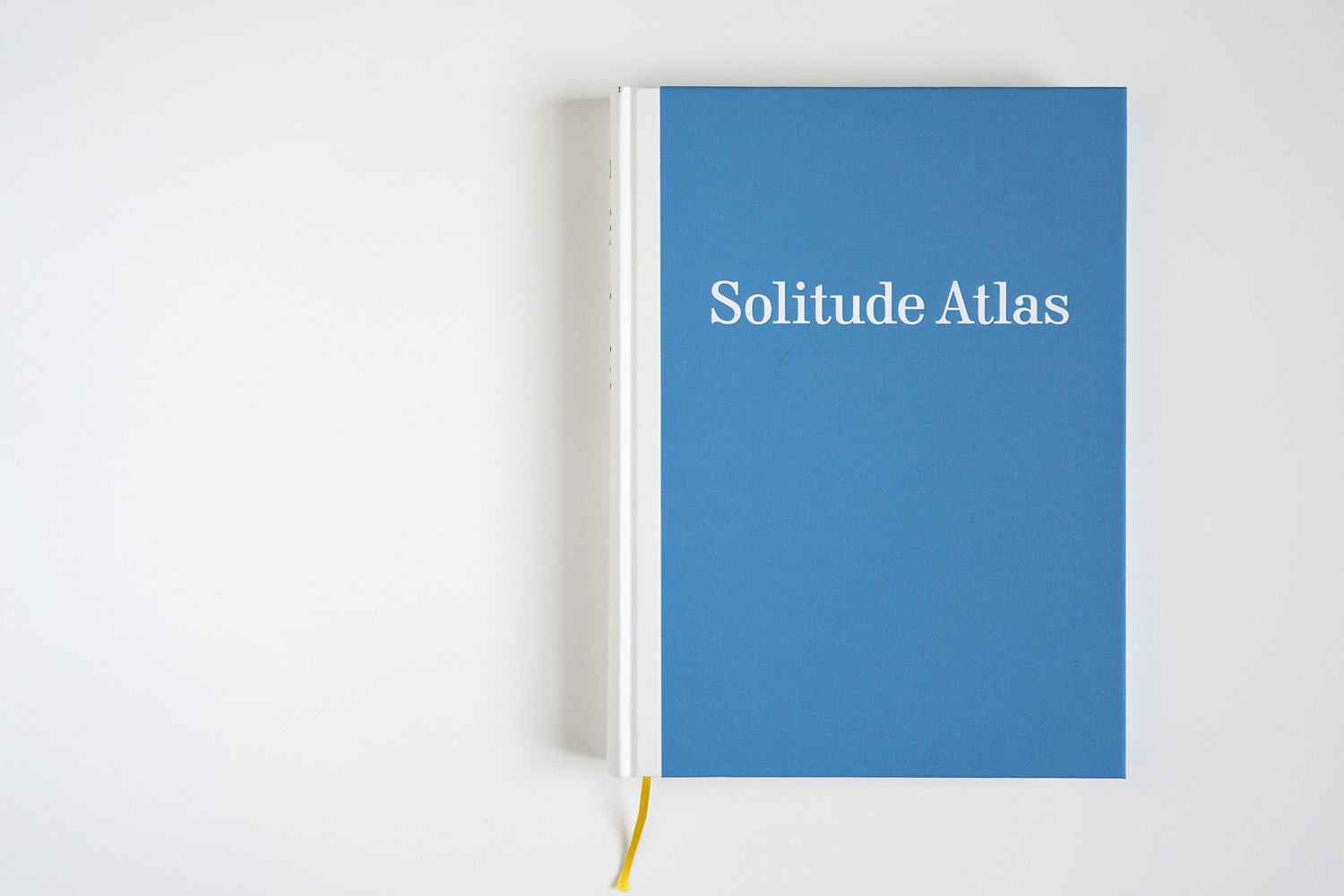
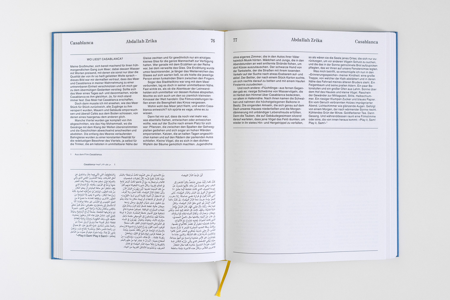
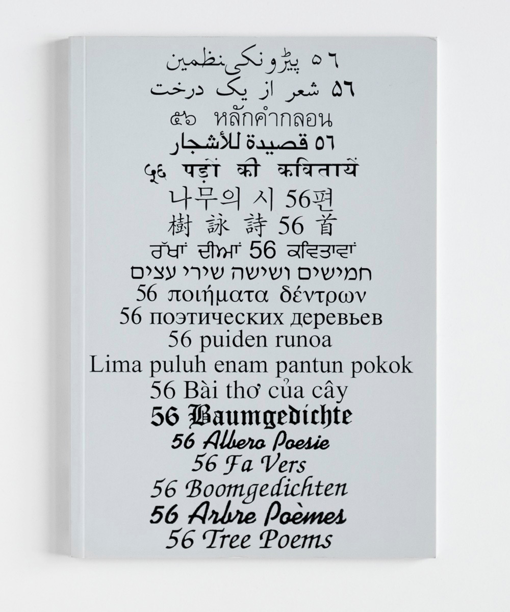
Solitude Atlas
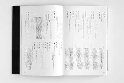
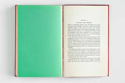
379 4This is a solid book as well as it is unexspectedly lightweight. It appears to have fallen out of time with its archetypal-universal form and construction. It claims to be an Atlas – in so far as it brings together places, transformed into texts and occasionally images by former Solitude stipendiaries. The editorial achievement is just as impressive as its typography: contributions in no less than 20 languages and most diverse forms had to be translated, layouted and typeset. The designer, Phil Baber, has delightfully succeeded in his task. I can’t put this wonderfully unagitated volume down again.
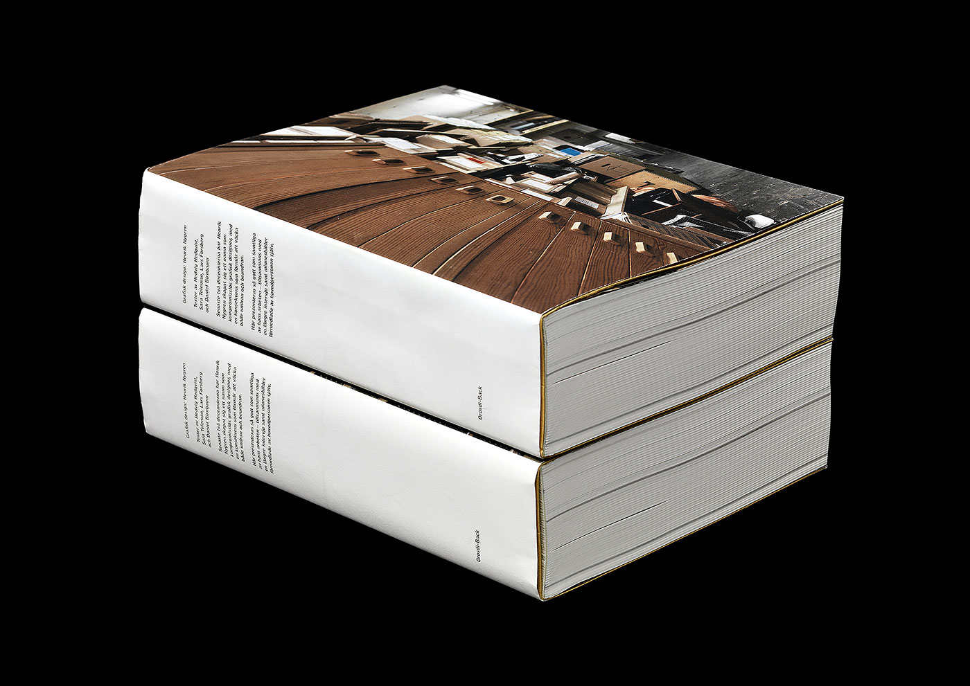
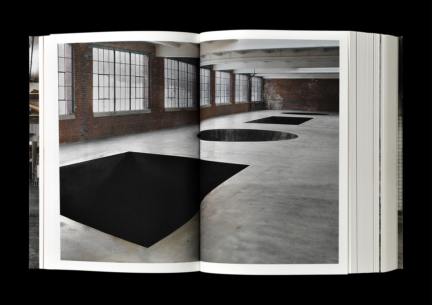
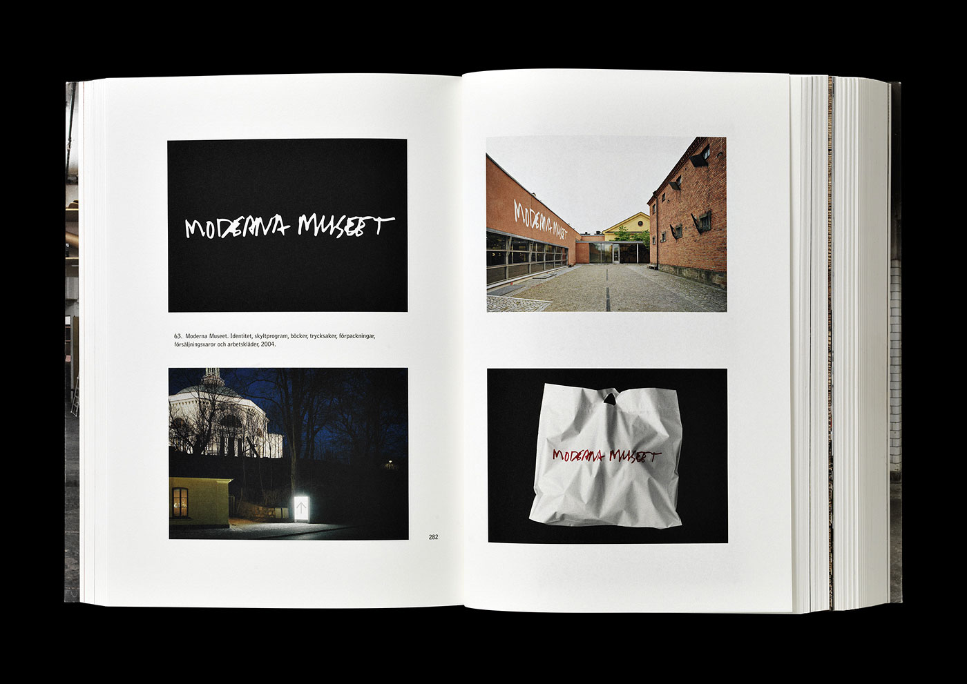
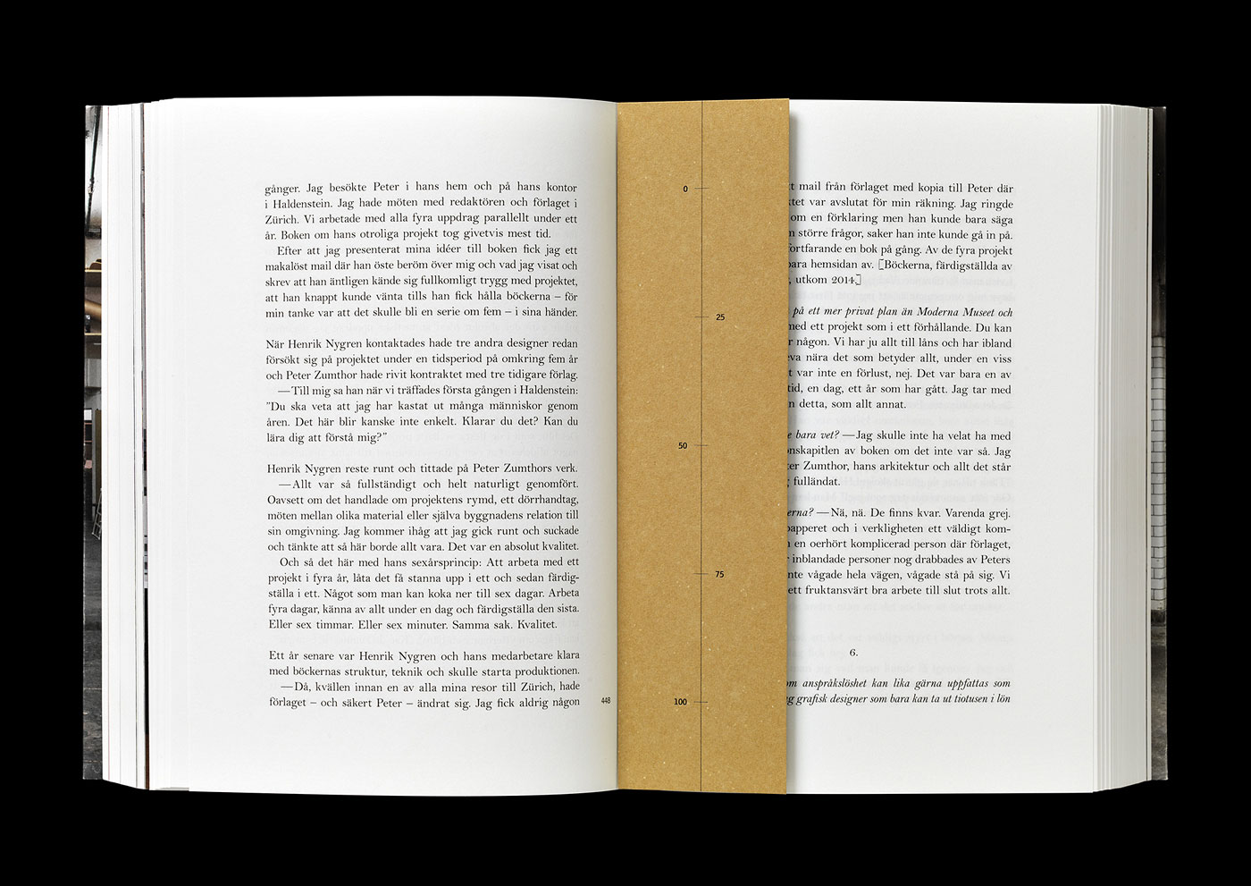
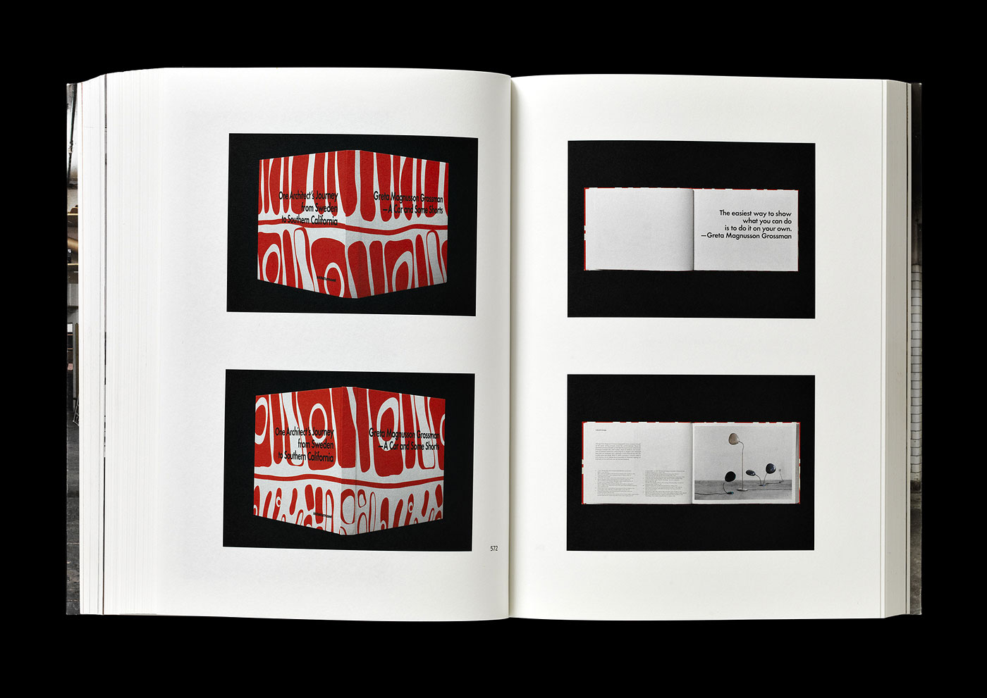
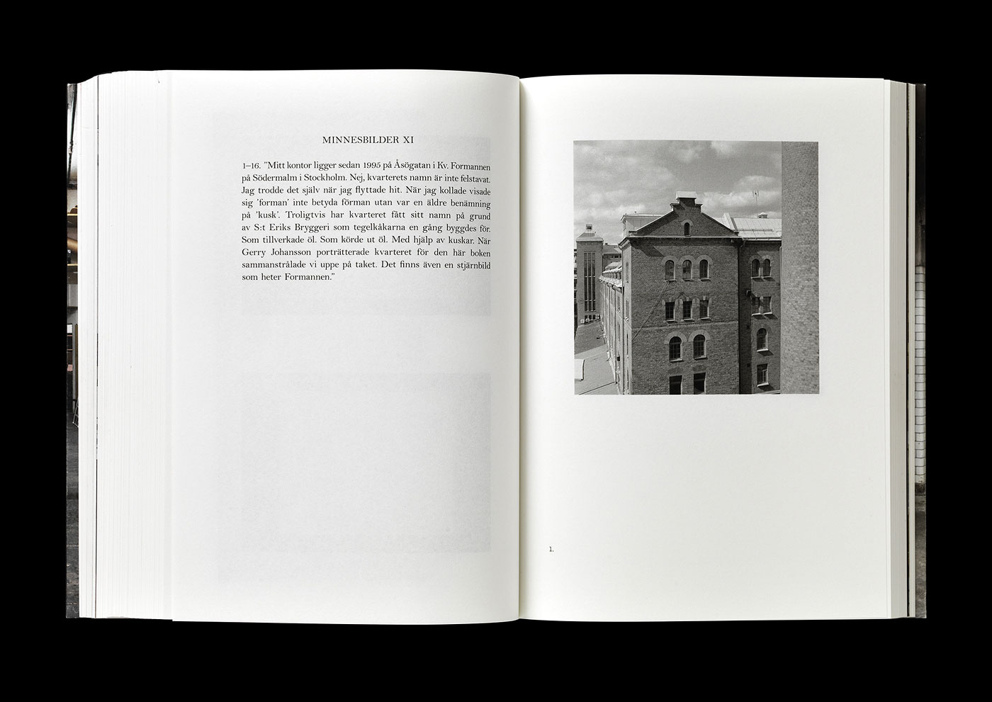
Grafisk design: Henrik Nygren
377 7So many great designers failed in doing their own monograph. This is certainly not true for Henrik Nygren. His presentation is poetic and modest, the consistency of quality in his designs is second to none. The quiet and straight portfolio is interrupted by what he calls “Minnesbilder” (Memories) – inspirations, points of reference, benchmarks for his work. Printing and material selection is first-rate. Only the bookbinding would have benefited from cold glue. I’ve asked Henrik to send me his 5 favourite spreads. Here they are.
Annahita Kamali and Florian Böhm
have kindly submitted
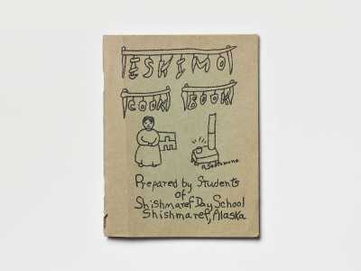
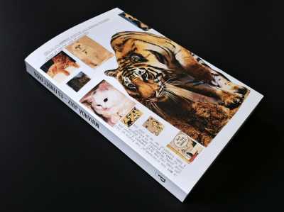
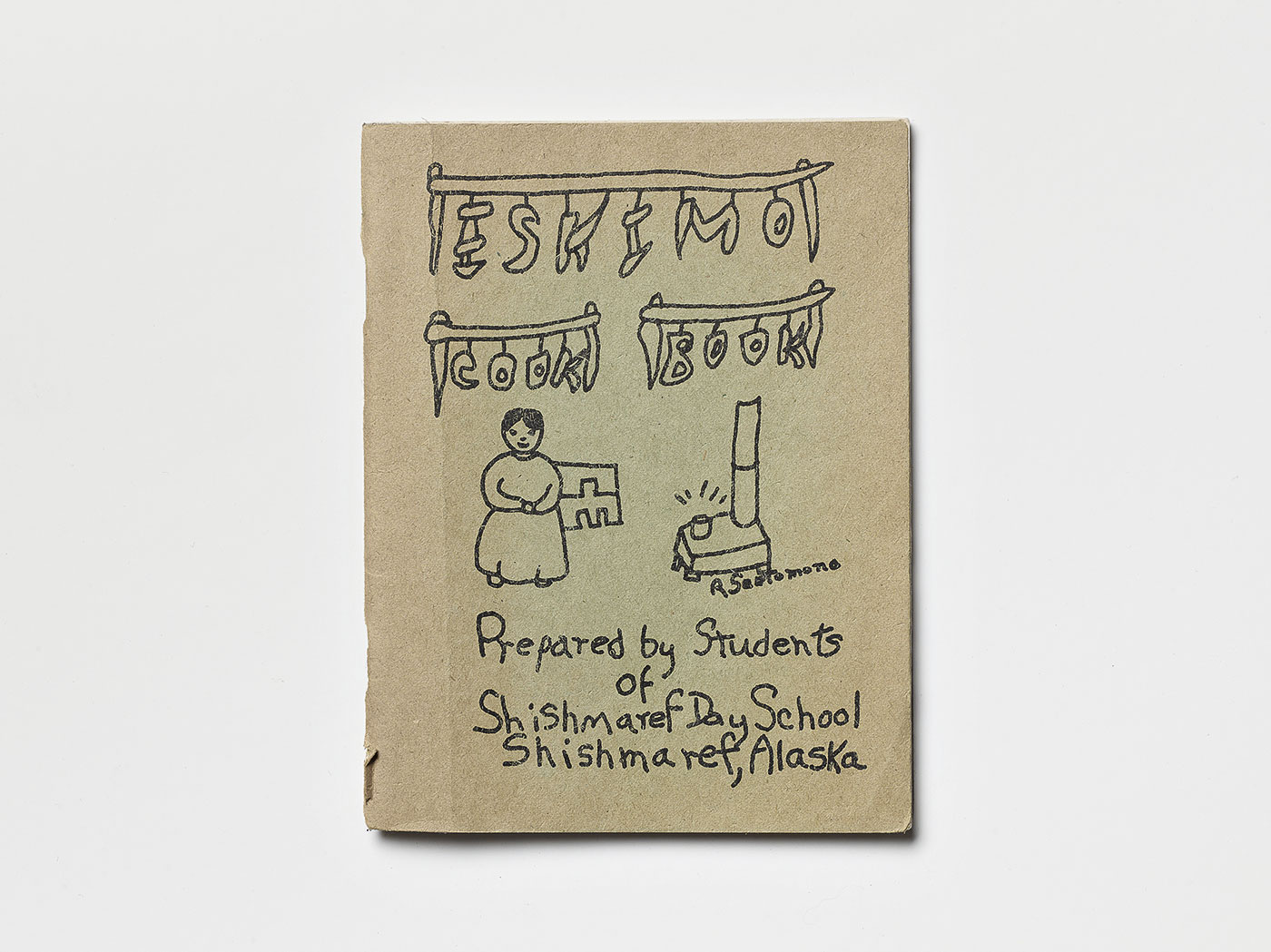
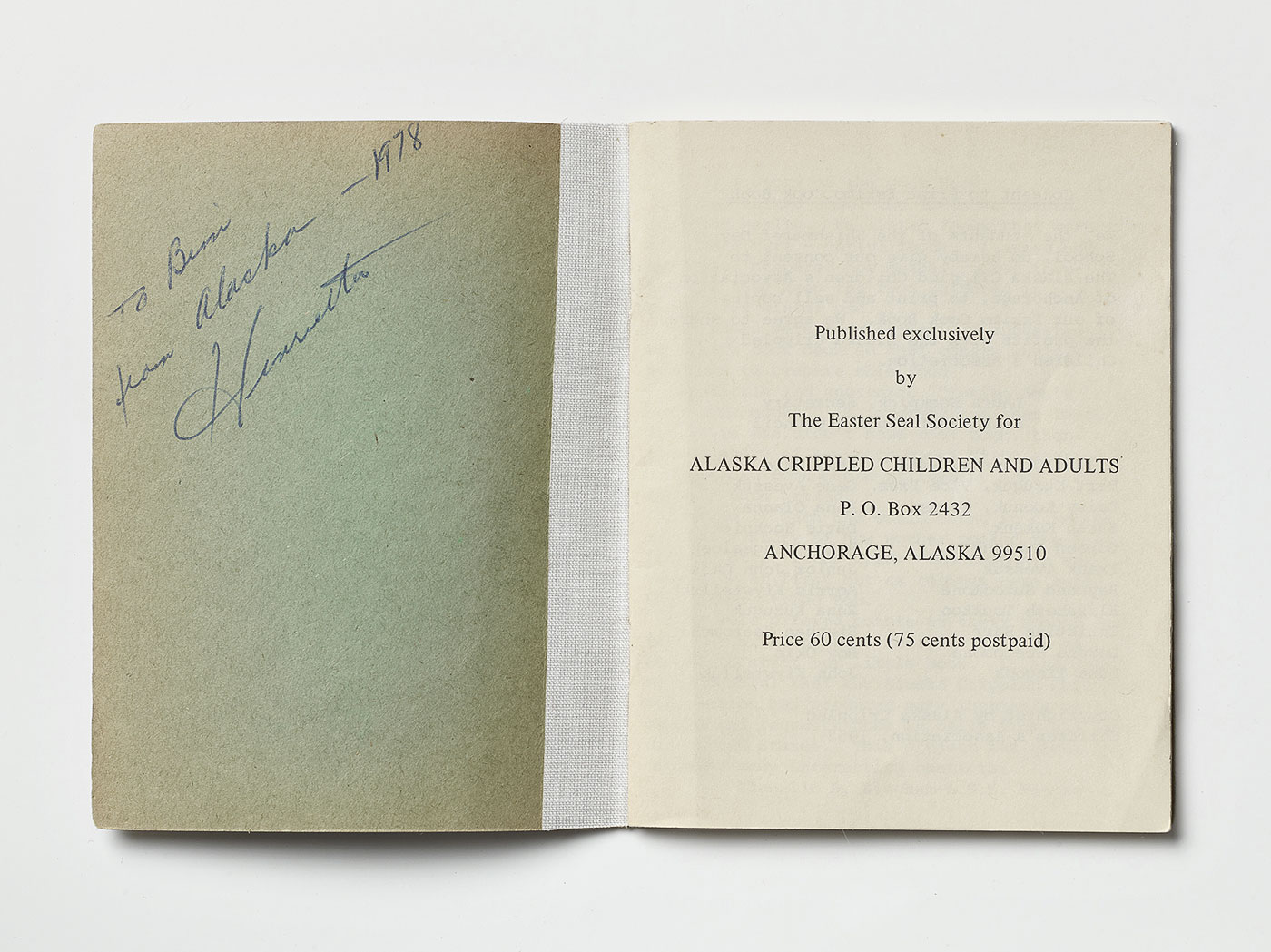
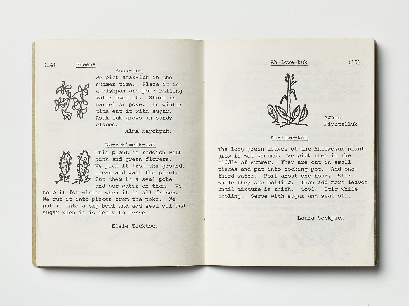
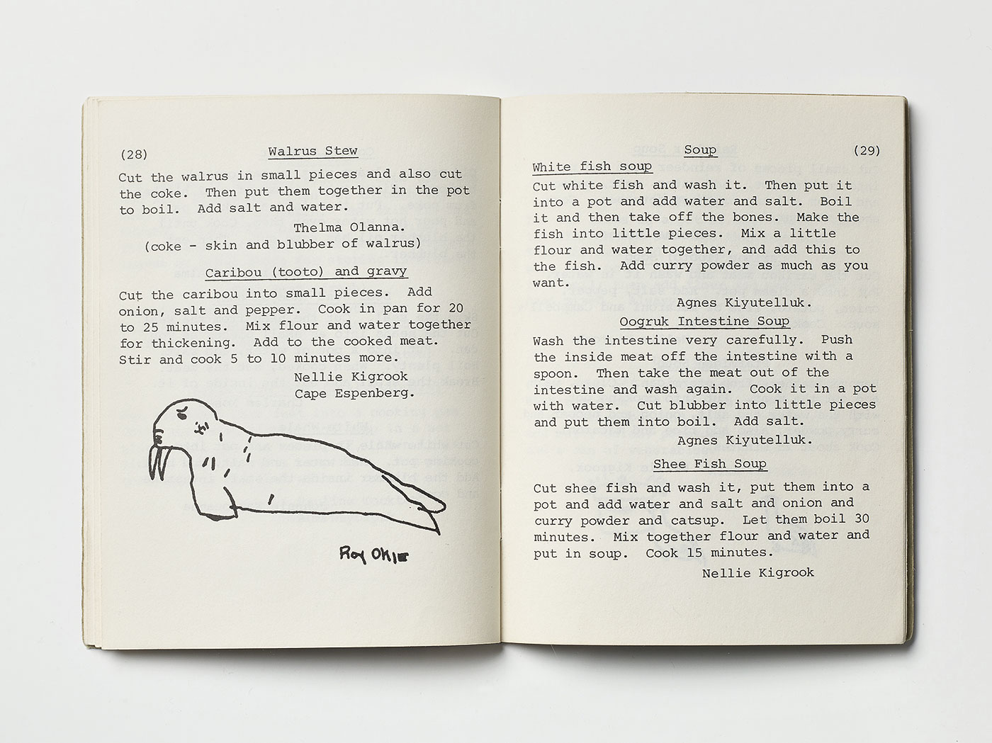
Eskimo Cook Book
This rare hand-made book, first published in 1952 began as a school project in Alaska, when a teacher asked her class to bring in a recipe or story of how mother cooked at home. The book is a great example of simplicity in any aspect. To prepare a herring for example, you apparently don’t need to to know more than: „Sprinkle the herring with salt. Fry them in the oven. Not too long.“
Submitted by Annahita Kamali and Florian Böhm
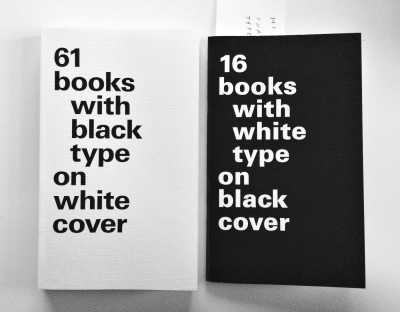
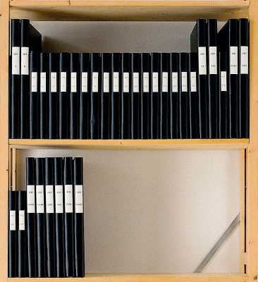
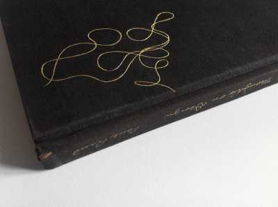
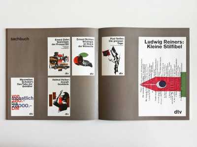
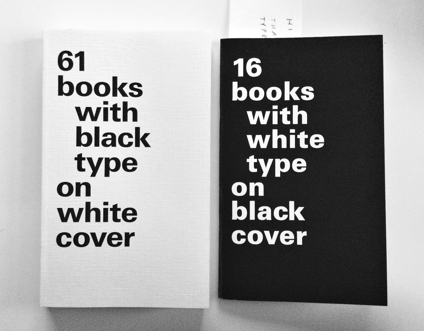
16 books with white type on black cover
375 2Aslak Gurholt from Yokoland made a great cover version of my 61 books book together with Martin Asbjørnsen. That’s the kind of “response” one loves to see but had never dared to hope for. Thrilling. Thank you.

Mirsad Ademaj
has kindly submitted
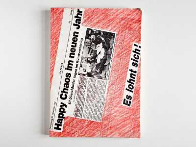
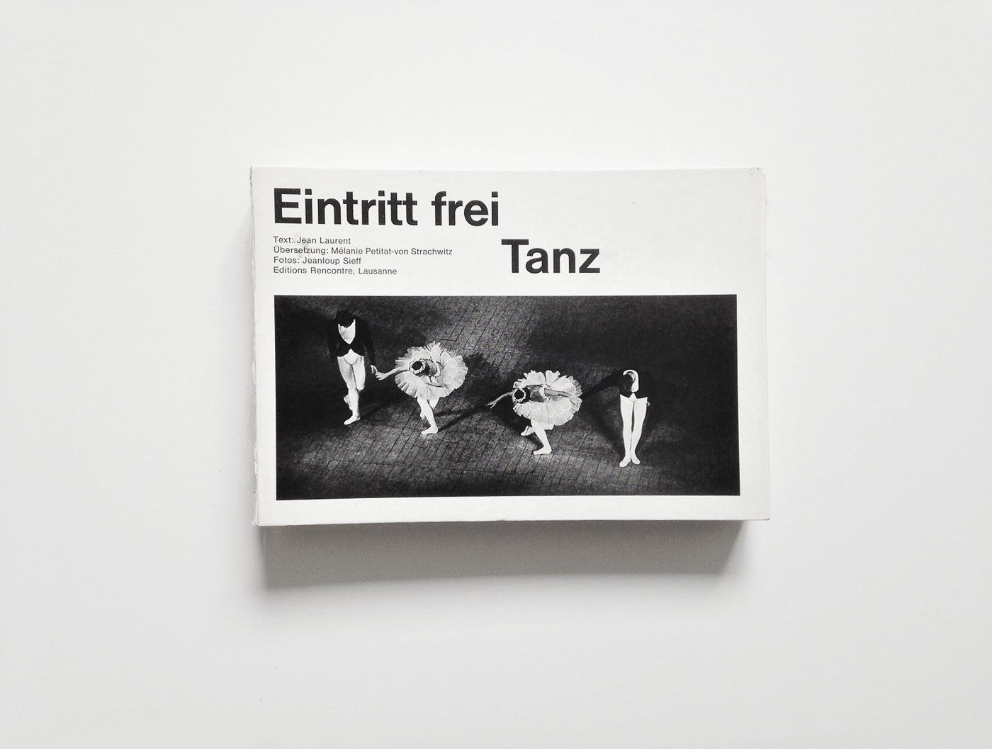
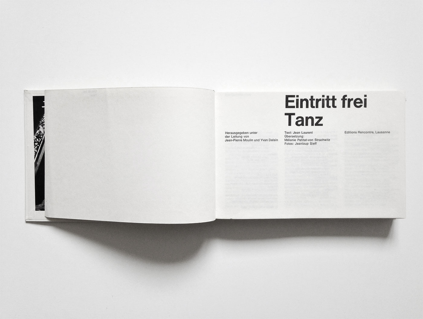
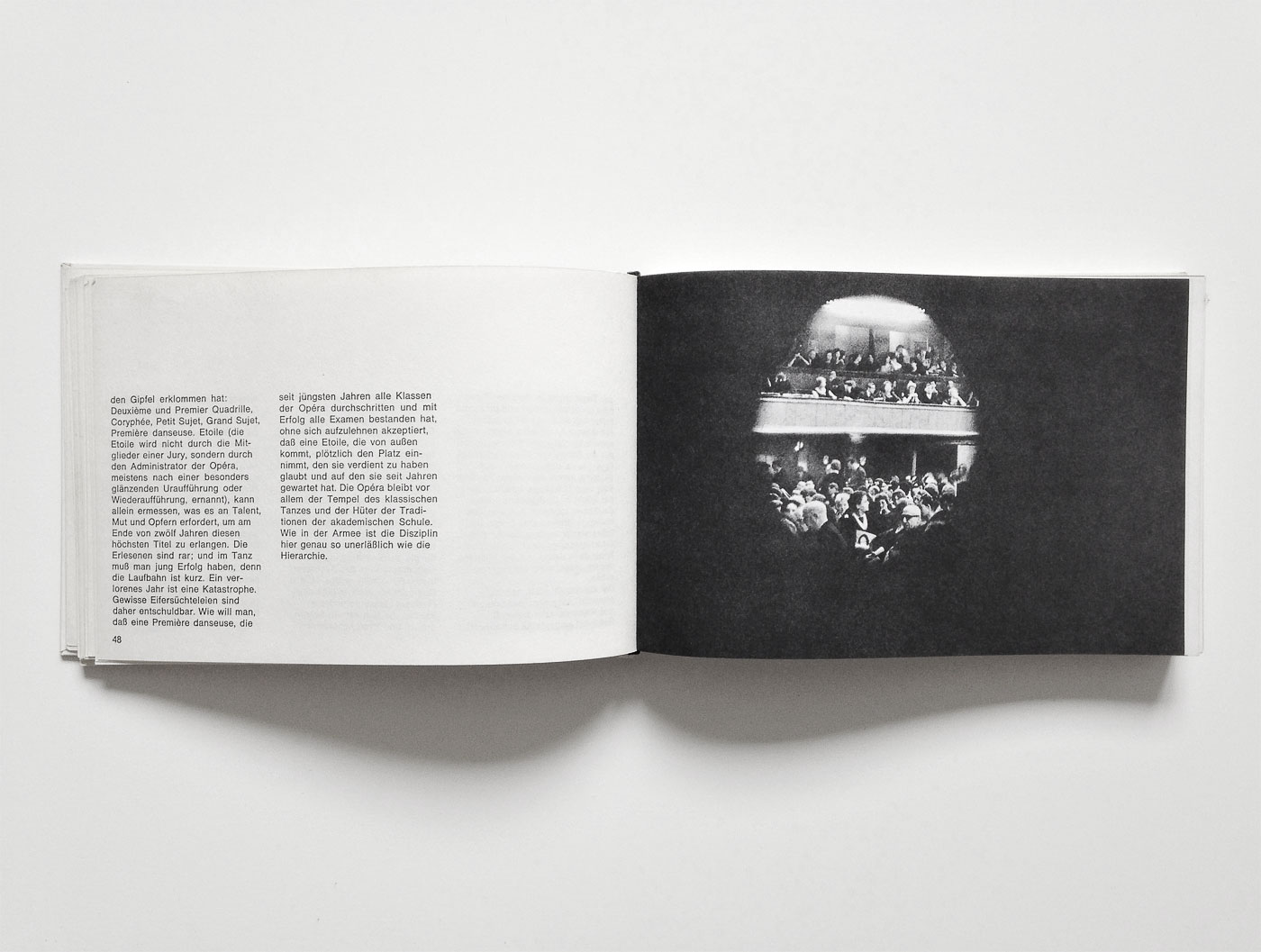
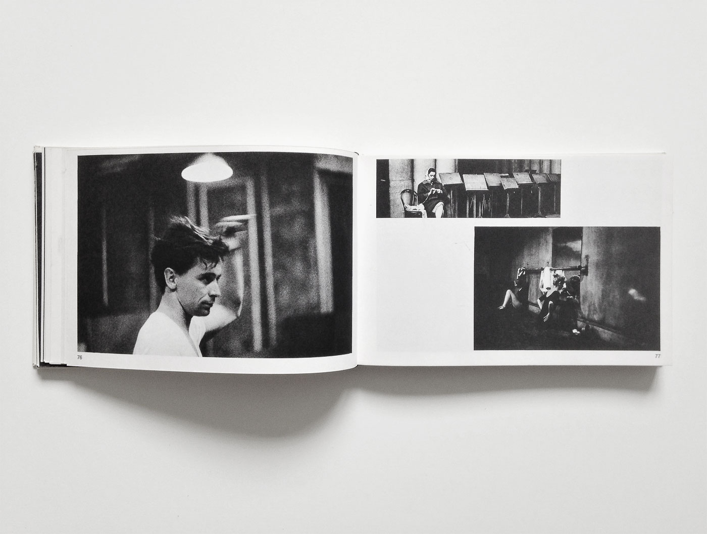
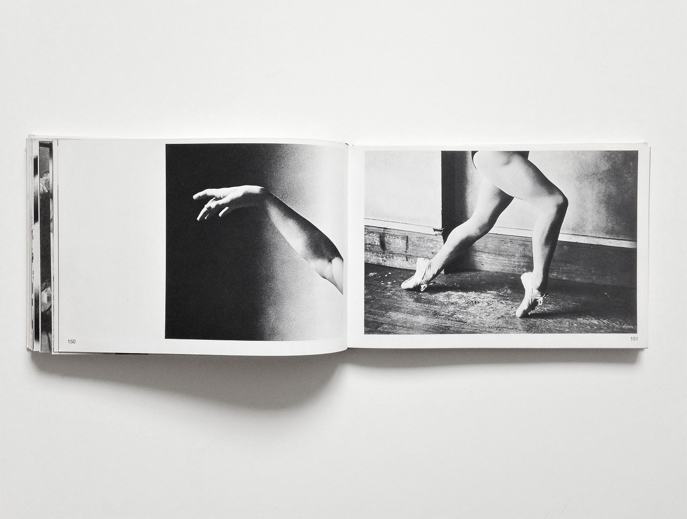
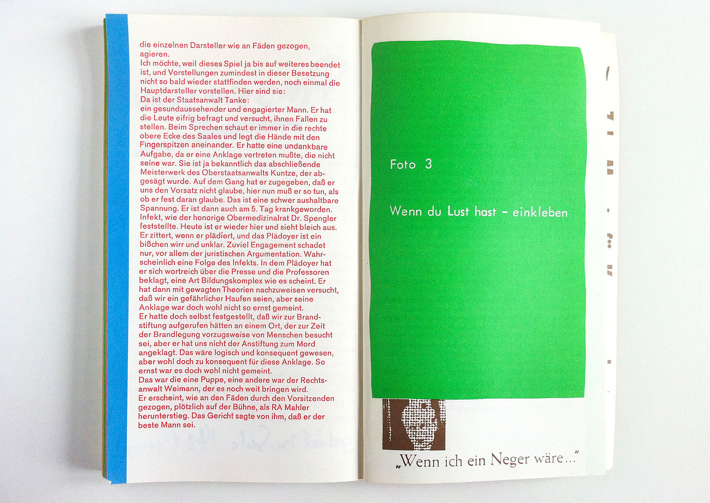
Eintritt frei – Tanz
I was intrigued by this book’s confidence of not trying to be something special. It almost disappears between other books on the shelf. But once you take it out, it allures with strong image sequences and peculiar design choices.
Submitted by Mirsad Ademaj
Europa Frohwein
has kindly submitted
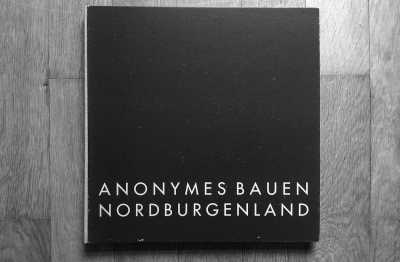
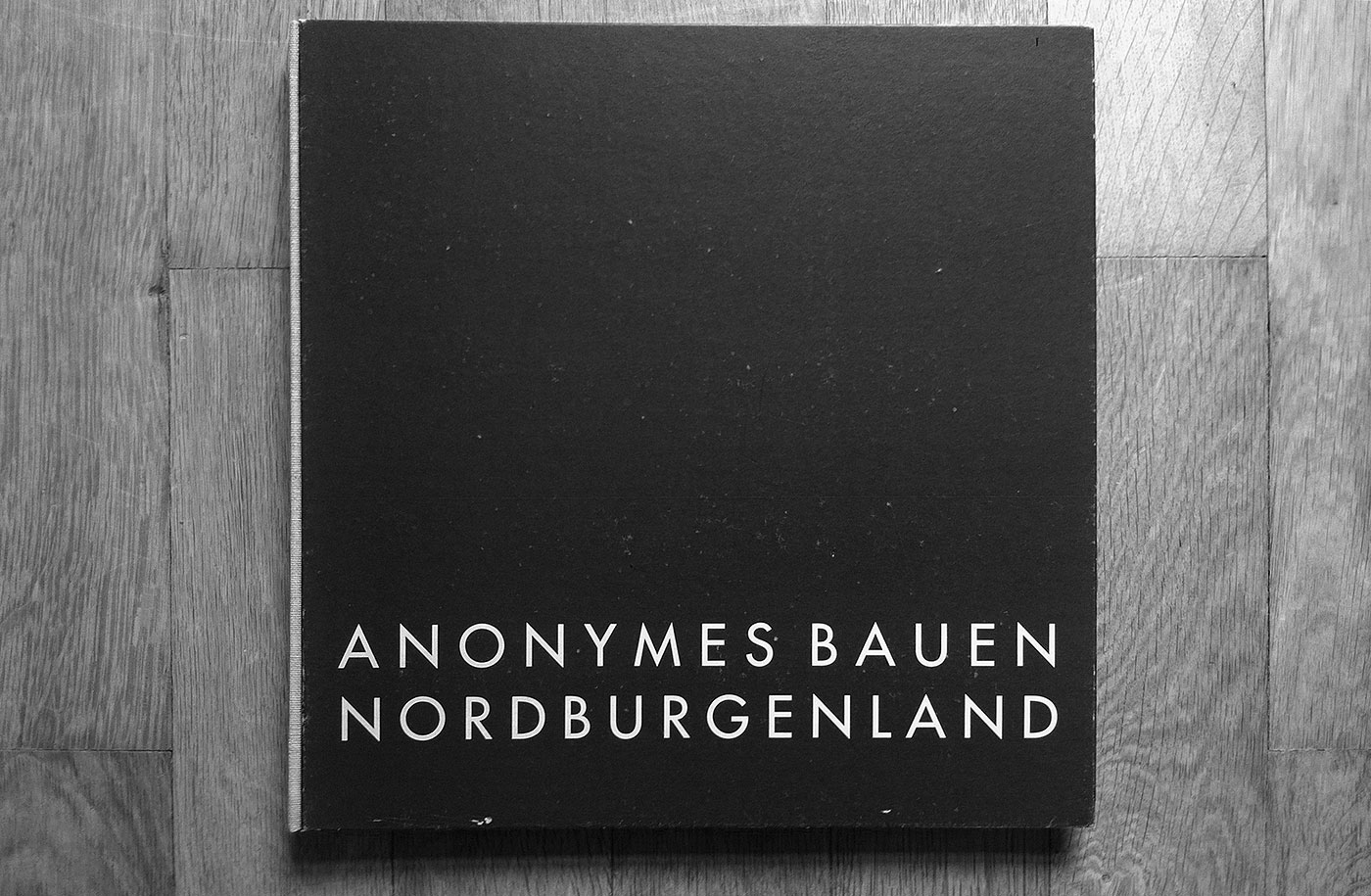
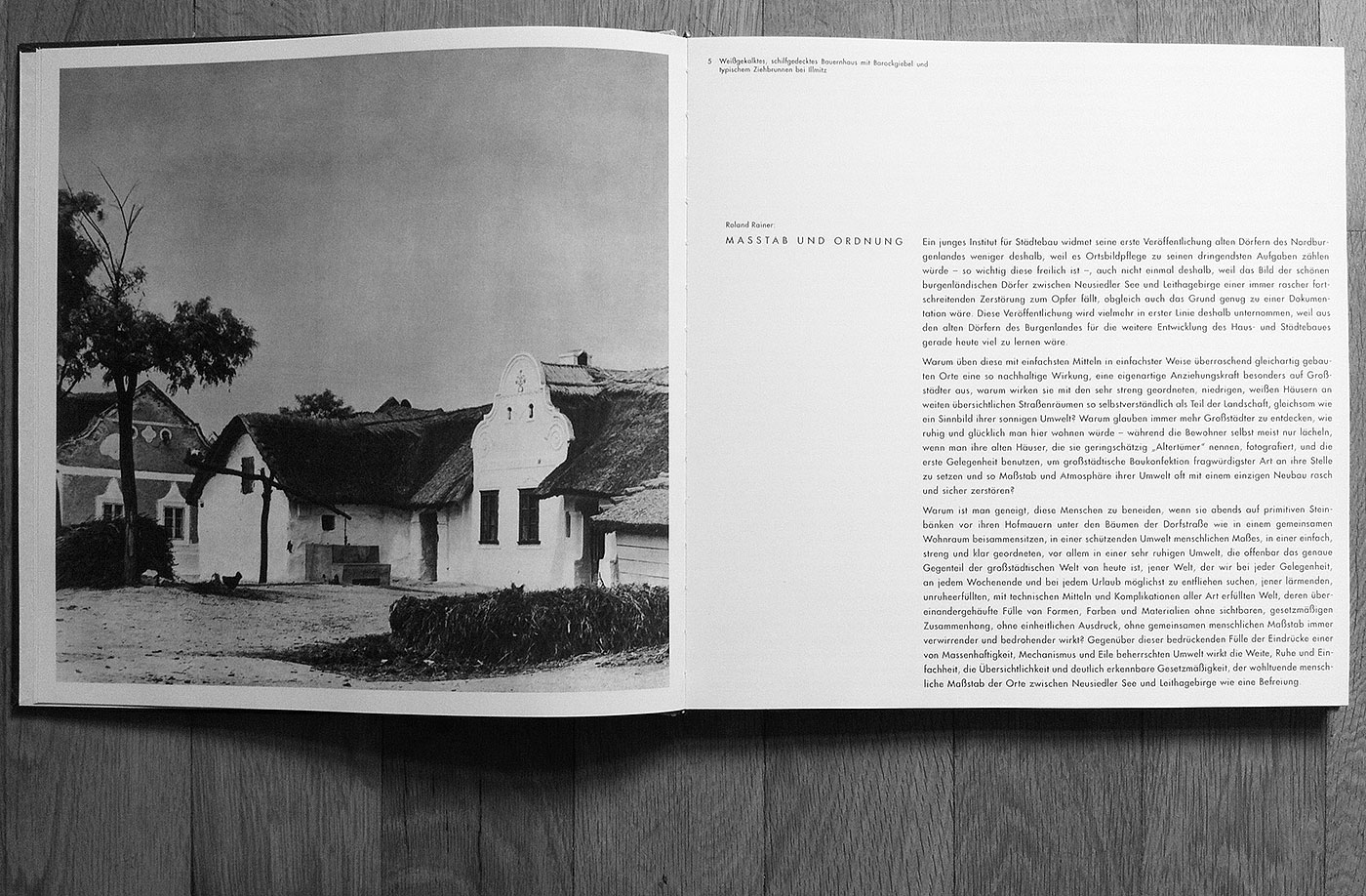
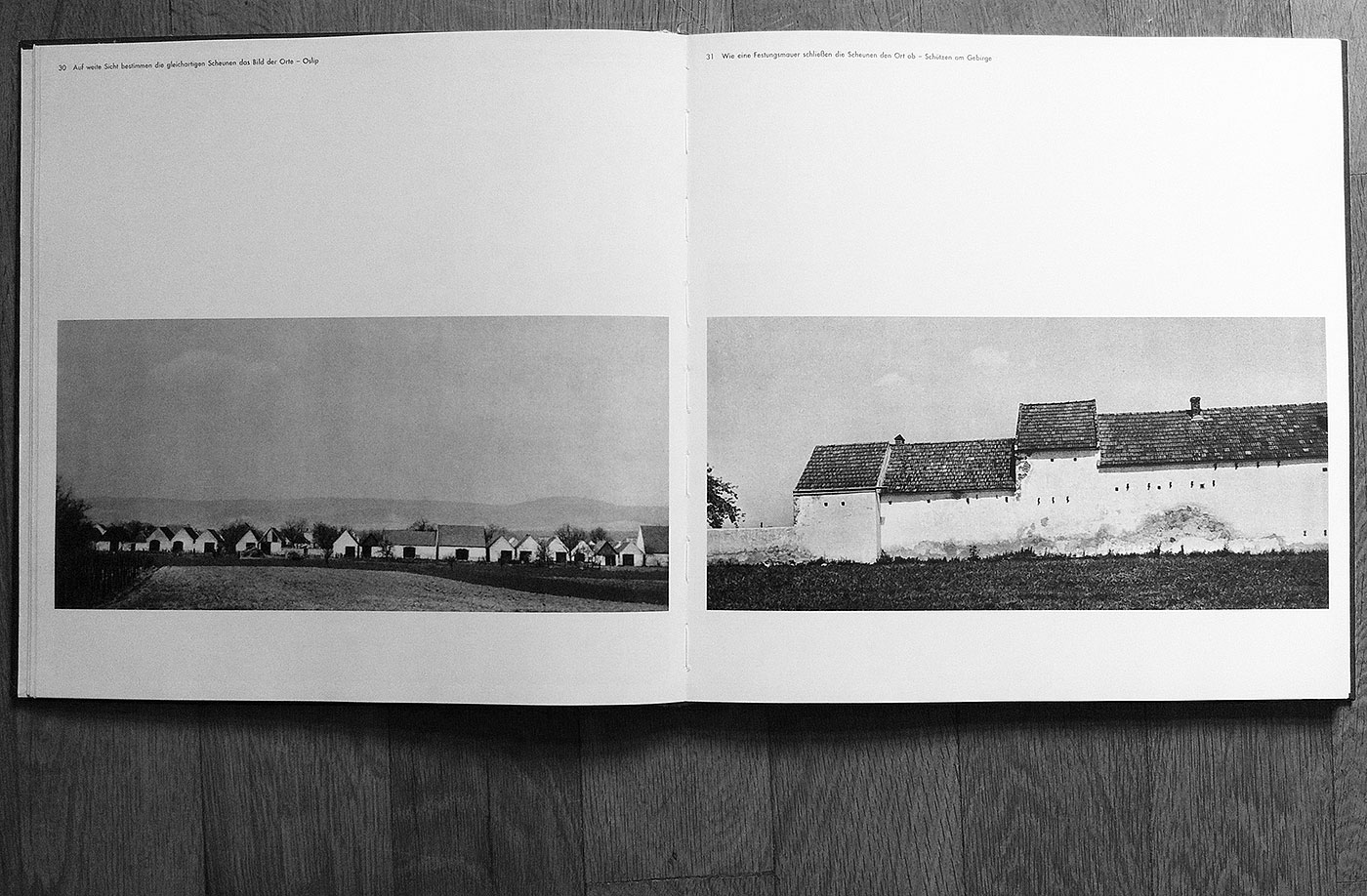
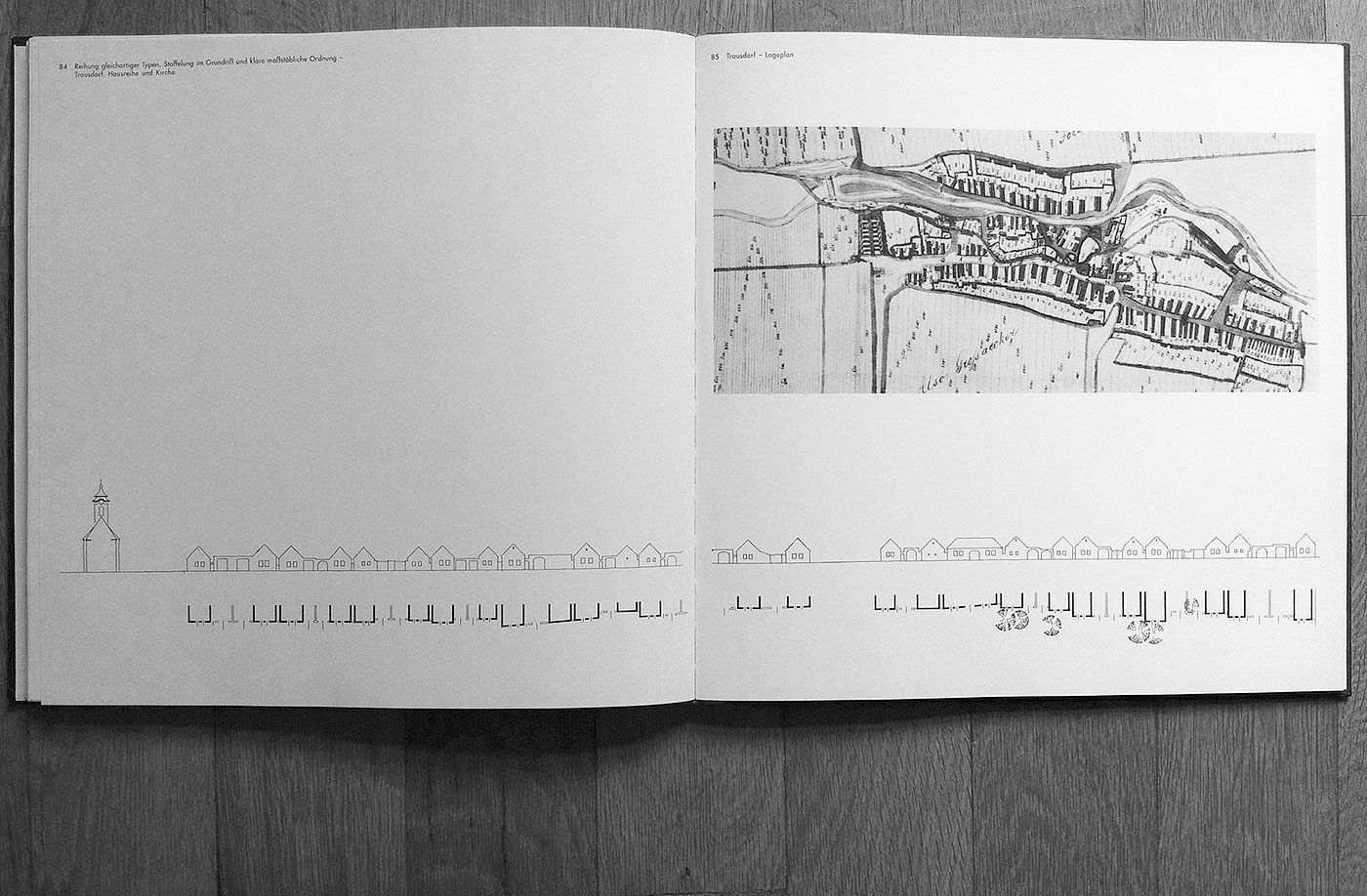
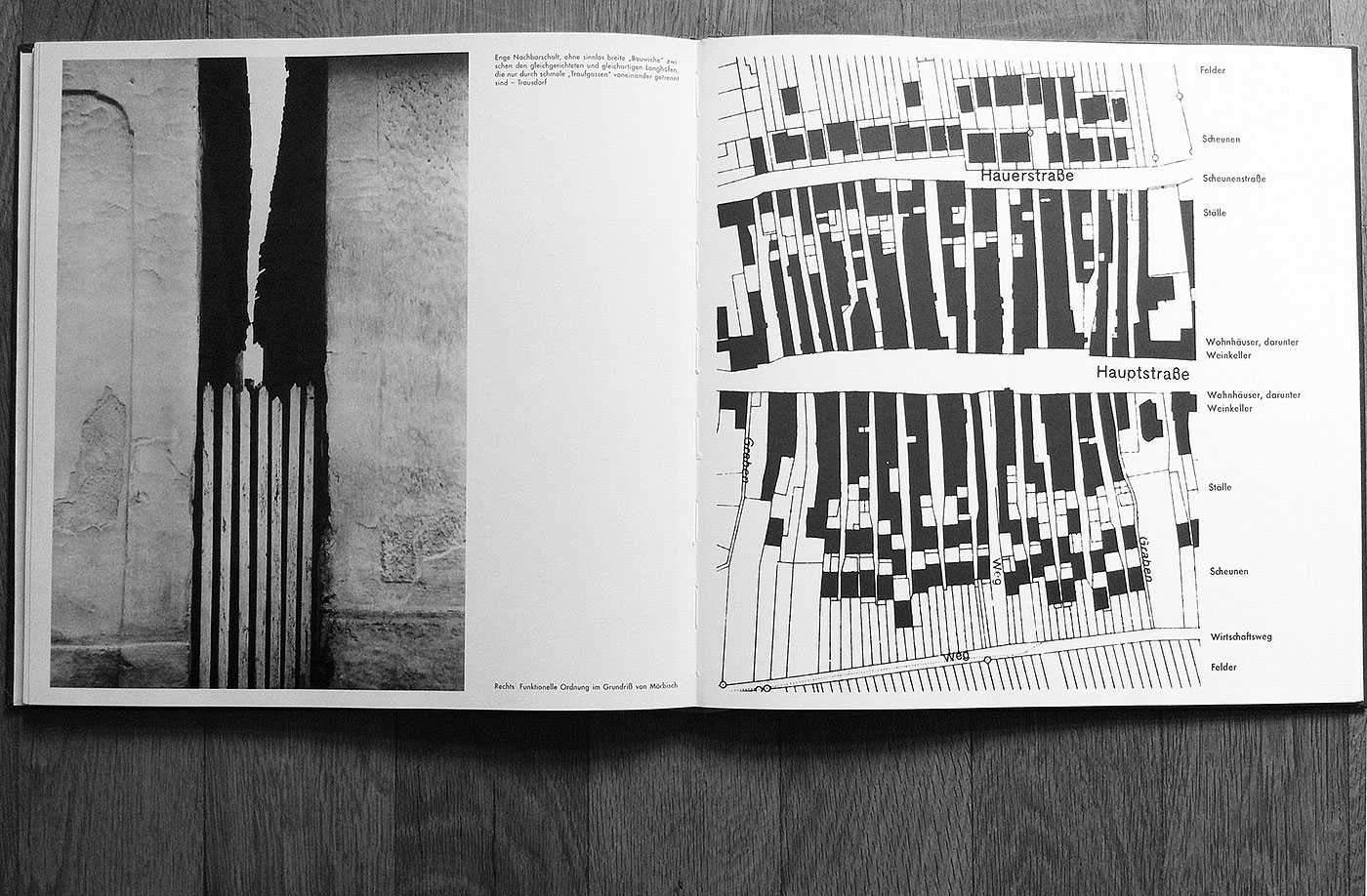
Anonymes Bauen
Gathering fine detail, tectonic relation, truth, humanity and intimacy of historical rural buildings in northern Austria, the book appeals also with great photographs and graphic illustration. The simplified beauty of the title seems to be a bit anachronistic for its year of reprint, but I appreciate the time its referring to and it speaks for the quality of the original.
Submitted by Europa Frohwein
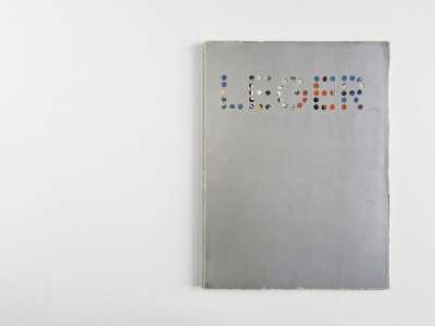
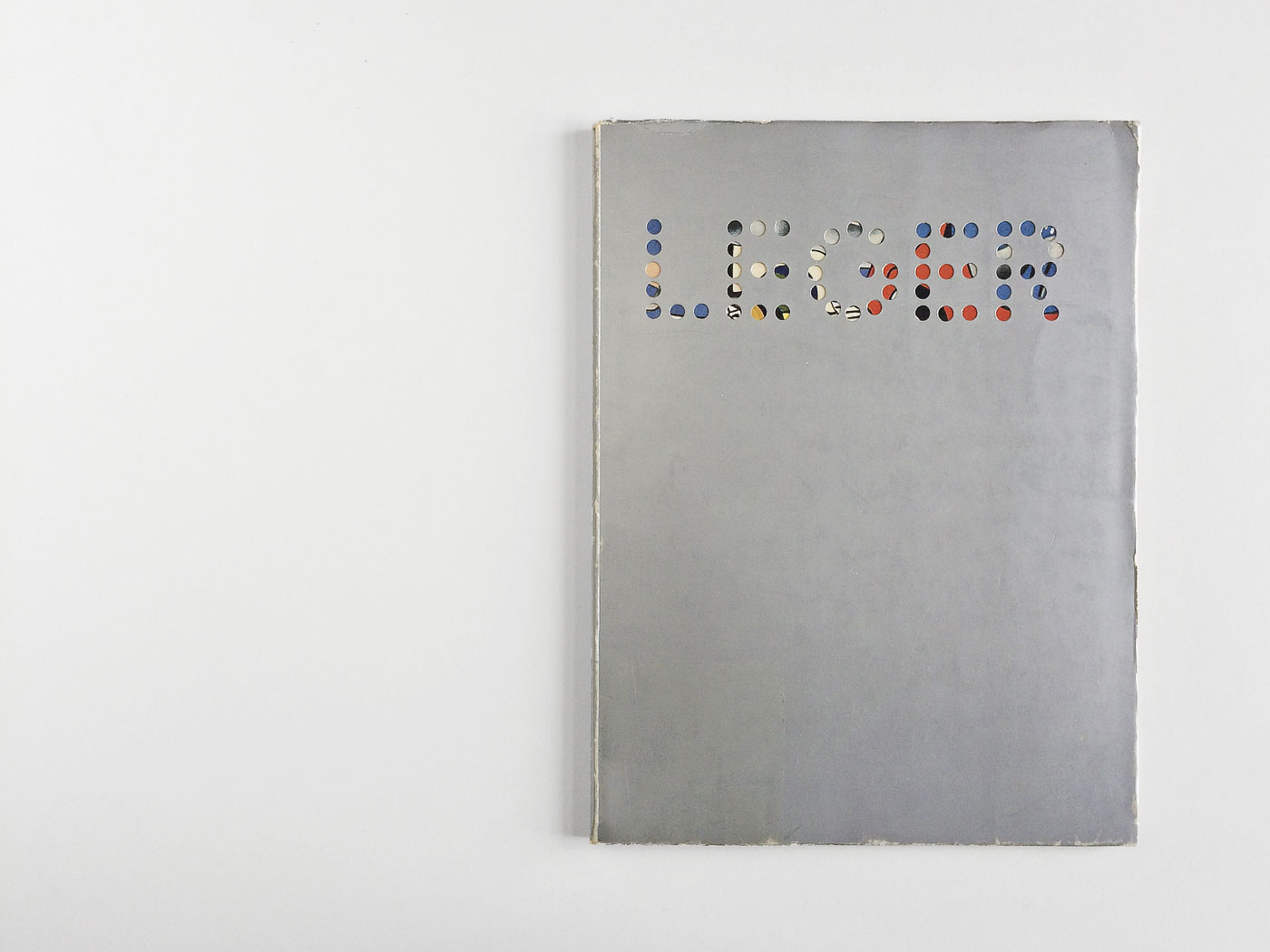
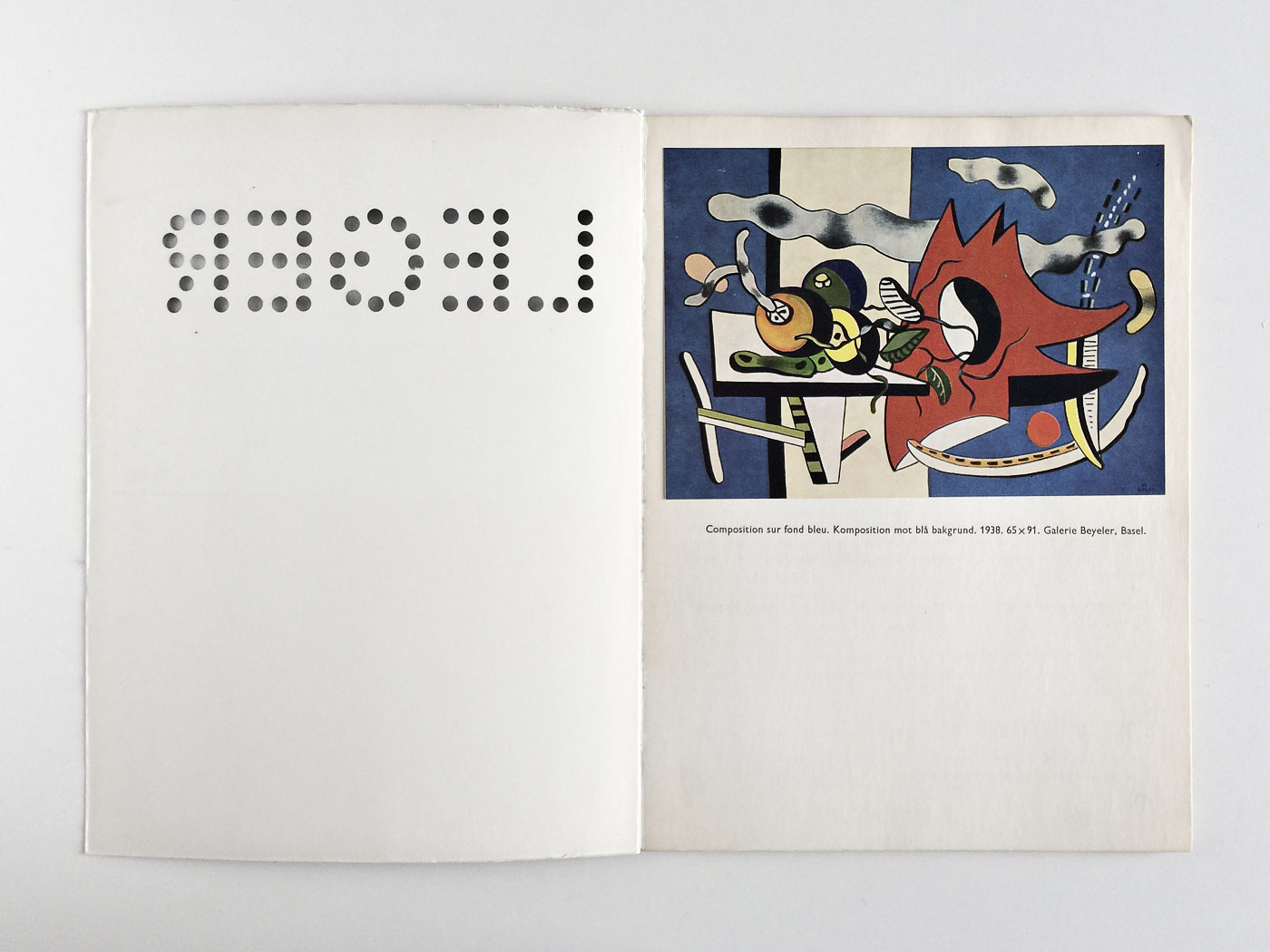
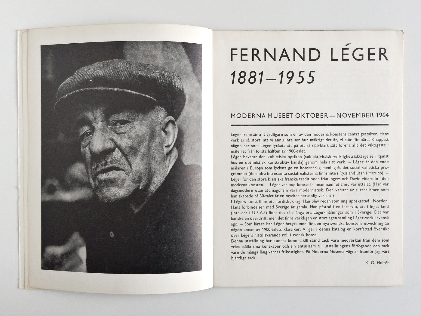
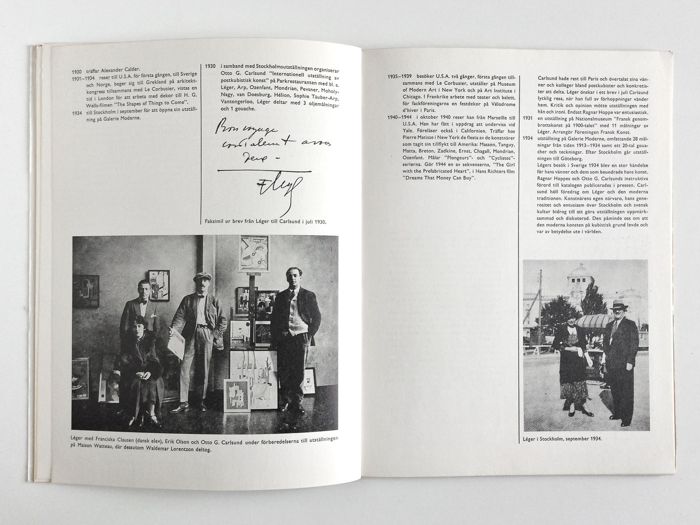
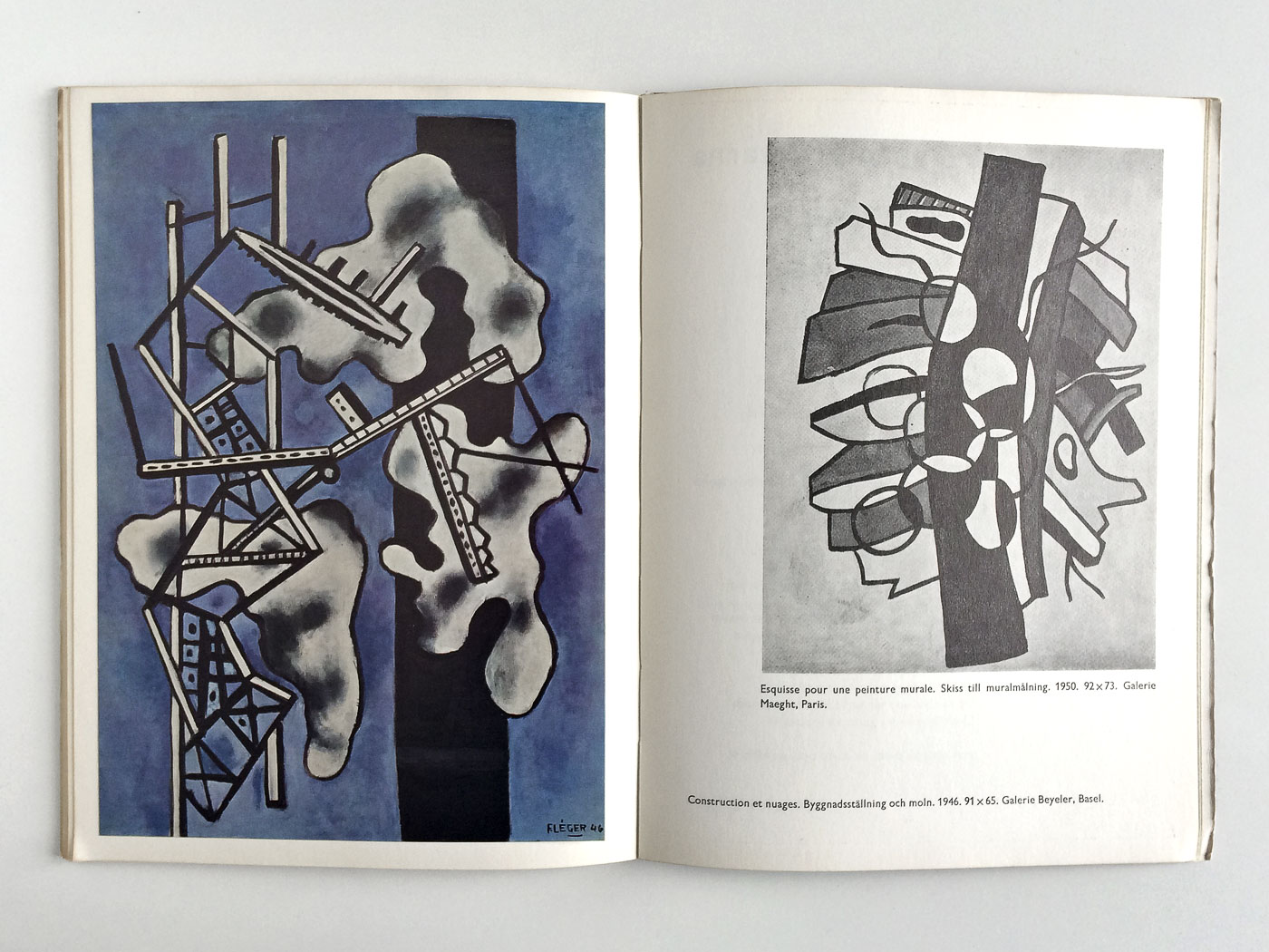
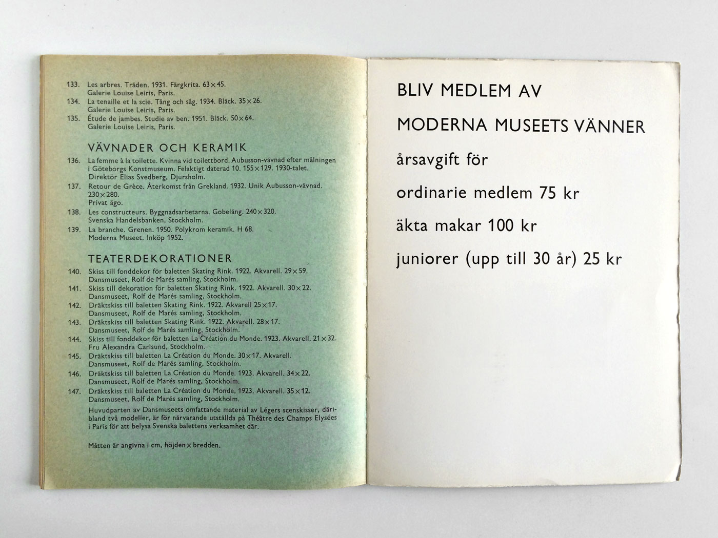
Fernand Léger
372 6Another exciting catalogue from Pontus Hulten’s early days at Moderna Museet. Especially its strong cover design and the sturdy typography appeal to me most. All colour images are tipped-in. Some time ago I found a little film of the catalogue in duet with a barcode reader.
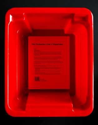
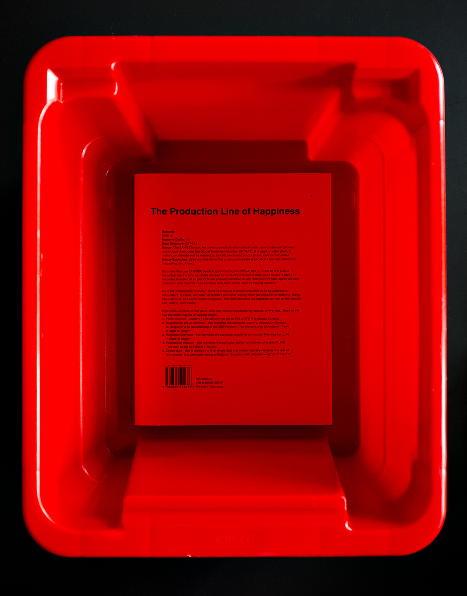
The Production Line of Happiness
370 6“The Production Line of Happiness” is an unusual volume in content and form. Sampled out of press releases, visual and textual material, essays and talks on the social functions of photography it’s something in between an artist’s book and an exhibition catalogue. It feels sympathetic that Christopher Williams’ self-conception resembles more the one of a factory worker than the one of an heroic artist. You don’t take a photograph. You make it.

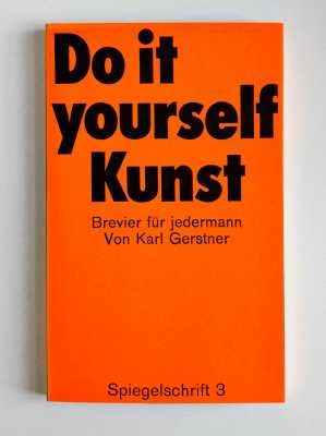
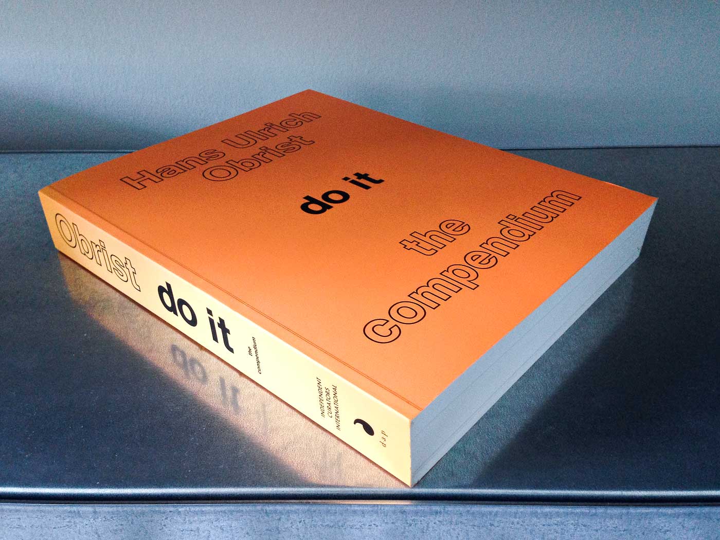
Do it – The Compendium
368 6Don’t know exactly where my fascination for this book comes from. Is it it’s bright orange colour that is slowly fading in the sun? The Helvetica Outline font on the cover? The relaxed and casual typography and layout? It’s well-proportioned physical form? Or simply the fact, that it brings together so many of my favourite artists?


Fabian Diem
has kindly submitted
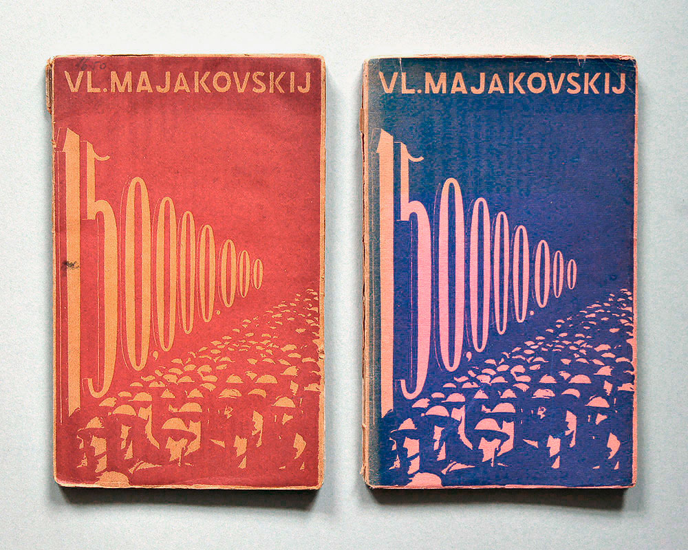
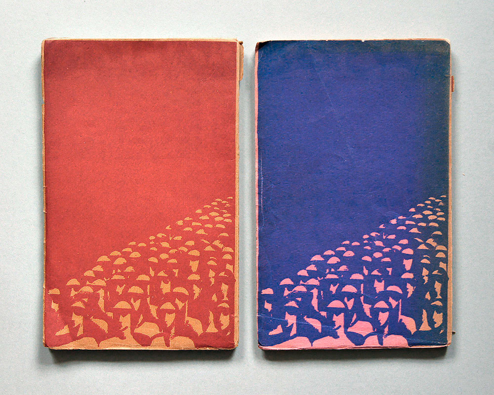
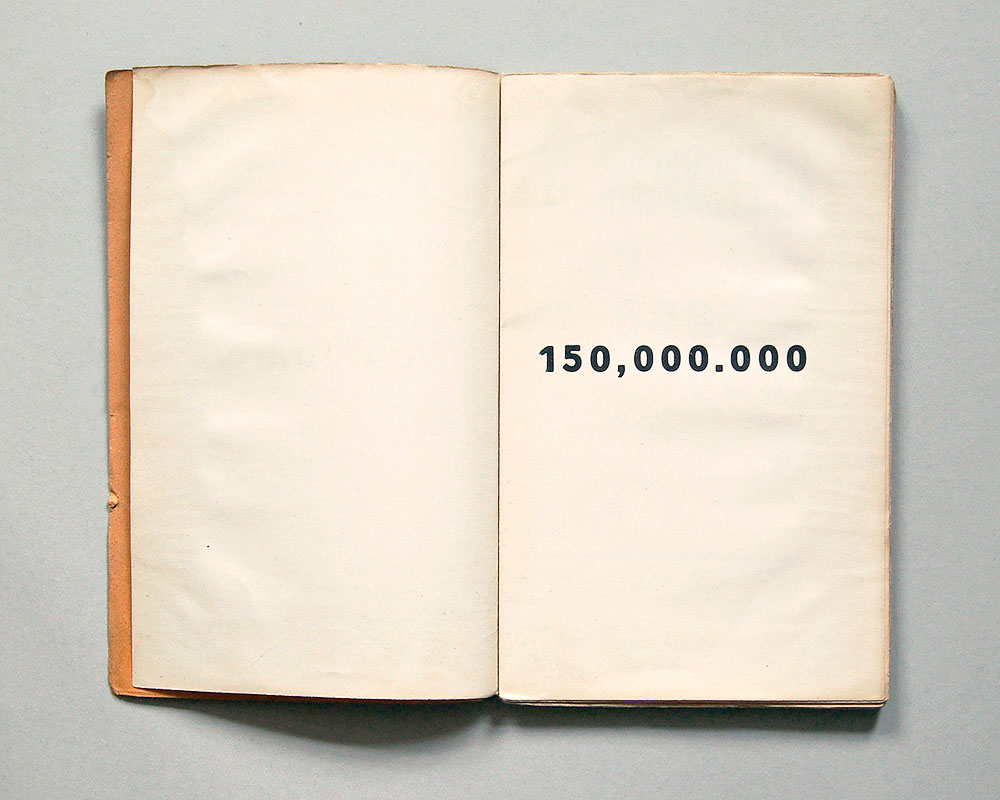
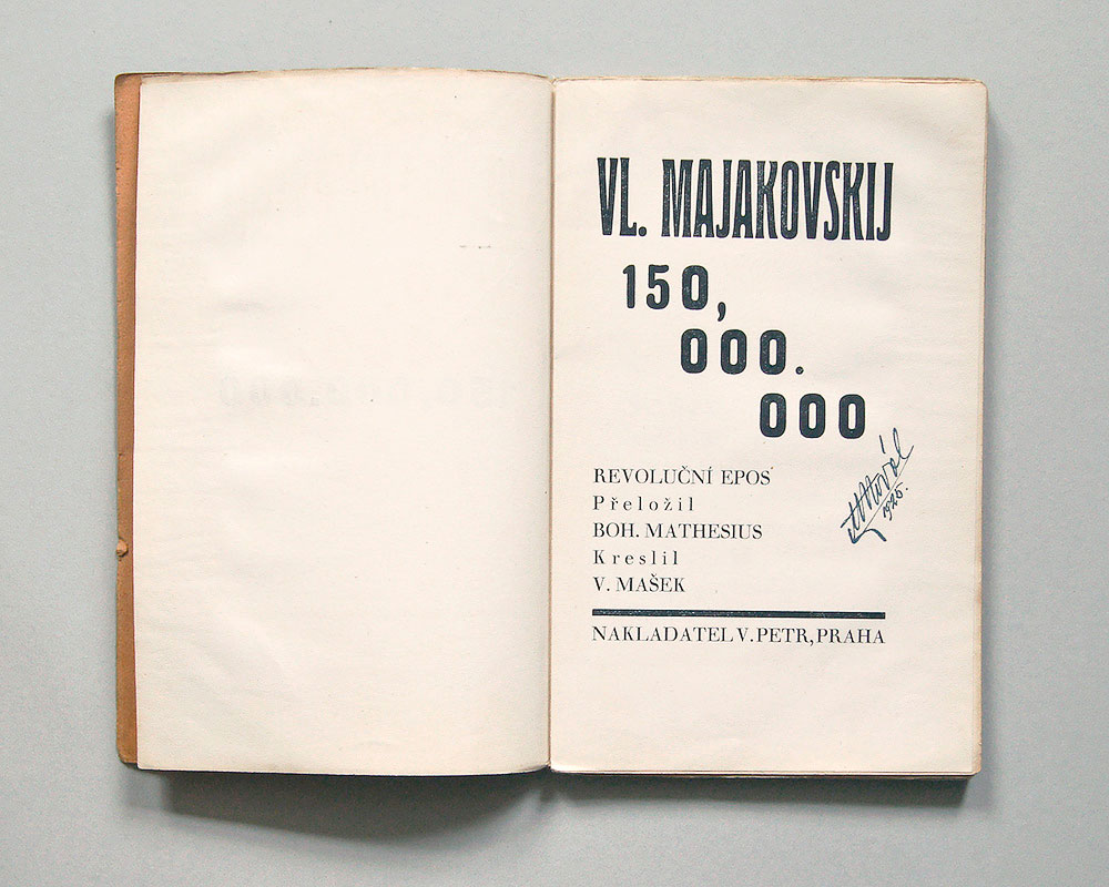
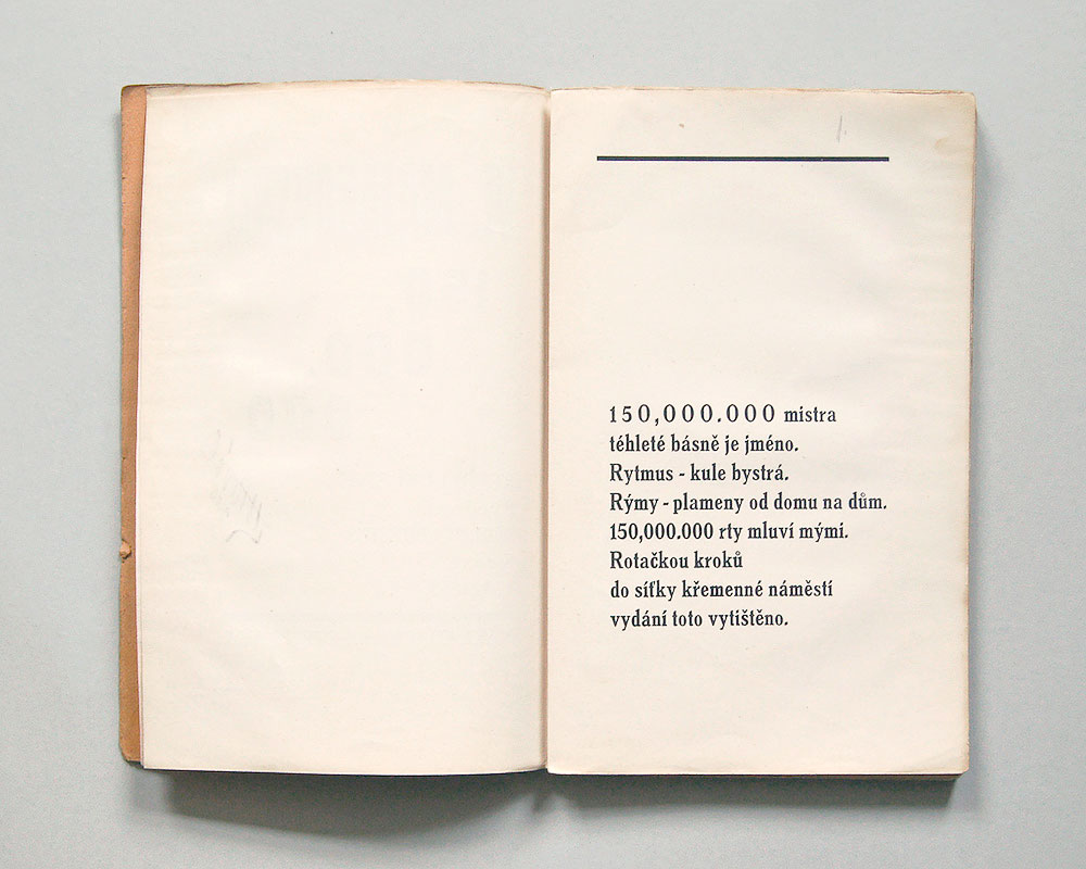
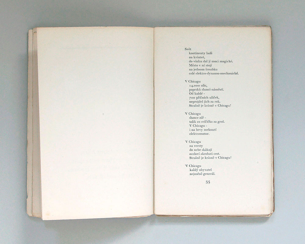
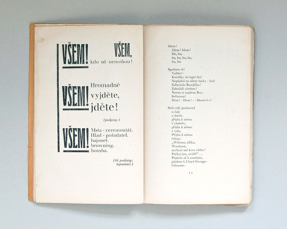
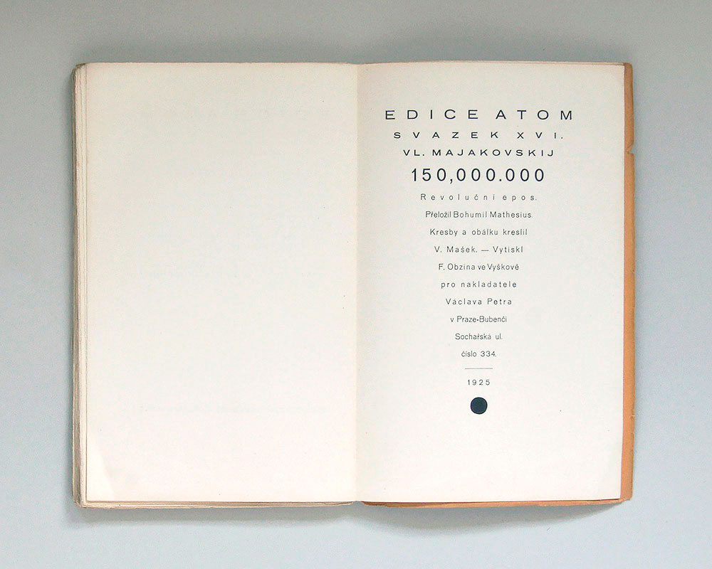
150,000.000
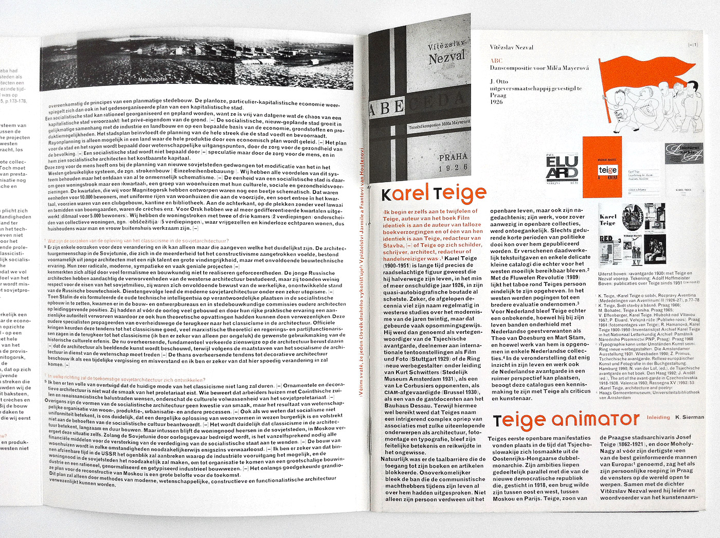
The Czech first edition of Mayakovsky’s famous poem 150,000.000 was illustrated by Václav Mašek. It was issued with two differently tinted soft-covers; red ink on beige paper and blue ink on pink paper along with a numbered and signed special edition. The cover art with its strong notion of the diagonal in the manner of the avant-garde, the abstracted wood-cut illustration and the simple, yet spectacular printing technique make this book such a unique piece. The typesetting follows basic rules of poetism, a sub-movement of the Czech avant-garde according to which type may become imagery and thus a part or even the poem itself.
Submitted by Fabian Diem
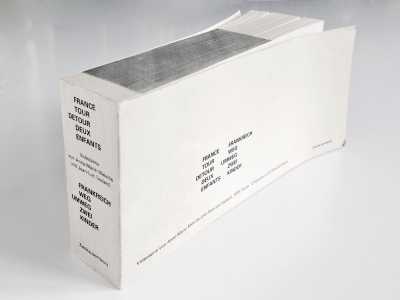
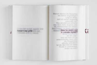
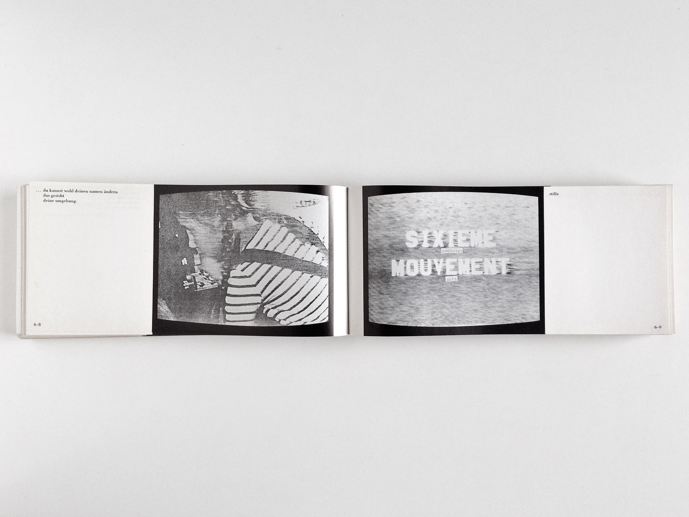
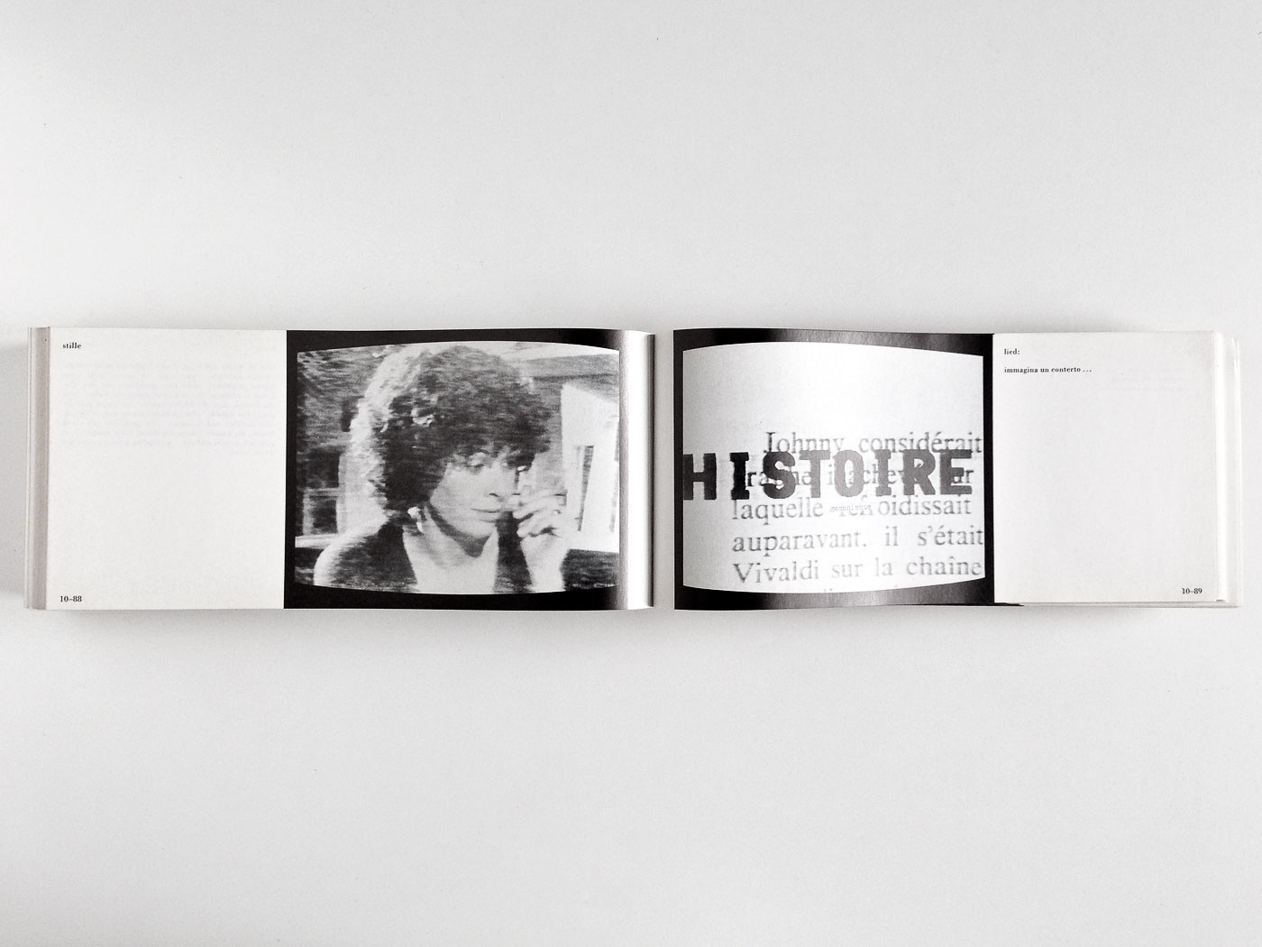
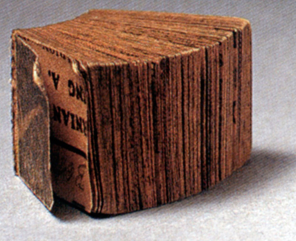
France Tour Detour Deux Enfants
364 4Godard’s astonishing twelve-part project for and about television examinates childhood within the contexts of family, home, work, and the shared idea of life and time within contemporary culture. It is based on the 19th century French children’s classic “La Tour de la France avec deux enfants”. Radical content found a radical form: A book like a briquette that reads like a score for an inner movie.
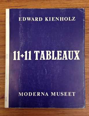
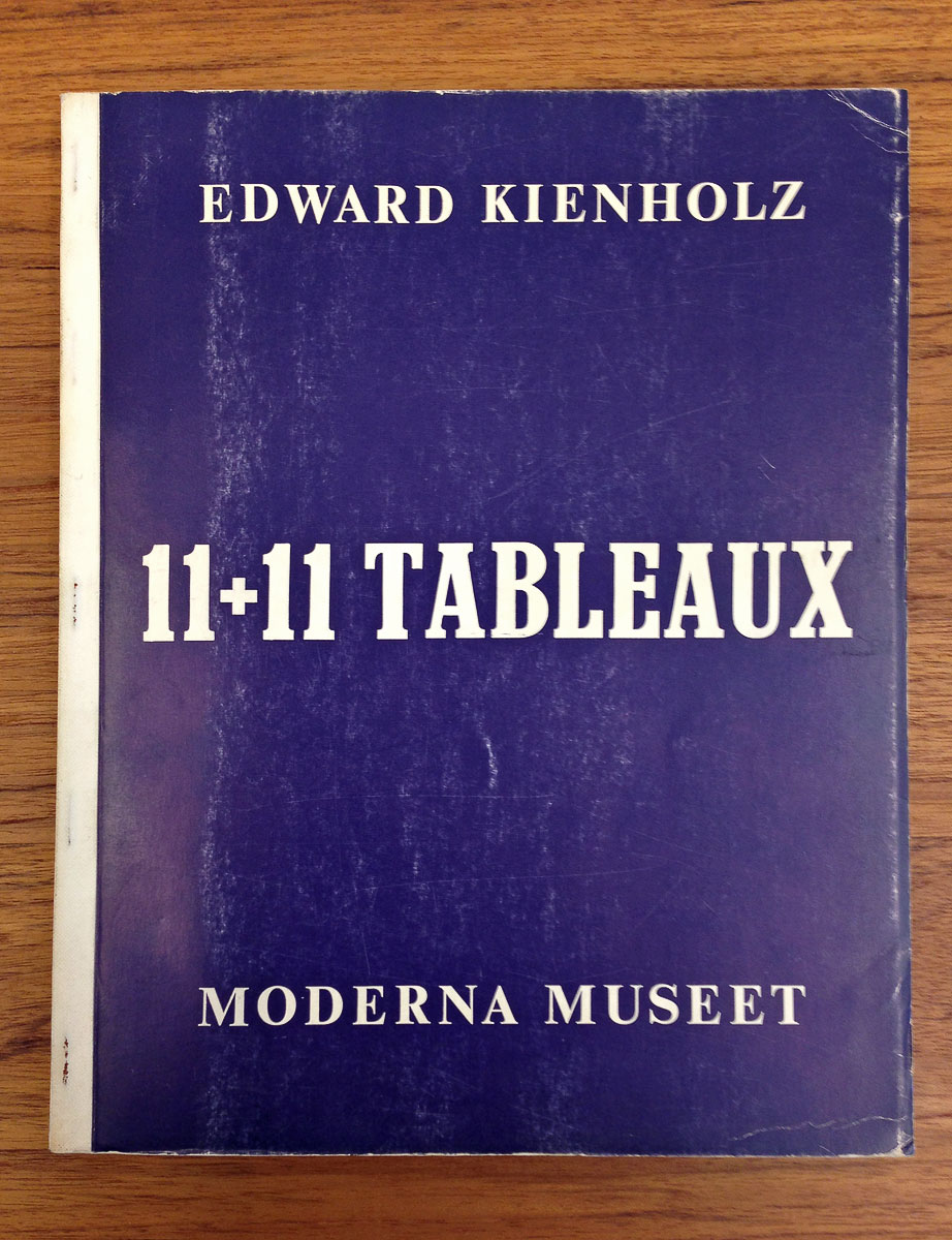
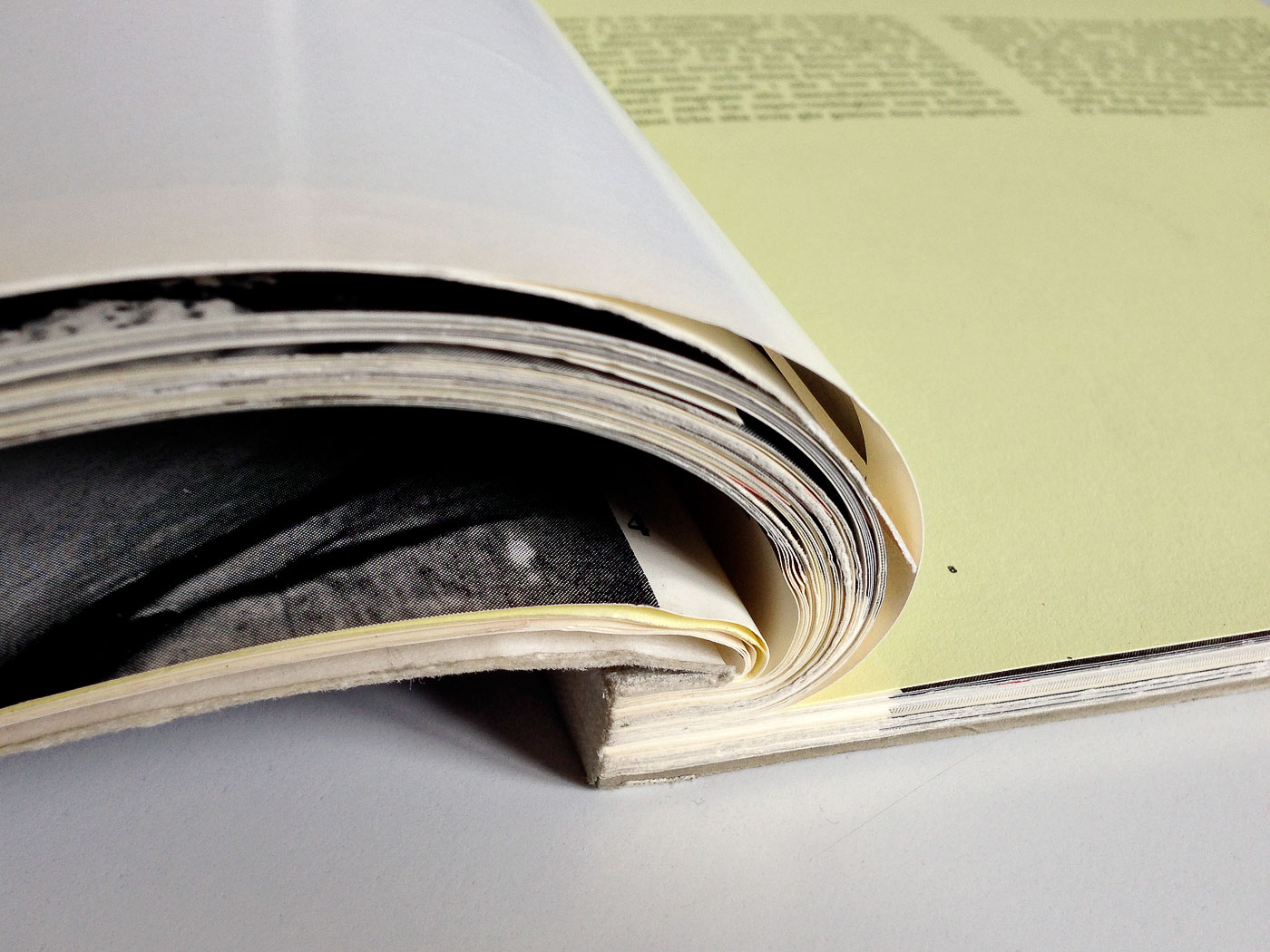
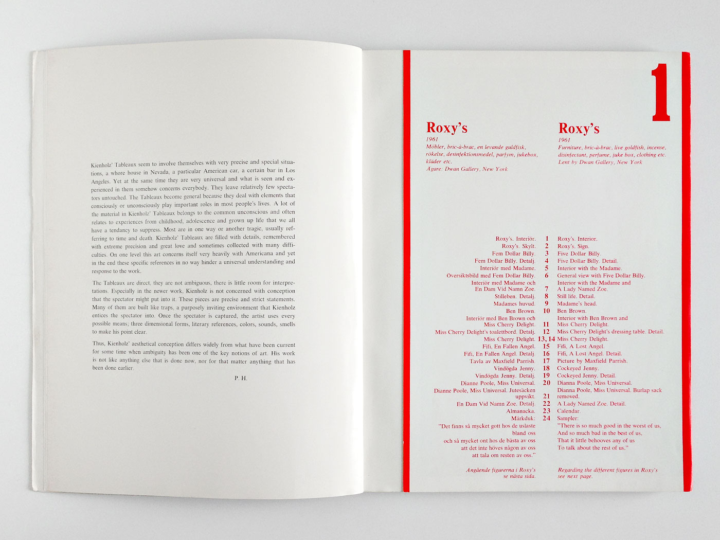
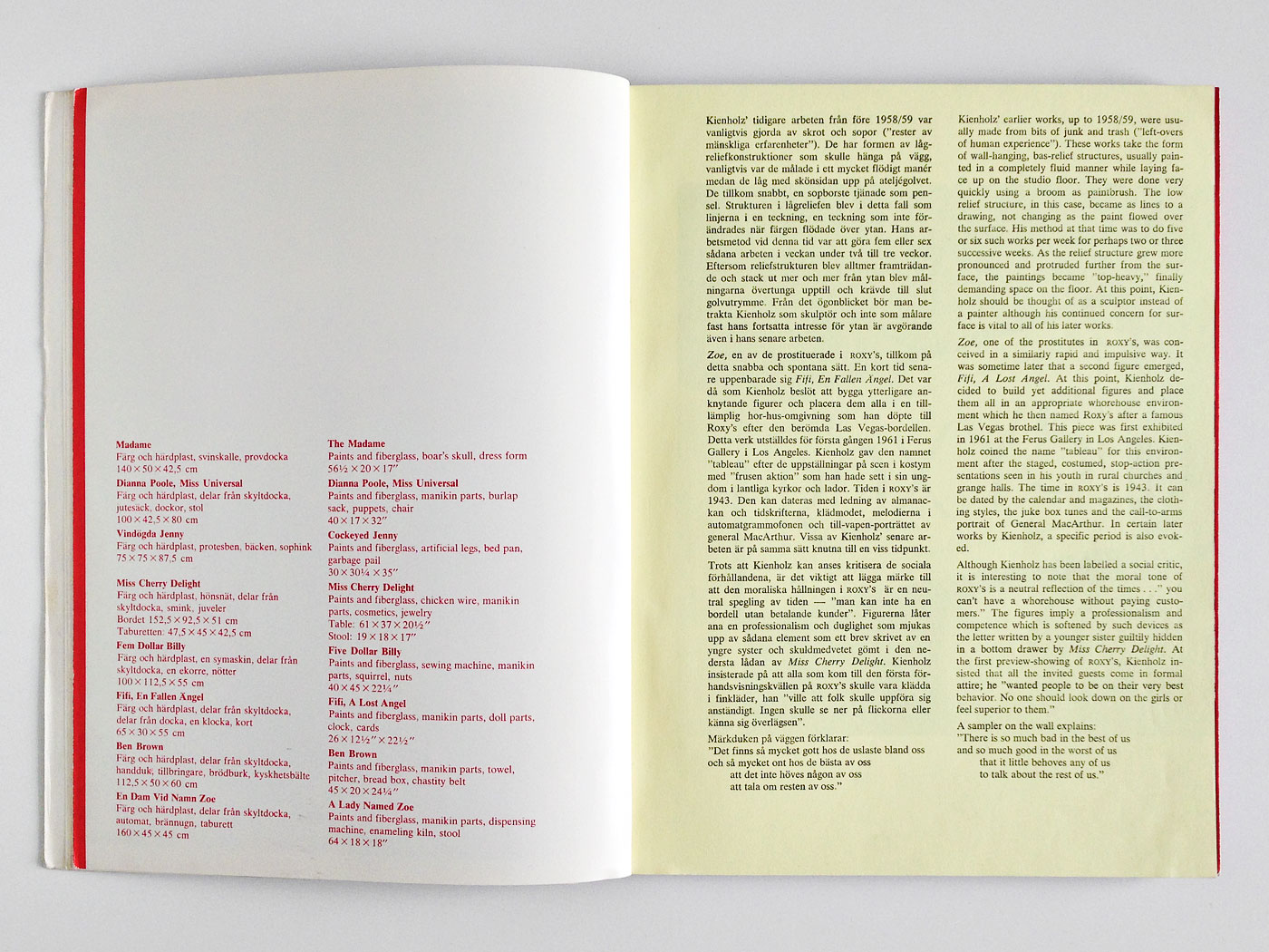
11+11 Tableaux
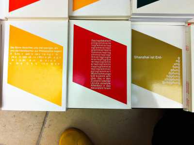
363 5Pontus Hultén was one of the leading museum directors and what’s more, he established the role of the curator as we know it today. From early on he praised the role of the catalogue as “the part of the exhibition, that can travel around the world (...) and the only significant part that will remain after the exhibition is over.” During his time at Moderna Museet, Stockholm he was often involved in the catalogue design. Together with John Melin and Gösta Svensson he realized a stunning series of books with exciting typography and tactile, object-like qualities.
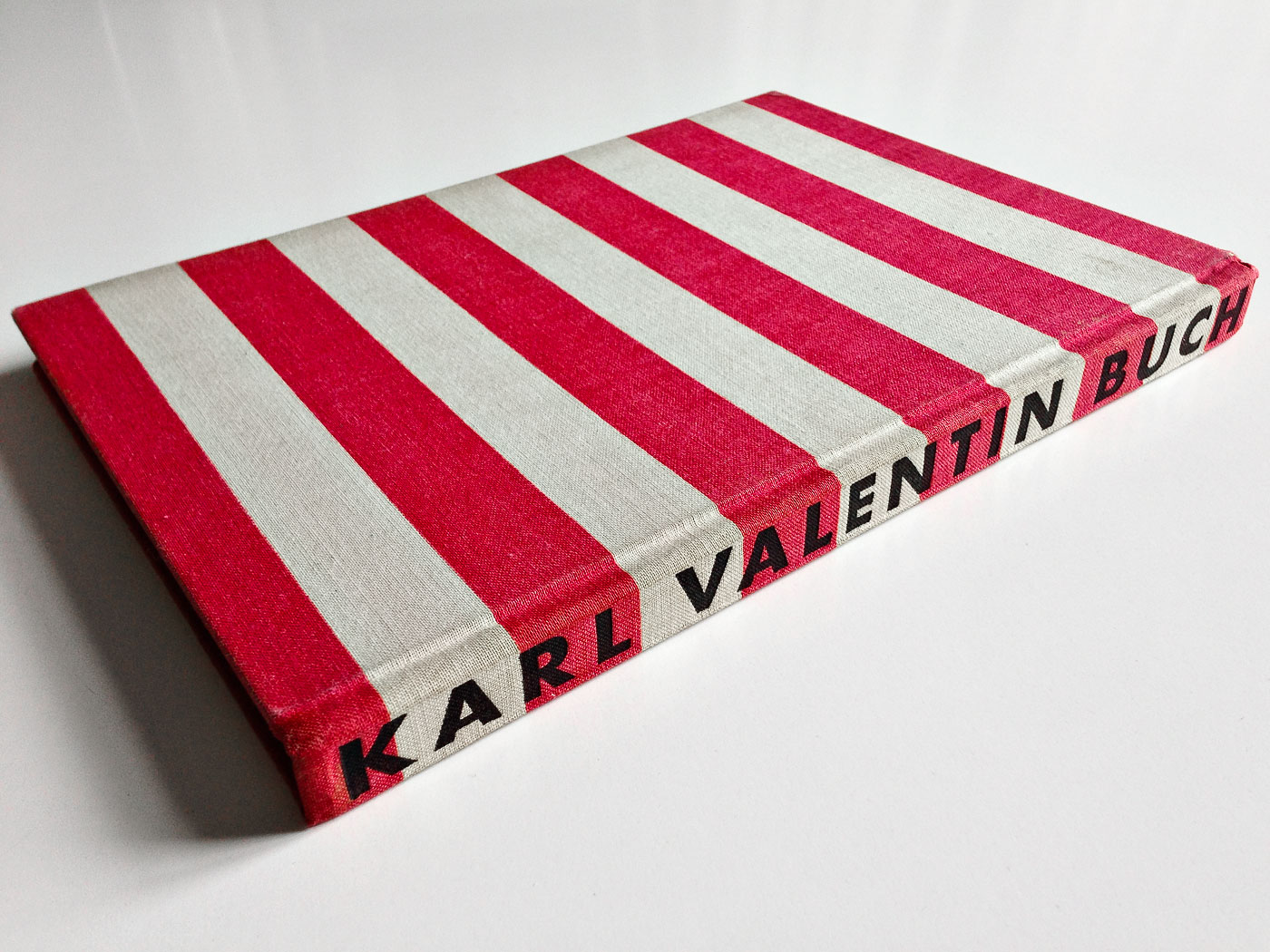
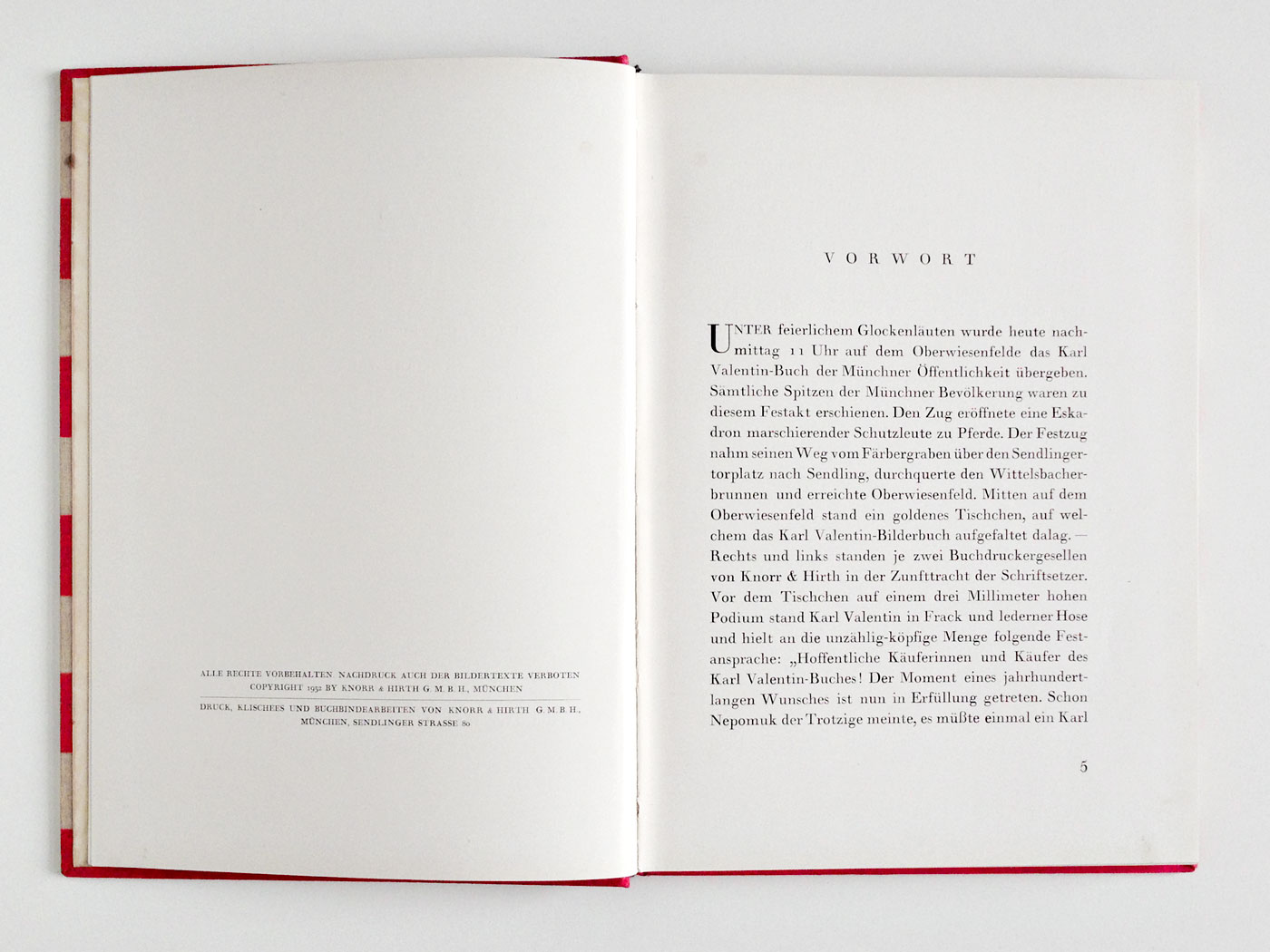
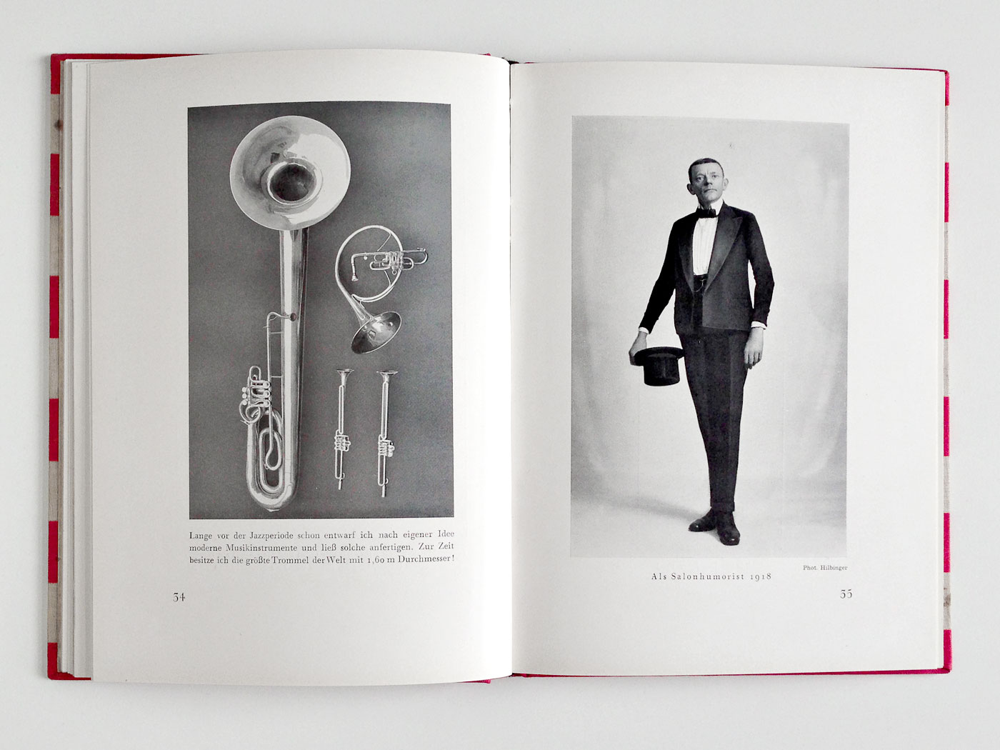
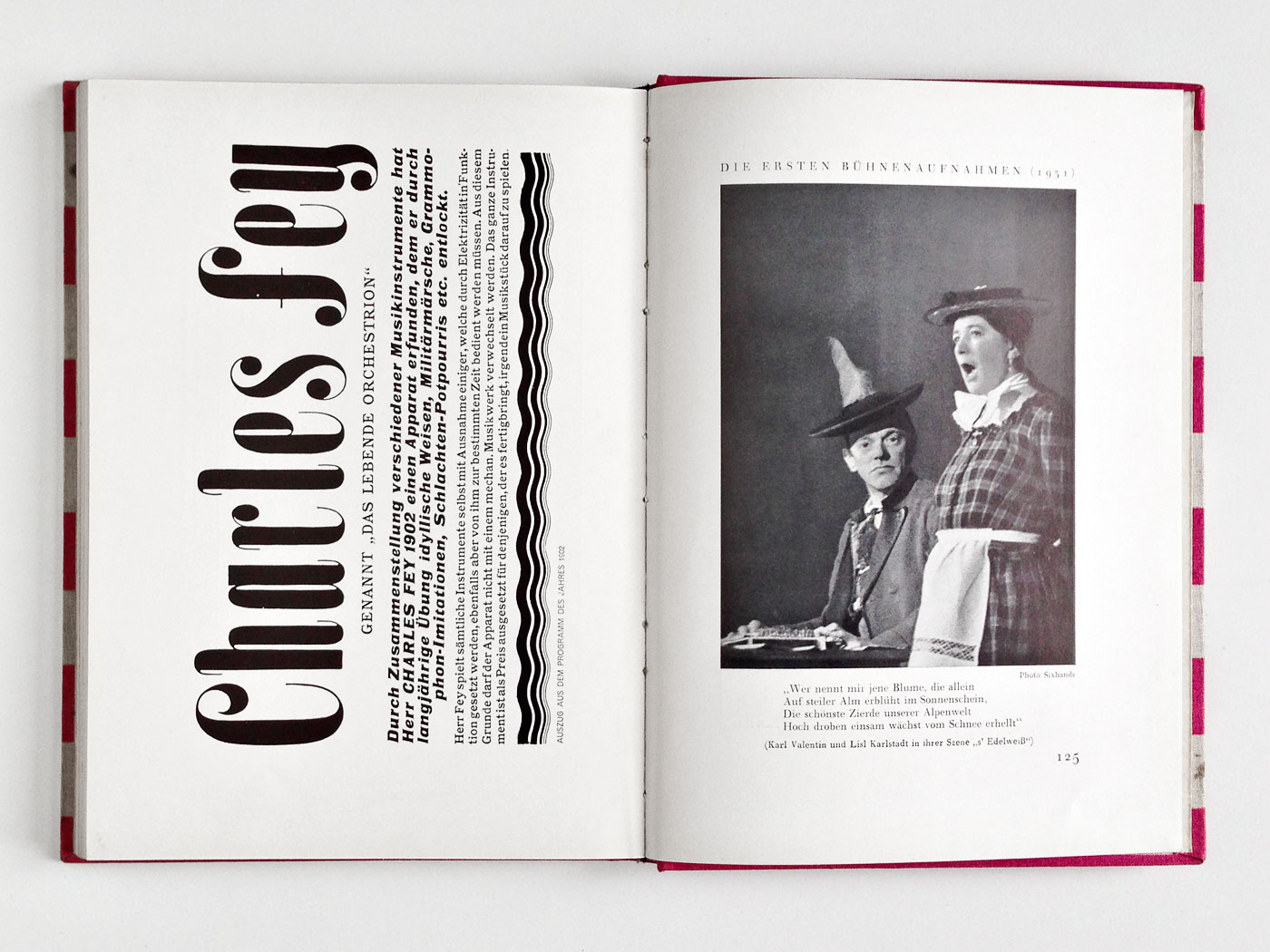
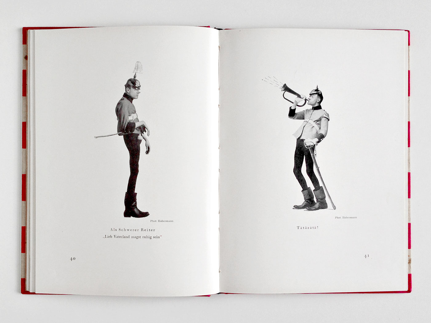
Das Karl Valentin Buch
361 6I’m no collector, I’m a hunter. I fell in love with this book some time ago and was hunting for it since I saw it in a second hand store – unfortunately far too highly priced (fig. 1). Last week I shot a rare copy with horizontal instead of vertical stripes (fig. 2), signed by Karl Valentin and Lisl Karlstadt, at a bargain price. If you speak German, you should definitely read Valentin’s nice introduction (fig. 3). Some books can make you happy!

Christian Lange
has kindly submitted
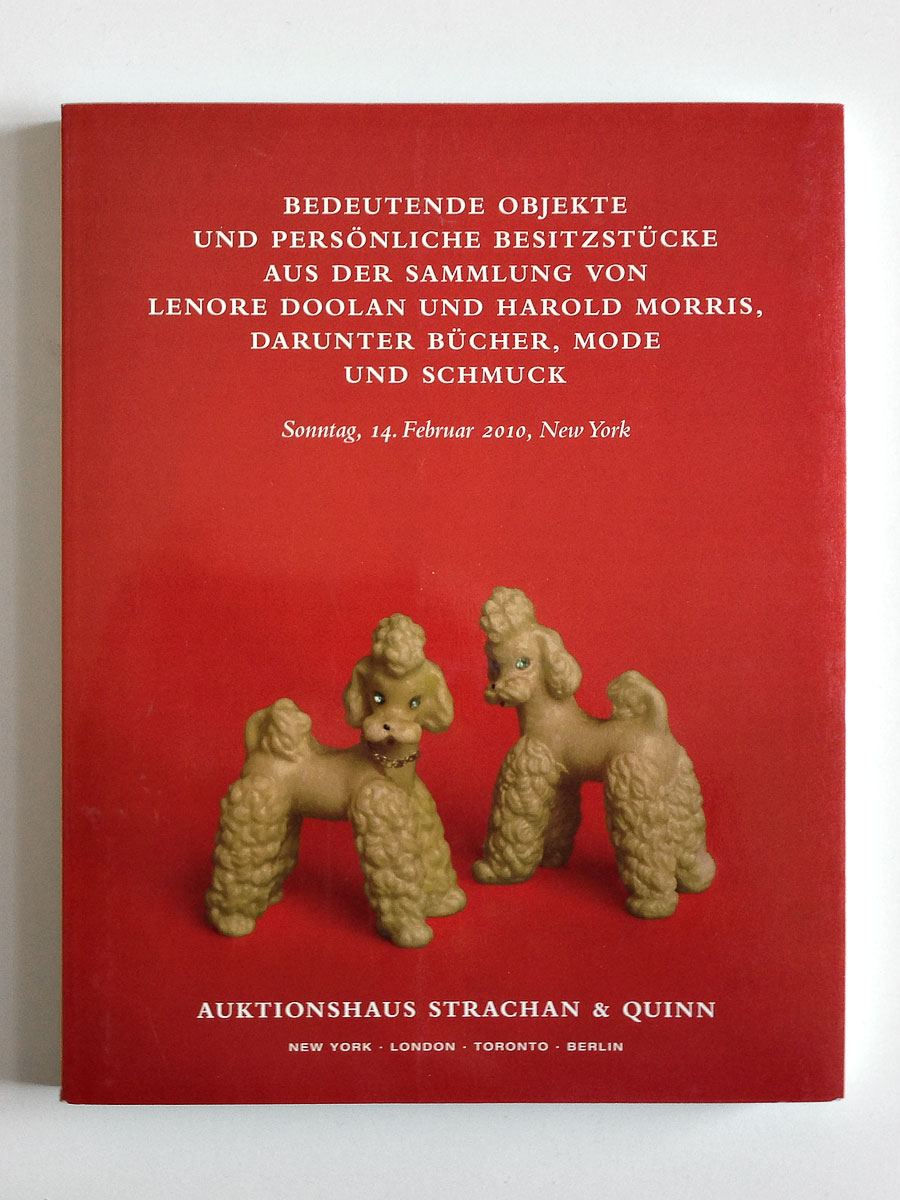
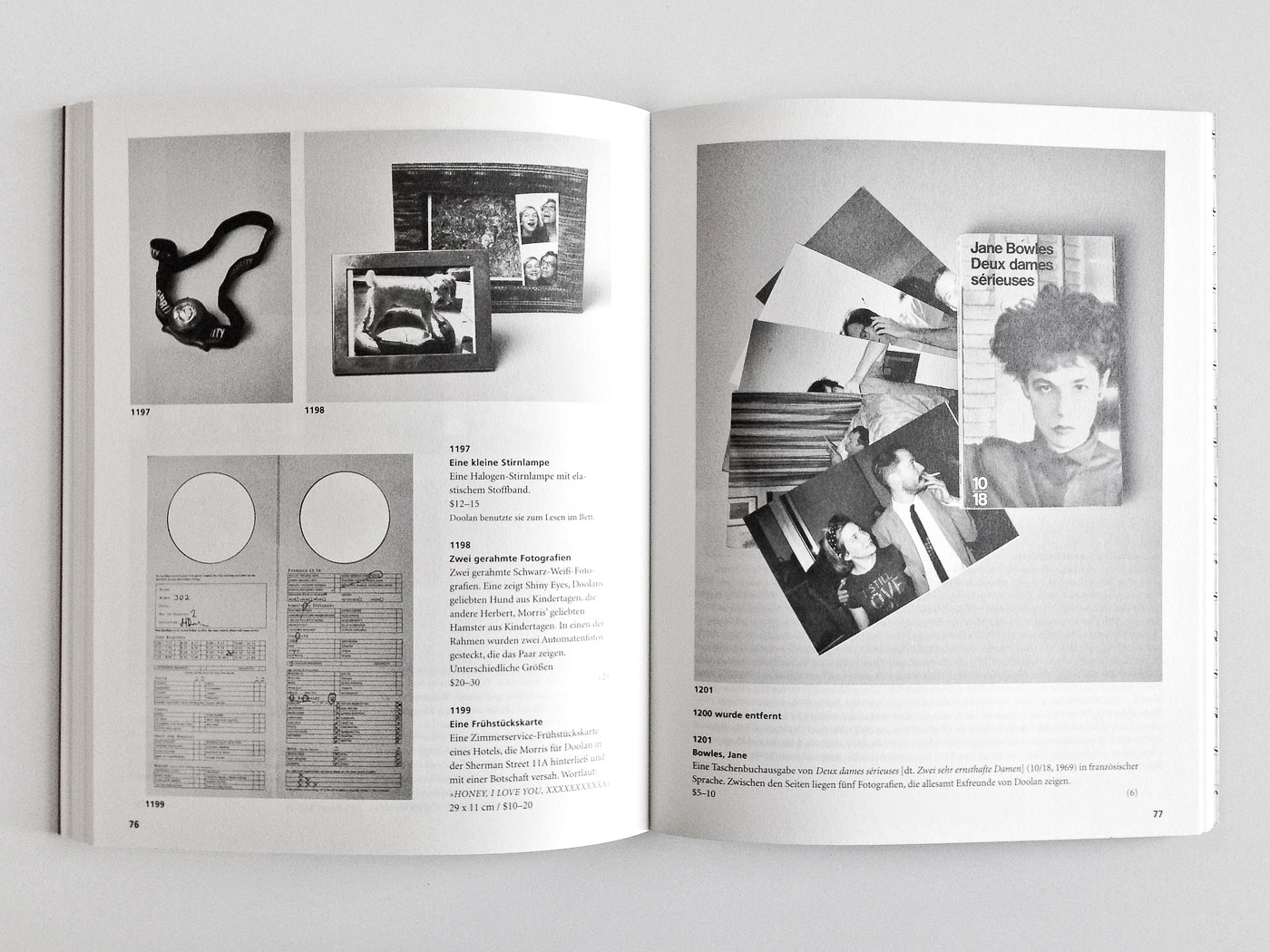
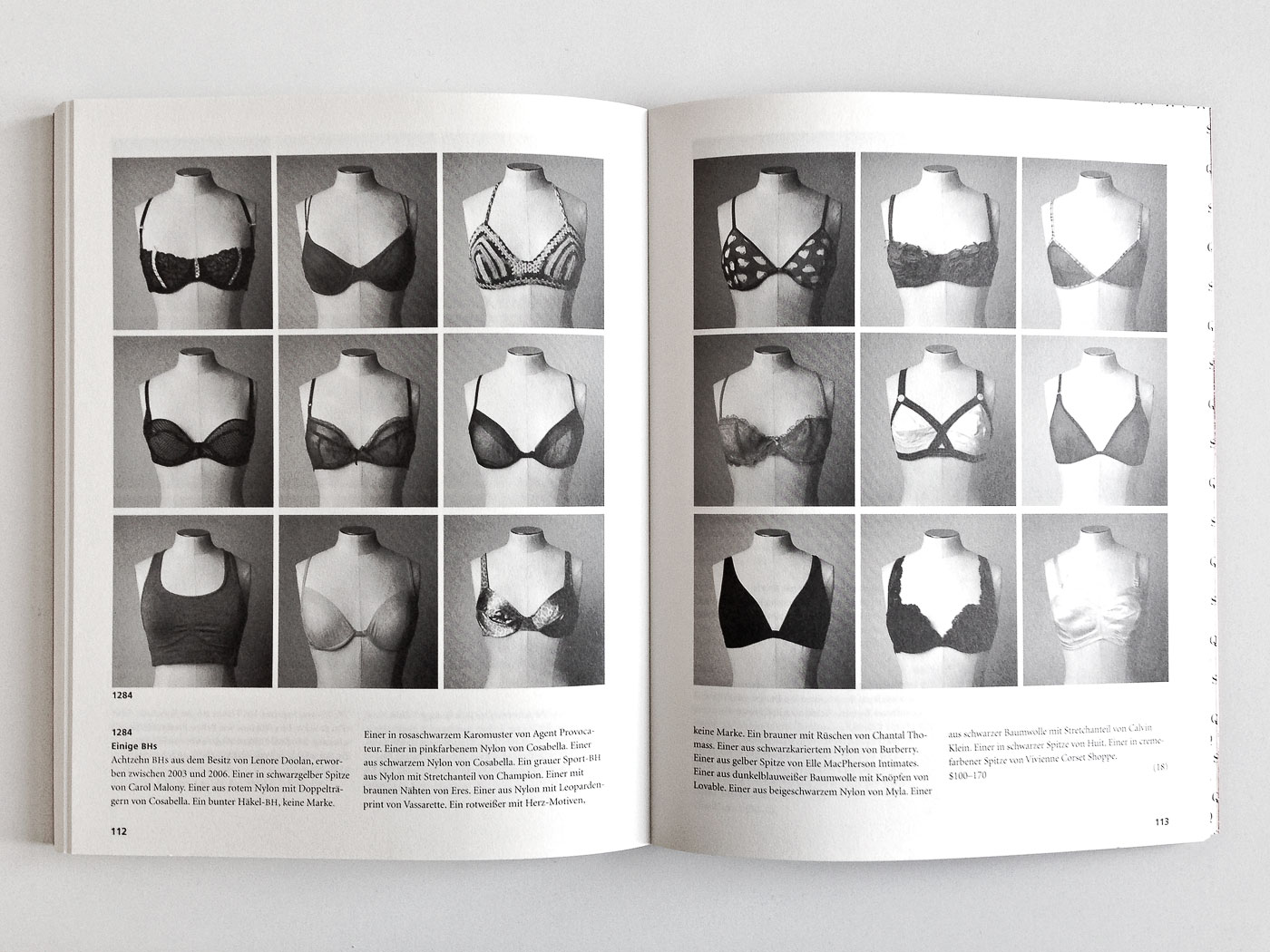
Bedeutende Objekte und persönliche Besitzstücke
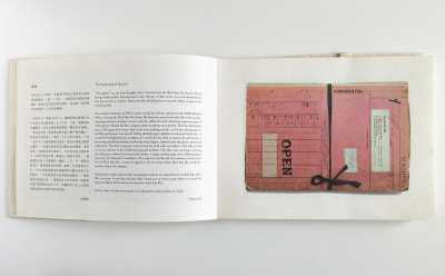
A declaration of love: a novel in form of a fictitious auction catalogue, the American artist Leanne Shapton tells the love story between two people illustrated with 332 objects, photographs, letters and books.
Submitted by Christian Lange
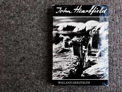
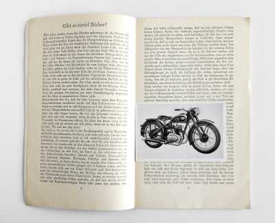
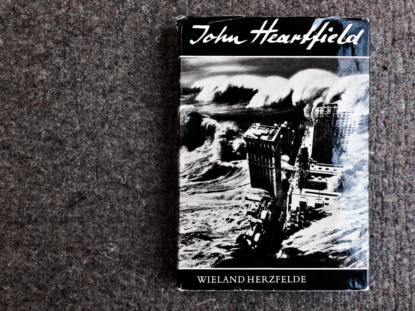
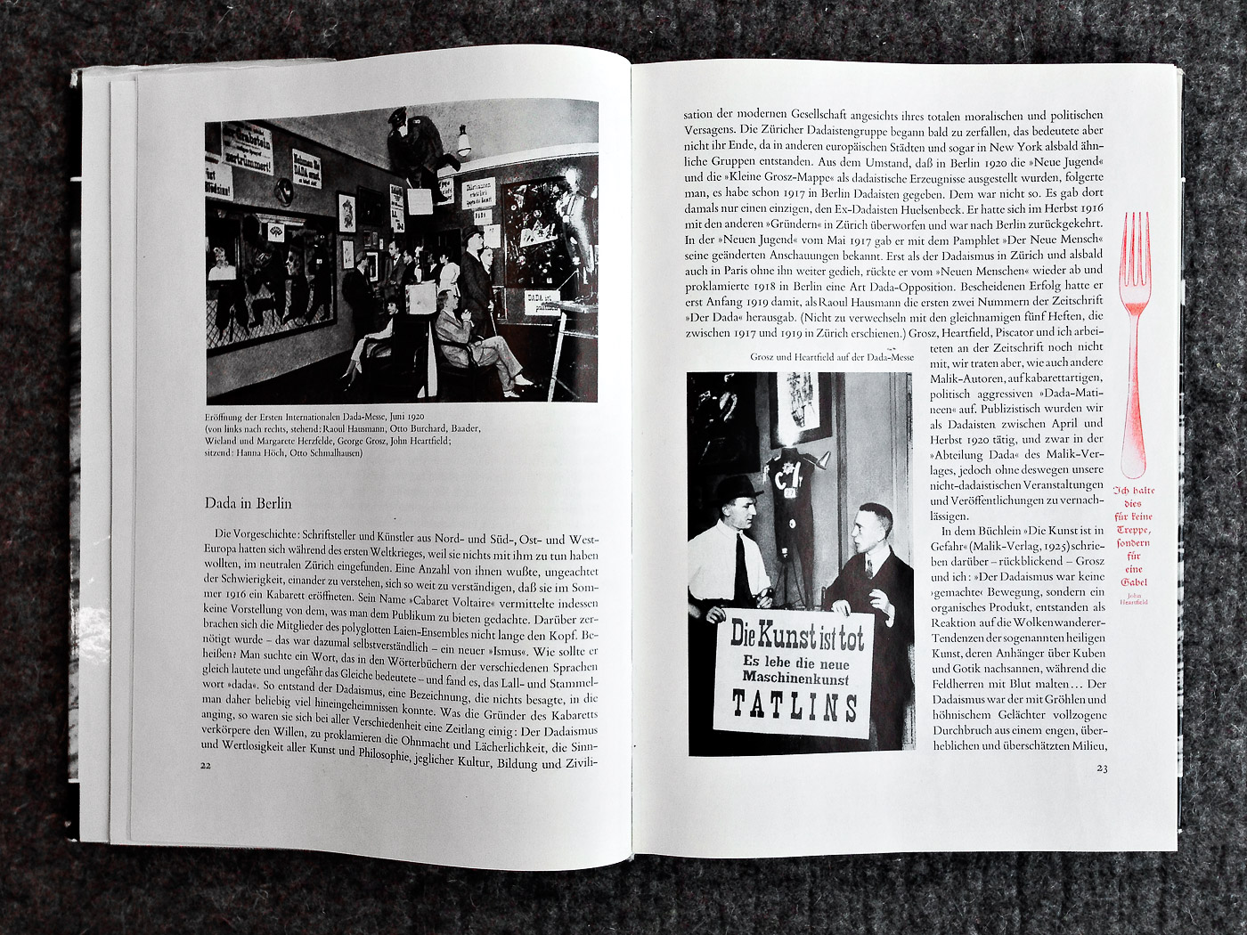
John Heartfield – Leben und Werk
354 4John Heartfield’s early works (book covers, posters and other printed matter) were and still are a revelation for me. The definite monograph on his oeuvre is this one, edited by his brother Wieland Herzfelde and published in the former GDR in the 1960’s. A treat for the eyes in design as well as production.
Michael Dyer
has kindly submitted
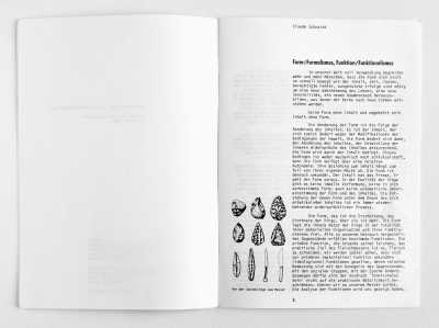
Die gute Form, Teigwaren aller Art
I came across this book on pasta in a dusty Zurich shop; I could tell by the spine alone that it was special (as is often the case). The entire book is printed in a single red ink, on a buff colored stock. The type is set discreetly but with personality. The real pleasure of the book is the pasta imagery (photos and silhouettes) shown in elevation, and sometimes in section as well. Totally unexpected presentation of material makes a lasting impression.
Submitted by Michael Dyer

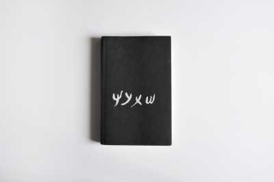
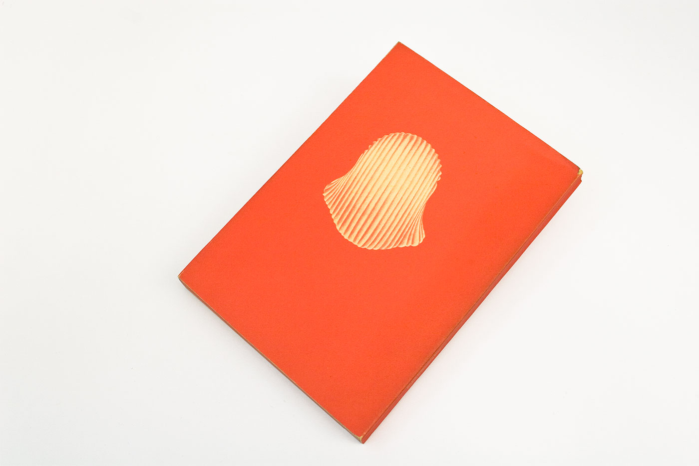
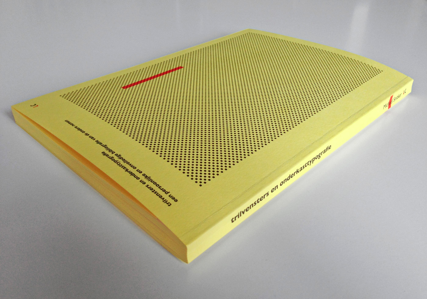
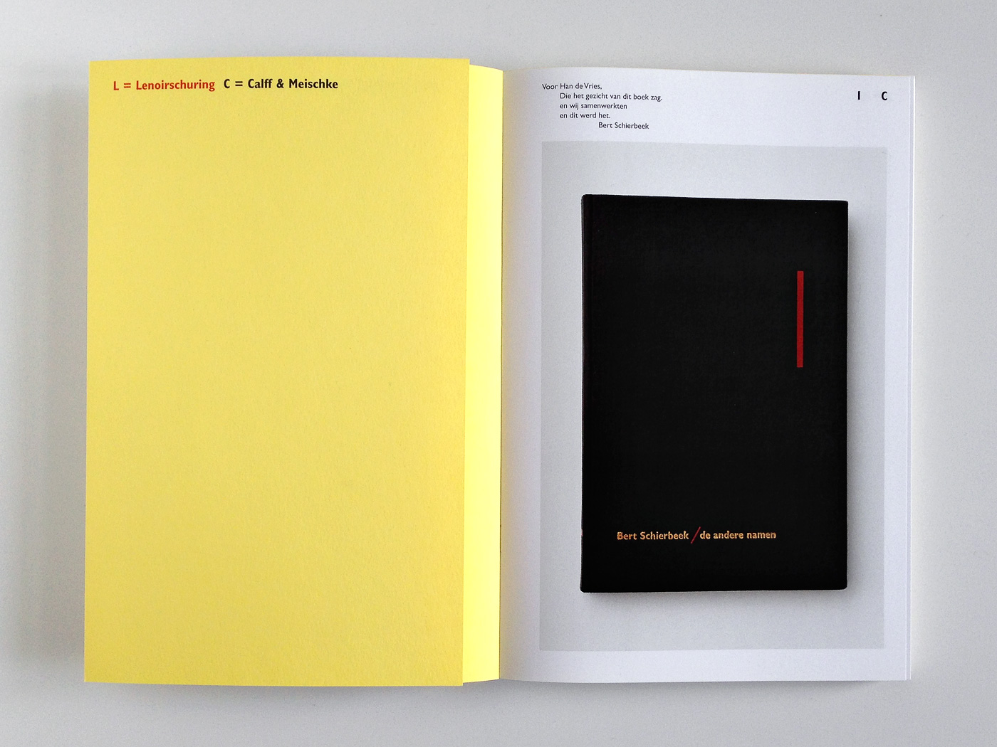
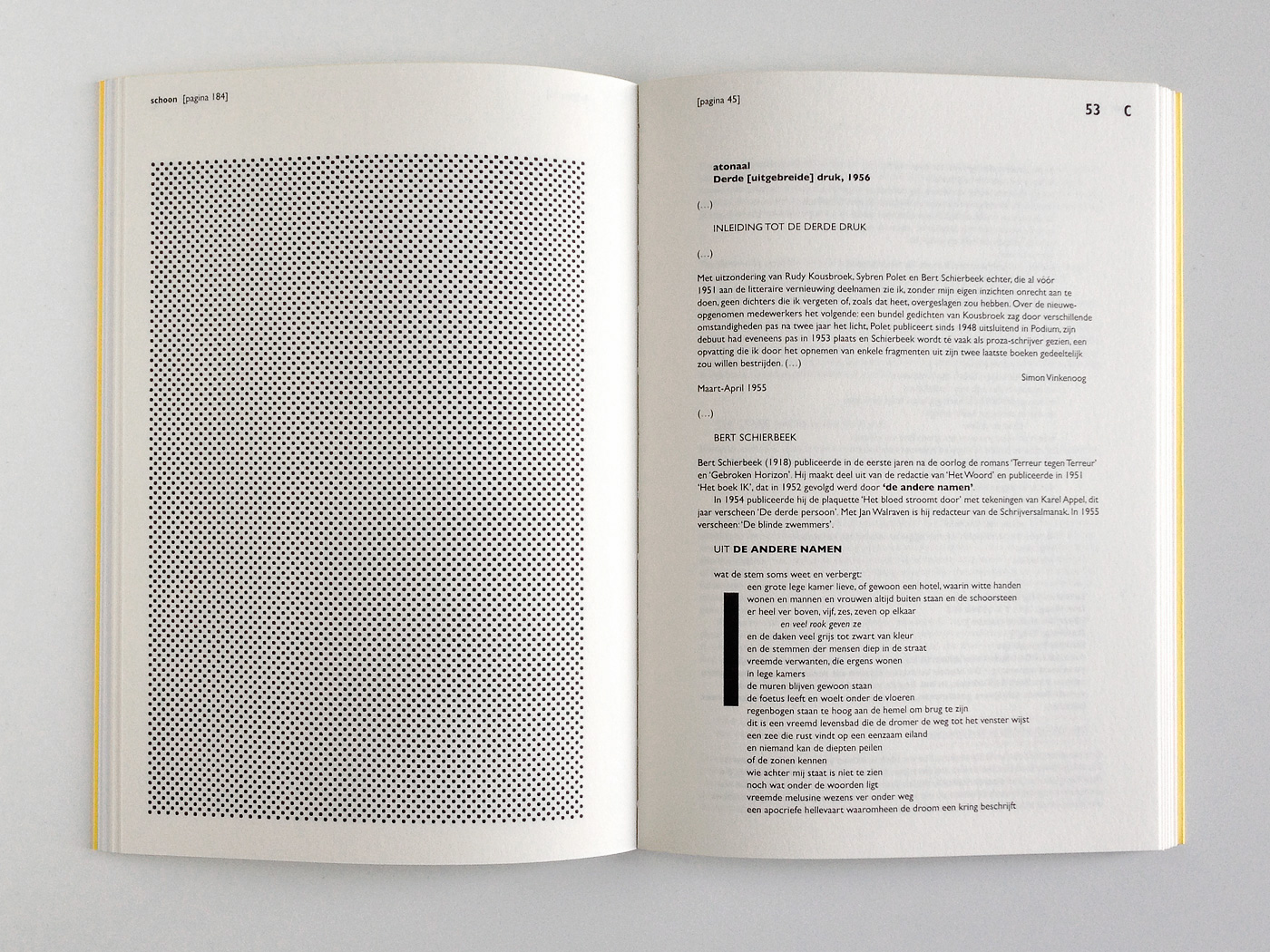
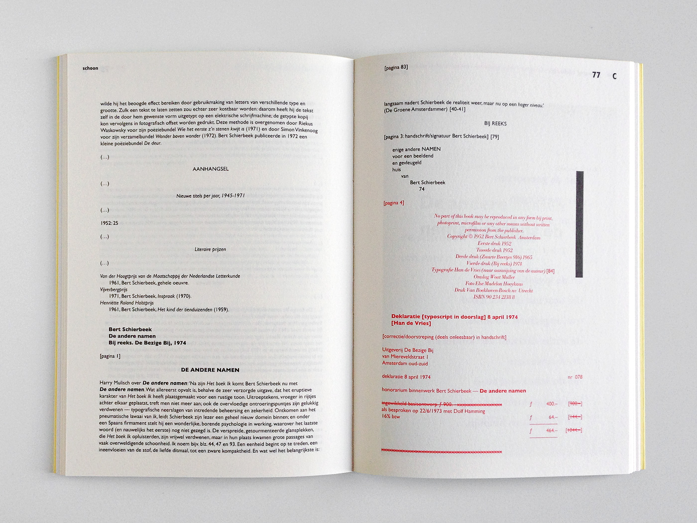
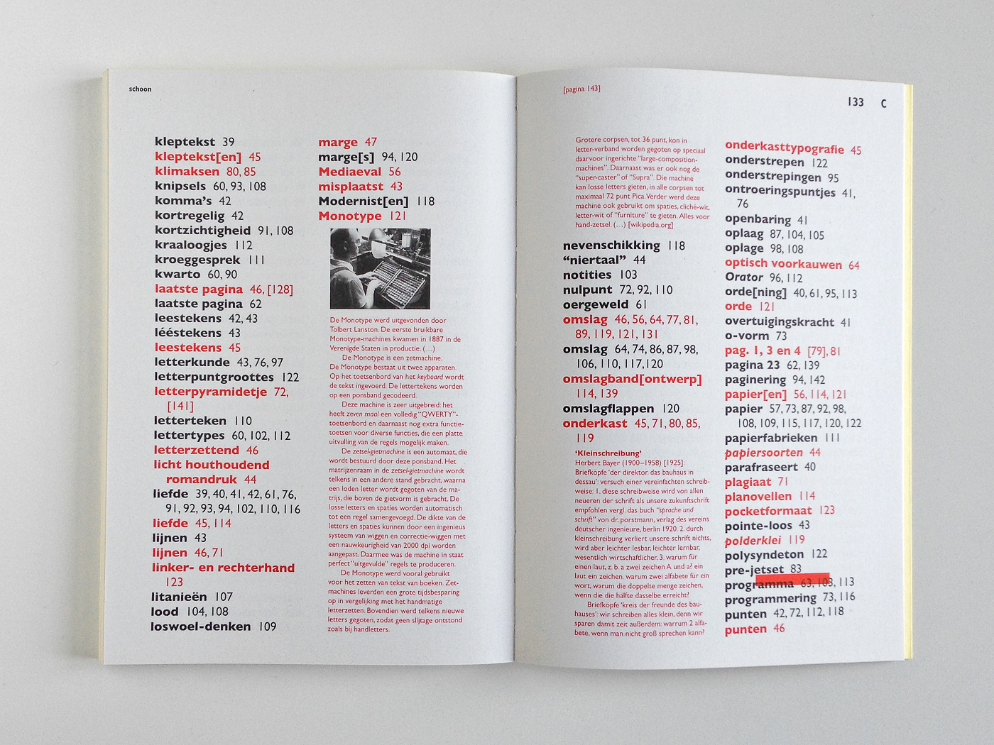
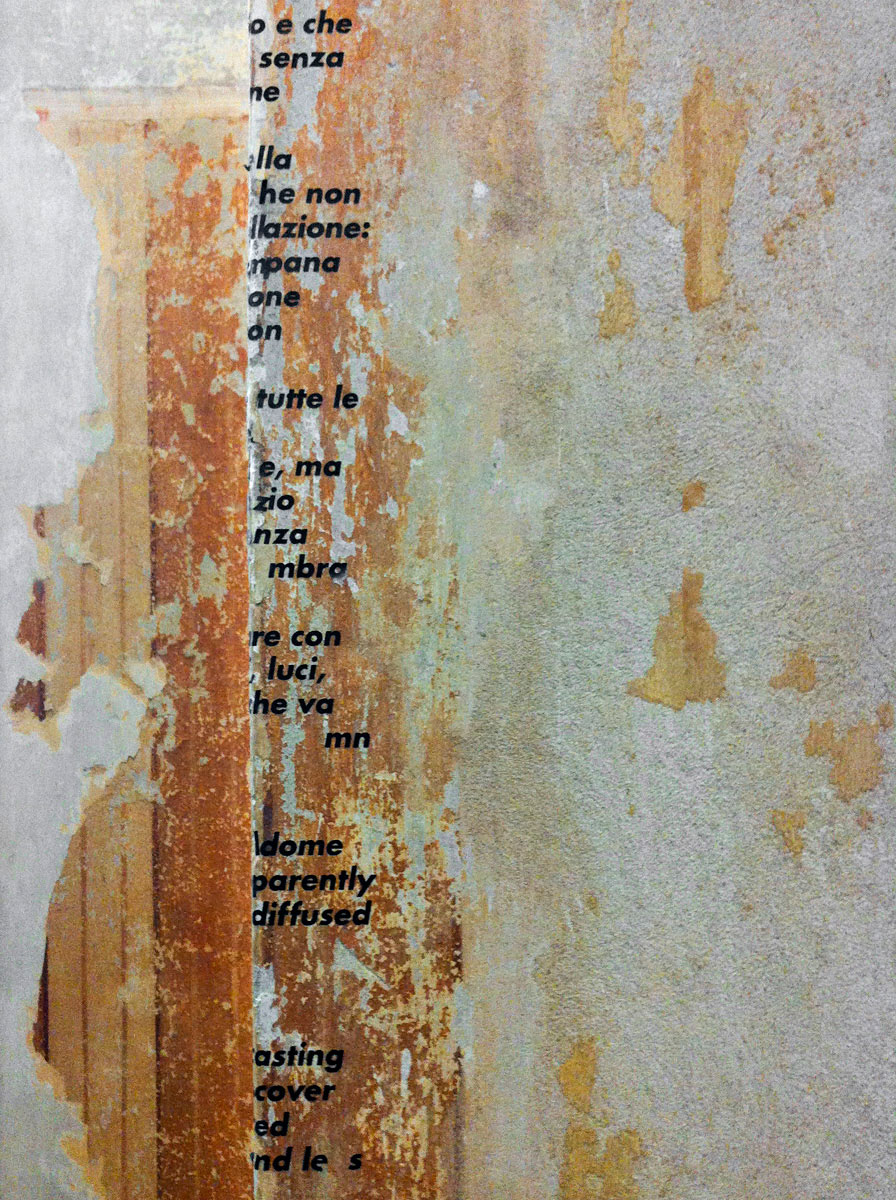
Trilvensters en onderkasttypografie
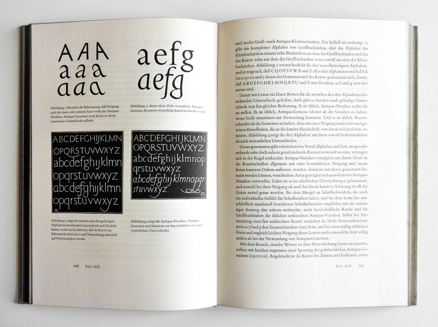
352 5This book documents a love affair: Michaël Snitker has collected almost everything on Bert Schierbeek’s experimental novel ‘De andere namen’ from 1952 – letters, reviews, publication statements, royalty calculations, interviews, references – and turned them into a wonderful book. Its tactile quality is magnificent, the refined Gill typography is a delight. Could hardly decide which pages to show, they’re all so beautiful.
Victor Malsy
has kindly submitted
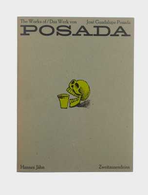
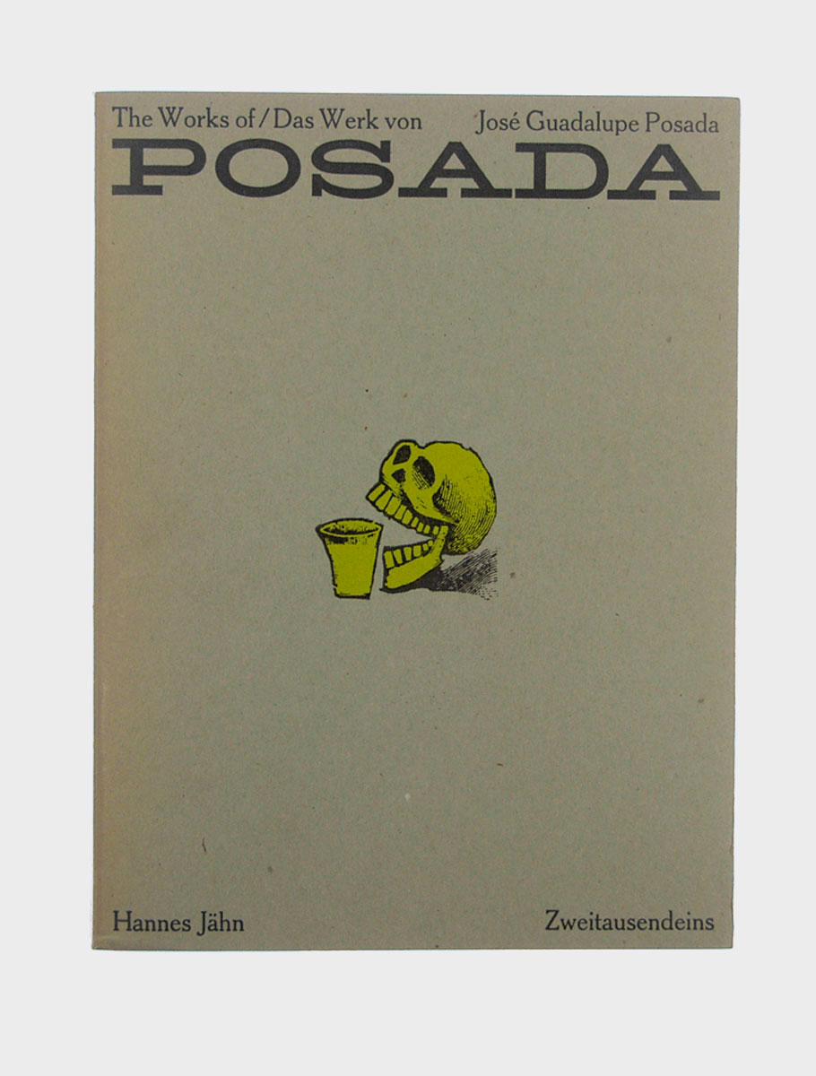
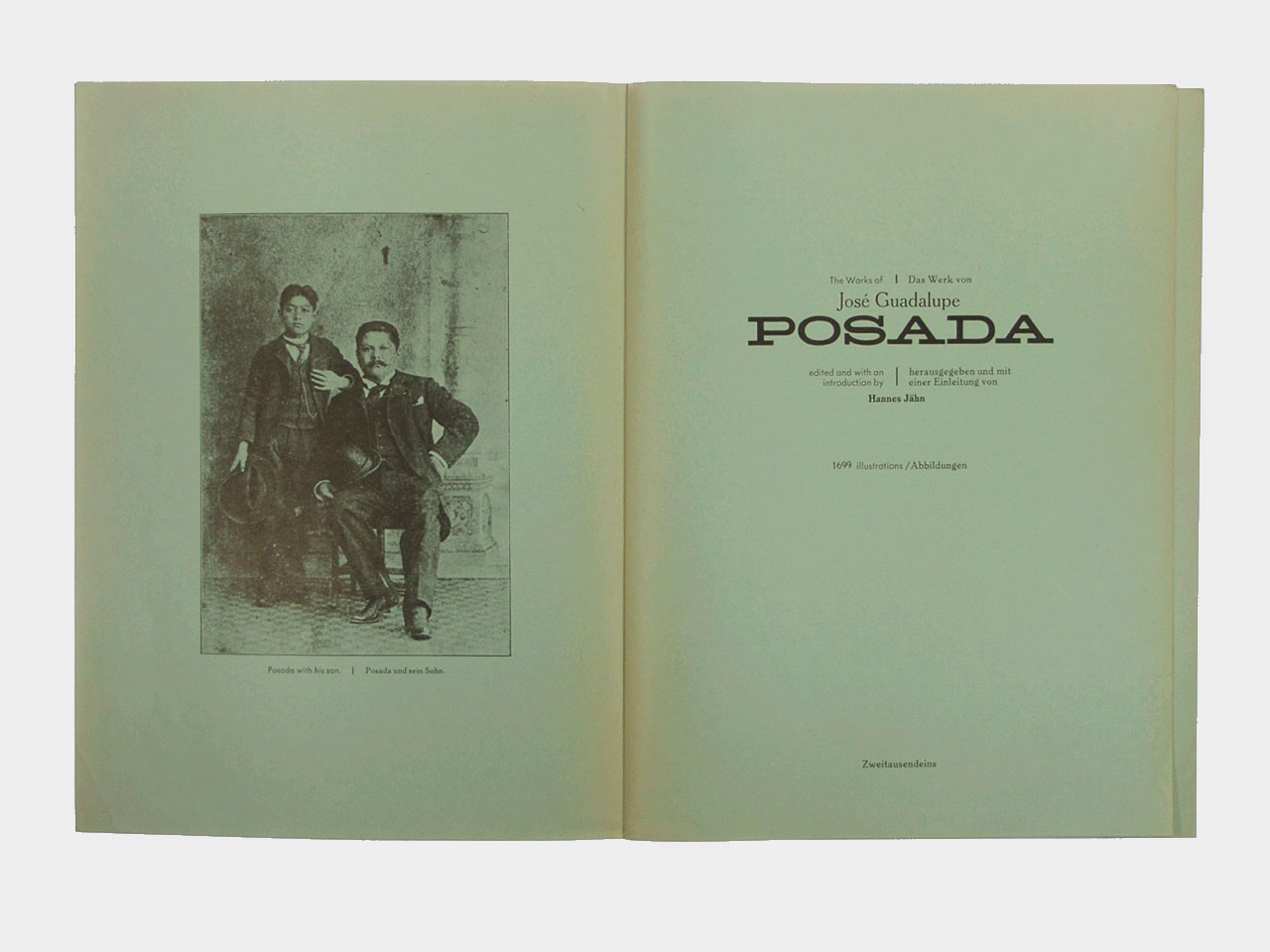
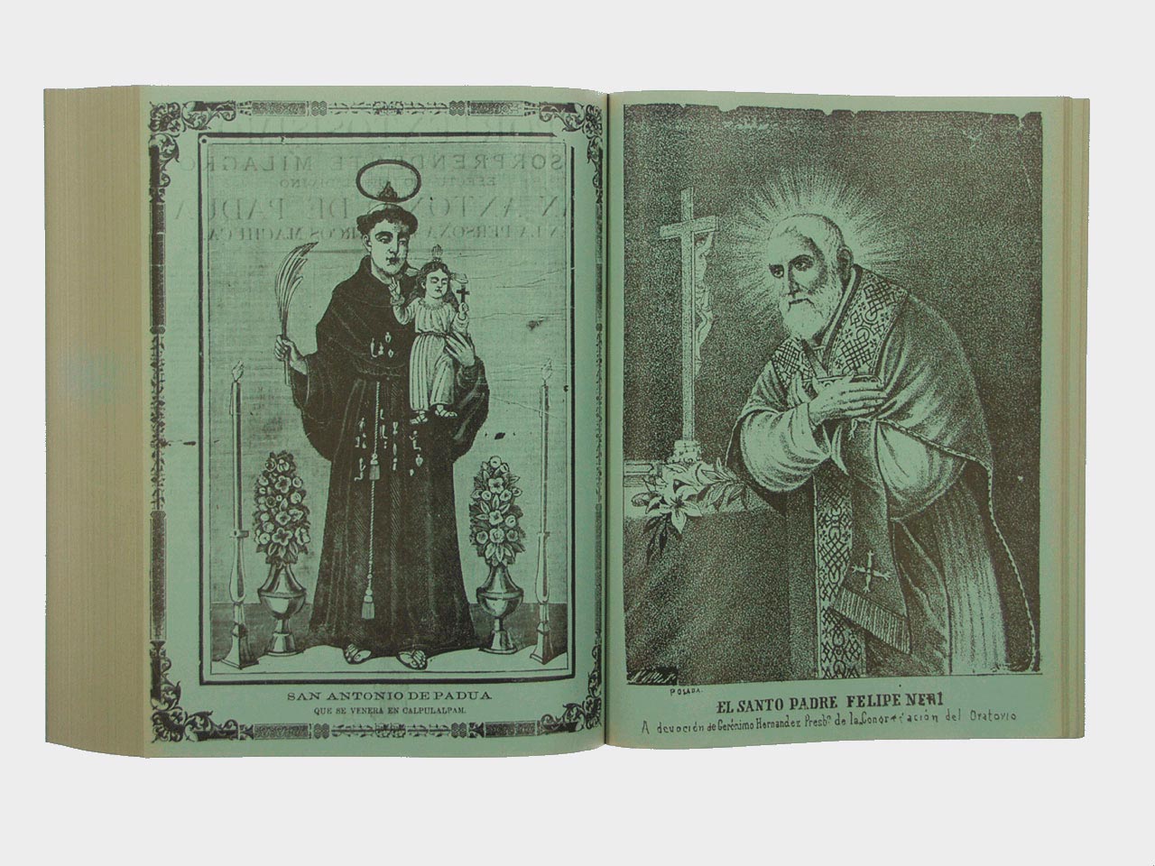
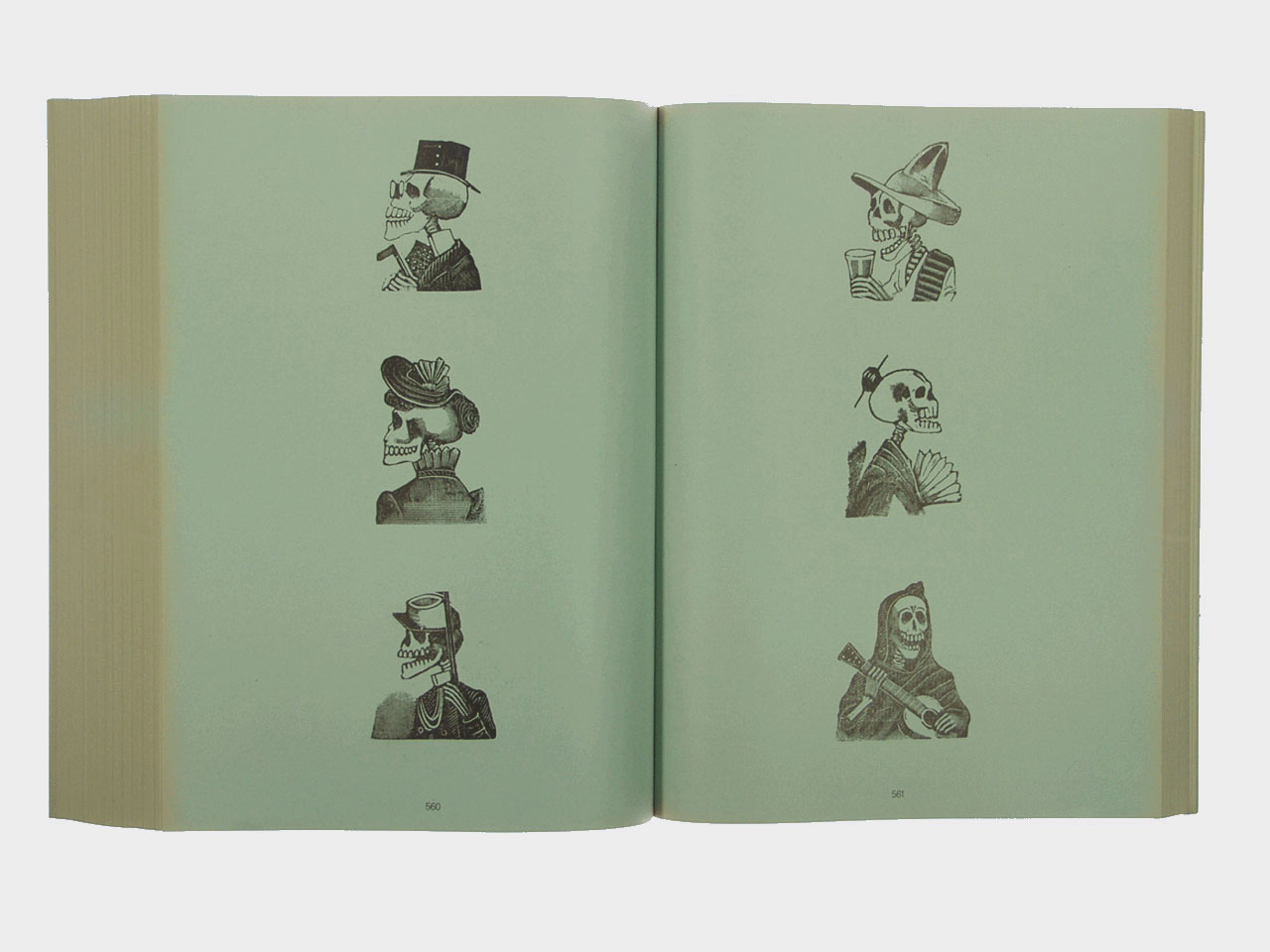
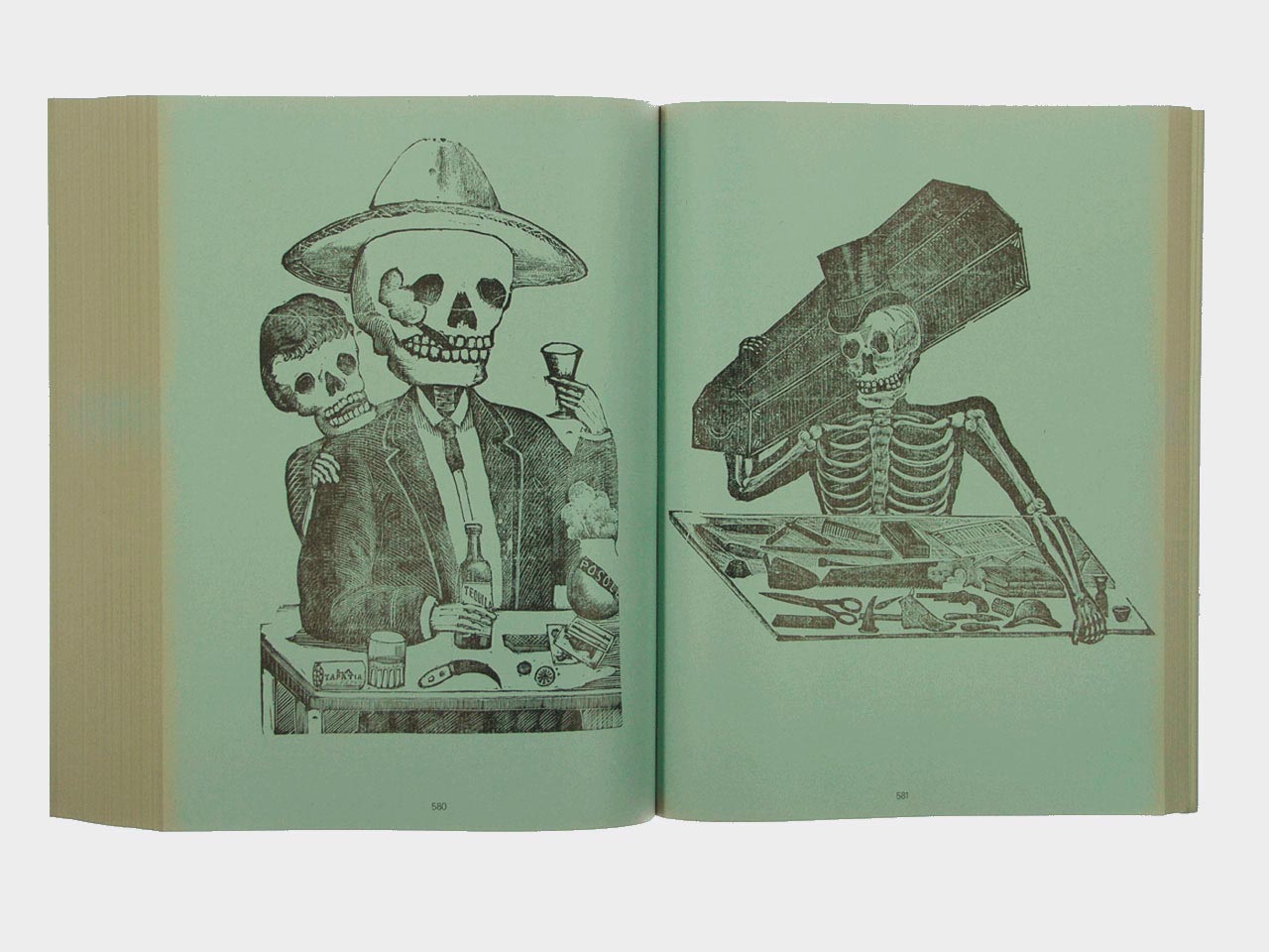
The Works of Posada
Hannes Jähn is presenting the largest collection of works by Posada. José Guadalupe Posada, born in 1854 in Aguascalientes, Mexico, began his artistic career as an illustrator of religious images. At the age of 12 he was introduced to lithography. In Mexico City he worked for the publishing house of Antonio Vanegas Arroyo and opened his own studio. After the Mexican Revolution Posada put himself in service of the people. Throughout his life he was an artist of the people without becoming overly ‘folksy’. Thanks to Hannes Jähn he was rediscovered.
Submitted by Victor Malsy

Dimitris Borsis
has kindly submitted
Psycho
This is a Greek edition of the book ‘Psycho’, the novel made famous by Alfred Hitchcock’s adaptation on his legendary same titled masterpiece. There must be countless editions of this book but what I like on this one, apart from Bloch’s ingenious writing of course, is the minimalism and the artistic orientation of the cover design for such a commercial title. Νο references to Alfred Hitchcock’s film usually seen on other editions with bold quotes and etc., not even a summary on the back, just a handwritten title on the cover to sell the book.
Submitted by Dimitris Borsis

Harsh Patel
has kindly submitted
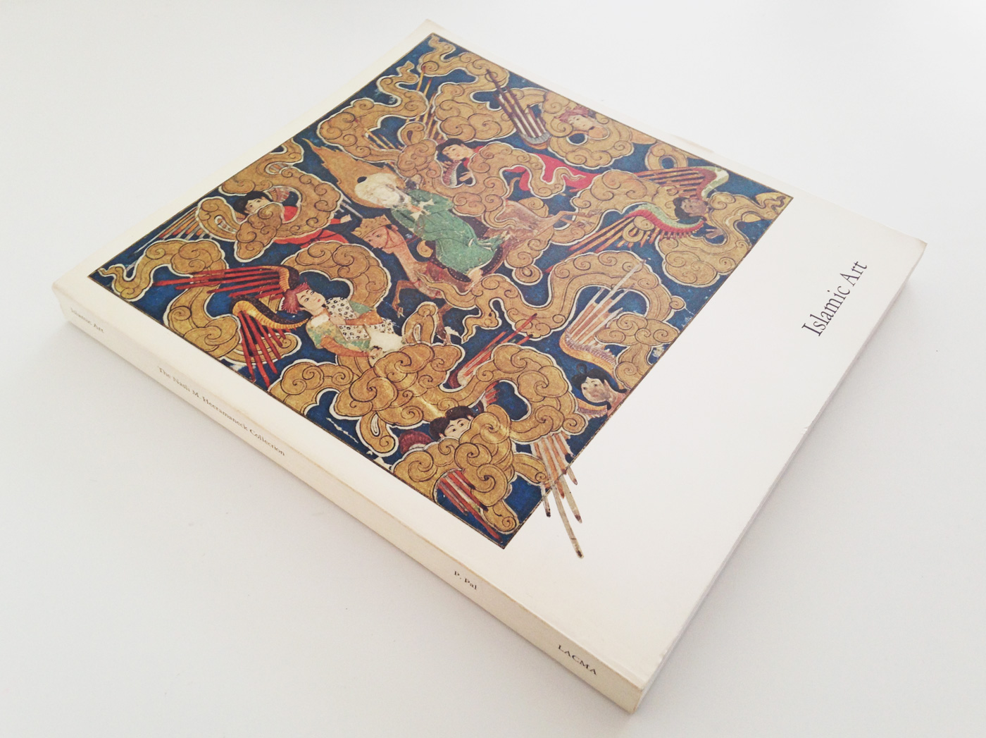
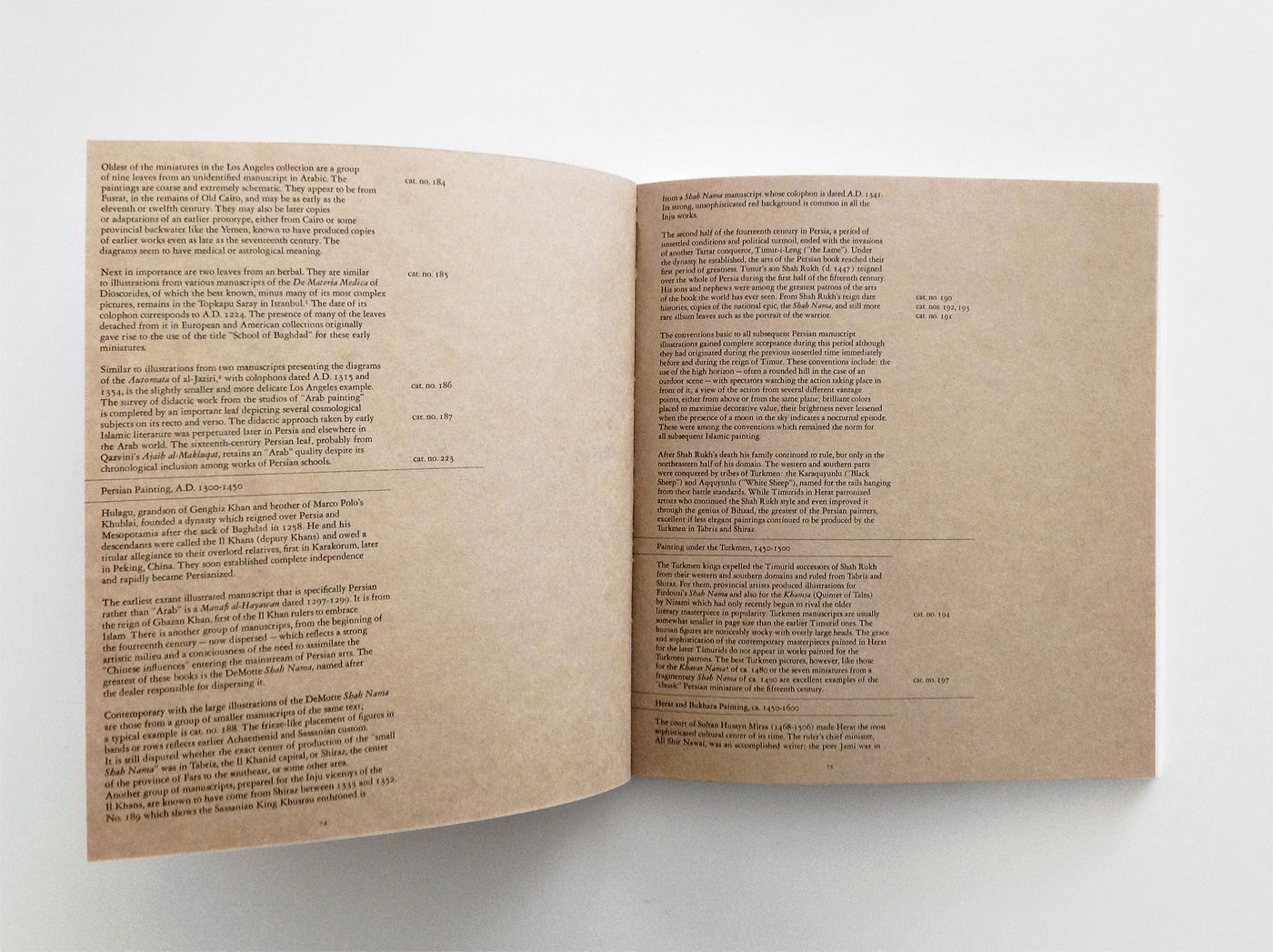
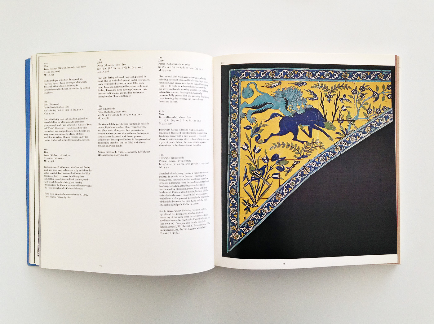
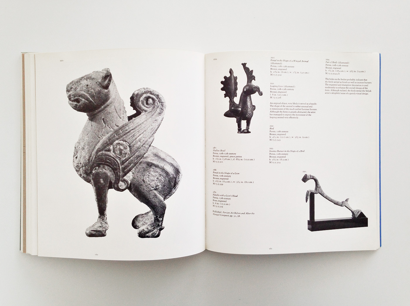
Islamic Art
This survey view of a LACMA acquisition beautifully juxtaposes matter-of-fact typography and the collection’s abundance of ornate, natural motif. The production holds the same, quiet, inward gaze: essays on brown kraft paper, plates on a spartan satin.
Submitted by Harsh Patel


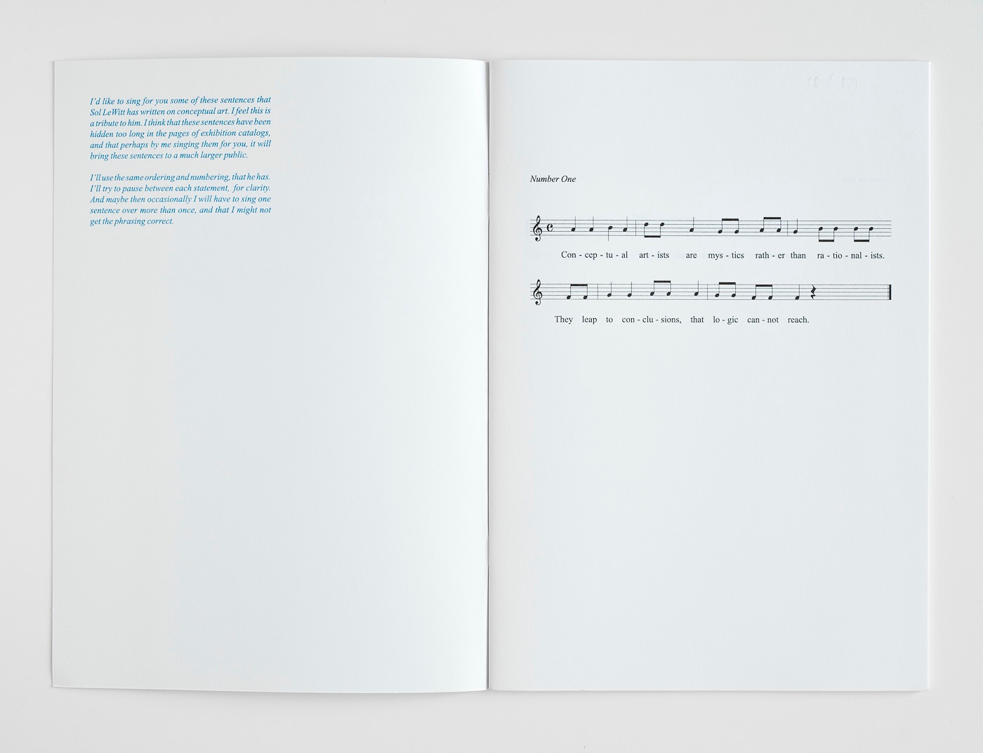
Baldessari sings LeWitt
314Because it’s Sunday: Baldessari sings LeWitt, Rollo Press, 2009.


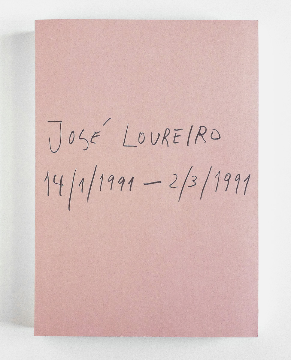
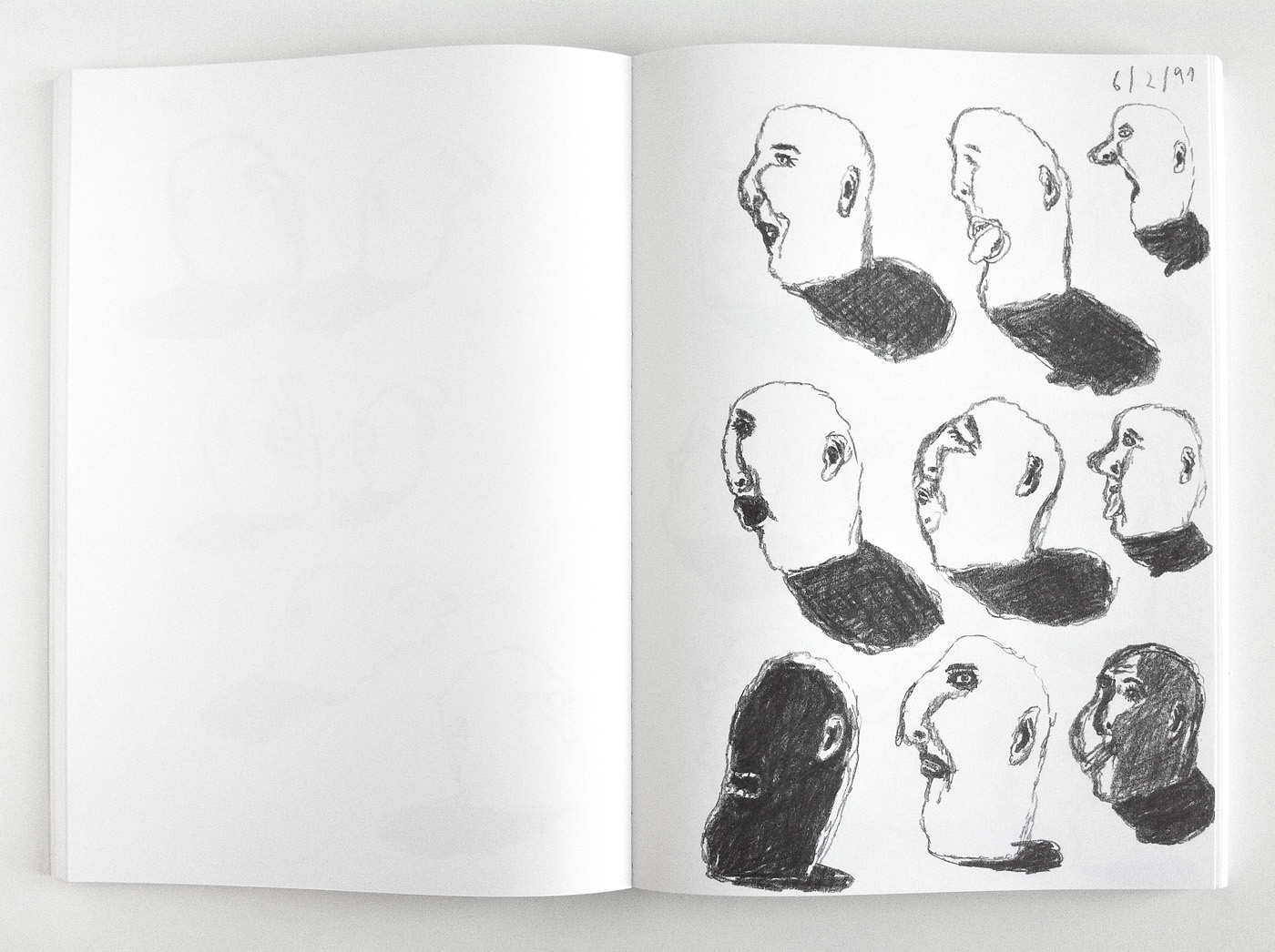
José Loureiro 14/1/1991 – 2/3/1991
289 2Dear @at_cb, thanks so much for your constant high-quality work, and even more for sending me physical proof – like this delicious book with drawings by Portuguese artist José Loureiro – he has a great sense of humour.
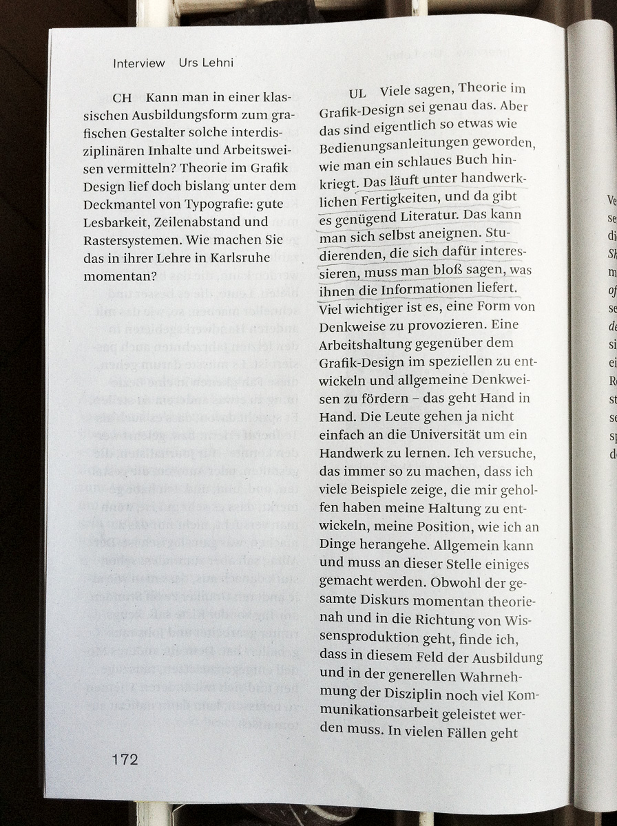
A Zine
275 2The future of design education? In my opinion, Urs Lehni is completely mistaken here. For me, it’s absolutely ridiculous to assume that one can learn practical design skills from books. To be honest, I don’t know of any books that can replace guided learning by experience. Here is the foundation of design education: 1. Learn the rules (in practical excercise) 2. Learn to leave the rules (in theoretical reflection).


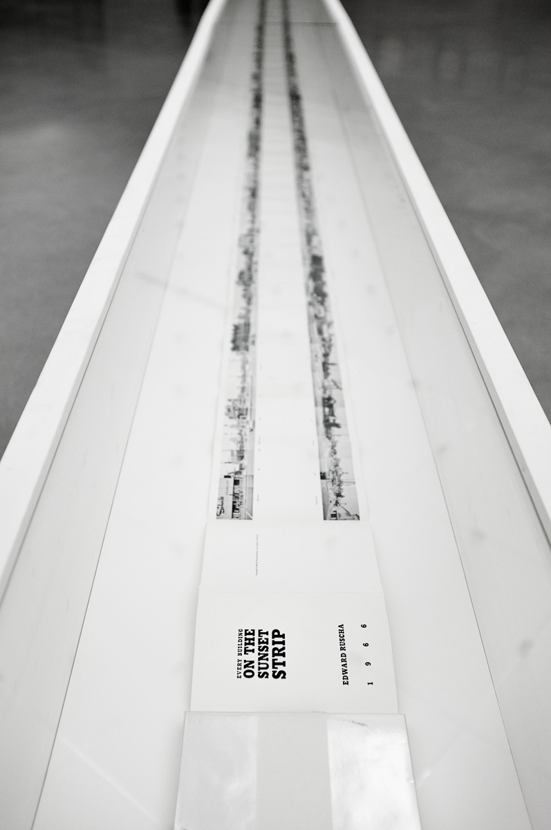
Ed Ruscha with six books on his head
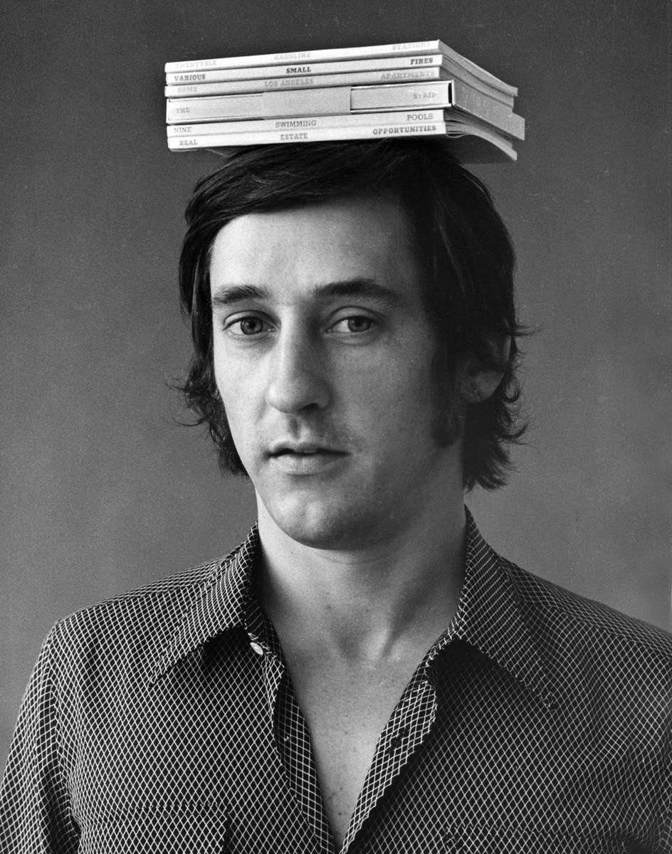
253Jerry McMillan: ‘Ed Ruscha with six books on his head’, 1970 — thanks @ibrahimltd.

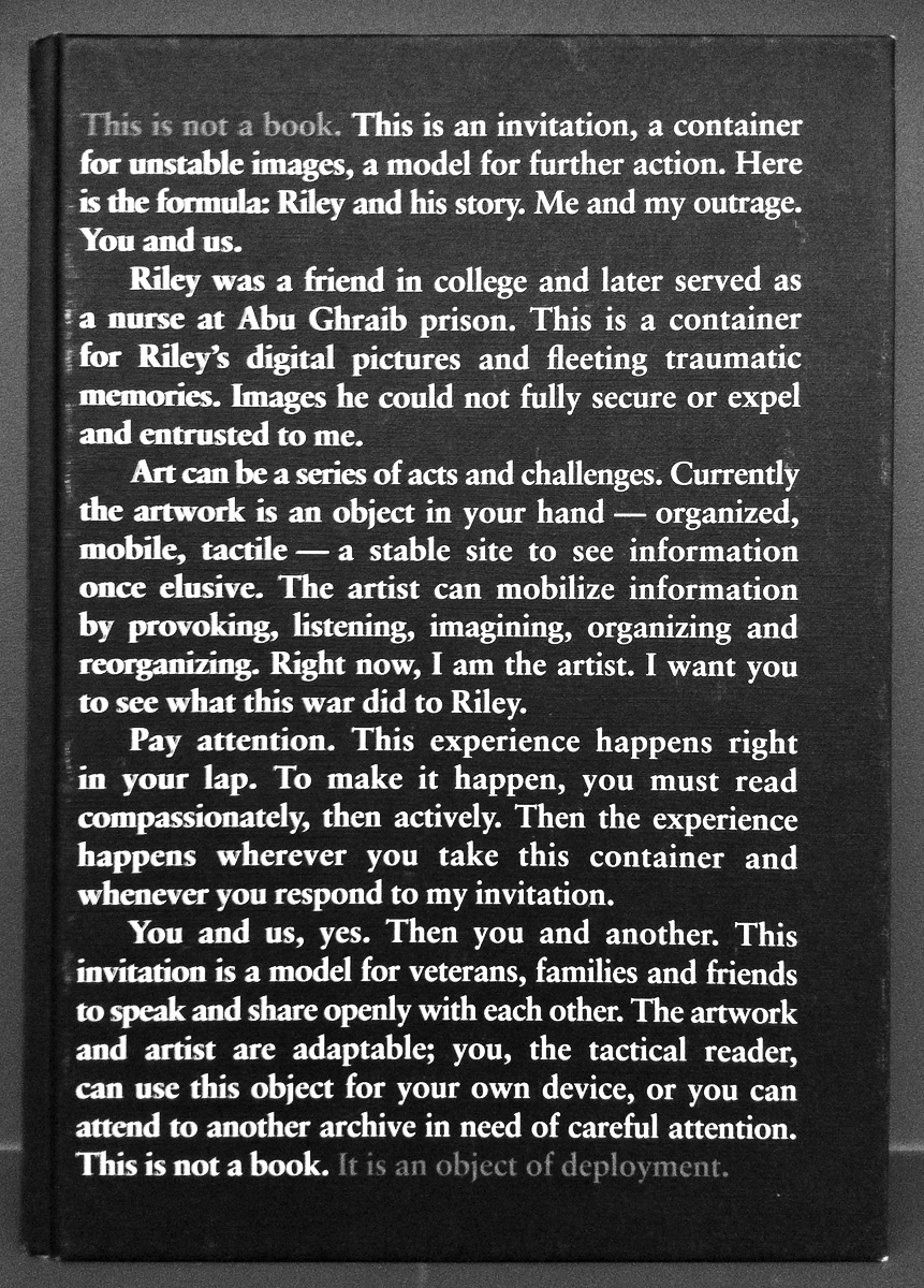
Riley and his Story
252Monica Haller: ‘Riley and his Story’ – the book is better than the XTC-mashup promises. Download a PDF of excerpts.

Back Cover Magazine No. 5
245In my humble opinion @backcovermag is the best European design magazine – nothing else to say.

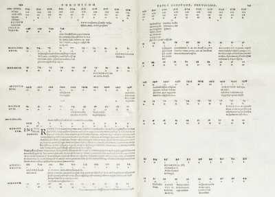
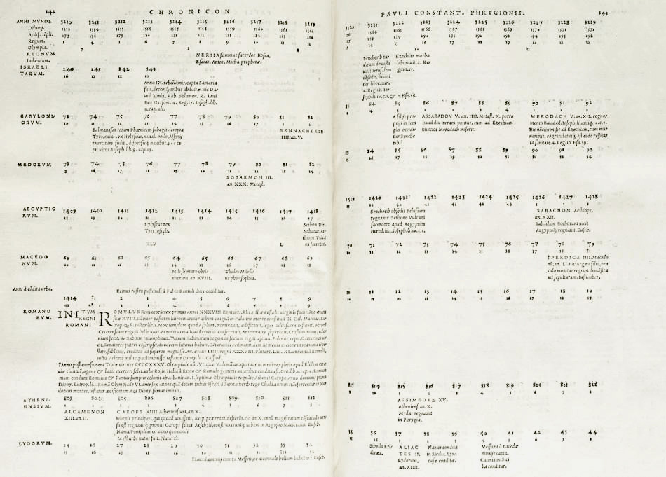
Chronicvm
237Phrygio: ‘Chronicvm’, 1534 – for me, one of the most exciting (and beautiful) books one can own. Can’t stop flipping through these musical page compositions.


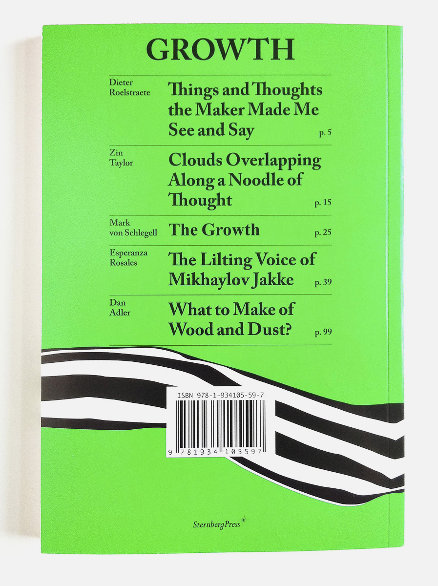
Growth
213Hey type geeks, wake up ... here is the quiz of the day: Spot the typographic accident! Can’t find it? You’re in the best of company: the Baudin Prize Jury couldn’t either. Love this cover nonetheless.


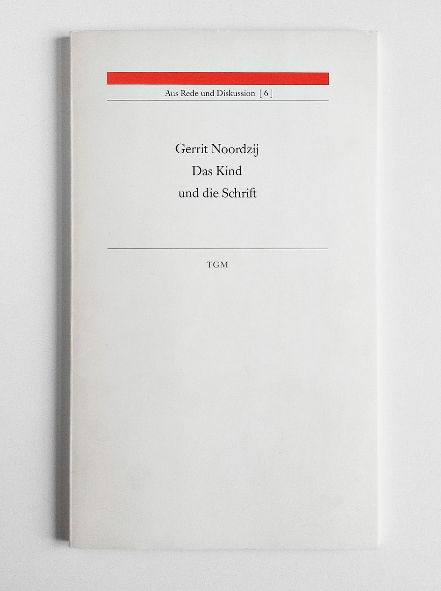
Das Kind und die Schrift
190Recommended reading – not least for our education ministry (designed by Philipp Luidl, published by @typographische).

Viabizzuno Report 26
186 2Traces of Fronzoni in Milan: ‘Viabizzuno Report 26’ (the corporate identity for Viabizzuno was one of Fronzoni’s last works) and Viabizzuno showroom, via Solferino 18, Milan.


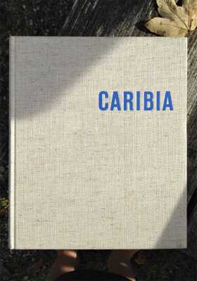
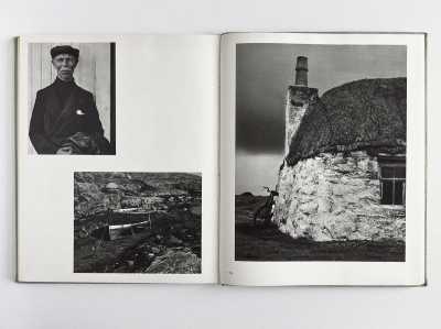
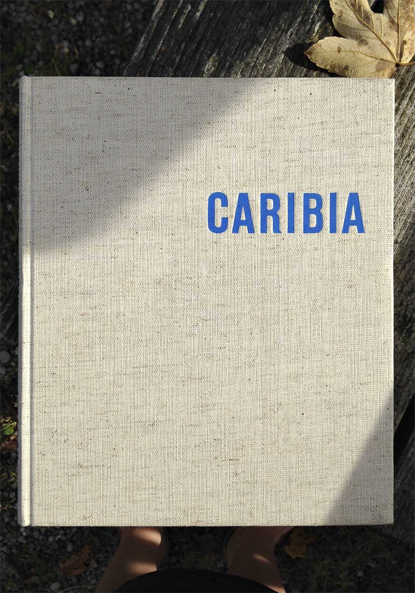
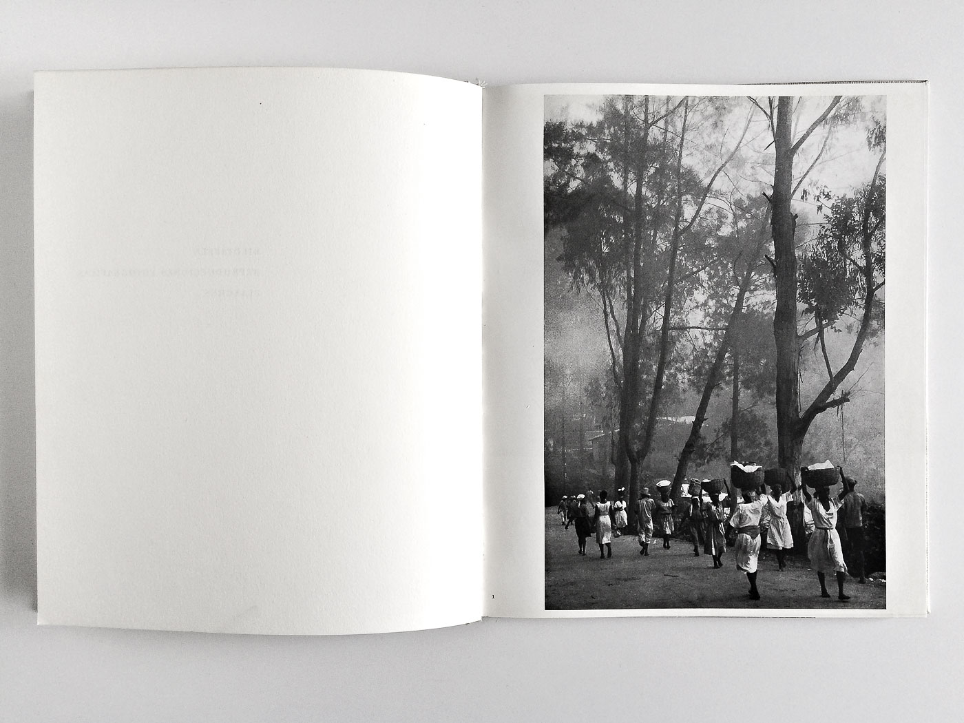
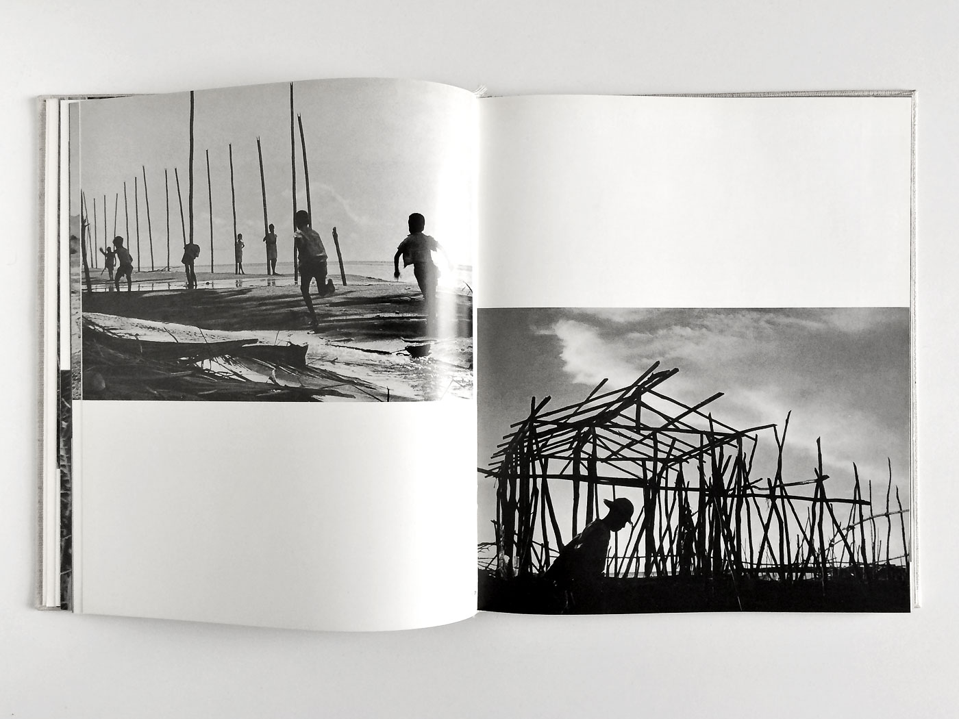
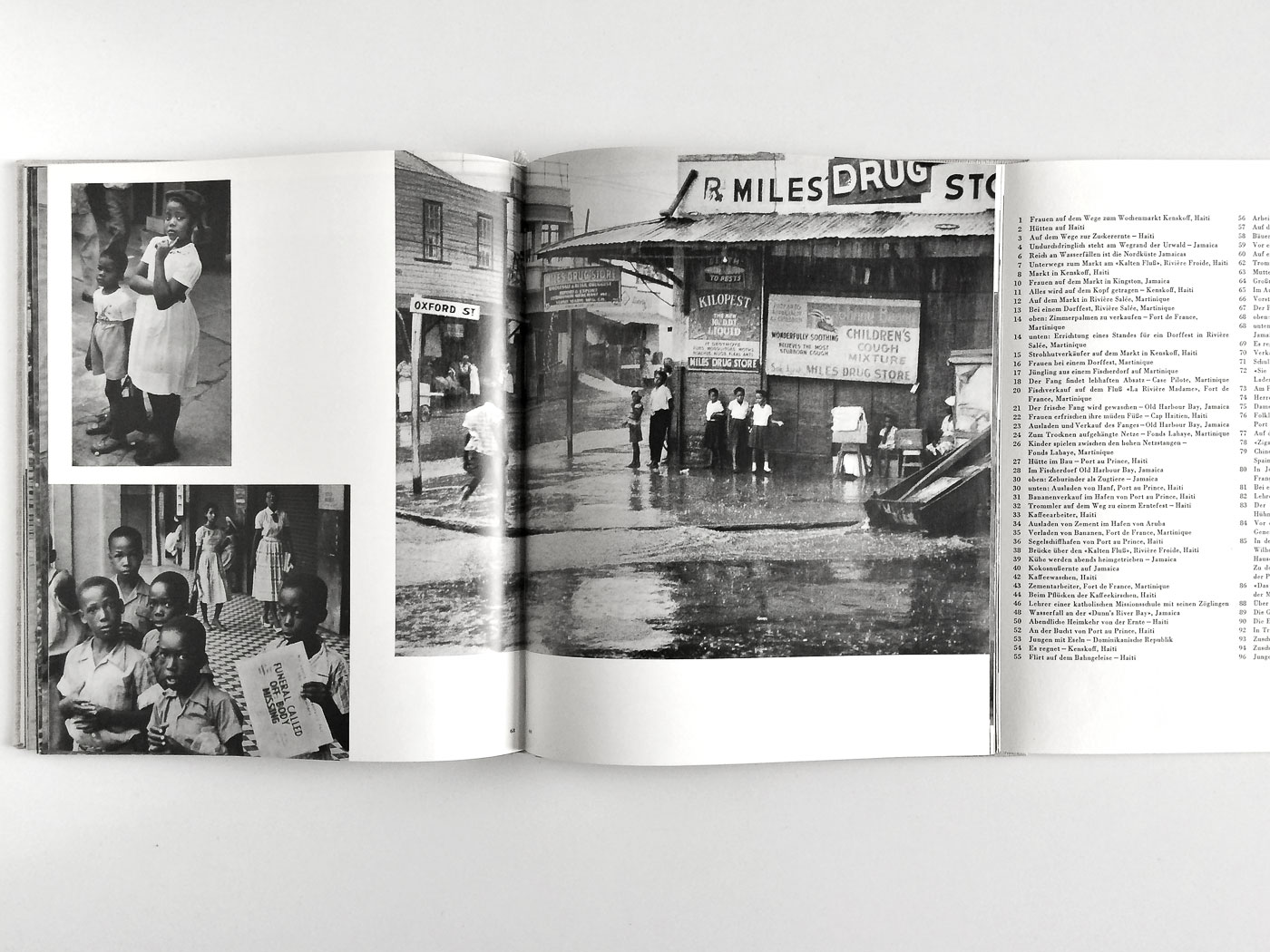
Caribia
175 4This photobook comes from a time when the Caribic islands had still the smell of an exotic and erotic paradise. ‘Caribia’, sponsored by an Hamburg shipping company, testifies that Herbert List is definitely one of the great documentary photographers on par with the Magnum stars. It’s easy to get it second hand and super cheap.


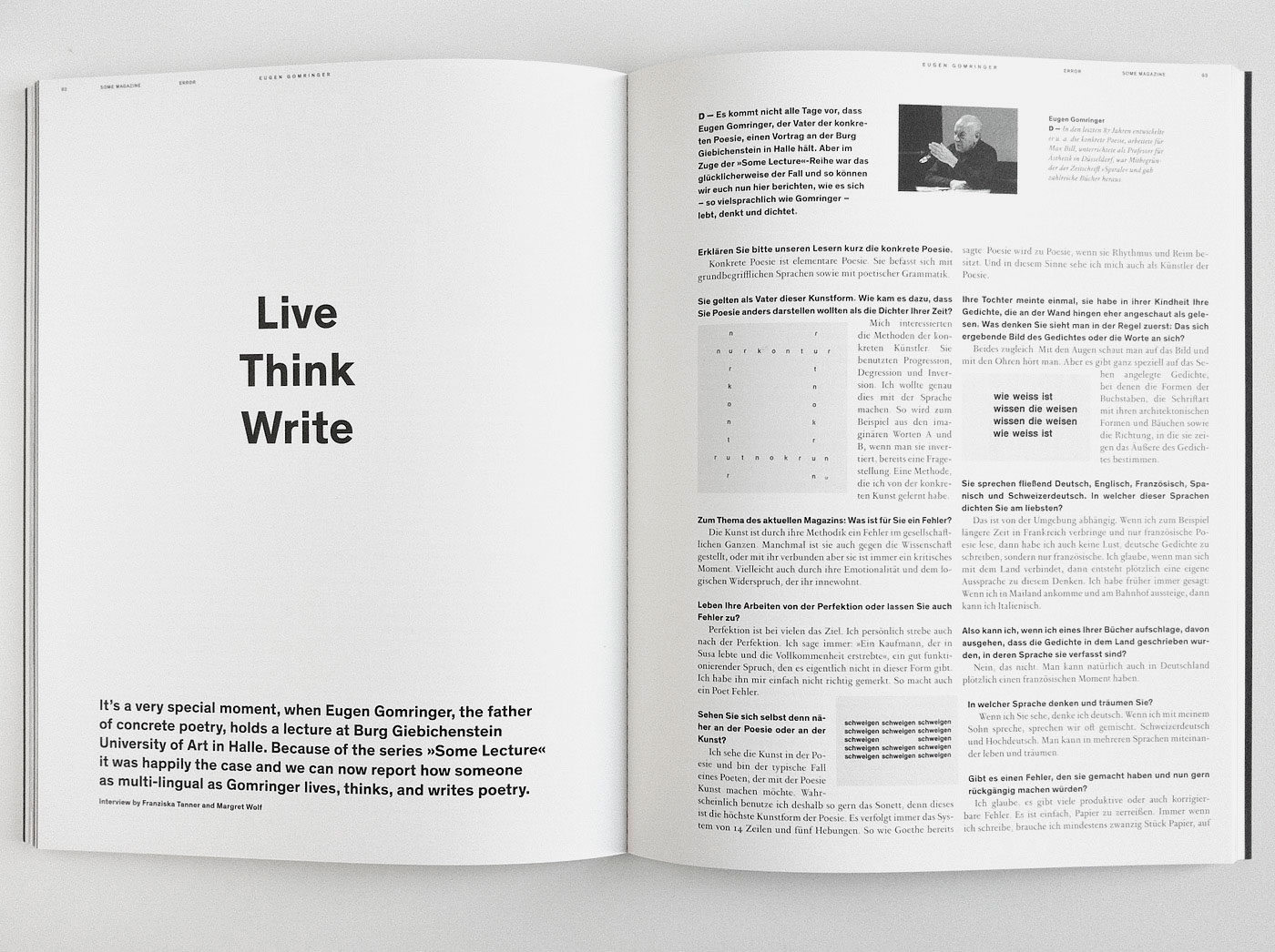
Some Magazine
165‘Some Magazine’ is proof that student magazines don’t have to be overly formalistic in approach or devoid of content.


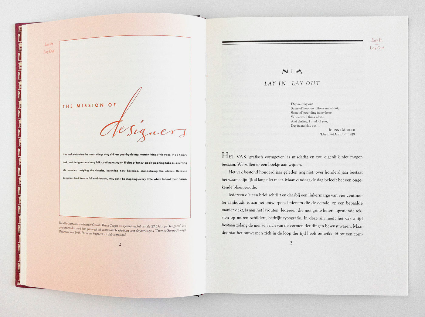
Lay In, Lay Out
163“The profession of graphic design is criminal” – Still fun to read @pietschreuders text from 1977. “Graphic designers: it is advisable not to deal with them directly, but they can be quite entertaining when observed from a certain distance.” English translation in ‘Looking Closer 3: Classic Writings on Graphic Design’.
De Aetna
161The last page of Pietro Bembo’s ‘De Aetna’ designed by Francesco Griffo in 1496, as found here.

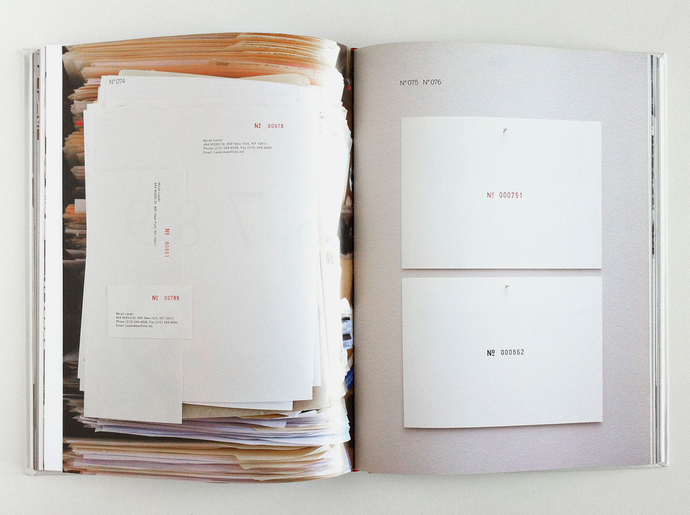
I’m Thinking of a Number
160 3Micah Lexier: ‘I’m Thinking of a Number’. A picture of a book showing a picture of a picture of books, featuring Lexier’s invitations, books, catalogues, objects, multiples, t-shirts and other epehemera, 1998 to 2010 – published by Nova Scotia College of Art and Design, designed by Andrew Di Rosa & Emma Wright.

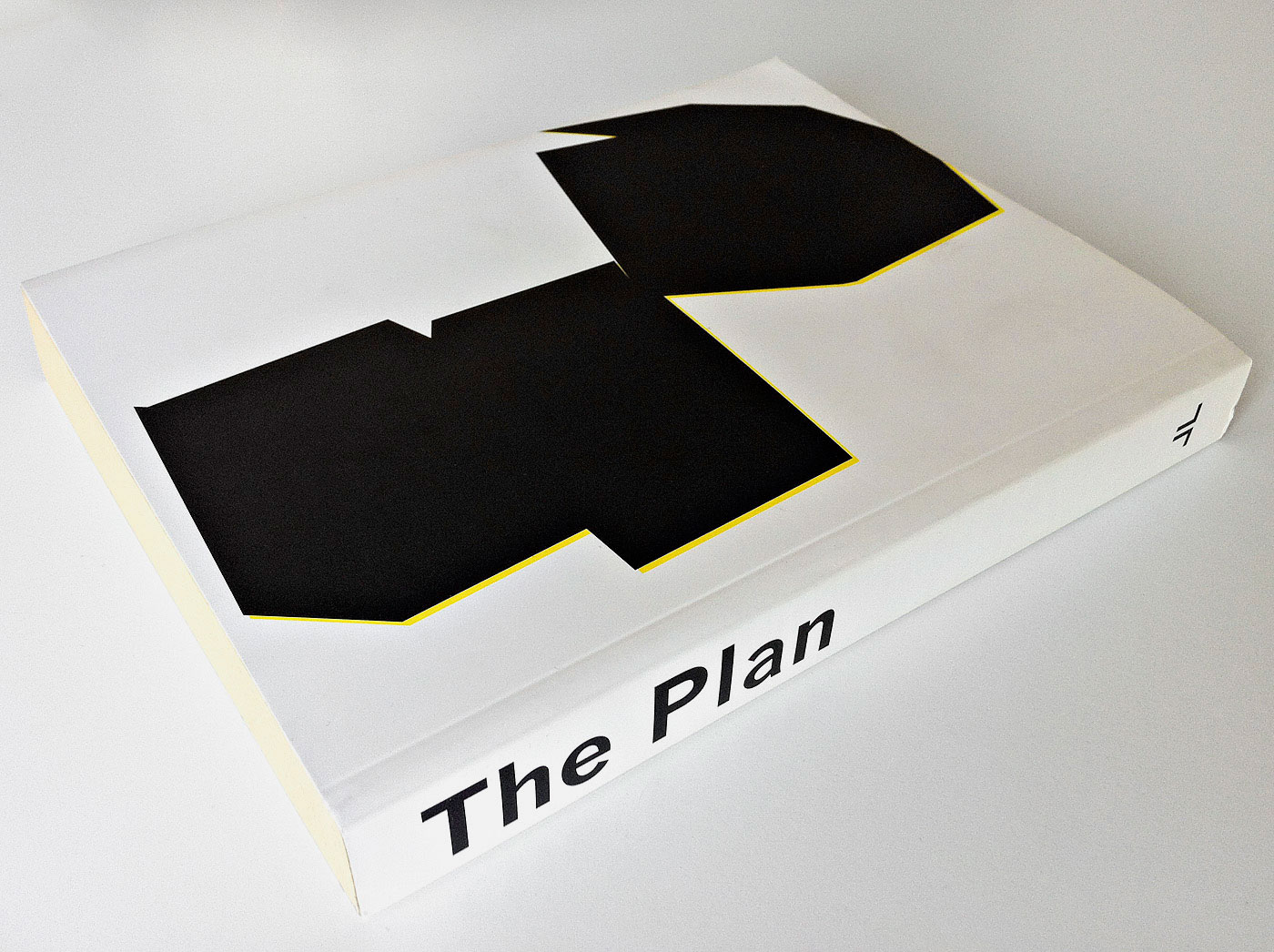
The Plan
158 2I don’t know why I love this book by Michael Schmelling, dirtily printed on thin newspaper stock, but I do. Michael photographed homes of obsessive-compulsive hoarders while working with the Disaster Masters task force – published by Jandl Books (they have some more beauties ...).
Double or Nothing
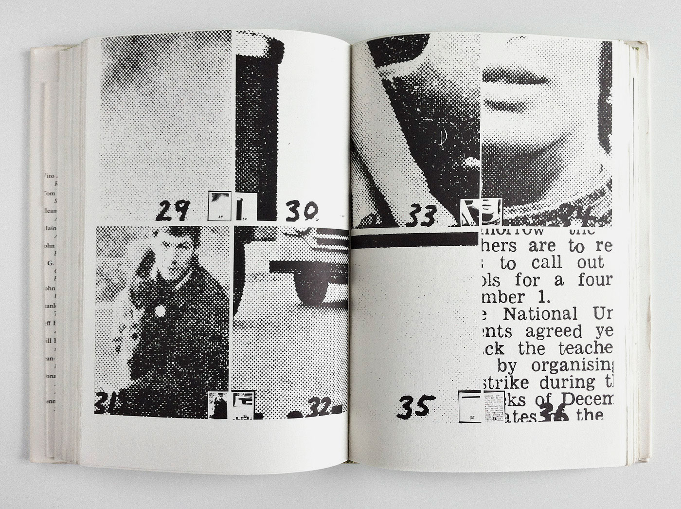
157 251N4E, ‘Double or Nothing’. After cutting the fore-edge, the book block (newspaper stock) was milled for binding. I dearly love the opening picture of this architecture book, designed by Zak Kyes.
Merve Backcovers
155Nice: ‘The Backcovers’ @MerveVerlag are increasingly becoming concrete poetry ...
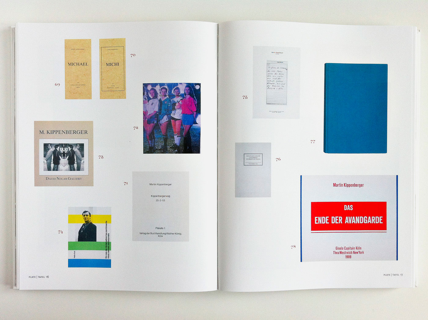
Catalogue raisonée of the books by Martin Kippenberger
154Uwe Koch, ‘Catalogue raisonné’ of Kippenberger’s books. Being sold off at a steal at Walther König.
Und sie bewegt sich doch
152An early publication by Lars Müller Publishers, when it was still LIT Verlag: Ilya Ehrenburg, ‘Und sie bewegt sich doch’, LIT Verlag, 1986 (original edition Moscow, 1922)
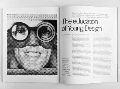
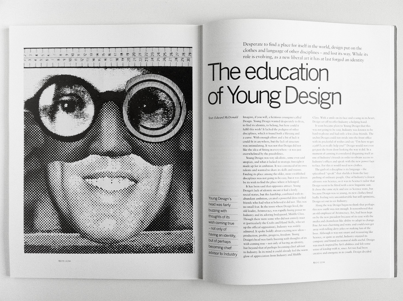
The Education of Young Design
149Yesterday I stumbled upon this essay by Edward McDonald in ‘Eye Magazine’ 12/1994 – re-reading was worth it. Read it here. I miss important articles like this one in current design publications.


The Cosmological Eye
132Henry Miller: ‘The Cosmological Eye’, 1939 – from the library of Philip L. Field, Kenneth Goldsmith’s grandfather via @thejournalinc.
Variantology V
131Ever heard of the exciting Variantology Project? Naples centered Vol. V is a great read: Neapolitan Affairs, edited by Siegfried Zielinkski and Eckhard Fürlus, designed by Silke Fahnert and Uwe Koch.
A Book About Some People and Time
129 2It’s always fun when Susana and Kai @at_cb come for a visit and we can exchange new ideas or books. Their ‘A Book About Some People and Time’ for artist Myung Feyen is incredibly musical – a polyphonic fugue.
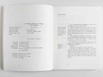
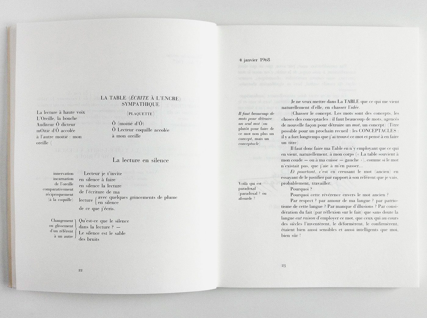
La Table
126With ‘La Table’ Francis Ponge expands the author’s scope into the typographical. “Qu’est-ce que le silence dans la lecture? – Le silence est le sable des bruits.” Interesting article on Ponge’s Table in ‘Backcover Magazine’ 1/2008 (incidentally one of the last design mags worth reading).

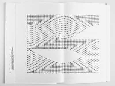
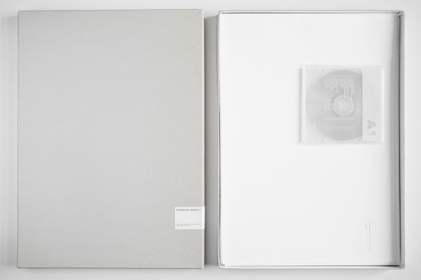
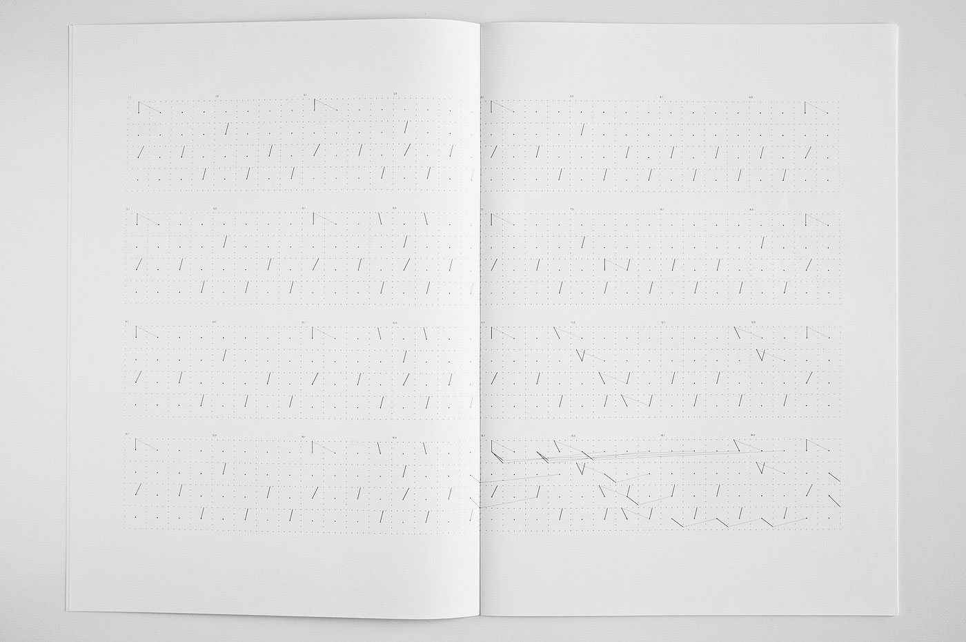
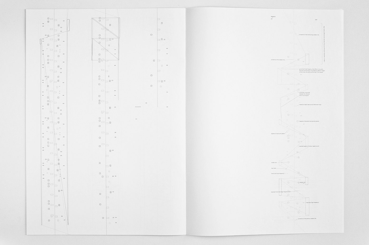
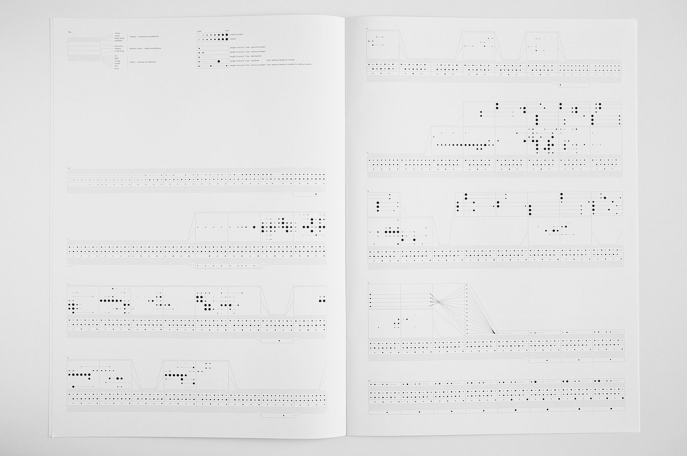
Notations Archiv 1
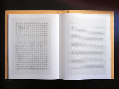
125 6‘Notations Archiv 1’, raster-noton: You can learn so much about typography by translating, i.e. notating music. This bookish box is the output of a project at the Academy of Visual Arts, Leipzig, supervised by Cyan and Carsten Nicolai. Each volume is designed by a different student. Hardly could decide which one to show – they’re all so beautiful.
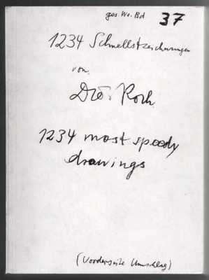
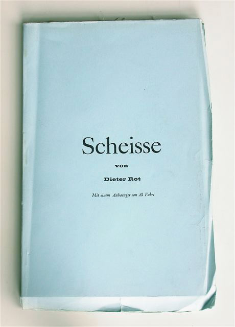
Dieter Roth Inserate
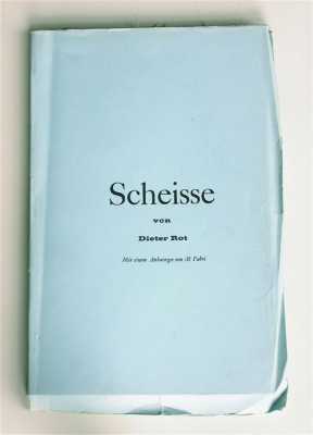
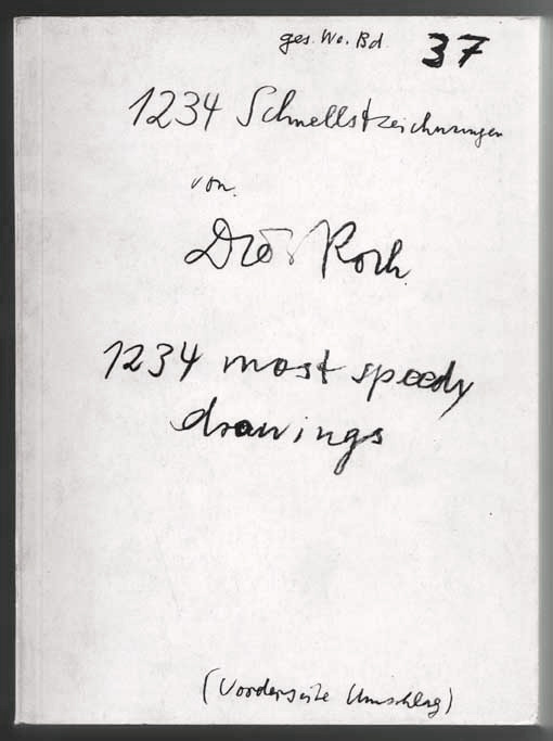
122 2Dieter Roth: ‘Advertisements’. “Those pages are like a junkyard. So I thought I’d just stick a little tear in them.” After 114 ads, the newspaper terminated the contract, supposedly because readers had complained. This book was carefully designed by Stephan Fiedler.


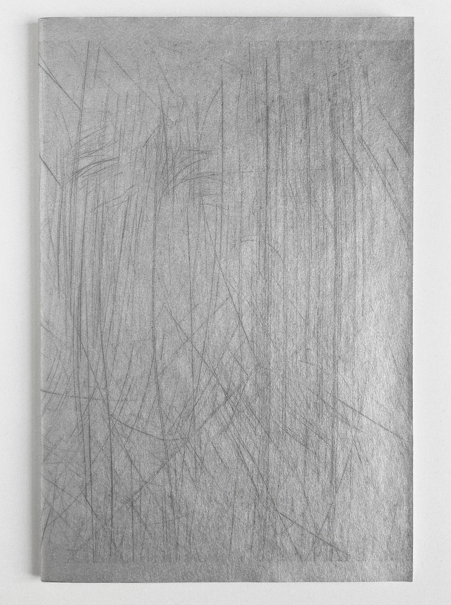
Vilém Flusser
119I love this strangely ephemeral cover with printed scratches designed by Philipp Luidl 1993 for Typographische Gesellschaft München. Vilém Flusser: ‘Typen und Charaktere, Vortrag für die TGM’, 1993.
Die Schöne Schrift
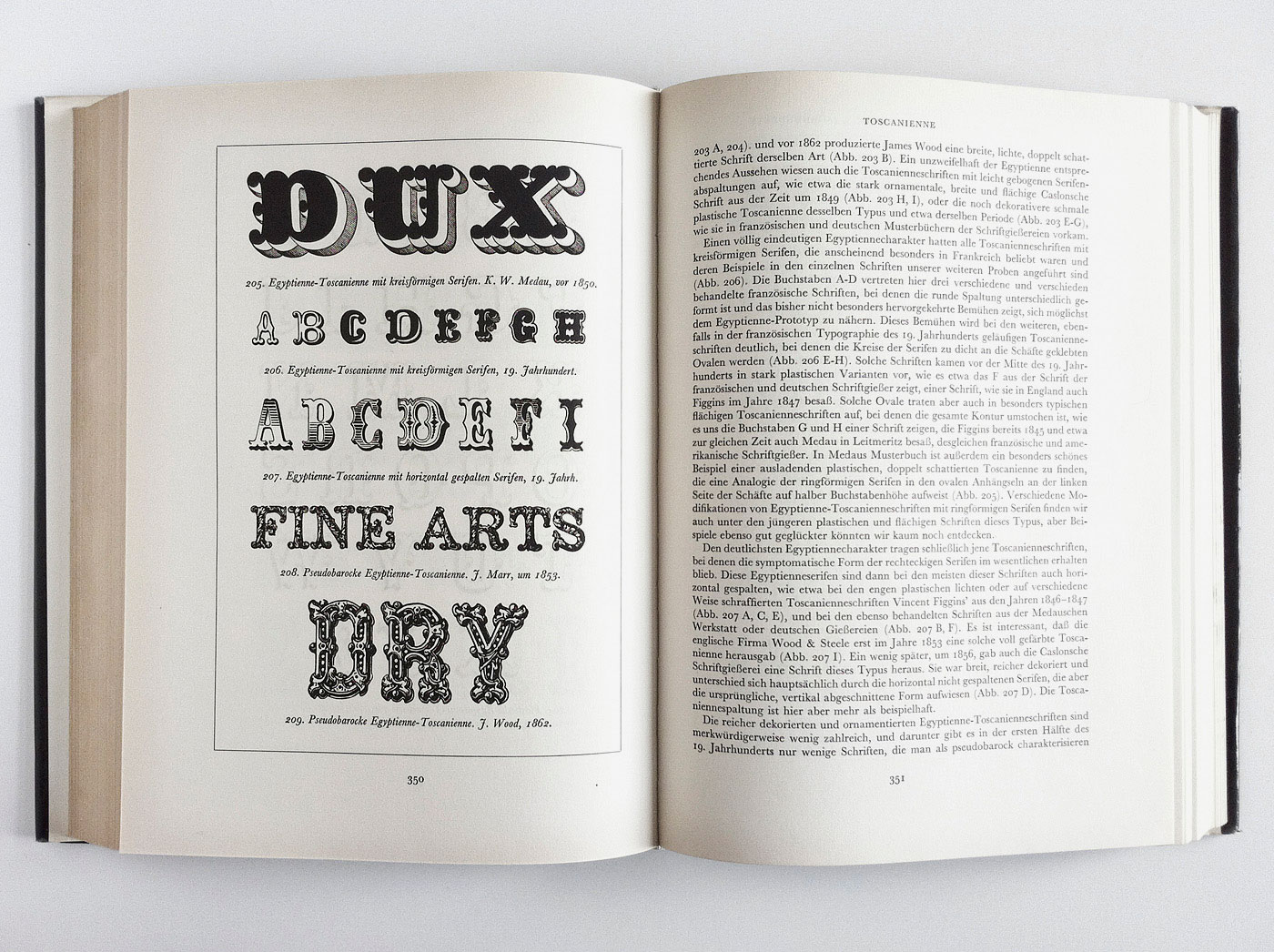
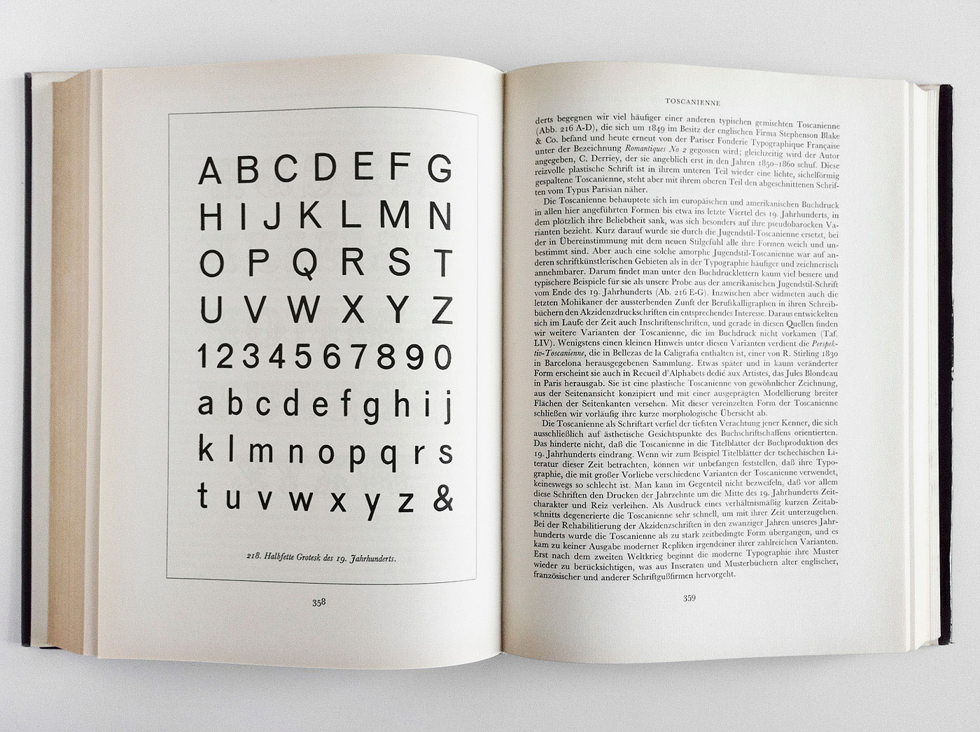
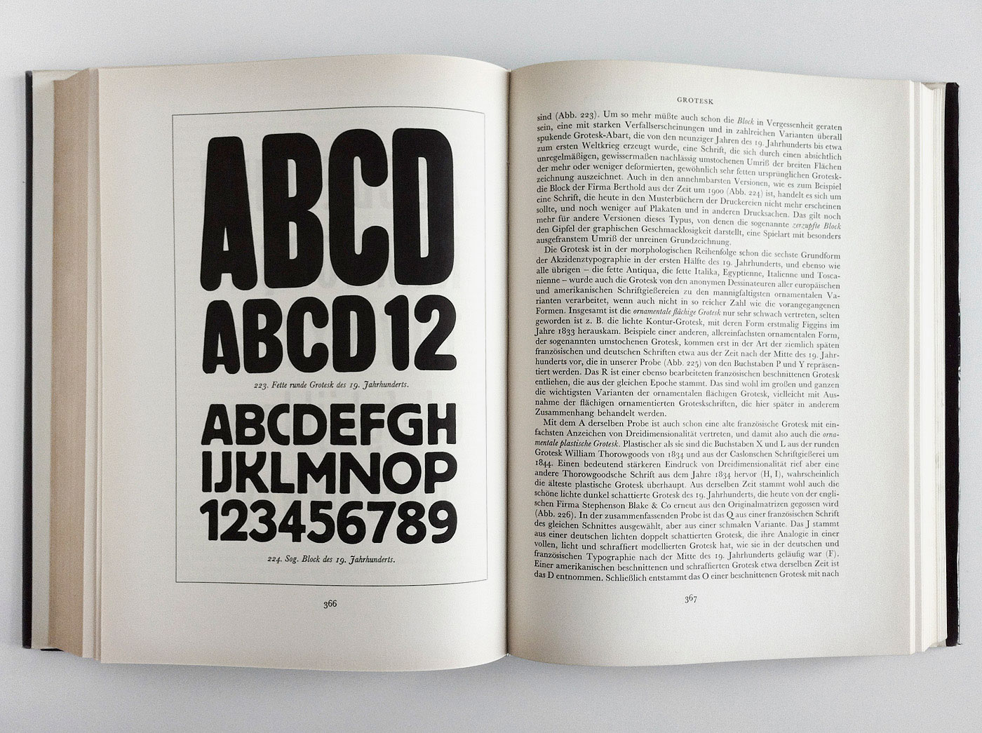
118 3From time to time the two thick volumes of František Muzika’s ‘Die Schöne Schrift’ are on my desk. The book is not only fun to read, but also packed with cultural and historical information and probably the only treatise on typography in German at this level of completeness. Unfortunately there is only this German translation published by Dausien and the Czech original ‘Krásné písmo ve vyvoji latinky’.
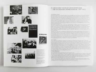
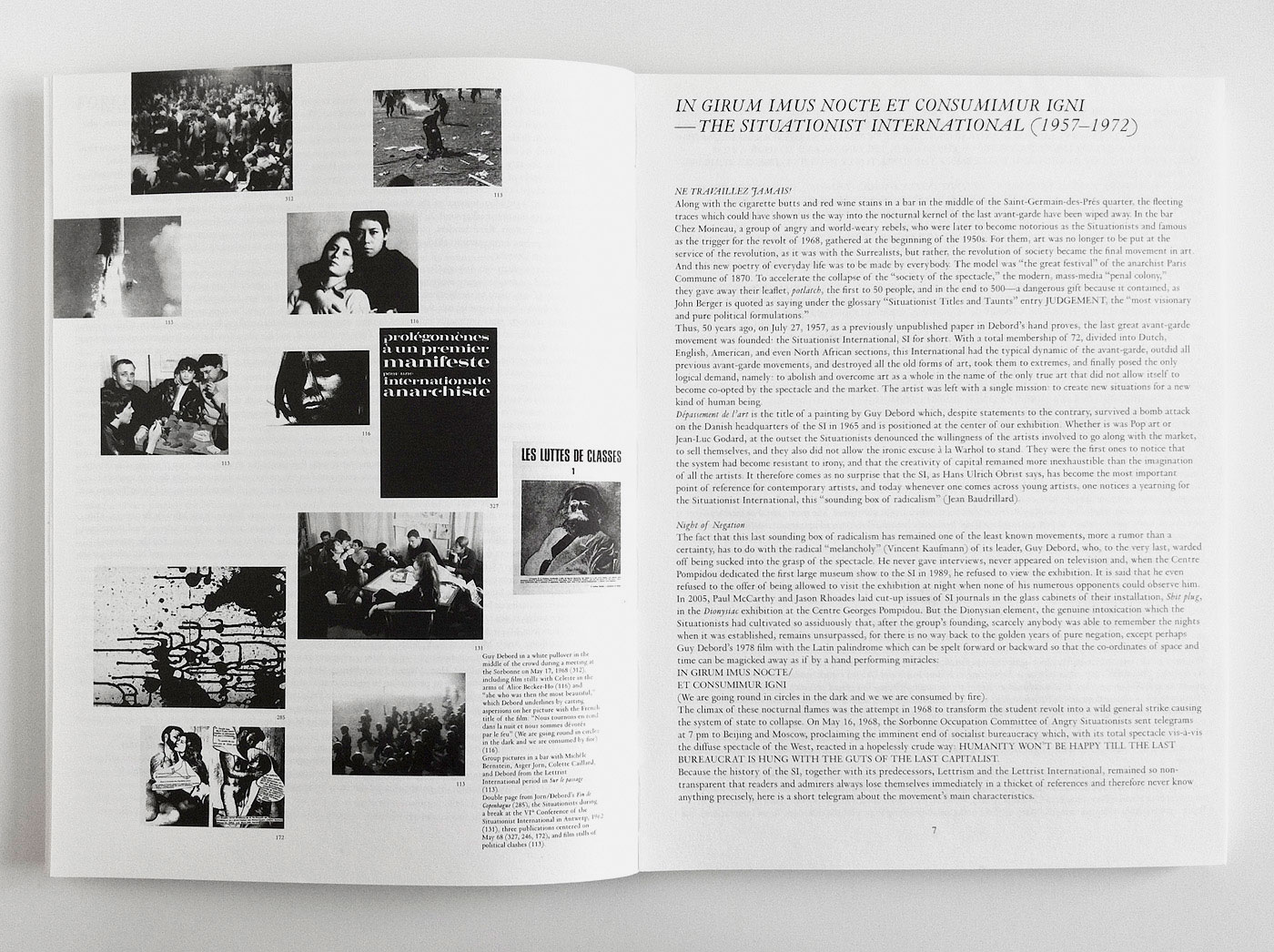
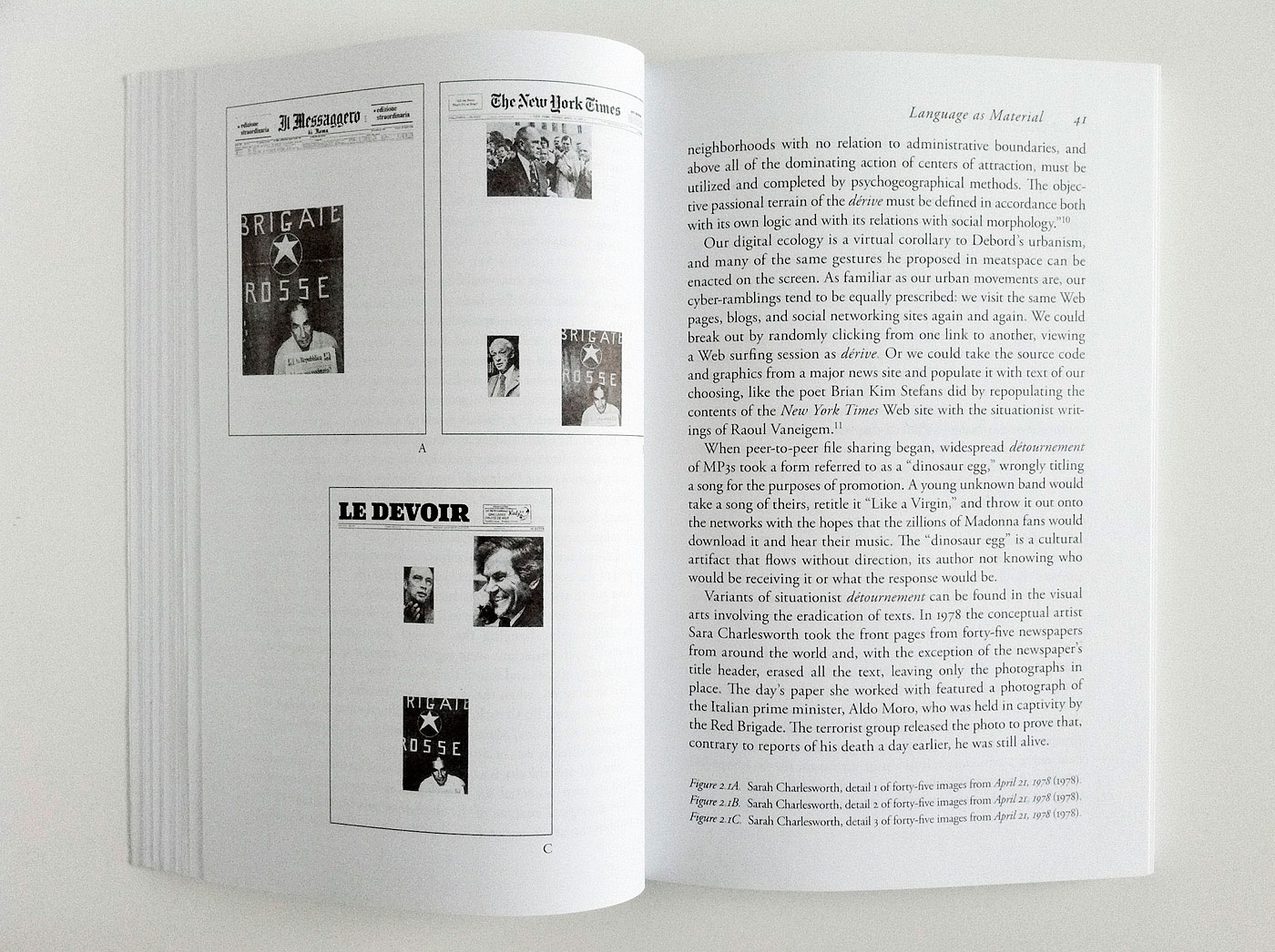
The Situationist International
117If you are even basically interested in the Situationist International, you need this book (headline = title). Designed by Marie Lusa and published by JRP Ringier.
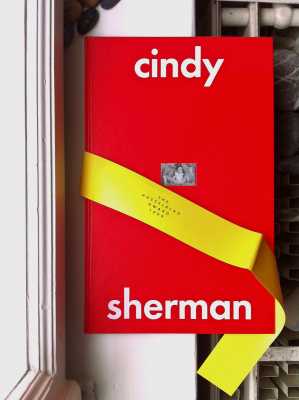
Cindy Sherman
116Some books have something to hide, as does this beauty designed by Lars Hall AB.
3rd Person Archive
114John Stezaker’s ‘3rd Person Archive’, subtly designed by YESstudio, features the smallest image sizes ever seen.
Le Spectacle Dans La Rue
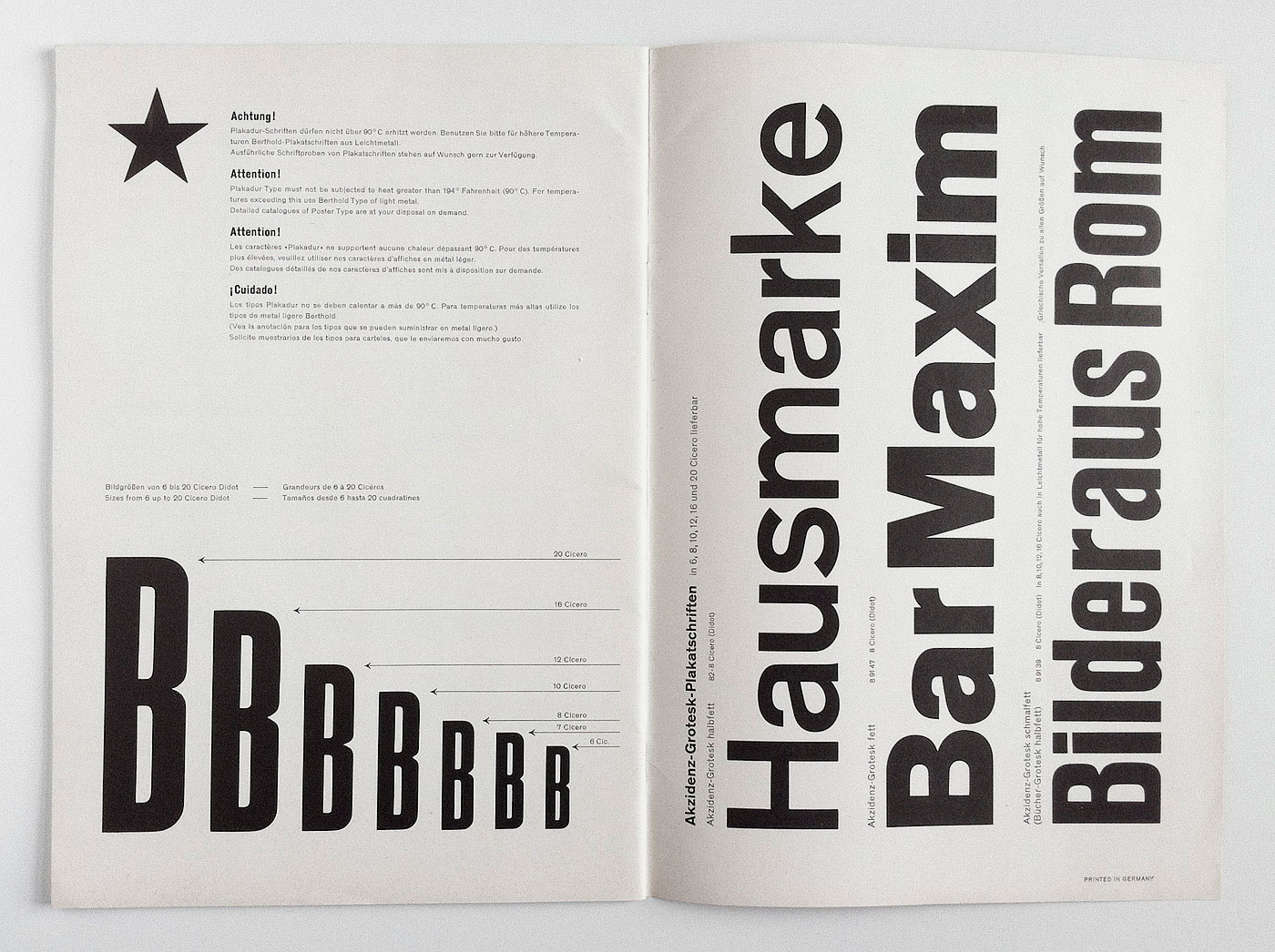
107‘Le Spectacle Dans la Rue’, Capelli, 2005. If you could only own one book on poster design, this would be it.


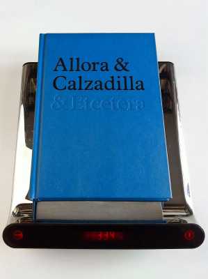
Allora & Calzadilla
91 2Weight can be a surprising as well as awe-inspiring means of design – as in this strange beauty. ‘Allora & Calzadilla & Etcetera’, Koenig Books, 2009, designed by Yes.

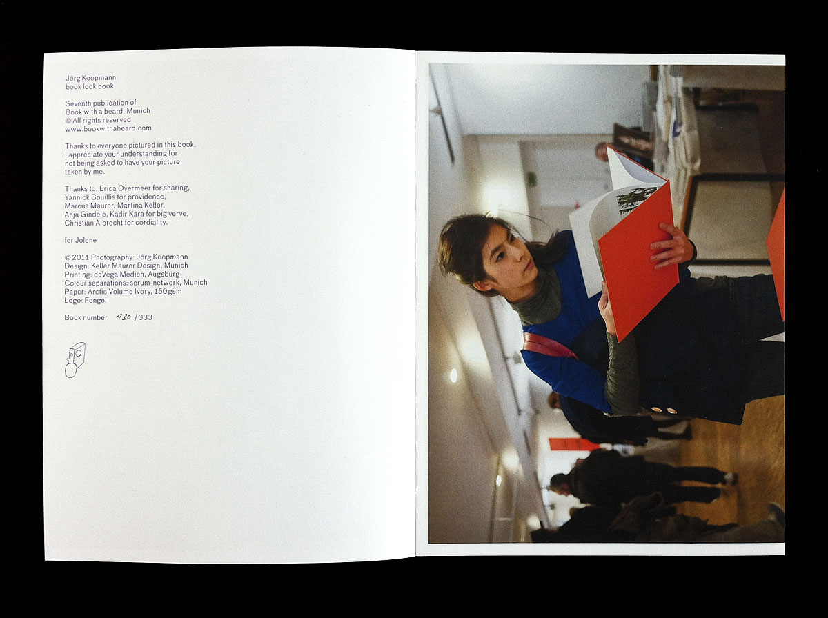
Book Look Book
89‘Book Look Book’: While sitting at his bookfair stand, Jörg Koopman took beautiful photos of beautiful people looking at his books – beautifully executed by Keller Maurer Design. For best separations around ask Christian Albrecht – he also made this book shine and gave me one of his rare voucher copies – many thanks.

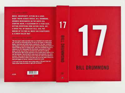
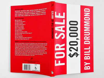
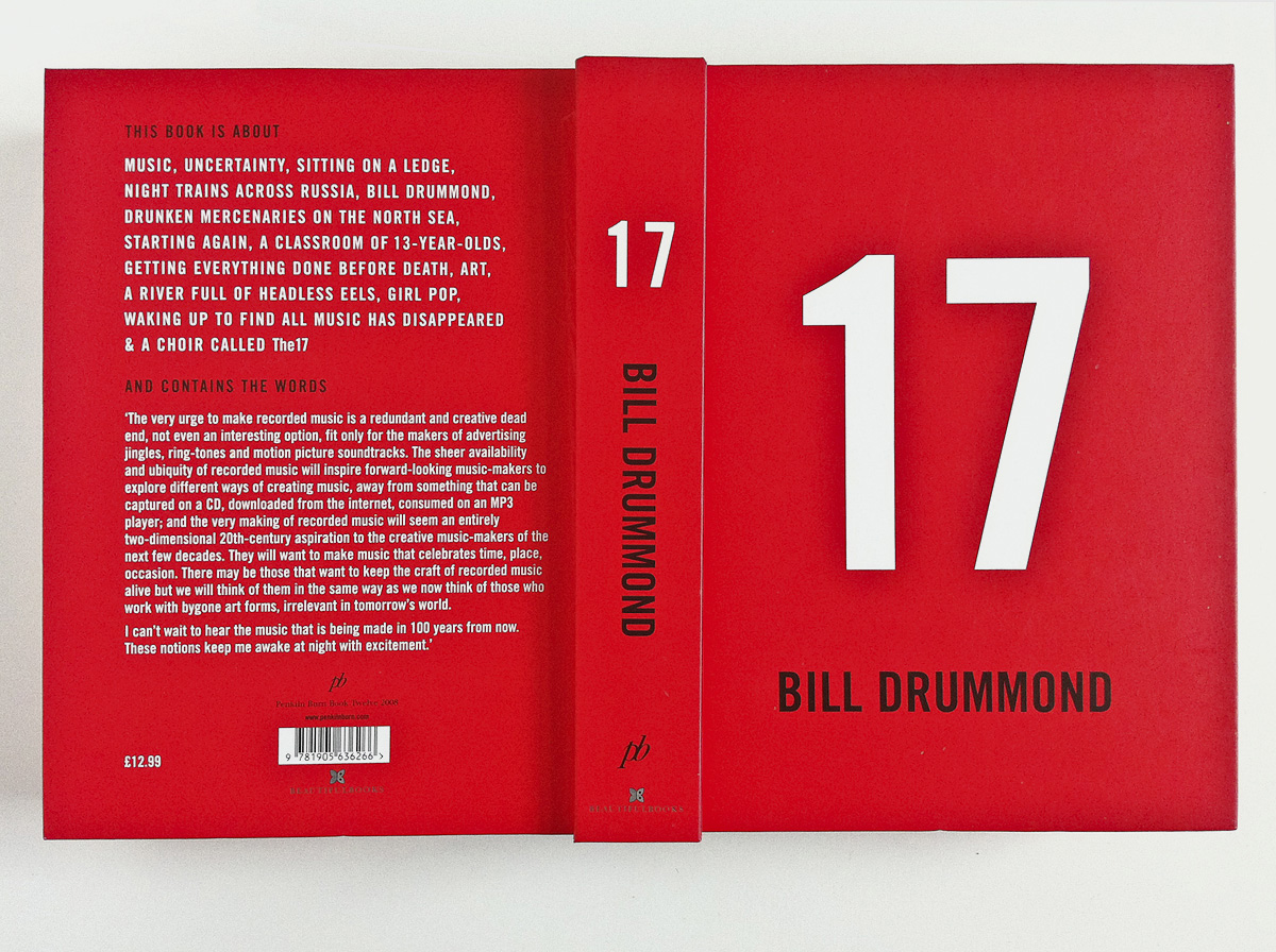
Bill Drummond – 17
86I really love Bill Drummond’s books. If only his UK printers had a sensibility for the running direction of paper. ‘To burn a million quid’ (one of Drummond’s best works) seems to have become a normal practice today.

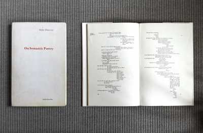
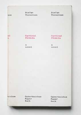
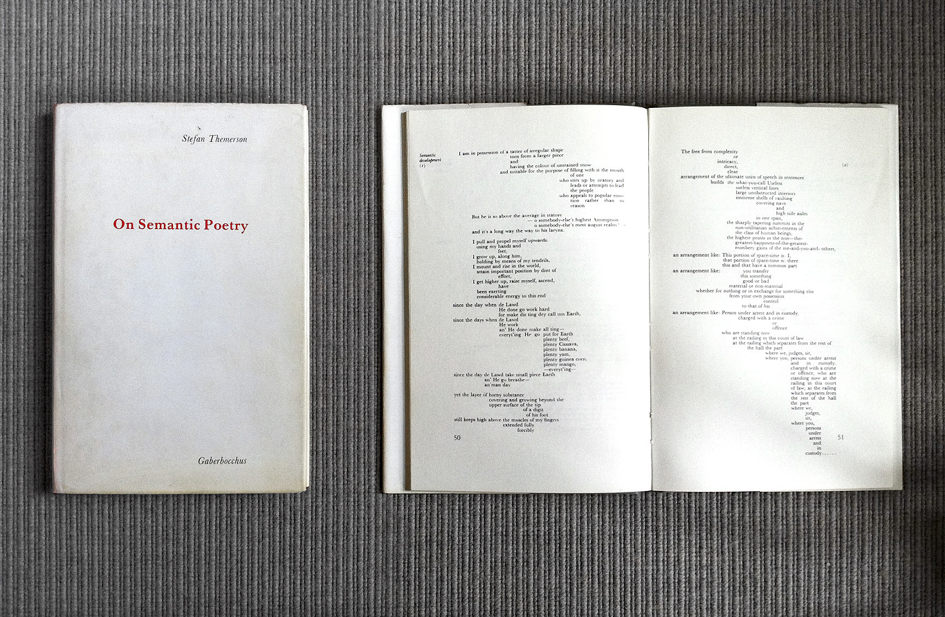
On Semantic Poetry
84In his ‘Semantic Sonata’ Themerson structures text prosodically with ‘semantic typography’. “One can understand the Themersonian ‘Internal Vertical Justification’ as a special case of what designers know as alignment”, writes Kinross in his Froshaug book, “whereby elements within a visual field are given order by letting them run from or to the same vertical axis.”
Lesen
83Stanislas Dehaene’s book on reading is not visually appealing, but essential to every typographic designer’s library. English edition here.


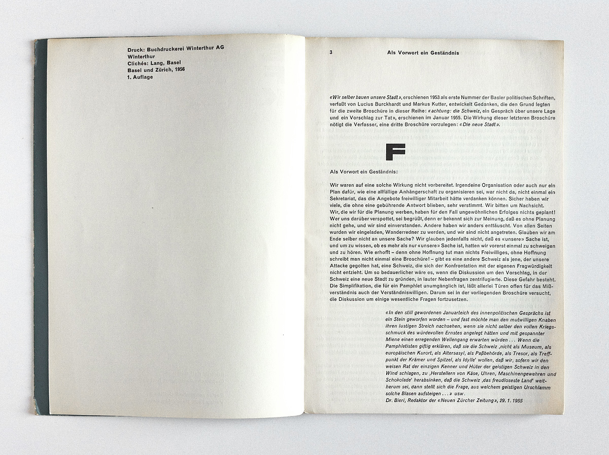
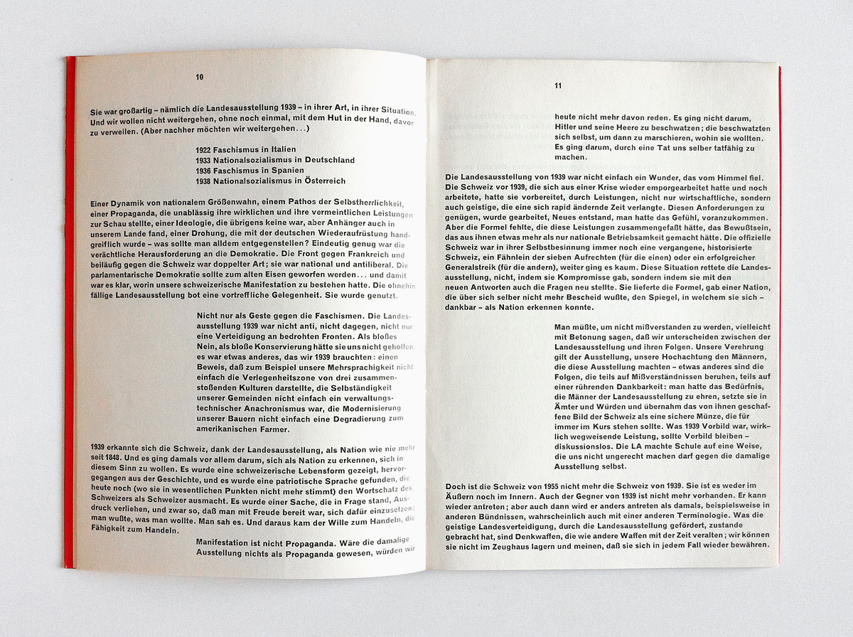
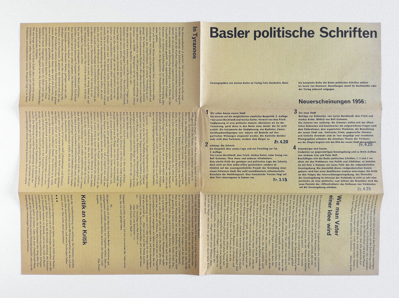
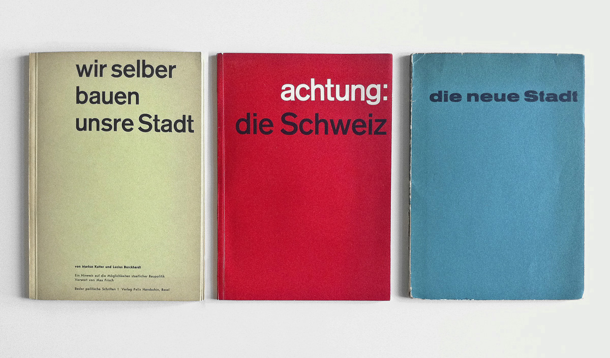
Die neue Stadt
72‘Basler politische Schriften 1-3’, edited by Markus Kutter, designed by Karl Gerstner, Verlag Felix Handschin, Basel, 1955-56. It’s fascinating to see how the typographical skill, expression and formal refinement of the young Karl Gerstner has evolved over these three publications. Here: ‘Basler politische Schriften 3 – Die neue Stadt’.
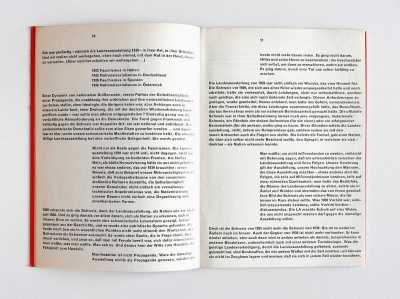
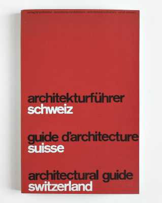
Achtung: die Schweiz
71 2‘Basler politische Schriften 1-3’, edited by Markus Kutter, designed by Karl Gerstner, Verlag Felix Handschin, Basel, 1955-56. It’s fascinating to see how the typographical skill, expression and formal refinement of the young Karl Gerstner has evolved over these three publications. Here: ‘Basler politische Schriften 2 – Achtung: die Schweiz’.
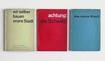
Wir selber bauen unsre Stadt
70 2‘Basler politische Schriften 1-3’, edited by Markus Kutter, designed by Karl Gerstner, Verlag Felix Handschin, Basel, 1955-56. It’s fascinating to see how the typographical skill, expression and formal refinement of the young Karl Gerstner has evolved over these three publications. Here: ‘Basler politische Schriften 1 – Wir selber bauen unsre Stadt’.

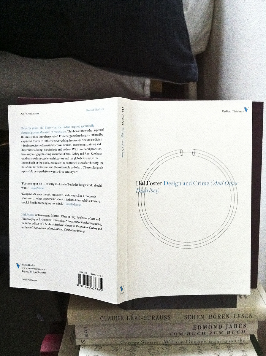
Design and Crime
66Maybe this book (strange line break on the cover, don’t have a clue what it wants to say) shouldn’t lie on my nightstand. It infiltrates my dreams.
Der Mut zur Wahrheit
65Michel Foucault: ‘Der Mut zur Wahrheit’ (English edition). Astonishing hallucinogenic documents ...
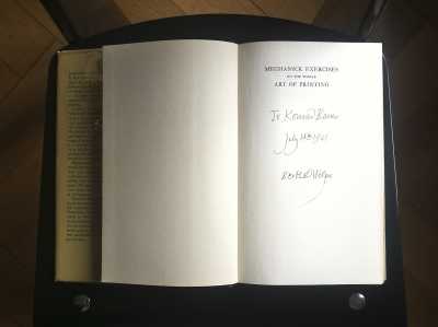
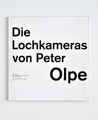
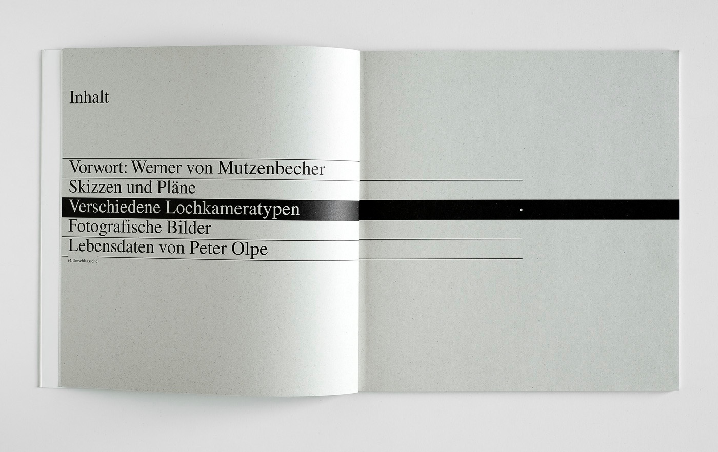
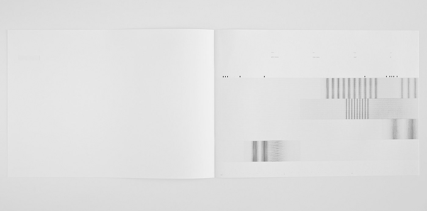
Die Lochkameras von Peter Olpe
60
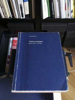
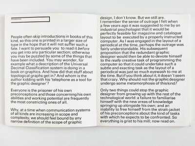
What is a Designer?
57Another book to read again and again: Norman Potter, ‘What Is a Designer?’ wholeheartedly recommended (here the revised third edition from 1989).
Slanted 16
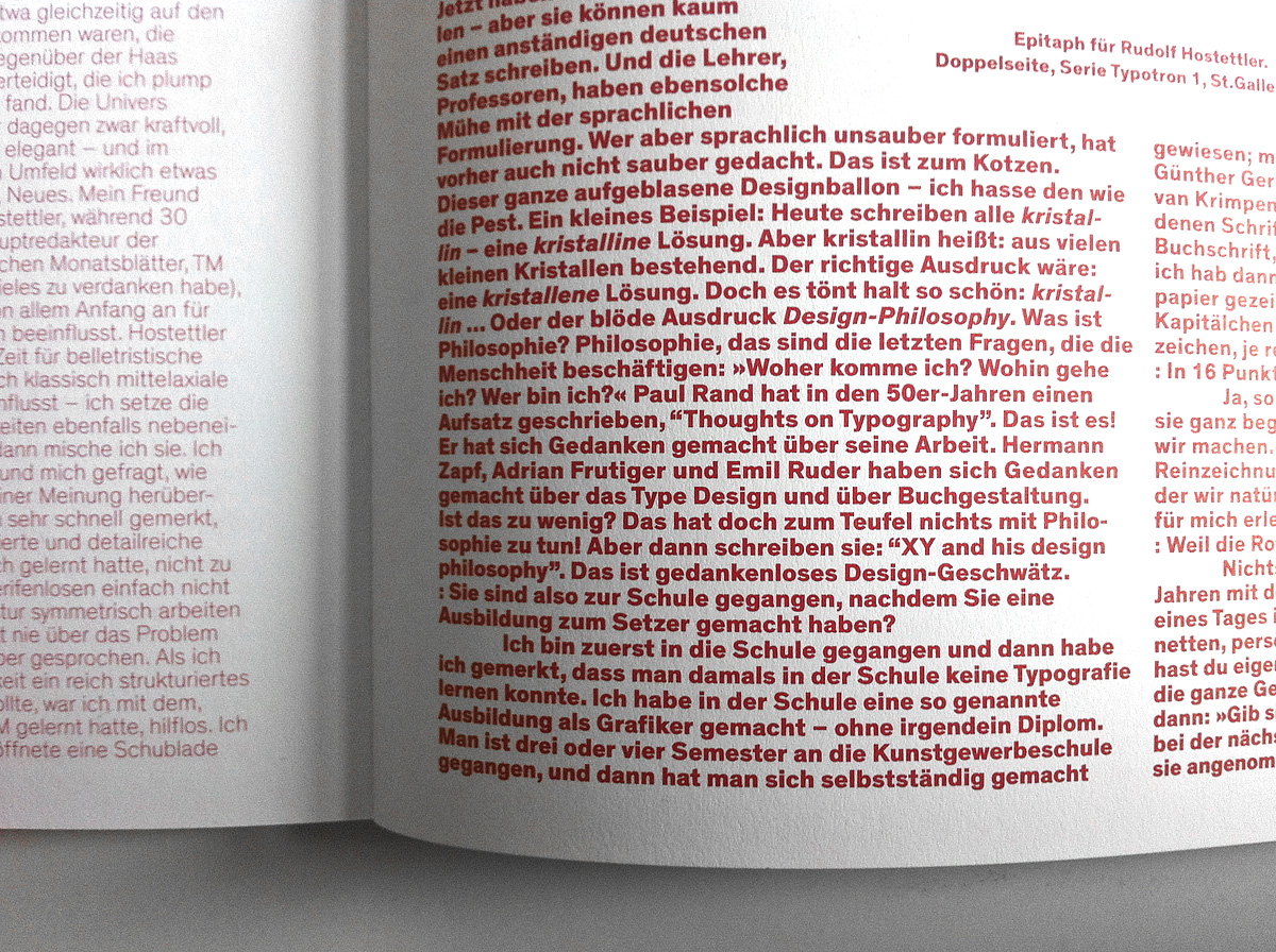
53“Dieser ganze aufgeblasene Designballon – ich hasse den wie die Pest (This whole overblown design balloon – I hate it like the plague!)”. Jost Hochuli in an interview in Slanted 16.

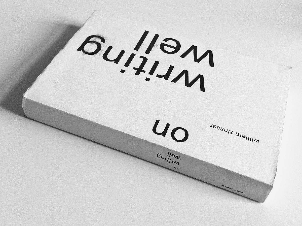
On Writing Well
50If you don’t like the cover but the book, make your own jacket. Essential reading for every designer by the way. It’s also a book on design in a metaphorical sense. Ugly German edition (the translation is better than the original cover design – under my jacket).
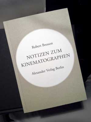
Notizen zum Kinematographen
41On my nightstand: Bresson’s musings on cinema (which is of course just another field of design). At least there’s a French edition of the Bresson book by Gallimard – don’t know if it’s available in English.


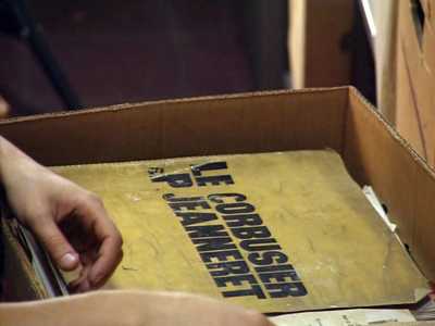
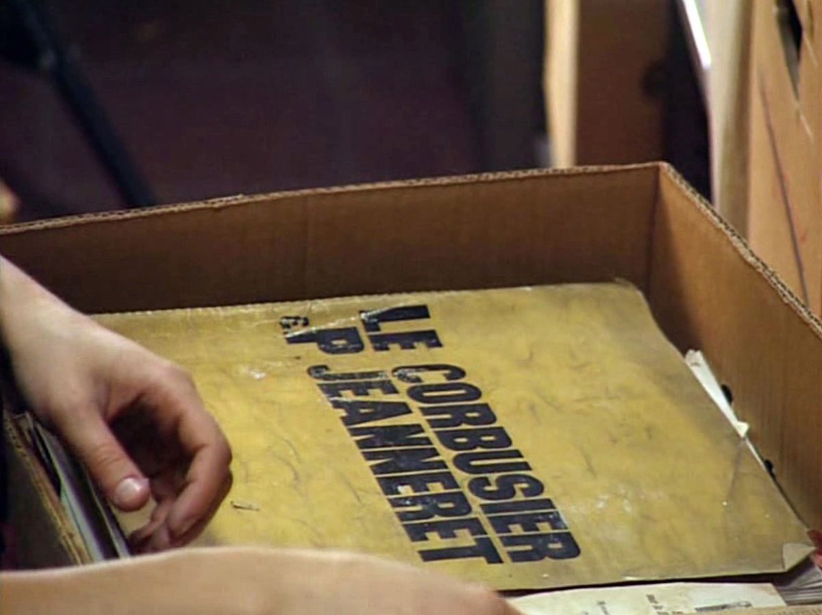
Paul Otlet
22A book by Le Corbusier I found in a film: ‘The Man Who Wanted to Classify the World’ – Paul Otlet.

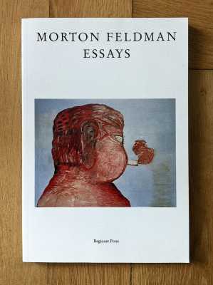
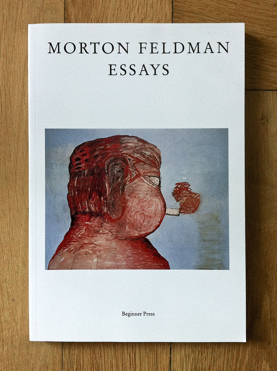
Morton Feldman – Essays
20Definitely one of the brightest minds in 20th century music. Feldman’s essays are seminal texts. Here is an interview with Morton Feldman in German.
Josef Koudelka – Roma
19Only Steidl knows how to catch up with gravure printing. Impressive! Read this article in the German newspaper ‘TAZ’.

Armand Schulthess
14The most beautiful book Elektrosmog ever made: awesome materiality, erotic tactile sensation. Feel it, pictures won’t tell you the whole story.
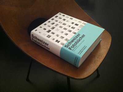
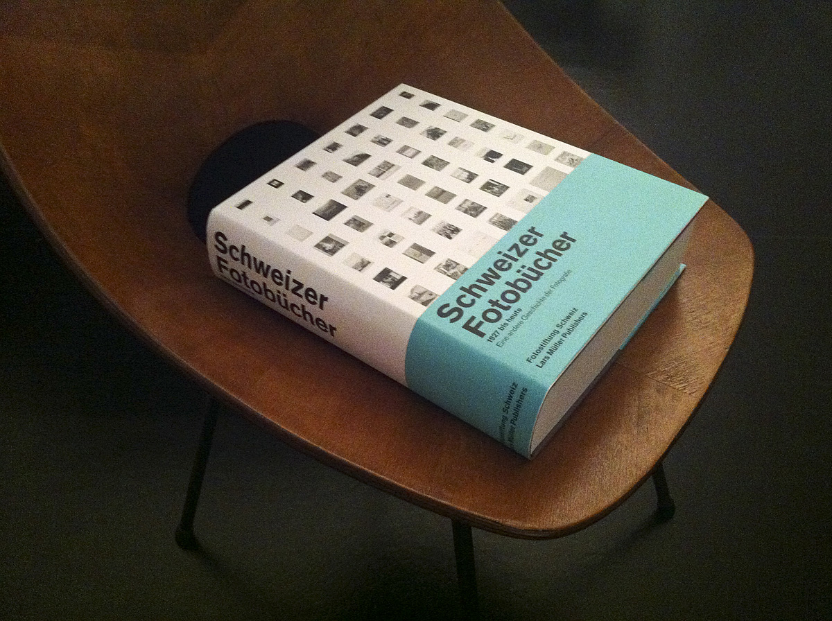
Schweizer Fotobücher
12Way too heavy to read in bed, nonetheless beautifully executed, as is nearly everything from @LarsMullerBooks.
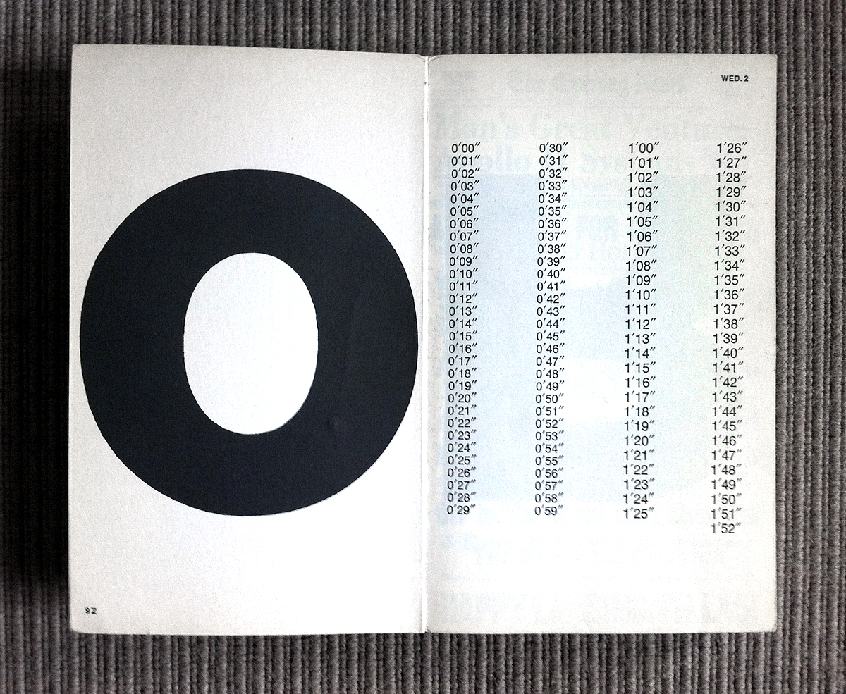
Apollo Amerika
11Finest Fluxus: Kriwet’s ‘Apollo Amerika’, published in 1969 by Edition Suhrkamp – a typographer’s delight. If you are looking for a copy you may find one available here.
Guy de Cointet
10Striking little book by Gavillet & Rust @optimofoundry on Guy de Cointet – a strange but fascinating artist.

Kultur Digital
7 4Last Week at Frankfurt Book Fair 2011, Part 7: “Finale” with a beautiful book designed by Glashaus – Gregor Huber and Ivan Sterzinger. The digital revels in the analogue. Form and content coalesce in an exciting compendium. This design has thoroughly analogue qualities – ergonomic typography, fine-grained materials, judicious use of a vocabulary well under control. Unfortunately the PUR binding makes the book difficult to open. An almost perfect book.
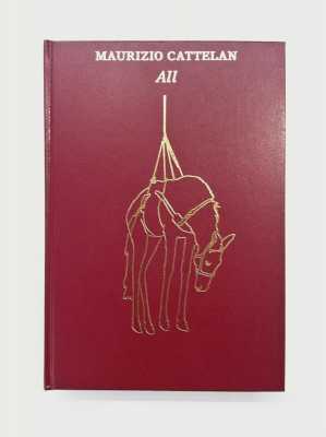
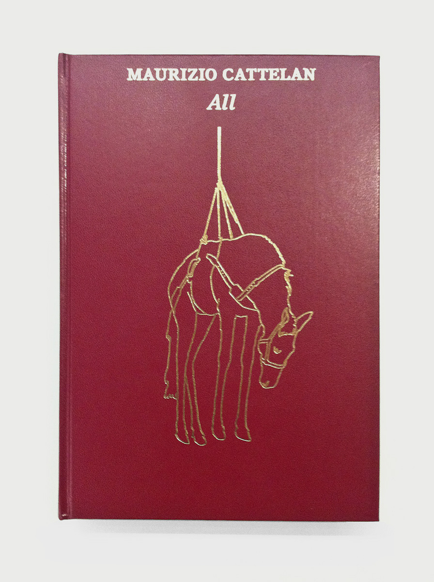
Maurizio Cattelan
5Last Week at Frankfurt Book Fair 2011, Part 5: A beautiful ‘bible’ for Maurizio Cattelan’s installation @Guggenheim.
Atlas Transformace
2Last Week at Frankfurt Book Fair 2011, Part 2: ‘Atlas Transformace’. Stunning. English edition available!
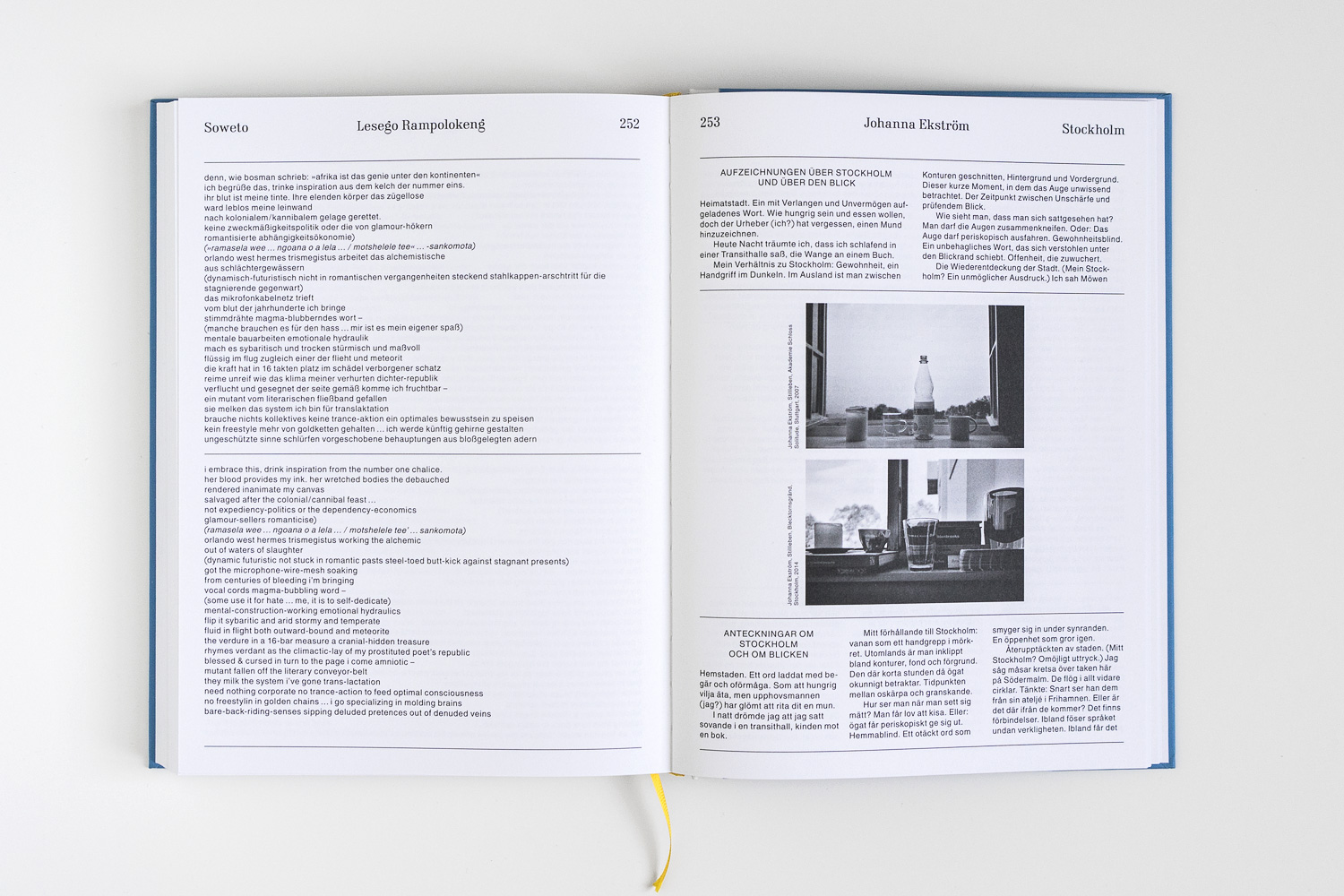